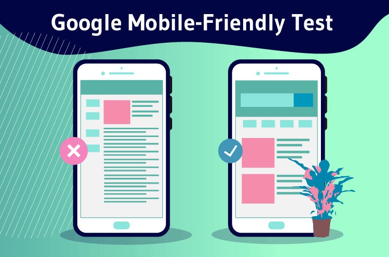
Google Mobile-Friendly Test is a tool designed by the number 1 search engine to help webmasters test the adaptability of their site to mobile devices. This tool is part of Google’s Mobile-First indexing policy which consists in indexing the mobile version of a website instead of the desktop version. The purpose of this policy is to prevent problems caused by sites whose mobile version and desktop version are completely different.
Checking the compliance of a site on mobile is nowadays essential for all webmasters because of the rise of mobile search and Google’s effort to offer a better experience on mobile.
Indeed, people use their cell phone in 70% of the cases when they browse the Internet. For this reason, Google tries to put the satisfaction of mobile users at the heart of its policy through a series of updates in favor of sites adapted to mobile.
In this approach, the American firm has developed Google Mobile-Friendly Test, a tool that allows to check the adaptability of websites on mobile.
Through this article, we discover what is the Google Mobile-Friendly Test and its importance for SEO.
We then go through the techniques to make a site work on mobile and how to use the tool to optimize your site for mobile SEO.
Finally, we will explore the elements that go into the Google Mobile-Friendly Test and how to optimize its elements for your site.
Chapter 1: What is Google Mobile-Friendly Test?
This chapter is dedicated to the definition of Google Mobile-Friendly Test and its implications in terms of SEO.
1.1 What is Google Mobile-Friendly Test?
The mobile version of some sites can be radically different from the desktop version. Visitors who connect to these sites through mobile devices may find this frustrating.

To avoid any situation that could alter the experience of online users, Google has decided to promote the mobile version of websites.
While it is the desktop version that used to be indexed, the American giant has announced in the wake of this decision to switch to indexing the mobile version of websites.
The consequence of this choice of Google is that website owners must try to adapt their sites to mobile devices.
The Google Mobile-Friendly Test is nothing but the tool that the search engine has set up to allow website owners to check the compatibility of their sites to mobile devices.

Of course, there are other online tools to check the compatibility of a site, but the Google Mobile-Friendly Test is one of the most popular and reliable sources of information about mobile-friendliness.
To better understand what the Mobile-Friendly Test is all about, let’s take a look at mobile SEO and Mobile-First indexing.
1.2 What is mobile SEO and why is it important?
Mobile SEO is the act of optimizing a site for people who visit it via a mobile device. Also known as mobile SEO, it also involves making a site’s web pages crawlable to search engine spiders.
Mobile SEO has become so important for all websites, as it keeps gaining popularity. It gets this popularity from the explosion of mobile search in the last few years.

It is estimated that 58% of all Google queries come from mobile devices. In comparison, Google estimates that there are more 27.8 billion searches done on mobile devices than on computers.
These numbers show that Internet users are using mobile devices to connect more than computers. This makes mobile seem like the future of search.
It is to adapt to this new trend that Google has activated to review its entire algorithm to focus on mobile search. Webmasters are also required to follow this dynamic of the American firm and focus on mobile search.
Indeed, 95% of mobile queries are made on Google. It will undoubtedly that the search engine will put mobile users first in its algorithm in order to keep its monopoly. This is what happened with the Mobile Friendly update.
1.3. What is Mobile-First indexing?
Google’sMobile-First indexing consists in considering the mobile version of a web page as the main version and adding it to the index.
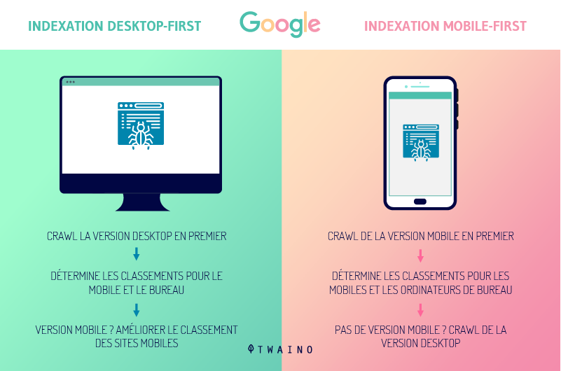
In an interview with Search Engine Journal, John Mueller said that the desktop version of a site is removed from the index as soon as it switches to Mobile-First indexing.
As a result, search results rankings are based solely on the mobile version of the pages. This is still valid for searches made from a desktop computer.
In the past, Google used both versions to rank search results. This means that when someone searches from a tablet, the search engine shows them mobile results.
But when the search is done on a computer, desktop results are shown.
Now you get results from the mobile index, regardless of what type of device you use to perform your query.

The question on many webmasters’ minds is whether Mobile-First indexing can be a problem for their site.
It is not a problem for sites that are properly optimized for mobile, especially those
- Whose pages load on all devices
- That do not use interstitials to hide content on mobile versions
- That load quickly
- Include internal links and functional redirects
- That present an optimized user interface for all devices used.
On the other hand, sites that are not properly optimized for mobile as above may see their rankings drop as Google rolls out the Mobile-First update.
Chapter 2: How do you make your site work and adapt it to mobile search?
By now, you’ve probably figured out that your site needs to work flawlessly on a mobile device. Before performing the Mobile Friendly test, it is essential to make all the resources of your site executable on mobile.
In this chapter we will discover the three techniques to make your site work on mobile.
2.1. Using Separate URLs for Mobile Devices and Computers
Separate URLs are a configuration that allows you to use both a mobile and a desktop version. With this configuration, your site determines the device from which a visitor is connecting and directs them to the device-optimized URL.
However, separate URLs are not easy to generate and they can cause SEO issues such as the need to add rel=can tags since there are multiple versions of your pages.
Therefore, this technique of making a site work on mobile is not the most practical to use
2.2. The dynamic service
Publishing content dynamically makes your content accessible on a single URL. However, the same content is shown to users in different ways depending on their devices.

Indeed, the HTML/CSS document is different for visitors who connect on computer and those who connect on mobile. This is better than setting up separate URLs, but its use is not without problems.
You need to create a new version of your content every time a new device comes out, otherwise the dynamic service cannot recognize it in order to show it the version that suits it.
2.3. The responsive design
Responsive design allows a site to work on different devices without the need for separate URLs or multiple HTML versions of the same content.
Responsive design involves formatting your content so that it responds to visitors based on:
- Device;
- The screen size; and
- Orientation.
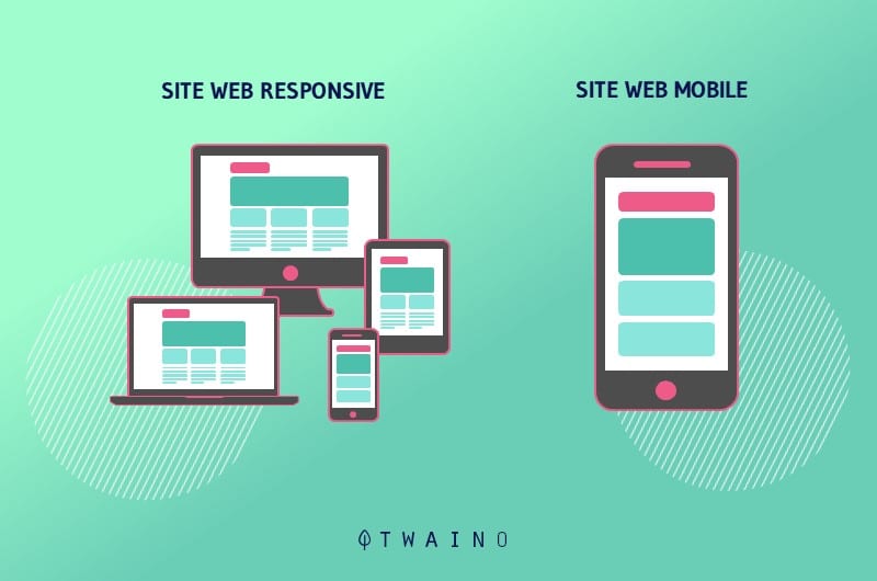
Simply put, websites created with this approach, also known as responsive design, display optimally at different sizes or resolutions, regardless of the device. Responsive design is a boon for displaying a site on multiple devices.
As far as compatibility with search engines is concerned, especially with web crawlers, responsive design remains the best of all options.
The main advantage of responsive design is that you only need one set of content for your site. It saves you the time and money of creating different content to be displayed on different devices.
With responsive design, you only have one site and one URL and you won’t have to manage the creation and maintenance of multiple separate sites. Better yet, your site’s traffic and SEO performance won’t be diluted across multiple URLs.
The other advantage of responsive design is that your site will also adapt to new devices that will be released or become popular. Your website will be flexible enough to adapt to all platforms.

On the other hand, not all elements of a site may display properly on all devices. An image that displays at full size may appear tiny on a phone screen and lose detail.
Responsive design provides a consistent experience for all visitors, yet visitors tend to behave differently on different devices.
In addition, although a site designed with a responsive design approach can be displayed on all devices, it may load more slowly on a mobile device than a site that is primarily designed for mobile.
However, responsive design is still the best option to make a site work properly on devices. It’s also what Google recommends webmasters do to keep up with the Mobile-First updates.
Chapter 3: How to use Google Mobile-Friendly Test to optimize a site for mobile?
Once your site is mobile-friendly, you need to get your SEO in order to take advantage of organic traffic from mobile devices.
3.1. Use Google Mobile-Friendly Test to detect compatibility issues on your site
The Google Mobile-Friendly Test tool provides you with a comprehensive report of what’s going on with your site’s compatibility to mobile devices. It is accessible for free and you will only have to insert your URL into the tool to get the adaptability report.

As you can see, the adaptability test tool shows whether:
- Your site is crawled with Googlebot for smartphone;
- The crawl was successful;
- If the page is added to the index.
If Googlebot for smartphone fails to crawl your site, you should know that there is a big problem. To fix this, you need to check if Googlebot for smartphone is not blocked in the robot.txt file.
When one of your pages is blocked using this file, it means that Googlebot is not allowed to crawl the page in question. You are required to unblock the page in order to allow the crawler to access the page.

The robot.txt file is located at the root of a site, namely at site.com/robots.txt. It can also be found in Google Search Console.
It is also advisable to see the blocked resources in Google Search Console to see if you have prevented Googlebot from browsing certain resources on your site.
Note that Google Search Console also allows you to see the usability of a site on mobile. Just choose Mobile Usability in GSC to see if your site has any usability issues on mobile.
3.2. Abandon the abuse of interstitials
Interstitials are popup windows that block the majority of content on a page. Still called interruption marketing, they allow to get a higher click-through rate for some pages. On the other hand, they are very annoying to users and degrade their experience.

In its effort to improve the experience of Internet users, Google discourages all practices that harm their experience. Thus, the search engine sanctions those ads that are triggered after a user enters from the organic results.
The same goes for ads that are automatically triggered by a user’s action on the page. Google had announced since 2017 that sites with content that is not easily accessible would rank lower.
This is part of the Mobile-First update and Google is working to make content easily accessible on mobile devices. It should be remembered that interstitials ruin the user experience on mobile.
There is much less space on mobile devices and users often fail to identify the button that closes the ad.

However, it should be remembered that not all pop-ups are harmful. Only those that block access to content can have a serious impact on your site.
3.3. Check if your site works for mobile devices
We showed in the previous chapter the importance of making your site work on different types of devices, especially mobile. Now we’ll look at how Google sees your site on mobile and other devices.
For sites that use a responsive approach, this tool allows you to see how they display for different devices and for different screen sizes. The tool has a search bar where you will enter your URL.
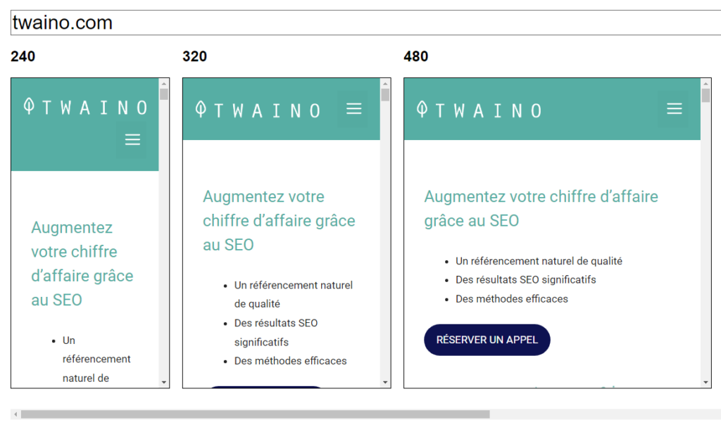
Apart from this tool, you can directly open the URL of your site on different devices to check how it displays on those devices.
If it doesn’t display correctly, it indicates that there is a problem and you should make the necessary corrections.
Chapter 4: What are the important elements for Google Mobile-Friendly testing and how to optimize your site properly for these elements?
The compliance test takes into account certain aspects of your site to see how comfortable it remains for mobile users.
This chapter is dedicated to these aspects of your site and how to optimize it to stay mobile-friendly.
4.1 User Experience: The Key to Google Mobile-Friendly Testing
4.1.1. Why User Experience Matters for Google Mobile-Friendly Testing
With the Mobile-First update, it’s no longer enough to create an attractive site to rank well and drive traffic.
User experience (UX) is now an important part of the SEO world and knowing how to do it is crucial.

In fact, the Google Mobile-Friendly test is based on mobile UX signals. This means that visitors accessing your site through their mobile devices should be able to do what they want without being disturbed.
Google is able to detect what is happening on sites through an algorithm specifically designed to see how Google users interact with a site. When your site frustrates visitors, this algorithm called RankBain drops you.
The search engine also rolled out a major update that combines a wide variety of metrics known as Core Web Vitals to form a page experience ranking factor
That said, user experience is a must for great online performance.
4.1.2. Benefits of a good user experience
A better experience benefits both the owner and the users of a site. It allows visitors to enjoy your content because it is accessible.

On the other hand, if they don’t have a good experience, they leave your site quickly and therefore the bounce rate of your site increases. In addition, visitors who leave a site in frustration will not return to that site.
As far as site owners are concerned, the more satisfied visitors are on your site, the more they trust you and do not hesitate to make purchases. But when a lot of people leave your site quickly, you will probably have less :
- Subscription
- Purchase
- Marketing campaign sign-ups
- Etc.
Next, let’s find out the UX signals that factor into the Google Mobile-Friendly test.
4.2. Your site’s loading speed on mobile
Loading speed is one of the reasons why mobile users will love your site. Users today expect a site to load faster, otherwise they will move on to another site rather than wait a few seconds.

According to a study by Aberdeen Group, one second delay in the load time of a resource causes a decrease of:
- 11% in views
- 16% in user satisfaction
- 7% in conversions.
Google also keeps reminding us that loading speed is one of its ranking factors. That’s why you need to ensure that your site’s load time is as low as possible.
You can check your loading speed online with PageSpeed. This tool shows the load speed status of a site on mobile and PC.
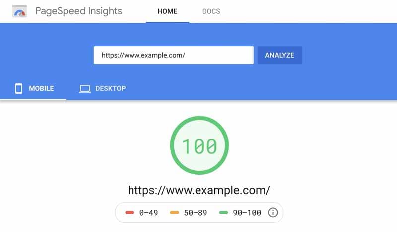
GTMetrix is also a loading speed tool that provides a report as detailed as PageSpeed.
When the indicators are in the red, you should optimize the loading speed on your site to make your web pages quickly accessible to mobile visitors. There are generally 5 ways to reduce the loading speed.
4.2.1. Use a good web hosting plan
Choosing a good hosting plan with a company with reliable hardware is one of the factors that come into play when it comes to optimizing loading speed.

If the hosting of your site is not reliable, it will not perform well in loading pages. Thus, visitors will run away and never come back. Do your research and check user reviews of hosting companies
4.2.2. Optimize images and videos for faster loading
Images and videos take up a lot of page size and appear to be the biggest culprits when a site’s pages load slowly.
Indeed, users expect to find better quality images and videos on websites. But the number of elements that appear on a page and the size of each of them are two important things to consider on your site.
So you need to reduce the file size of all multimedia assets. You should also resize your images appropriately.
It is not uncommon for people to make the mistake of uploading 12 megapixel images without resizing them first. There is no point in uploading an image that is 5000 pixels wide if it is going to be displayed at 500 pixels.
Using the JPG format is also an effective way to reduce the size of an image file, it preserves the integrity of the image without wasting space. This format is preferable for the vast majority of sites and applications.
Don’t hesitate to compress photos that are well sized but still large. Compression is also an alternative for high-resolution videos that can be very time-consuming.
There are many video compression tools online like this one. These tools can help you reduce your video files to a reasonable size.

Another way to lighten media files is to embed videos from a third-party video hosting platform such as YouTube and Vimeo.
Also look to limit the number of assets on each page, as the more images and videos you place on each page, the longer it will take to load.
It’s true that elements such as carousels, background videos, images and background textures can add interest to a site, but they also increase loading speed.
Therefore, a healthy balance must be struck between visual aesthetics and user experience.
4.2.3. Use a caching and page speed plug-in
Using caching plug-ins can help solve some page load speed issues that are beyond the expertise of the average marketer. This is because caching helps speed up page loads.
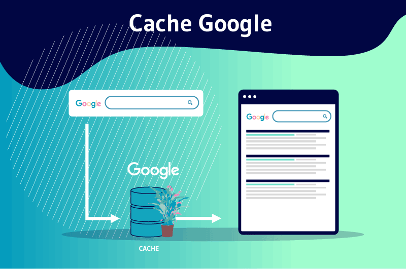
It is a technique that involves storing data in a temporary storage area to improve loading speed, as some of the resources are already available for viewing.
Cached pages reduce the load on your server by up to 80% and load faster. On WordPress, you can for example install W3 Total Cache to cache your pages.
4.2.4. Use a content distribution network
Using a content delivery network (CDN) is also a way to load web resources faster. It is a global network of servers that allows you to duplicate and store the static elements/files of your site including:
- CSS
- Javascript
- Images
- Documents
- Videos
- Etc.
These elements are then transmitted to users from a server that is closer in terms of physical location

Let’s say your site is hosted in Canada, users in other parts of the world will have to wait a (relatively) long time for your content to reach their browser.
With a CDN, this delay is greatly reduced, since the static content will be delivered by a local server much closer to them instead of a server located on the other side of the world.
4.2.5. Minimize HTML, JavaScript and CSS
Both websites and web applications are increasingly dependent on CSS and JavaScript. It is therefore important to optimize the size of these text files.
It is mainly about getting rid of
- Comments;
- Extra spaces
- Extra line breaks;
- Block delimiters in the code.
This helps to reduce the size of the files and to promote the fast loading of a page.
4.3. Create content that is easy to read on mobile devices
When your content is difficult to read on mobile, you agree with me that users will not hesitate to leave your site, a sign of a bad experience.

So your efforts to optimize for Google Mobile-First will be for naught if your content is not readable on mobile. To ensure the readability of your content on phones
- Adopt a readable font of at least 14px ;
- Make your paragraphs short (1 to 2 lines);
- Choose a line length between 50 and 60 characters
- Make sure the contrast between text and background is high for visibility when users are viewing your site externally.
4.4. Use the Viewport tag
This tag is included in the header of the HTML document and tells the browser how the page should be rendered. It is a responsive element that turns ordinary pages into responsive pages.
It changes the size of a page according to the visitors’ device when properly configured
Chapter 5: Some Questions about Google Mobile-Friendly Test
This chapter discusses questions that are often asked about Google Mobile-Friendly Test.
5.1. What is Google Mobile-friendly Test?
It is a tool that Google has made available to webmasters to check the compatibility of their website on Mobile. This test is part of Google’s policy to recognize the mobile version of sites as the main version.
This is the result of the search engine’s desire to improve the experience of online users due to the explosion of mobile search. This measure became effective with the implementation of the Mobile-First update.
5.2. What is the implication of Google’s Mobile-friendly Test for SEO
Mobile search is exploding in recent years and Google prioritizes content that is easily accessible on mobile

As a result, not having a mobile-friendly site can hurt your site’s SEO.
The mobile-friendliness of your site also impacts traffic, visitor interest and lead conversion.
It is estimated that 74% of visitors are likely to return to a mobile-friendly site. In addition, 67% of visitors are more likely to make purchases on mobile-friendly sites.

The Google Mobile-Friendly Test tool then appears as a key SEO resource to detect mobile-friendliness issues in order to:
- Stay in sync with Google’s mobile-friendly updates
- Maintain your SEO performance;
- Increase traffic and lead conversion.
5.3. How to use Google Mobile-Friendly Test?
Using Google Mobile-Friendly is very simple. Just type the URL you want to check into the tool and it will generate a report for you within seconds.
From this report, you can identify the possible problems of your site on mobile and make the necessary corrections.
5.4. What are the characteristics of a mobile-friendly website?
Mobile-friendly websites are different depending on the niche and audience. However, there are a few basic elements that should be considered to satisfy your mobile audience.
Some of these elements include:
- Minimum load time: this is a site’s ability to display page content quickly;
- Absence of intrusive interstitials: content should not be hidden by popups;
- Readability: visitors must be able to read your content without hindrance;
- Better spacing between elements: the screen of a phone is small and when elements are too close together, visitors can click on one element instead of another.
5.5. What are the techniques to adapt a site to mobile and pass the Google Mobile-Friendly test?
There are many techniques to adapt your site to mobile. Among the most practical techniques, we find :
- Make the site work on mobile according to the responsive approach;
- Improve the loading speed on your site by optimizing the size of multimedia files;
- Making your content accessible to mobile users by abandoning the use of intrusive interstitials;
- Make your content readable by choosing a good font, an adequate size and a background that facilitates reading.
In summary
At the end of this article, it is worth remembering that Google Mobile-Friendly Test is a SEO tool that helps webmasters to check the adaptability of their sites on mobile devices for free.
This tool is essential in a context where the figures on mobile search are mind-blowing and search engines are trying to adapt to this new trend.
SEO is more than ever focused on mobile SEO and Google Mobile Friendly Test comes at the right time to help detect problems related to the compliance of a site on mobile.
This will allow webmasters to adapt to the new Google updates and take advantage of the mobile search boom to increase organic traffic to their site and lead conversion.
The different techniques discussed in this article will allow you to make your site work on mobile devices and improve the user experience on mobile.
They will also help you improve your SEO performance and maintain your position in the SERPs.
Feel free to tell us in comments how Google Mobile-Friendly Test helps you stay compliant with Google’s mobile-friendly updates.

