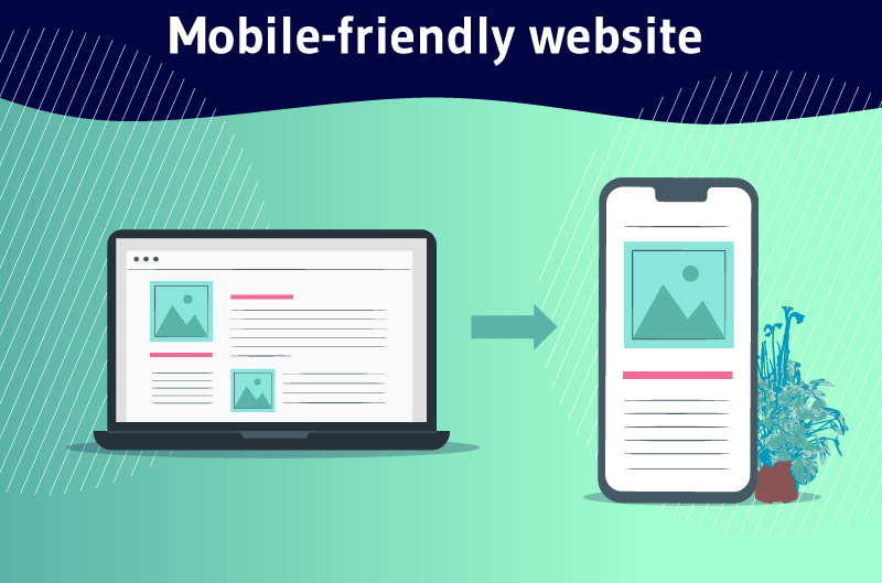
A Mobil Friendly website is a website designed or modified to automatically adapt to all types of mobile devices without the need for the user to zoom the screen or adjust its settings manually. This ensures ease of navigation, good readability of content, ease of clicking on links and consequently, a perfect user experience on these mobile devices.
According to Bright Edge, 69% of cell phone users confirmed that they are more excited to make a purchase from a company with a mobile-friendly website that fulfills their requests
In addition, 50% of B2B queries come from mobile devices and 69% of digital media consumption takes place on smartphones.
These figures are quite substantial and sufficient to translate the need for a Mobile Friendly site these days.
However:
What exactly is a mobile friendly website?
What are the characteristics of a mobile friendly website?
Why is it important to adapt your website to mobile devices?
How to perfectly adapt a website to all types of mobile devices?
If you have already asked yourself any of these questions, don’t hesitate to continue reading this guide in order to have a perfect understanding of the subject.
Let’s get started!
Chapter 1: What do we mean by Mobile-Friendly website?
In this chapter, we will go into an in-depth explanation of this topic so that you can fully understand it.
1.1. Definition of Mobile Friendly website
Mobile Friendly website refers to a website designed and optimized to automatically adapt to any type of device used by a visitor to perform a search.


In fact, a design that is not mobile friendly will have small fonts and buttons that force the visitor to enlarge the screen to read the content and click on links.
This simply means that a mobile-friendly site is likely to offer a better user experience to anyone browsing the net with a mobile device.

1.2. what are the characteristics of a mobile-friendly website?
If it is also necessary to make a website mobile-friendly, it would mean that the website has some special features. Here are some of them:
1.2.1. A Mobile Friendly website should be accessible to everyone
A mobile friendly website should, first and foremost, be accessible to everyone, including people with eye ailments or the elderly. These users usually use screen readers to access the Internet
In addition, the website accessibility guidelines highlight simple design techniques that can be applied to ensure that your website is easily accessible to readers on all screens
1.2.2. A Mobile Friendly site should have a well-organized architecture
The usability of a website also depends on the order of the information on the site and how it is likely to appear
In addition to that, the menu should be carefully planned with categories and sections to make it easier for visitors to find the information they need with their mobile devices.
This becomes even more important when you regularly publish content on your website.
1.2.3. A Mobil Friendly website must have a fast loading time
A website that takes a long time to load becomes annoying for most visitors. If your website takes a long time to load, visitors will have no desire to continue browsing on it, which can negatively affect its ranking in SERPs.

For this, a Mobil Friendly website designer should make sure that his website loads within 4-6 seconds at most to ensure good usability
To test the loading speed of your site on mobile devices and others, you can use the PageSpeed Insights tool from Google
This tool, in addition to being free, analyzes the content of the web page and comes up with suggestions that you should take into account to speed up its loading.
1.2.4. A Mobil Friendly site must take into account all browsers
Very often, many designers ignore or forget to design the site so that it is suitable for all browsers.
It is true that there is a tendency to believe that with the modernization and evolution of browsers, a designed website can easily appear when searched on any browser.
In reality, there are still incompatibilities and not all browsers have the same ways of interpreting a website
For this, you need to opt for a thorough design so that your site appears on the most popular browsers like:
- Chrome
- Internet Explorer
- Firefox
- Safari ;
- And Opera
1.2.5. A Mobil Friendly website must be efficiently navigable
Excellent navigation is very important for the usability of a website on mobile
Simple HTML or JavaScript menus tend to work better and look consistent across all browsers.
The advancement of DHTML and JavaScript libraries has also opened the doors to many new possibilities for creating innovative navigation systems.
However, navigation is not just limited to the menu. Here are some other aspects to consider:
- Good search function;
- Good structure of the site contents on mobiles;
- Less advertising;
- Customization of the 404 page;
- Good internal linking;
- Etc.
1.2.6. A Mobile site must have a contrasting color scheme
Good contrast between the website background and the content is one of the most important web design principles that should not be overlooked
A good contrast between the background and the text, such as black text on a white background, will make your content easily readable.

On the other hand, lack of contrast or poor contrast will make it very difficult for visitors to read your content.
1.2.7. A Mobil Friendly Site must have well formatted and easy to scan content
Most users do not read your content completely. In fact, they just skim it by following the headlines to see if they actually get the answer to their question.
So you need to keep this in mind, forming your content with this in mind.
And to do this, you need to make good use of your :
- Paragraphs ;
- Headings ;
- Sub-headings ;
- Bulleted list ;
- Etc.
1.2.8. A Mobil Friendly site must be mobile friendly
With the increased use of cell phones these days, having a mobile friendly site has become a priority.
If you are unsure about the mobile compatibility of your existing website, you can use the testing tools to find out

In case it is not compatible, you can easily create its mobile version with the free website creation tools
1.3. Some specific actions that a mobile friendly site should allow users to perform easily
As mentioned above, user actions should be made easy. From the responsive or mobile site, it should be possible to perform all the actions configured for the desktop site
In fact, it often happens that the user, frustrated by an uncertain or non-transparent mobile navigation, signs the site address and then visits it from his computer. This is a sign that navigation on a smartphone is treacherous and unclear.
For this, from the Mobile site, it must be possible to
- Buy a product
- Fill a shopping cart
- Finalize the order and pay
- Send an email
- Click on the phone number and activate the call
- Browse images, lists and drop-down menus;
- Fill out the contact form and send easily
- Complete the Captcha
- Watch videos
- Easily change volume levels
- Download PDFs;
- Etc
If these actions are complicated or the site does not allow them due to poor navigability, it is advisable to intervene.
Finally, it should be noted that a website receives more visitors from Mobile than from Desktop. For this reason, you must prioritize simplicity, stripping the site of all the elements that are unnecessary for navigation and that hinder the actions of visitors.
Chapter 2: What is the importance of a Mobil Friendly site?
The use of mobile friendly sites nowadays is no longer a matter of choice. It is a necessity because of the way people use mobile technology today
However, it’s more than just a matter of accessibility on mobile devices. There are several reasons why having a mobile-friendly site for your business is a good initiative
Understanding these reasons can help highlight the value of this approach to your company’s business goals.
2.1. Find users where they want you
If you have a website, it’s probably with the goal of offering your products/services and attracting leads back that can turn into potential customers.
Statistically, the number of searches coming from mobile devices is much higher than the one coming from desktop computers. According to a report from Brightedgereport, nearly 60% of all website traffic comes from mobile.
This would simply mean that if your site is not mobile-friendly, the majority of people visiting it may encounter problems such as
- Slow loading time
- Confusing layout or missing information;
- Etc.
None of these problems give a good first impression. So you need to optimize your mobile site so that users can find information about your business quickly and easily.
2.2) Google prioritizes Mobil Friendly Website
This is because Google prioritizes mobile-friendly websites over non-mobile-friendly ones. In 2018, Google announced that it would begin ranking search results based on the mobile friendliness of sites.
This decision was motivated by the fact that most users conduct searches on mobile devices
So Google wants to make sure that the results they display first are not only high quality, but also fit all types of searchers.
For most people, SEO is the gold standard when it comes to marketing and advertising on the net, but it will all be in vain if your website is not optimized for mobile use, as you will surely appear at the bottom of the rankings.
Besides, a study indicates that more than 71% of users will click on sites on the first page of search results.

So, if you’re on the second page, you’re only noticed by about 30% of the people who might need your goods or services.
2.3. A mobile-friendly site is more credible
Having your web pages functional on cell phones makes your website credible and gives your business great credibility. This is because anyone can visit your website anywhere and anytime without any disruption.
A fast, interactive and mobile-optimized website is one that your customers will enjoy
If they are on their phones and want to browse your site, but it’s not possible, they are much more likely to turn to competing sites.
2.4. Mobile-friendly content is more likely to be shared
Sharing is an important way to make your content viral. People want to be able to share what they see and like, whether it’s on social networks, forums, messaging sites, to friends or family
In addition, some customers may want to share the information on your page with others who may become your future customers.
However, if the format of the shared content is not suitable for the new user’s device, the sharing will not yield the right result
Now that we’ve explained why it’s necessary to prepare your site for mobile use, let’s get a little more practical.
Chapter 3: How to make your website mobile and responsive?
In this final chapter, we’ll look at some of the most critical aspects of creating a mobile-optimized website. Of these, some are simple and require no skill, however, others are technically more complex.
I recommend that you take the time to implement as many of these methods as possible, in order to improve the chances that your website will work well on all devices (and be favored by Google’s mobile-first index)
Let’s get started!
3.1. Use a responsive WordPress theme
What many people often ignore is to check if a theme is responsive or not before installing it. In fact, there are some tips that are important to keep in mind when choosing a WordPress theme
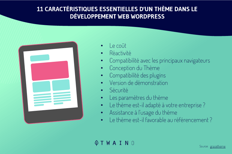
First of all, you should make sure that it is perfectly optimized for the site and will not have a negative impact on its performance
In addition, it should be secure and provide you with all the customization options you will need. Of course, it should also have an attractive look and feel.
This way, your site’s design will be rendered correctly no matter what device, browser and screen size it appears on
Fortunately, you won’t have any trouble making the right choice, since most themes these days are fully responsive. This is especially the case for the vast majority of options offered by the wordPress theme directory.
Moreover, the developer usually mentions it in the theme’s description, so be sure to check its feature list carefully:
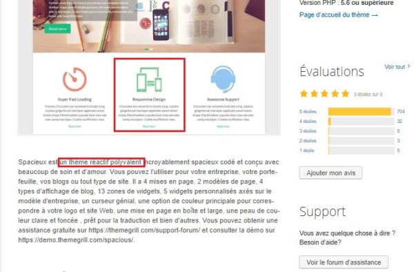
Other sites, for example ThemeForest, will allow you to filter the themes to show only the responsive options.
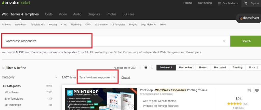
Once you’ve found a theme you like that offers a responsive design, you now need to see how it looks on different types of devices
Some themes allow you to do this by displaying a set of icons at the top of the screen that represent different types of devices:

Clicking on any of them will change the view and you’ll get an idea of what it might look like on the selected device type.
It may take some time to find the right responsive theme and configure it to work on various devices, but it’s worth it when you think about its benefits.
3.2. Adopt AMP for your Mobile site
In reality, it’s no longer a secret that the deciding factor in bounce rate is the speed at which a website loads
According to Kissmetrics40% of Internet users will abandon a page if it takes more than three seconds to load.
The project Accelerated Mobile Pages (AMP) is an initiative supported by Google that aims to increase the speed of websites on mobile devices
On its blog, Google stated that the main goal of the AMP project is to improve the performance and potential of the mobile Web:
”Every time a web page takes too long to load, businesses lose a reader and the opportunity to earn revenue from advertising or subscriptions. We want web pages with rich content like videos, animations and graphics to work with smart ads and load instantly. We also want the same code to work across platforms and devices so that content can appear anywhere in an instant, no matter what type of phone, tablet or mobile device you’re using.”
The AMP framework is open source, available to anyone and completely free. As a result, all websites optimized for AMP are distinguished by their ultra-fast loading time.
3.3. Make your CTAs visible
One of the biggest mistakes some website owners make when designing a website is cluttering it with so many dispensable elements.
Additionally, if your website is going to contain call-to-action (CTA) buttons, make them clear and easy to read

To do this, use an attractive color that relates to your brand and a font size that people can read very easily.
3.4. Make sure your pages load quickly
Many mobile users use a limited internet connection, so it would be appropriate for your pages to load very quickly at the risk of exhausting their plan.
To do this, you can use a free speed testing tool to get suggestions on where you can improve your site to increase page load speed
As an example of a tool, we can mention:
- Google PageSpeed Insights ;
- Gtmetrix ;
- Google Lighthouse (site audit tool proposed by Google) ;
- Etc.
Very large images, pop-ups, and enough redirection links are also the causes of a slowing down of a website.
3.5. Resize and optimize images and logos
Photos in image banks or even photos taken with a good digital camera can contain large files, sometimes over 1MB, which can slow down your website
The good news is that you can compress them without losing their quality, using a free tool like :
- Adobe Photoshop ;
- TinyPNG
- TinyJPG ;
- Reduceimage;
- And so on.
You can also change the dimensions of a photo to make it smaller, for example by limiting it to 800 pixels wide instead of 2000 pixels wide.
3.6. Keep your forms as short as possible
It’s often not an effective approach to ask the customer for enough information, especially on mobile. Instead, you should change the design to keep your forms short.
Again, if someone is filling out a form on their computer, this isn’t a real problem because it’s easier to type and navigate on a larger screen. But that’s not the case with smartphones and tablets.
Evaluate your forms and ask yourself if you need every line. For example, if you’re trying to get users to subscribe to your mailing list, you don’t need their home address and phone number.
Also, forms designed for sales should not ask the user what their favorite color is. Just ask for their billing and shipping information.
In fact, a long and complicated checkout process is one of the main reasons for cart abandonment.
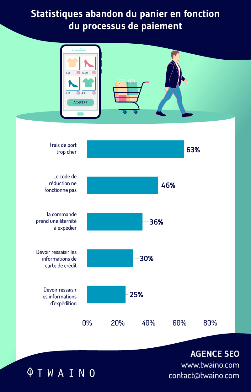
If you want to reduce cart abandonment rates from mobile devices, you should change your mobile website form design.
3.7. Make it easy to find information
People often pull out their smartphones looking for something specific
- The answer to a question
- The address of a nearby restaurant;
- A customer service phone number ;
- Etc.
In this case, the user is eager to get this information accurately and as quickly as possible.
You need to identify the information your mobile visitors are looking for when they are on your site and put it in the right place on your mobile homepage.
If you doubt you know exactly what your visitors are searching for on your website, you can see it all on your Analytics.
Once in your Google analytics, you have the option to include mobile traffic as a segment in the ”Behavior” section. This will allow you to know exactly how mobile visitors interact with your site.
3.8. Eliminate or minimize pop-ups
Most users and Google don’t like pop-ups, as they are sometimes annoying and hinder the user experience.

The problem with pop-ups on mobile devices is that they become even more annoying because they are so hard to close.
Remember, people use their thumbs to press small screens. The little ” X ” button to close a pop-up will be so small on a mobile device that users may have trouble clicking it.
They may even accidentally click on the ad while trying to close the window. In this case, they may be redirected to a new landing page, ruining their experience.
Sometimes, users try to zoom in on the close button for ease of use, but the screen dimensions are also disturbed.
It would be better to get rid of these pop-ups completely. Find other ways to promote whatever your pop-up contains.
If you decide to keep a pop-up on your mobile site, be sure to do a lot of testing to see if the mobile user experience is not affected.
3.9. Choose the right font
Choosing the right font is also a crucial design principle. Fonts should be clear and easy to read. You also need to pay attention to line spacing so that the text on one line does not coincide with the text on another.
You have a small workspace, so you can’t rely on a page break or image every time you want to separate text.
3.10. Test and compare mobile and desktop versions of the site
Whenever you make changes or update your content, be sure to test both versions of your site
This will ensure that your site is optimized for mobile and that your users will be able to access all information quickly and easily.
Here are some suggested tools:
3.10.1 Google mobile optimization test
The most important of all these tools is the Google mobile test. Compared to many other mobile testing tools, it is free, very fast, efficient and accurate.
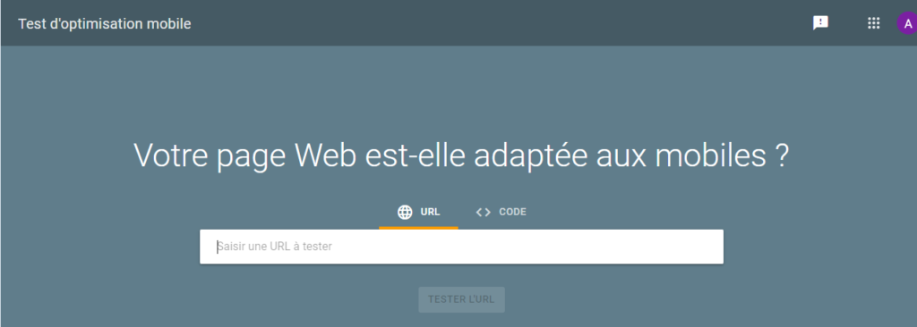
At the end of the analysis, it shows you a screenshot so you can see how your site looks on a mobile device.
You can also see a usability report, as well as a reference documentation to know what changes to make to improve the optimization for mobile devices.
3.10.2 Bing mobile testing tool
As in the previous case, the analysis is fast and the results are very accurate.
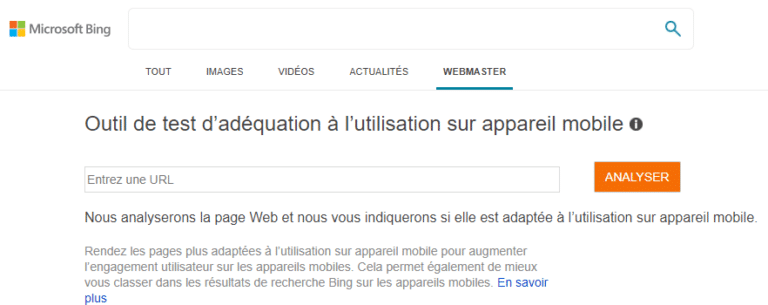
Specifically, it relies on four factors to tell you if your site is mobile-friendly or not. It checks if
- The display window is correctly configured
- The content is displayed on the width of the screen;
- The text is readable;
- The links or objects can be properly pressed.
3.10.3 SmallSEOTools mobile usability test
Another option is to use SmallSEOTools, which works in the same way as the two previous tools, by specifying the main URL and clicking on the ”Start Test” button.

At the end, you’ll see a compatibility percentage, showing you how mobile friendly or not your site is. It also displays a random screenshot of your website in mobile mode.
3.10.4 Mobile Friendly Test by Veloxsites
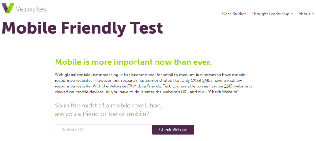
Veloxsites offers a free online tool that basically displays a preview of how our page looks on the smartphone and tablet screen so that we can manually check if it is mobile friendly.
Chapter 4: Other questions asked about Mobile Friendly website
4.1. When is a website said to be mobile friendly?
A mobile-friendly website is one that is sized and coded for easy interaction on mobile devices, which means that it
- Is easy to read the content;
- Is easy to navigate (buttons and links are large enough to type with your finger);
- Is pleasing to the eye (the user experience is enjoyable).
4.2. Why is it important to have a mobile-friendly website?
Providing mobile compatibility is one of the most effective ways to keep mobile visitors on websites for a long time
In fact, users are less likely to leave a website that has ease of navigation, which means improved bounce rate
Therefore, this sends positive signals to major search engines for site ranking.
4.3. Is Mobile Friendly website design the same as Responsive Design?
In simple terms, both work in almost the same way
A responsive website is a website that automatically changes based on the screen size of the device the user is using. This can be desktop, tablet, smartphone, etc
The Mobile Friendly website is a responsive website that conforms to all types of mobile screens.
4.4. What makes a good mobile website design?
There are enough criteria to judge whether the site is well designed or not. For example, mobile-friendly websites should have buttons that are large enough for users to press without having to zoom in
In addition, there should be large gaps between hyperlinks. If links are placed too close together, users may attempt to click on one link and accidentally click on another.
4.5. How do I make my website compatible with mobile devices?
11 steps to make your website mobile-friendly:
- Make your website responsive.
- Make it easy for people to find the information they are looking for.
- Ditch ads and content-blocking pop-ups.
- Make website speed a priority.
- Keep your web design simple.
- Make your button sizes large enough to work on mobile.
- Use large fonts.
- Don’t use Flash.
- Include the Meta Viewport tag.
- Disable auto-correction for forms.
- Perform regular mobile testing.
In summary
Making your website mobile-friendly should be a priority for you, given the trend of mobile device use these days.
Indeed, anyone, on any device can easily visit your website, to search for information, discover your products/services and if possible buy.
To get the best out of it, we have listed for you, 10 specific and efficient tips that can help you.
However, if you have other ways to optimize a website for mobile or if you have any questions, don’t hesitate to mention them in the comments.
Thanks and see you soon!

