The footer is generally part of the important elements to put in place when creating a website, that’s why it is important not to neglect it ? Since far from being a detail without great importance as many people tend to think, the footer is actually a capital element that will be present on a majority of your site pages. Indeed, it is the last area that the visitor will have the opportunity to see before leaving your website. Therefore, the footer is your last resort to capture his attention and do not forget that it is a privileged area for visitors to get more information about your company. You must therefore take good care of it and I will give you all the useful information about it, as well as the different steps to achieve it. A video accompanies this guide and I recommend you to follow it to have a visual of the whole process.
The footer in WordPress
Discover in this video
how to create a footer in wordpress:Why is the footer important?
When creating a website, it is often advisable to put the most important information above the waterline. Indeed, this line is a virtual delimitation above which the content of the page is visible without the user scrolling down with the scroll bar.
However, the area above the waterline is not the one that necessarily enjoys a much higher number of engagements. Note that the term “engagement” that I use here, refers to the time spent on the area by visitors.
Indeed, this fact is supported by the Chartbeat study, which was based on 25 million web sessions. This study reveals that without taking into account the users who immediately leave the page, the majority of visitors do not wait for the page to load completely before scrolling down
Moreover, the area just below the waterline enjoys more than 80% engagement compared to 75% for the area above.
And these numbers decrease little by little until the bottom of the page, which implies that there is a large number of visitors who see your footer. For this reason, you should not neglect its design and execution.
The elements of which the footer of a website is composed

The footer must leave a good impression since it is the last element that the visitor sees before leaving your page. In addition, it can help enormously by allowing him to access directly to the most important sections of your business.
For this, I list here the different elements that can be found in the footer of a website from those that are essential to those that are optional.
The copyright
It allows you to protect yourself from any plagiarism of your website. It is therefore the element that should not be missing and you just have to integrate its symbol followed by the year.
The privacy policy
It occupies the second position in terms of importance and you must think of integrating it in your footer. Indeed, this link redirects to a page that indicates the types of information that are collected by your website and the way they are used and kept.
The terms of use
This link is usually displayed as a warning and allows you to indicate to users the conditions they agree to when they continue browsing your website.
Indeed, the terms of use are often integrated in the footer of the website of companies operating in a highly regulated sector so that they are protected from any disappointment.
I recommend you to do the same if you are such a sector of activity.
Contact
It has become more than a habit, visitors generally expect to find in the footer, the contact information. It would be a shame not to include a link to this data.
An address and a link to a map
Including a location address in the footer allows visitors and Google to know the geographical location of your company. To be much more practical, you can try to link a map to this information. This way you will benefit from the traffic coming from the geolocalized search.
A phone number
In addition to an address, you can add a phone number with the area code. Also, make it a clickable button so that mobile users can dial it automatically by clicking on it.
The Sitemap
It is one of the most used elements in a footer, even if it is rarely used by Internet users.
A navigation menu
This is the ideal option to help visitors quickly get to the part of your website they want. Indeed, the fact of not finding the information they are looking for is sometimes the reason that leads them to go down so low. For this, you can integrate for example a drop-down menu to send them to the most important pages of your website.
Icons and/or widgets from social networks
These are excellent solutions when you are very active on social networks. Having icons allows you to send your visitors directly to your social accounts. Widgets on the other hand, allow you to display directly on your website the latest messages posted on social networks.
Newsletter subscription
The footer is the place where you can integrate a newsletter subscription module since this layout is very common and Internet users are already used to it.
A search engine
If your top navigation menu doesn’t seem to be able to keep a search engine, you can place it in the footer. However, you must make sure that it is clearly identifiable by your visitors.
Apart from these links, you can add other much more optional elements such as:
- An image or a mini gallery to personalize your footer;
- Awards and certifications to reinforce your credibility;
- Members of your association;
- A clear and understandable call to action to optimize the number of conversions.
As you can see, the choice is quite vast and I suggest you follow some good practices to have the ideal footer.
Best practices to create the right footer for your website
In order for you to have a footer that offers an optimal user experience, I suggest you to consider the following points.
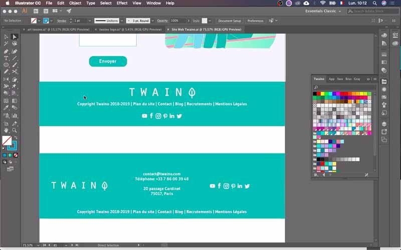
Make a mock-up of your website
This is a step that comes before the creation of a website and I recommend that you do not miss it. Indeed, the model allows you to keep a certain consistency between the footer and all pages of your website.
In addition, you have time to think about the links that are more relevant to integrate into the footer of your website. The idea is to have a correct and pre-established scheme before you go on to create it in WordPress.
Do not overload the footer
Apart from the design of your footer, you should think about integrating useful elements into it without making a carbon copy of your main navigation menu which is at the top.
Make sure that the footer is not overloaded so as not to bring confusion to visitors who are likely to leave your website immediately.
Choose the best links for the footer
The best footer should be a call to navigation for users so that they stay on your site the longest. For this, there are three main categories of links
Must-have links
This category includes the most important links according to your activity such as :
- Customer service: Contact us, FAQ, payment methods, delivery, order tracking, etc.
- Information about your company: About us, our stores, employment, etc.
- Legal information;
- Site map;
- Etc.
Recommended links
These types of links add value to your website and include
- A newsletter subscription ;
- A Social presence ;
- A logo;
- Etc.
Adjustable links
These are links that vary according to your objectives at a given time. I distinguish :
- Gift cards;
- A mobile application;
- Testimonials ;
- A visual ;
- And so on.
After choosing the elements that will constitute your footer and its design, you will move on to the creation phase.
How to create your website footer with WordPress and Avada?
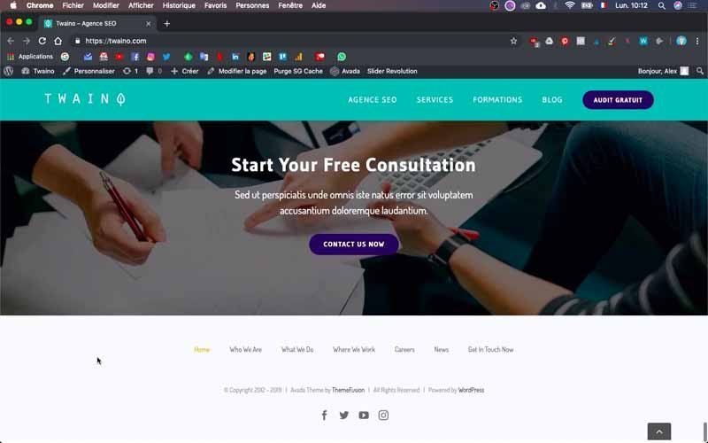
As in my other articles, I will use the website of my SEO Agency Twaino.com, to show you the process ”step by step”. Thus, the following steps show the method I used to create the footer of my site with WordPress and the Avada theme.
Therefore, I distinguish two main steps for the creation of a footer:
- The configuration of the content of your footer;
- The design of the footer.

Let’s go !
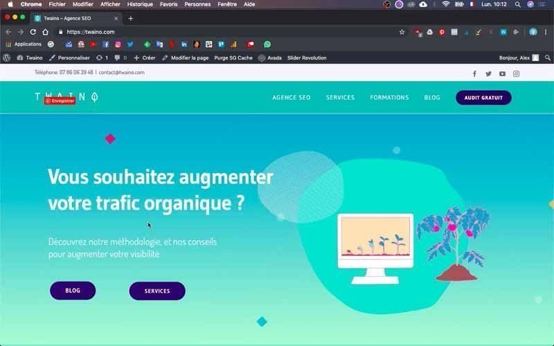
Connect to the Dashboard of your website
The first thing to do is to access the WordPress console. So you need to log in to your website’s admin account and just fill in the “…./wp-admin” entry at your website’s URL in your browser.
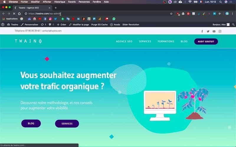
On the login page, fill in the boxes with your credentials and then validate to access the “Dashboard”.
The configuration of the content of your footer
1) Go to the options of your theme
Once in the dashboard, click on the topic of your theme which is on the left sidebar. I click on “Avada” and in the menu that appears, I select “Theme Options” located at the bottom of the list.
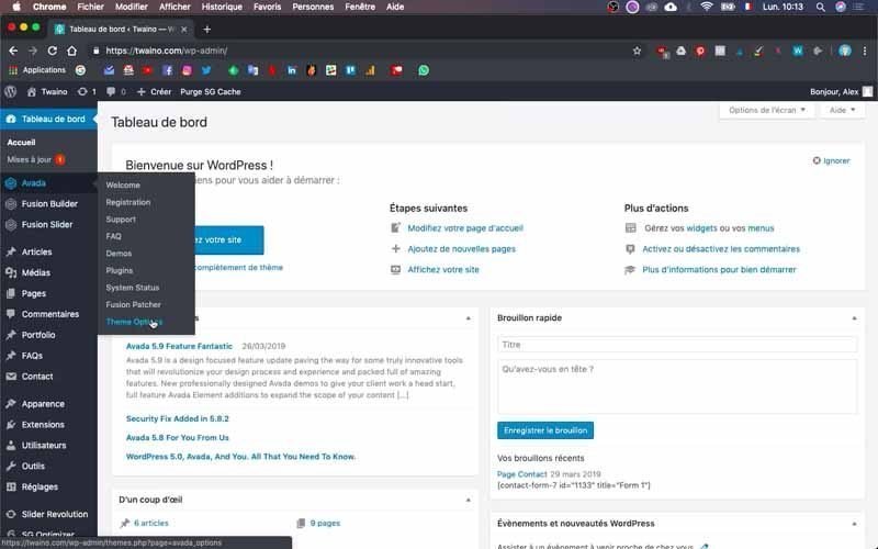
On the following interface, you have all the options offered by your theme, especially on the second left sidebar which follows the dashboard.
2) Configure the parameters of the content of your Footer
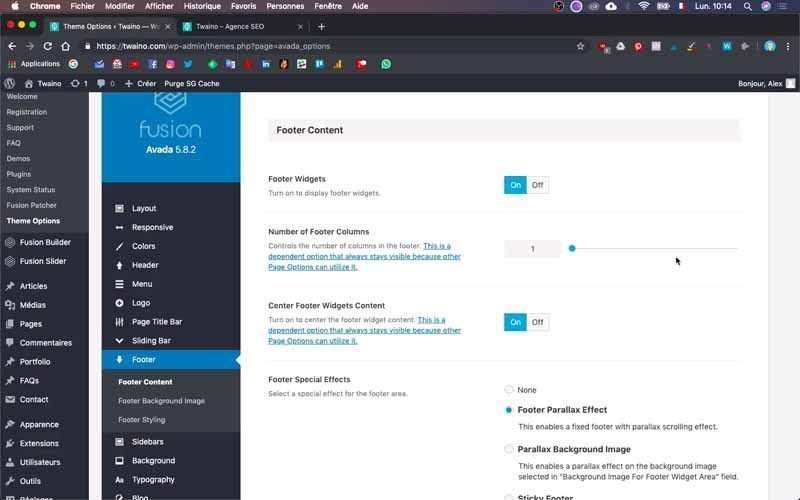
Among the options available, click on “Footer” which is located just below the “Sliding Bar”. Then select the first parameter “Footer Content” which gives you access to its configuration interface with several parameters.
2-1) Footer wdigets
First of all, activate the ” Footer Widgets ” by clicking on ” ON “. Widgets are downloadable modules that offer certain functionalities and that can be integrated into various parts of a site.
For example, in the default “footer” of my website, the navigation menu was created using a widget. This is the footer area with :
- Home;
- Who Are We ;
- What We Do ;
- Where We Work ;
- Careers ;
- News ;
- Get In Touch.
In addition, I need to activate the widgets to integrate the icons of the social networks.
2-2) Number of footer columns
On the default footer of my website, there is currently only one column. However, you can easily notice that there are three columns on the second footer that I designed during the creation of my model. On the other hand for the first template, it is also a block or column.

At this level, you must choose the number of columns you want given the expected result. In my case, I leave it as I finally chose the first template.
2-3) Center Footer Widgets Content
This option allows you to center the footer content and I leave it on. You can choose “Off” if you don’t want to center the content.

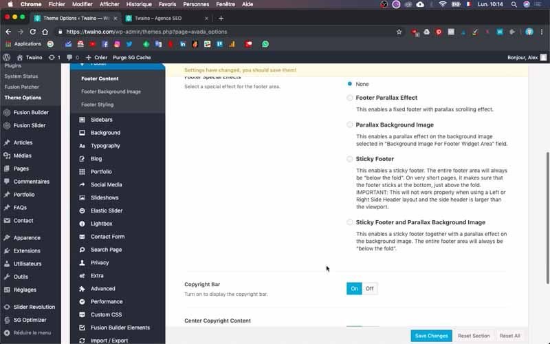
2-4) Footer Special effects
This part allows you to add a special effect to your footer. You can choose none or choose between the other options:
- Footer Parallax Effect;
- Parallax Background Image ;
- Sticky Footer ;
- Sticky Footer and Parallax Background image.

At my level I check “None” since I don’t want to add a special effect to my footer.
2-4) Copyright Bar
This option allows you to have the mention Copyright followed by the year. Activate it by clicking on the “On” button if you haven’t already done so.
2-5) Center Copyright Content
Allows you to center the copyright content, which is the case of the Copyright elements of my default footer including :
- Copyright 2012 – 2019 ;
- Avada Theme By ThemeFusion ;
- All Rights Reserve;
- Powerd By WordPress.
To get the same result, enable this option by clicking “On”.
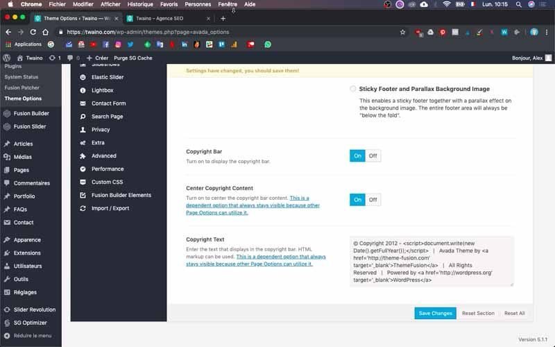
2-6) Copyright text
This section allows you to specify the content you wish to have in the “Copyright” section.
3) Configure the copyright text
In the “Copyright text” option, you can modify the different texts or links that are displayed on the same line as the Copyright. These are:
- Copyright 2012 – 2019;
- Avada Theme By ThemeFusion ;
- All Rights Reserve;
- Powerd By WordPress

3-1) Make the year 2019 appear before the copyright
In place of the year 2012 that is in front of the Copyright, I write 2018. This is actually the formula to indicate 2019 to WordPress.
3-2) Modify the other elements
I delete the “Avada Theme By ThemeFusion” part and write in its place “Site Map” that I want to have in my footer. At this level, take care to also remove its URL and the “‘target=’_blank'” code that opens the copyright links in a new tab.
For example, when I click on the “WordPress” in my default footer, another tab opens in my browser in addition to the old one that is still open. To make sure that everything is in the same tab, simply remove the “‘target=’_blank'” code.
3-3) Add clickable links
I want to add more items that are clickable in the footer. To do this, I copy “Site Map” with its code, which gives: Site Map.
Then, I paste this code just after the small right bar “|” which allows to separate the elements from the copyright. In place of the Site Map, I write “Contact” in two places and it gives: Contact.
Note that the first “Contact” is nothing more than the name of the page and it is possible that I will modify it later according to the exact name of the pages I will create.
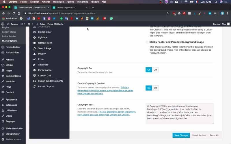
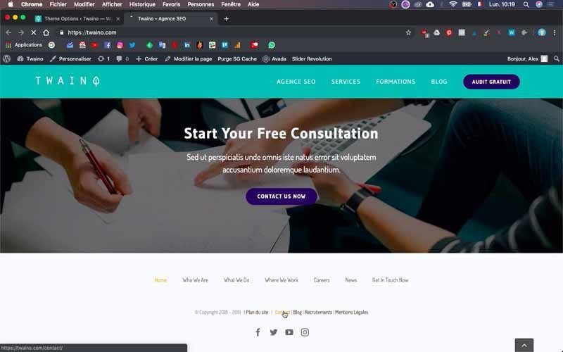
I repeat the same operation for “Blog”, “Recruitment” and “Legal”. Given the expected result, you can add the elements you want and to validate these changes, click on the blue button “Save changes” located just below.
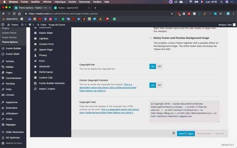
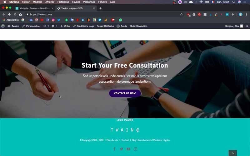
By refreshing your homepage, you can already see that the new changes have been taken into account.
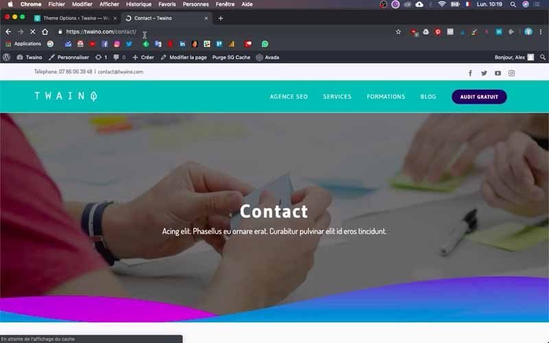
Moreover, by clicking on “Contact” for example, I am automatically sent to the contact page of my website.
The footer design
1) Add a background image to your footer
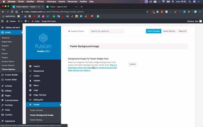
Click on ” Footer Background Image ” which allows you to add an image to your footer if you wish. To do this, simply press the “Upload” button to choose your image. I don’t want to do it so I leave this part.
2) Configure the style of your footer
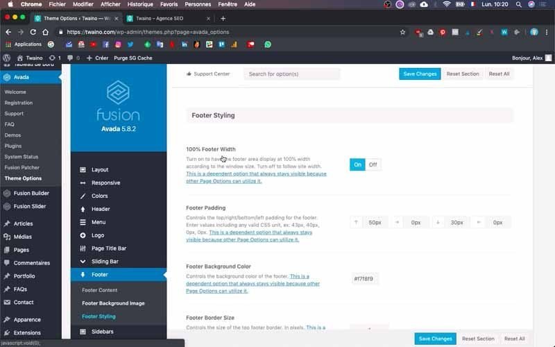
To configure the style of the footer, click on the third parameter “Footer Styling” of “Footer” which gives you access to several options.
2-1) 100% Footer Width
The first option “100% Footer Width” allows you to change the size of your footer. In my case, I prefer not to make any change since this size suits me.
2-2) Footer Padding
Next, there is “Footer Padding” which allows you to configure the space between the top and bottom edge of the footer content. You can try to adjust it to get the best result. At my level I write for the moment “0 pixel” everywhere.

2-3) Footer Background Color
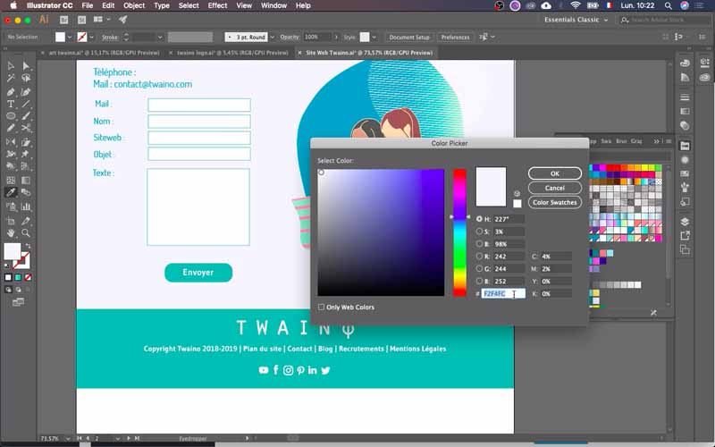
After this option, there is “Footer Background Color” which allows you to change the color of the footer. Click on “Select a color” to take the color you want.

But if you have a specific color to have, you just have to copy its code and paste it in the box reserved for this purpose.
2-4) Footer Border Size
This option allows you to change the size of the border of your footer. In my case, I put “0” because it will not be used.
2-5) Footer Border Color
If you have chosen to add a border to your footer, you can give it a color
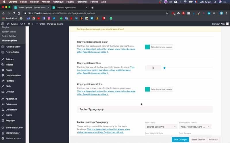
In my case, I paste the code of my main color to make sure I have the same color everywhere.
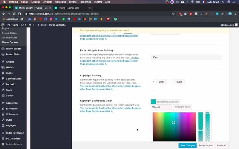
2-6) Copyright Padding
At this level, you can configure the space that separates the content of the copyright from that of the widget that is on top of it. Since the space is a bit too big at my level, I will replace the default numbers by “20 pixel” at both levels.
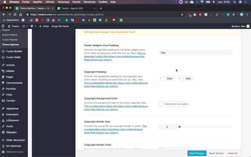
2-7) Copyright Background Color
Here you can set the color of the copyright.
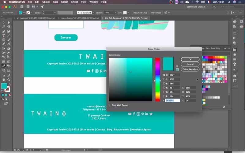
For my site, I always choose the color that I used previously by pasting my code.
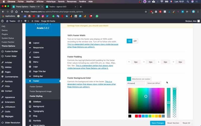
I do the same for “Copyright Border Color” by pasting the same color code with “0” as “Copyright Border Size”.
2-8) Footer Typography
In this section, you can change the typography of the texts of your footer. I put the usual font “Gudea” and I choose the color white for the text.
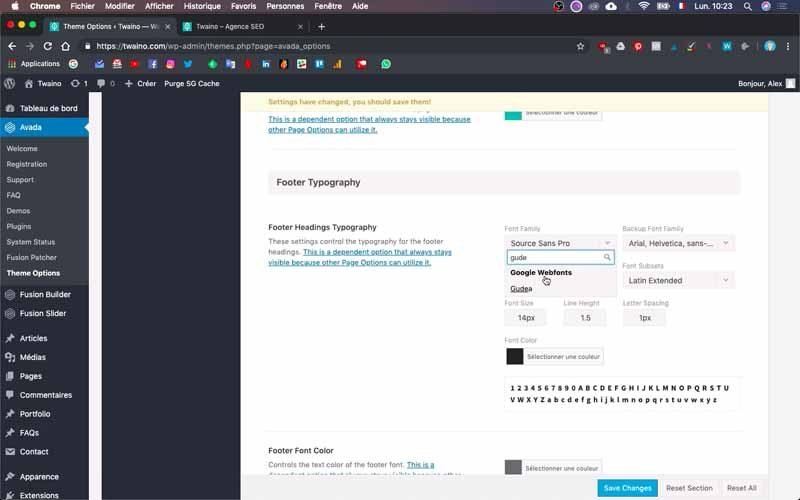
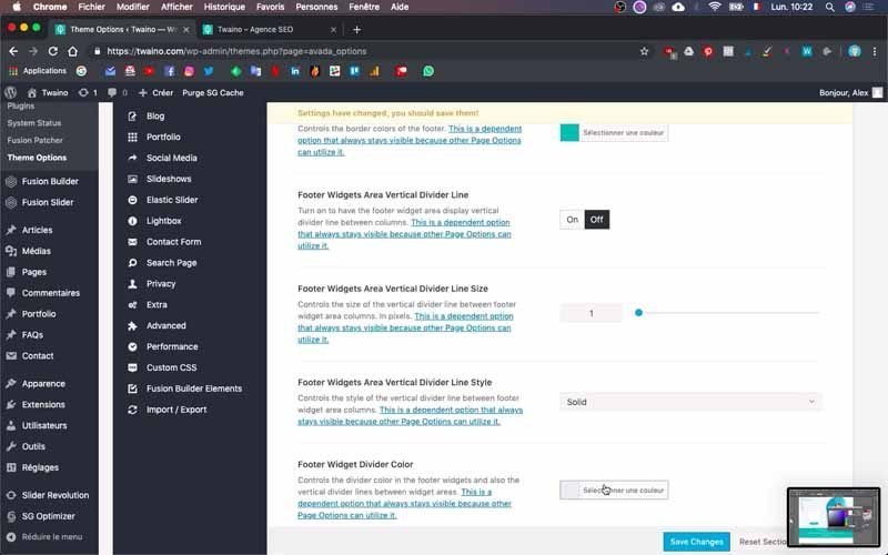
Also, I select white as the color of the “Footer Font Color”. I choose another color, which will be displayed when the visitor drags his cursor over the links, for the “Footer Link Hover Color” and the “Copyright Hover Color”.
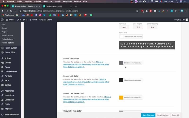
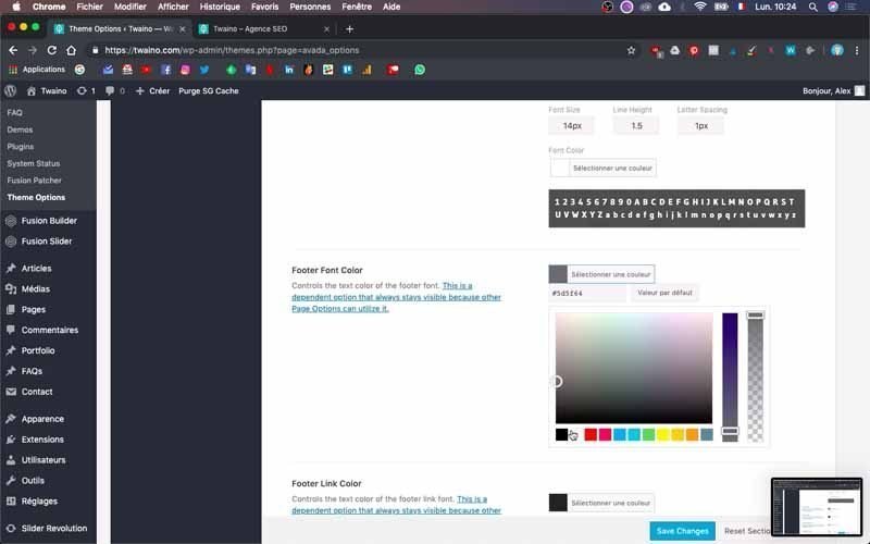
Save the modifications to appreciate the rendering and make other changes if necessary. To do this, click on the blue “Save Changes” button at the bottom and refresh your home page.
At my level, the colors are not quite right yet and I’m going to do some more configuration. To do this, I change the “Footer Link Color” option in the “Footer Typography” section to white.
I do the same for “Copyright Text Color” and “Copyright Link Color”. I then save to check the rendering, which does indeed change the color of the Copyright content.
On the other hand, to change the size of the content of your Copyright, you just have to enter the size you want in the option “Copyright Font Size” which is at the bottom.
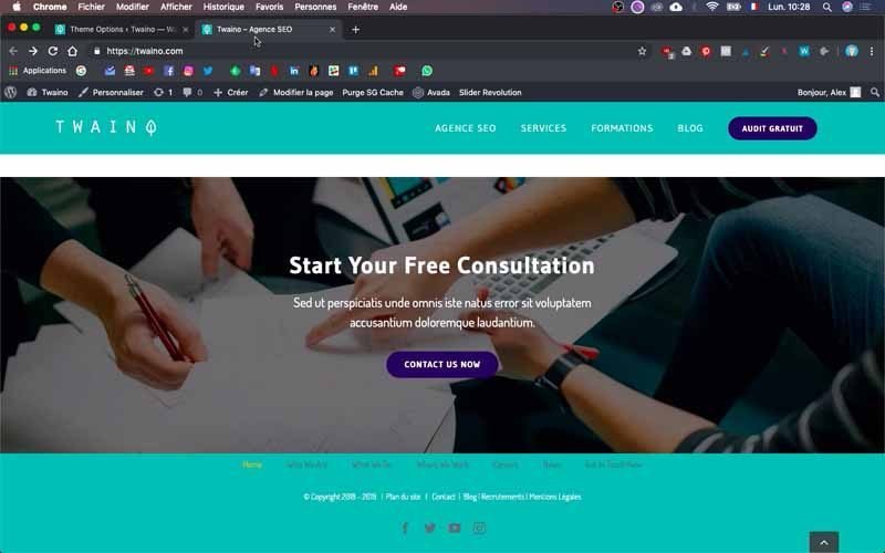
I entered “15 pixels” instead of “13 pixels” and when I saved, I found that it was much better for my footer.
3) Change the widget of your footer
My current footer widget doesn’t work for me, so I’m going to change it. On the default footer of my website, this is the widget that allowed me to have the elements such as:
- Home;
- Who Are We ;
- What We Do ;
- Where We Work;
- Careers ;
- News ;
- Get In Touch.
To change the widget, go to the “Appearance” section of the left sidebar of your dashboard and click on the “Widgets” menu.
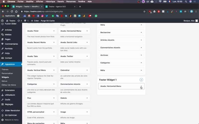
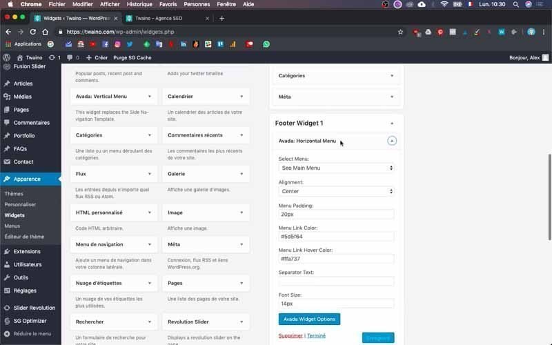
In the configuration interface that appears, you will find the “Footer Widget 1” bar. At my level, it is located at the bottom of the right sidebar.
3-1) Delete the current widget
Click on the little arrow on the right to open it. I have at my level “Avada Horizontal Menu” which shows me the configurations of the menu present in the footer.
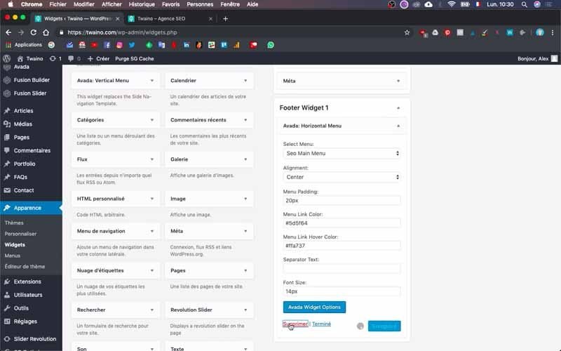
Since I don’t want to use it, I delete it. However, you can make changes if you wish.
3-2) Integrate an image widget in your footer
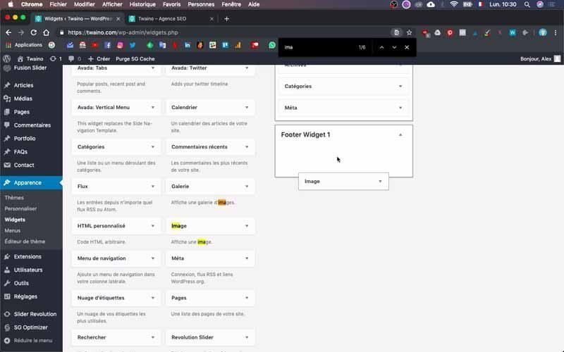
Instead of this widget, I’m going to embed an image. To do this, dig into the “Available Widgets” that are just to the left and search for “Image”.
Then left click on it and hold it down to drag it to the “Footer Widget 1” bar.
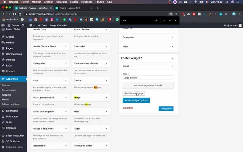
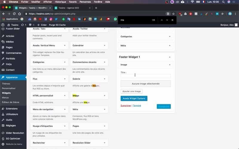
Note that by naming your new widget here as I do with mine with the title “Twaino Logo”, I notice that the name appears on the final render and right at the top of the logo. So I remove this title so that there is only the logo.
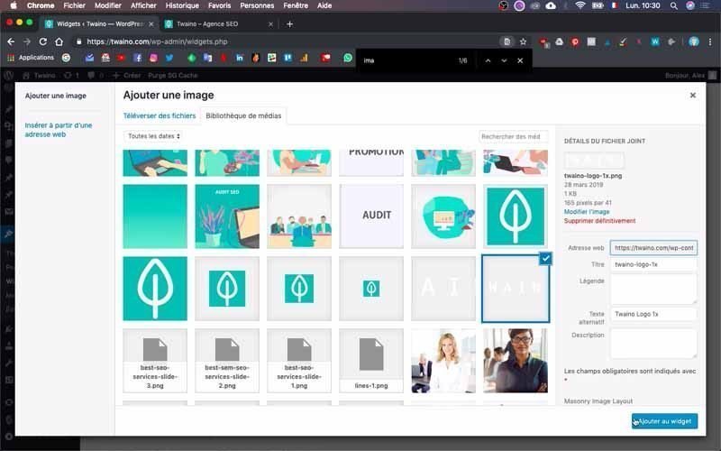
To add the image, press the “Add Image” button located in the second position and select your image in the media library of your website. If it is not there, click on the “Upload files” window to upload your logo or image.
Then click on the blue “Add to widget” button after you have selected your logo or image. You can associate a link to it, especially the link to the home page. In the “Link to” part, I write ” https://twaino.com “.

3-3) Make the background of the widget transparent
Press the blue “Avada Widgets Options” button at the bottom to access other options for the widget.
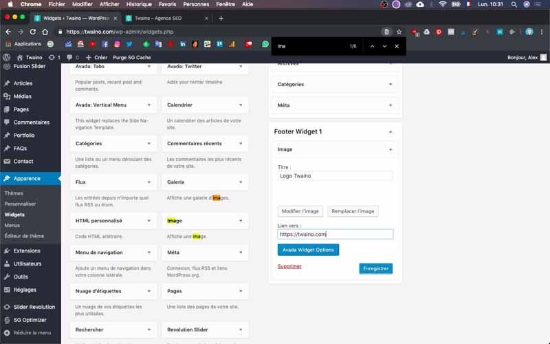
At the “Background Color” level, click on select a color and at the tiled right sidebar, drag the selection bar all the way to the bottom for transparent.
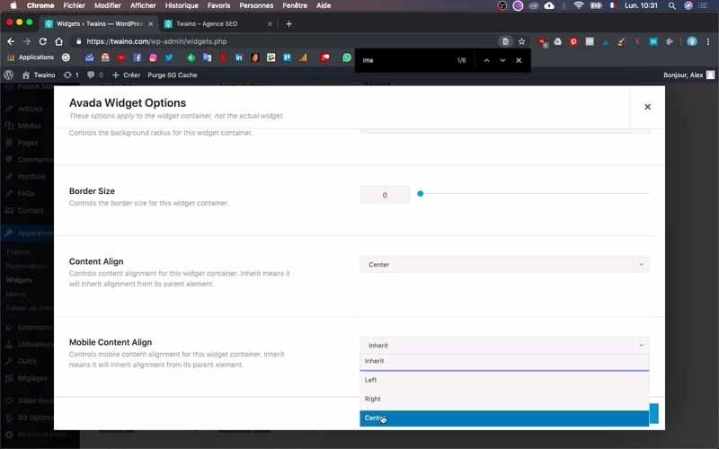
In the “Content Align” and “Mobile Content Align” options, select “Center” to center the widget image.
At the end, click “Save” and then “Save” on the “Footer Widget 1” to save the changes.
4) Adjust the dimensions of your footer
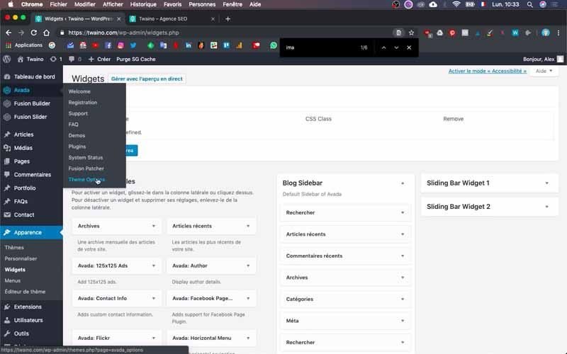
The footer is too close to the logo that has just been inserted into the footer and you need to increase the size of the footer a little

To do this, click on “Avada” in the left sidebar and then on “Theme Options” and “Footer”.
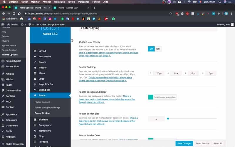
In the “Footer Styling” option, increase the number of pixels in “Footer Padding”. Don’t hesitate to try several numbers and to check your homepage to get the ideal result. At my level, I enter “20 pixels” in the first frame, which gives me a satisfactory result.
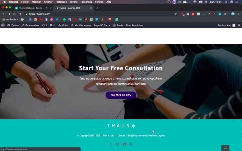
5) Change the color of the social network icons
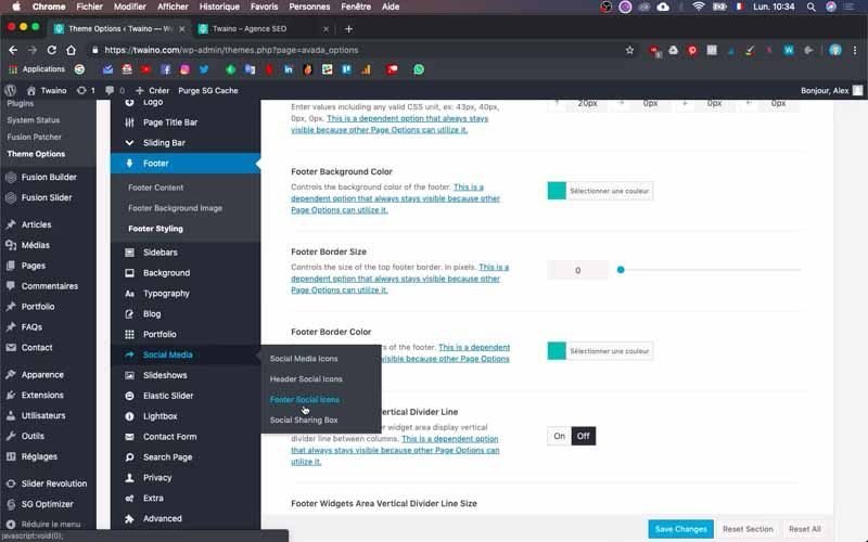
To change the color of these icons, click on the “Social Media” option of “Theme Option” and select “Footer Social Icons”
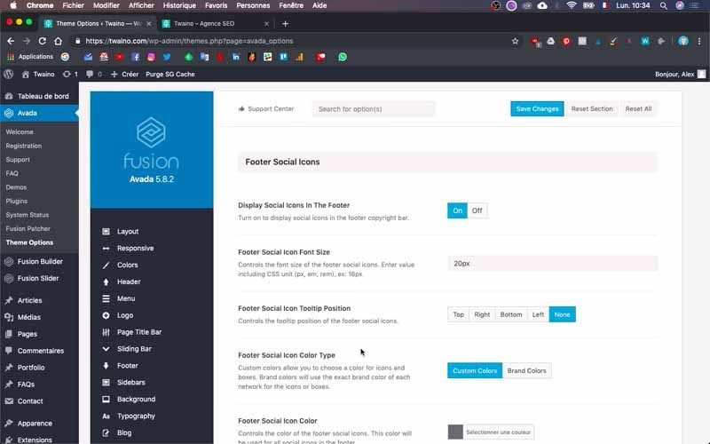
Swipe down and go to “Footer Social Icons Color” to select the color of your choice.
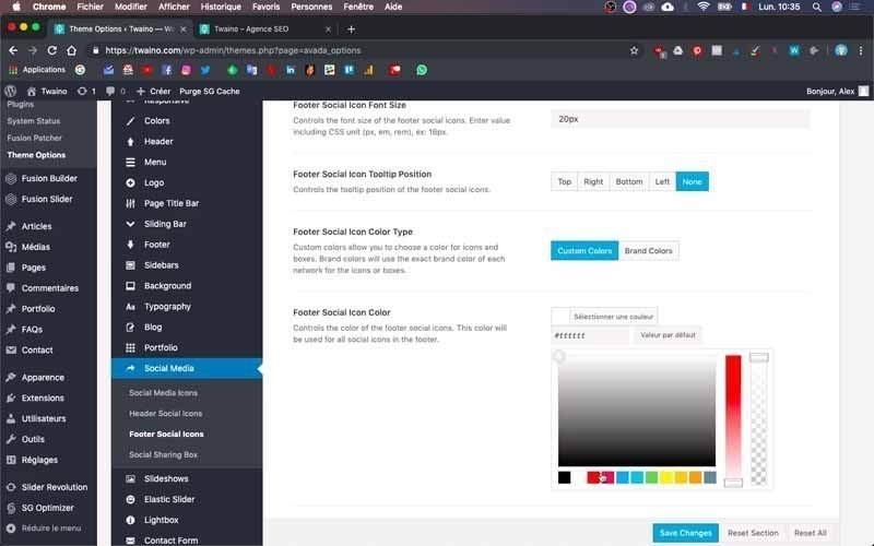
I choose white and save.
Check your changes one last time
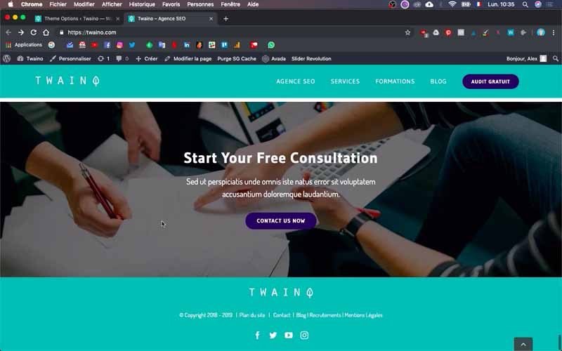
After all these changes, sometimes there are omissions. For this, go to the footer of your website and check the harmony and consistency of all its components. Also, make sure that all your links are working properly and pointing to the right pages.
That’s it! You have just created the footer of your website.
Conclusion
The footer is one of the most important elements to put in place when creating a website. In addition to the fact that it is completely at the bottom of the pages, many people tend to neglect its design. However, the footer is one of the most important parts of a website because of the many roles it plays. I therefore recommend you to select the most relevant elements for your footer and to opt for a design offering an optimal user experience. And the best way to get exactly the result you want is to proceed by iteration, checking each time the changes to make corrections, especially if it is your very first website creation.

