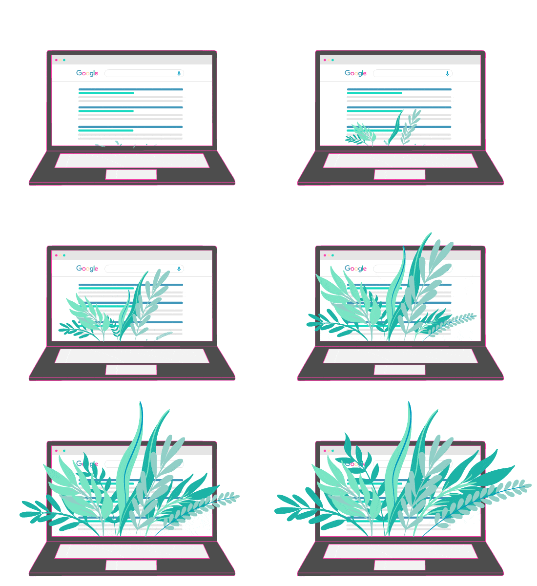
Have you made the same observation as me? The ability to sell a company’s products or services depends on the level of trust that the company is able to establish with consumers.
If so, you will certainly join me on this statement by Siva Devaki:
“Selling is no longer about selling, but about building trust and educating.”

In the architecture of an e-commerce site, the product sheet is one , if not the most important element of all. It must be complete enough and catchy enough to encourage the customer to buy.

For this, the product sheet must be properly studied, from the simple details to the most crucial information to convey.
It must also be optimized by several SEO strategies in order to be quickly found by Internet users.
- How to properly write and structure your product sheet to make it a real sheet that sells?
- How to optimize its product sheet by SEO strategies for a better ranking in the response elements returned by search engines?
So many topics to cover in this eBook to help you have a good SEO for your product sheet and increase the sales of your businesses.
Chapter 1: What is listing optimization and why is it important?
Before seeing how to optimize a product sheet, we should all agree on what is meant by “optimization of a product sheet”.
1.1. What is listing optimization?
The term “product sheet” was used to designate a paper document issued by the manufacturer and which lists all the characteristics of the product. It can sometimes be supplemented by some visual illustrations such as photographs of the product.
Today, the term product sheet has evolved and refers much more to structured content of features and illustrations (photos, videos, plans, demos, 360 views, etc.) of the product on an e-commerce site.
Source : Diligent Agency
manufacturer to create a more complete and enticing e-commerce catalog with the aim of facilitating the referencing of its products on the Internet. We are talking about optimization of the product sheet.
It is an essential SEO strategy for any serious e-commerce site wishing to experience great success.
1.2. The importance of optimizing a product page and its impact on the referencing of the product
Consumers rely more and more on search engines to help them find a product or service. It could be finding a simple local restaurant or ordering a luxury item online.
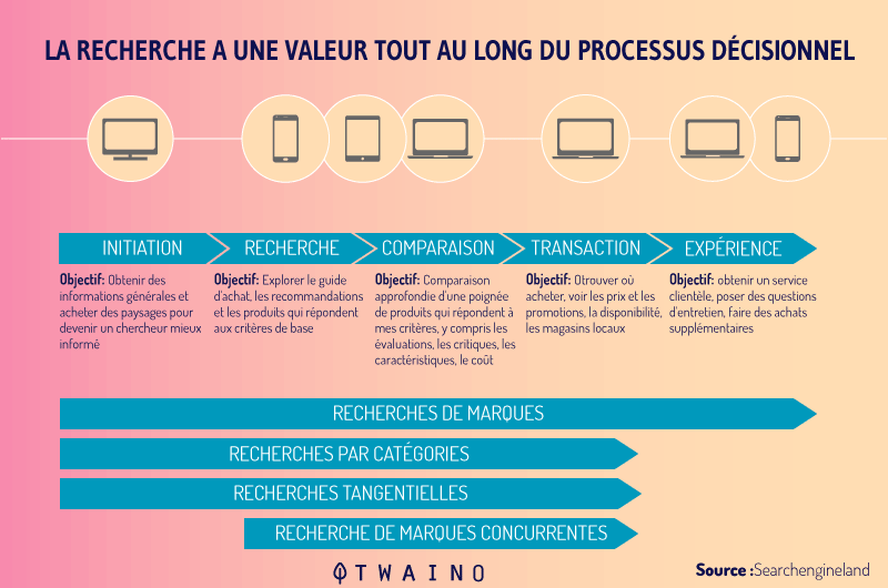
Statistically, nearly 85% of website traffic comes from search engines. We can notice that search engines have literally dominated the web!
Which means that regardless of your industry, your target customers are looking for products or services like yours on search engines like Google. Hence the importance of optimizing your product sheet.
Here are some good reasons why your product page needs to be optimized:
1.2.1. An optimized product page attracts more traffic.
At first sight, the objective of an optimization is to improve the ranking of the site in the proposed answers returned by the search engines.
But beyond this superficial aspect, optimizing a product sheet also helps to attract more traffic to the product’s site.
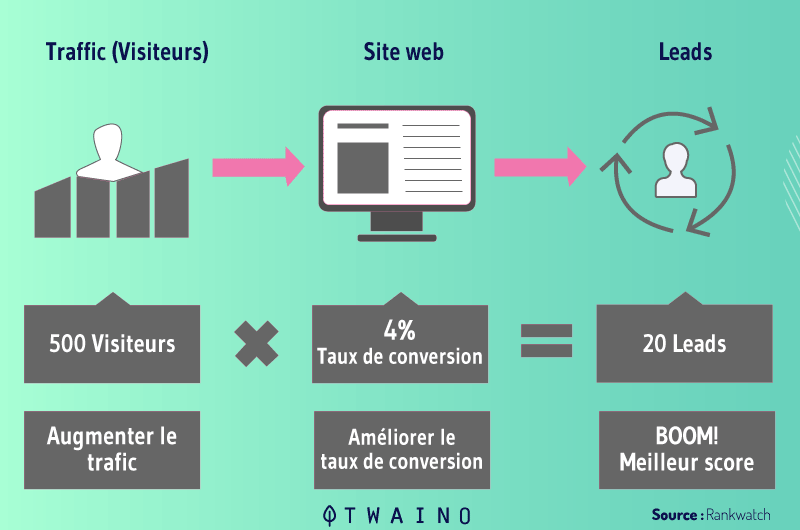
This traffic rate can be converted into customers and leads and generate a significant return on investment for the site. This is a proven strategy that no longer needs to be demonstrated.
Let’s take the example below to analyze the impact of SEO on the organic (natural) traffic of a site:

We can notice that in one year, the traffic of this site has evolved from 0 to 100,000 visitors thanks only to the natural optimization of the site. Like what, optimization remains the best strategy to attract more visitors to your site in the long term.
1.2.2. Optimization exempts you from sometimes expensive advertising costs.
One of the biggest advantages in optimization is that it does not require you to allocate resources to advertising space. This represents a significant gain of money for companies, especially for the most nascent ones.
Let’s recall the procedure of a traditional advertising campaign in order to better see by contrast the importance of optimizing a product sheet.
To begin with, it will be necessary to choose a competent structure for the distribution of the advertisement. It can be a TV channel, a radio station or the pages of a magazine.
Then, pay the chosen structure according to its terms of distribution. Once the duration of the offer has expired, the advertisement is cut immediately as well as the income it generated for the company.
Now let’s put this example into a digital context:
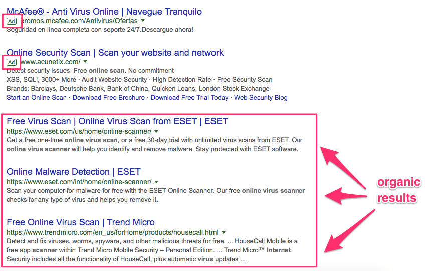
Source : Crazyegg
Here, the little “Ad” tags mean that the first two URLs are pay-per-click ads. Just like a traditional ad, these two structures had to pay a sum to be well placed.
But sites that rank in organic search don’t pay any advertising fees until they land on that first page.
Thanks to the optimization of their page, Google’s indexing robots were able to appreciate the relevance of their content and its value for Internet users. Conclusion, a better ranking in the Google SERP, which implies an increase in traffic without paying a single penny.
1.2.3. Optimization can be used to easily track the progress of your site.
SEO is not just about increasing traffic and generating revenue. It is also a set of tools to measure the performance of your site.
For example, you have the Google Analytics to check the evolution curve of your traffic, conversions, reference indications and all other important site statistics.

With such access to your site’s data, you can accurately assess the marketing strategies that affect your returns and better refine them.
But before optimizing a product sheet, you need to know how to create it. Which we will cover in the next chapter.
Chapter 2: How to create a product sheet that sells?
Whether you are new to e-commerce or already own an online store, it is important to master the main principles for creating a product sheet.
The structure of a product sheet, the rules to adopt, the mistakes to avoid… In short, everything you need to bring together for a product sheet that sells.
2.1. The essential elements of a product sheet
The layout of the elements of a sheet may vary from one sheet to another, mainly depending on the products offered or your sector of activity. Although, certain elements remain indispensable and essential for any type of product sheet:
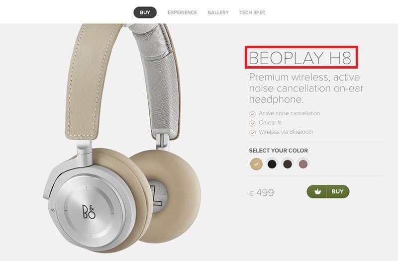
2.1.1. The name of the product
The name of your product is a very crucial aspect that should not be rushed. It must be able to:
- Make the product easily identifiable, both by your visitors and by indexing robots. For this, you need to think of a size, color and font that harmonizes perfectly with the decor of the site;
Source : Diligent Agency
- Reveal full product identity. That is to say, include its generic name (provided by the manufacturer), its brand with, if possible, certain main characteristics such as color, size, model, etc.
2.1.2. The visual
Given that the store is not physical, the visual of the product must be able to fill this void. To do this, the image must:
- Be of good quality so that the customer can integrate down to the smallest detail as if he were holding the item in hand:
- Allow the product to be viewed from several angles;
- Allow to understand the real dimensions of the product (size, volume, etc.);
- Offer the possibility to the customer to imagine himself with the product in situation. If you are specialized in the sale of furniture for example, it is recommended to choose visuals which put in situation different rooms already furnished such as the bedroom, the living room or the terrace.
Generally, the visuals used for product sheets are in the form of a series of photos. But many e-commerce platforms are starting to opt for product demo videos.
This is an interesting and quite effective trend when looking at the statistics.
Nearly 85% of consumers said they were convinced to buy a product or service after watching its brand video.
2.1.3. The description
The purpose of a description on a product sheet is to provide more details to the customer and above all to persuade him to buy. This is a unique opportunity not to be missed and which requires a great deal of tact and, above all, frankness.
Especially since half of internet buyers have already returned a product for dissatisfaction because it did not conform to the description on the sheet, according to a study conducted by OneSpace.
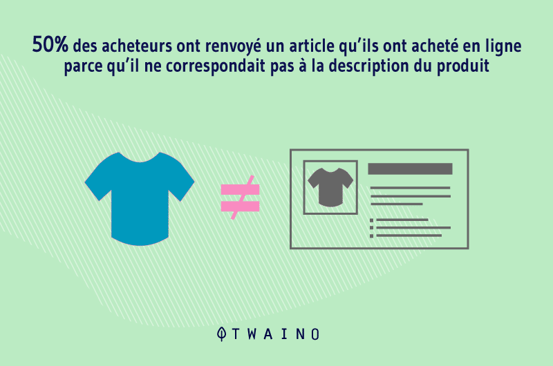
So to maintain a good reputation and become a benchmark for online shopping, your product sheet must:
- Provide all the relevant information for the item;
- Respect the inverted pyramid method. The information must be aligned from the most important to the least important to gradually descend to the small details;
- Be very well written, with no spelling or grammatical errors;
- Be readable and well structured.
The writing of the description must convince the Internet user and reassure him that the product concerned is indeed adapted to him and meets his needs or desires. Which means that it can be a purely factual and descriptive extract that will move the reader. These types of descriptions that arouse emotion have a much greater positive impact on the reader’s decision to buy.
2.1.4. The call to action
Still called CTA “Call To Action”, the call to action is used to encourage the user to take a specific action. It can designate a quote request, a registration, a click, or an online purchase.
In our current environment, the desired action is to buy online. The most suitable and effective element would be a clickable button with the inscription “add to cart”. But there are other equally effective calls to action depending on your sector of activity:
- Add to favorites
- Add to my wishlist
- Check in-store availability
- Confirm my order
- Set aside
- Submit
- Etc.
To make the action button more effective, it must be:
- Easily readable: Choose a good font with a large size and a color that stands out easily from the background color;
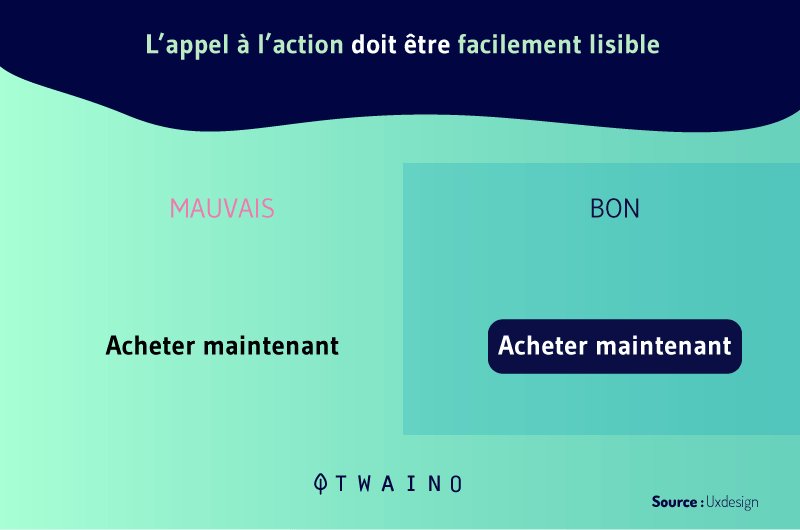
- Clear, simple and concise;
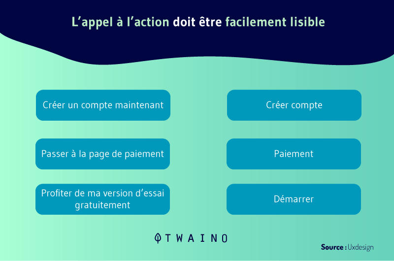
Fixed to the navigation bar. This way of positioning the action button keeps it constantly on the screen and does not require the user to scroll down the page before finding it. 
2.1.5. The price of the product
Generally, the price is the first information that Internet users seek when accessing a product sheet. Like the action button, it should be highlighted, preferably right after the article name.
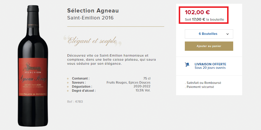
Source : La Baronnie
It is a mandatory notion on a product sheet and which includes several parameters:
- The normal price of the product;
- Any current promotional offers;
- Payment terms ;
- Delivery rates;
- And all other elements that may be added to the gross amount to constitute the total price of the product.
2.1.6. Additional information
A good product sheet that will sell must be as complete as possible. She must be able to answer any questions the buyer may have. Depending on your sector of activity, you can complete your product sheet with the following elements:
- A size guide, to help the customer in his choice;
- The composition and the list of ingredients for beauty products to demonstrate transparency;
- The different options available (colors, sizes, patterns, etc.) to help the customer personalize his product;
- A user guide, to accompany the customer even after his purchase;
- Consumer reviews and product ratings to reassure and build customer confidence. This is one of the criteria that many customers check before making a purchase;
- Small alert messages that encourage the customer to make the purchase as soon as possible, for example the deadline of a promotion, the available stock of the product;
- Etc ;

2.1.7. Cross-selling to offer more items to the customer
For those who still don’t know what it’s all about, know that this is a sales technique that we find every day, in real life as well as on the net. When the bartender offers you a drink to aid digestion, this is a way of cross selling.
Or when the seller offers you a bag to protect your new PC well, this is also another form of cross selling.
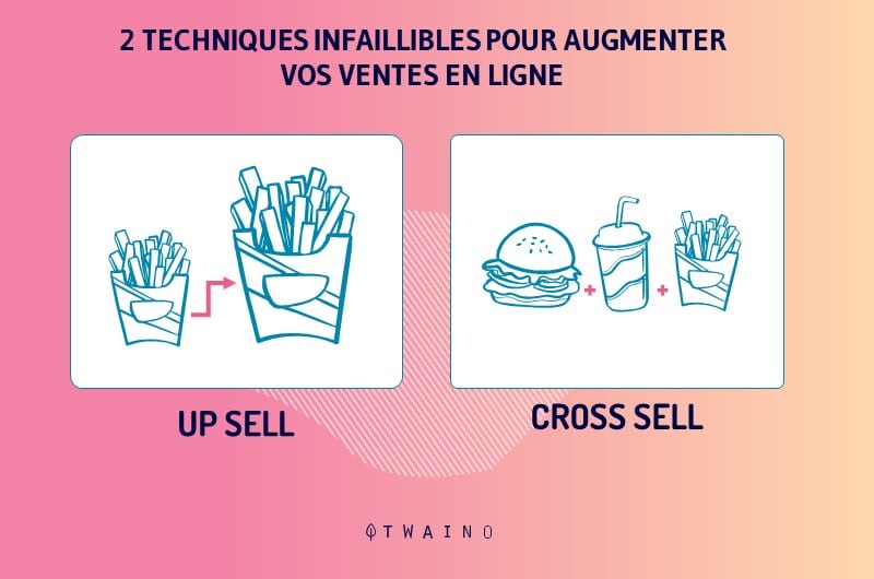
Cross-selling is therefore a business strategy that consists of offering a potential customer one or more additional items to the one he is about to buy. Also known as “cross-selling” or “up-selling” also works very well on e-commerce sites.
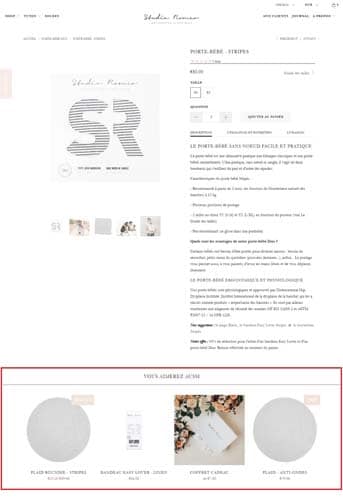
This is an essential strategy that must be on your product sheet if you want to make a good turnover. Moreover, cross selling is used by many e-commerce sites, including the biggest brands.
In May 2006, Jeff Bezos, CEO of Amazon admitted that 35% of his sales were the direct result of cross-selling.
There is another strategy very close to cross selling which also increases the sale of an e-commerce site: up selling. Here, it is a question of offering the customer, not an additional product, but a complete range or a more advanced version.
To better illustrate this concept, let’s say you want a cheeseburger and the seller suggests a pack of double cheeseburger, fries and soda to eat your fill.
2.2. Good practices for writing and structuring the URL of your product sheets
One of the important questions that an e-merchant asks themselves is how to properly structure the URL of their pages so that they easily stand out from the crowd. when Internet users launch a request.
To do this, you have to think of a URL that can be easily interpreted by indexing robots without ignoring your visitors. This is a fairly common mistake in the creation of e-commerce stores that can reach the optimization of the pages and you will understand why.
2.2.1. The Url of your product sheets
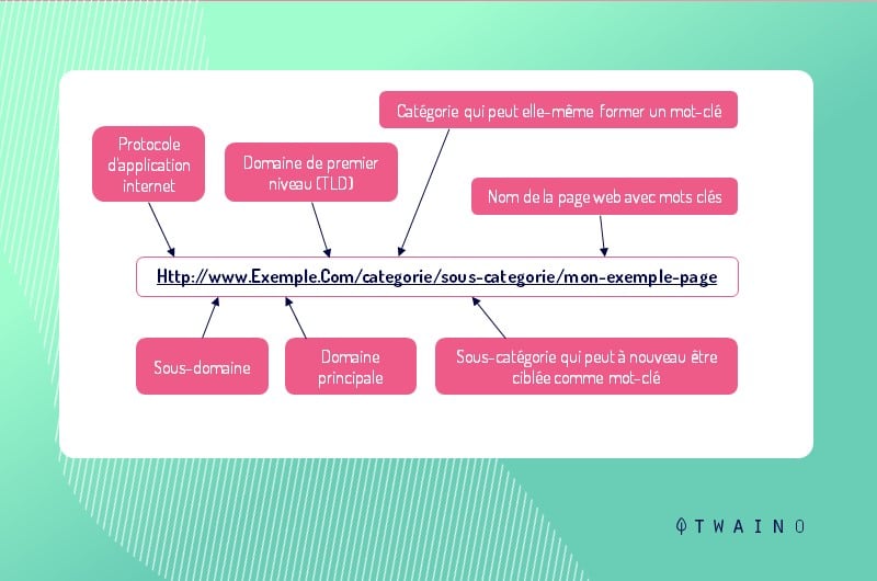
The Url (Uniform Resource Locator) designates the access path to an Internet page. It is a unique link that allows you to find precisely and in record time each of the billions of pages hosted on the net.
Choosing the right URL is an important step and one of the essential strategies for successful SEO optimization.
2.2.2. How to properly write the URL of your product?
The best way to show you how to properly write your URLs for product sheet would be to proceed directly with an example.
Suppose two URLs that all refer to the same page:
- https://www.example1.com/fr/categorie/sous-categorie/nom-du-produit
- https://www.example1.com/fr/produit.php? id:706
The first link is probably the most understandable for site visitors and search engines can easily interpret the “product.php?id:706” syntax contained in the second URL.
But by preferring the first URL that informs the name of the category, the subcategory and the product, you have all the chances on your side so that the link of your product sheet does not go unnoticed by Internet users.
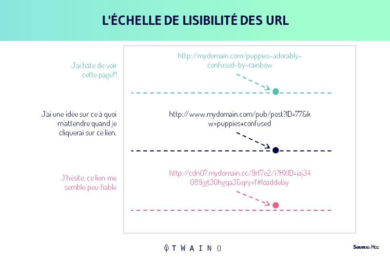
This small detail will gain traffic to the site and limit its bounce rate. But if you have already become accustomed to using IDs in your URLs, still take care to add concise indications to guide your visitors.
To make it easier to read the URL of a page, you can separate each word with small dashes.
Example:
- https://www.exmple1.com/fr/categorie/sous-categorie/chemise-homme-coton
- https://www.example2.com/fr/categorie/sous-categorie/chemisehommecoton
Here, we can notice that adding dashes improved the readability of the first URL. But it is important to remember not to overuse the insertion of punctuation characters. You can only stick to dashes to separate words from your URLs.
We have seen the importance and influence of descriptive URLs on the behavior of Internet users. But offering short descriptive URLs would be even better. Let’s analyze all this more closely:
- https://www.example1.com/fr/categorie/sous-categorie/chemise-homme-coton
- https://www.example2.com/fr/categorie/sous-categorie/chemise- homme-cotton-manche-longe-collar-officer
For this example, the second Url is certainly explicit but, a little too long. The ideal for thinking a URL is to remain as clear and concise as possible for Internet users. This is an approach that finds its full value on the mobile web.
Indeed, the most concise URLs are the most preferred when optimizing mobile conversions.
One last tip to improve the experience of your visitors if you opt for URLs of the type https://www.example.com/fr/category/sub-category/name-of-product: Always ensure that the category or the sub-category contained in the link does not refer to a 404 error page.
2.2.3. Understand the concept of canonical URL and its importance for the optimization of a product sheet.
We designate by canonical URL, the address of a web page tagged as being the original and the only one to be indexed by search engines. .
This is a concept that has been briefly discussed in the previous chapters, but which needs to be reviewed in depth because of its importance for the referencing of a product sheet.
2.2.3.1. In what context should canonical URLs be used?
Canonical URLs or canonical tags are used to manage duplicate content conflicts. It may happen that when creating your e-commerce store, a product sheet is accessible through several different URLs.
It’s a structural error that can ruin the SEO of your listing. Just because indexing robots are programmed to identify a page or any indexable file (.png, .doc, pdf, etc.) thanks to a unique URL.
So for each different URL, search engines think of a different page and treat it that way. So, what will happen during a request launched on Google for example?
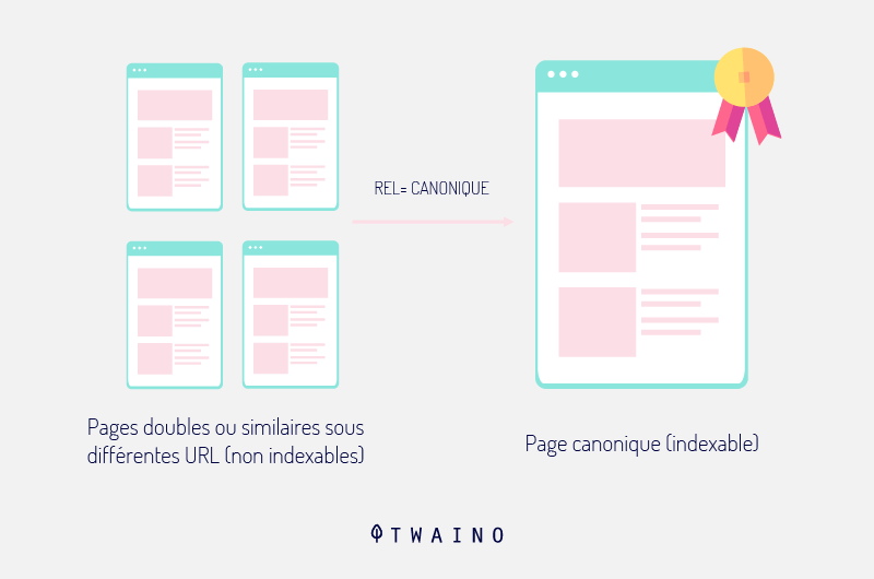
Each URL will compete with other URLs since they are all directed to the same product sheet. All the referencing criteria used for this sheet will therefore be dispersed.
Conversely, if the file was associated with a single URL, all the efforts for its referencing will be concentrated to give more efficiency.
2.2.3.2. The solution of canonical URLs
To overcome this situation of duplicate content, the major search engines have agreed on a solution, it must be admitted, quite effective. The idea is to offer website developers the possibility of choosing a canonical URL.
Clearly, this would mean that the webmaster decides which URL he would like to consider to be official. The others will therefore be treated as copies of the same page. It is a solution that solves the problems related to duplicate content and improves the reference of the page.
2.2.3.3. The canonical tag syntax
There are two ways to add a canonical URL tag to a page: either directly in the HTML structure or via the HTTP header.
- Rel tag
This way of defining a URL is obviously the easiest to do. You will just have to replace the Url of the syntax of the tag and everything is done: <link rel=”canonical” href=”URL” />
The rel tag itself is nested inside the <head> tag.
Let’s take the example used previously, we will therefore have:
<link rel=”canonical” href=”https://www.example.com/fr/category/sub-category/name-of-product” />;
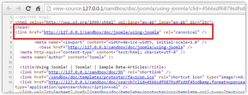
Source : Weeblr
- The HTTP header
The method via the HTTP header consists of adding this piece of code Link: <URL>; rel=”canonical” in the .htaccess file contained in your site folder.

Source : Moz
In our example, this would be like inserting this line of code:
Link: <https://www.example.com/fr/category/sub-category/name-of-product” >; rel=”canonical”
2.3 Mistakes to avoid
Unlike a salesperson in a physical store who has the possibility of changing his speech according to each customer, the product sheet remains the same for everyone.Also, a customer generally takes 1min 30s to consult a product sheet. A real race against time where some mistakes can be fatal and cause you to lose customers.
Here are some mistakes to avoid to get the best chance on your side:
- Avoid adopting too technical a discourse: if you have a perfect knowledge of your product, it is not obvious that it is the same for all your customers. So do not confuse your customers with purely technical jargon;
- Ventilate your file: overloaded content does not make you want to The client will scroll without actually taking know your arguments;
- Re-read your product sheet several times: this is a trick that helps firstly to detect small misprints but also to find good inspiration and offer more drinkable content;
- Avoid placing your product sheet in a pop-up: the customer may have difficulty scrolling it.
2.4. The golden rules for an eye-catching product sheet
The aspects discussed above for the creation of a product sheet are basic notions that your competitors probably already know and apply. So what do you need to do to distinguish yourself?
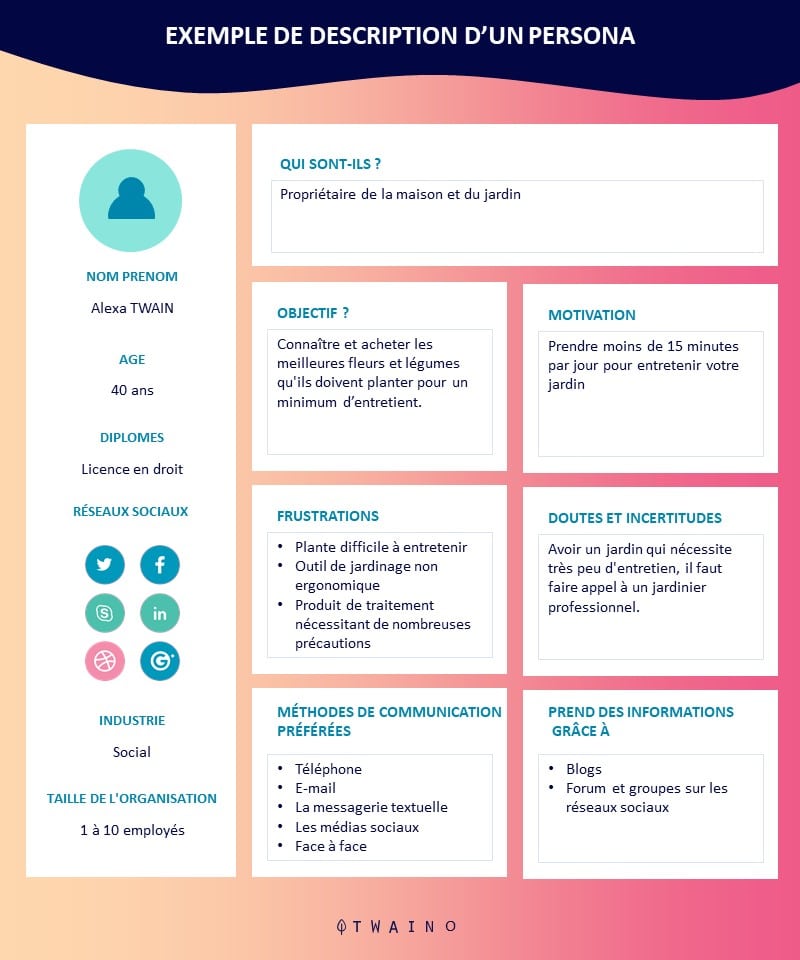
2.4.1. Target your audience or your clientele
Before writing a novel, it is essential that its author knows the advantage to which type of reader the work will be intended. The principle remains the same for a product sheet to better adapt your speeches to the needs and desires of your audience.
By knowing the aspirations, the styles and the financial capacities of your target, you will have an facility to direct your arguments.
2.4.2. Think of a pitch
Each item that you offer in your e-commerce store has its own characteristics, specificities and functionalities that make it attractive. It would therefore be smart to list all these strengths to build your argument.
But it is far from hooking your clientele. What you need to do is pull out every real-life benefit that lies behind every technical feature. Clearly, each feature must be converted into customer benefit. And to formulate these benefits be positive.
Example:
- Cotton percale bed sheet with a real feeling of well-being for peaceful sleep.
- Backlit keyboard for easy writing even in the dark.
This is a very promising principle that e-commerce leader Amazon has understood. Through the description below, we can see that the brand has shown all the customer benefits of the Kindle e-reader:
You can carry out a survey to get an idea of the usual questions that Internet users ask about a product. Do not hesitate to browse the discussion threads of forums or social networks.
Also take into account the questions that your customers send to you directly on your customer service area. If your brand has a community on the networks, listen to them to find out what interesting aspect is covered on your product sheet.
2.4.3. Offer new features to stand out
To stand out from your competitors, add a grain of creativity to your product sheet and make it a real tool for your Internet users. It must be recognized that this is an idea that cannot work with all sectors of activity.
But if your domain allows it, you can offer an emulator, a calculator or an argus for example. However, please do not offer too heavy features that may slow down the page load time.
2.4.4. Think about the information that can reassure your customers
It is important to put the customer in confidence. This is an aspect that many prospects look for before making a purchase. So do not hesitate to show certificates or labels that testify to the quality of your products or the professionalism of your team.
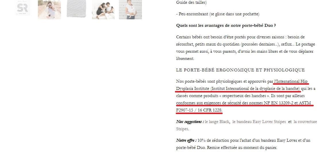
If you also offer guarantees for your items such as the “Satisfied or Reimbursed” guarantee for example, that would be a real asset for your product sheet.
Finally, don’t forget the traditional proofs of trust such as delivery time, after-sales service, secure payment methods, etc.
2.4.5. Choose a tone
It will not be enough to list the customer benefits and the points of seduction of your product to be eloquent and persuasive. To be persuasive, it is important to produce text with a specific style and tone.
These are parameters that will enhance your descriptions and reveal all the professionalism of your team. This implies that all your product sheets must respect a precise register.
Serious and refined, simple and fun, technical and precise… So many registers to choose from and there is no wrong selection. Unless you choose a tone that is irrelevant to your brand or a bit distant from your target audience.
However, what is the value of a carefully written product sheet if no Internet user can find it. She may have complied with all the requirements described so far, but will not be able to attract customers for the site, hence the need for optimization.
Chapter 3: On-page SEO optimization of your product sheet
In 2019, there were 1.7 billion websites spread across the four corners of the globe and specialized in almost all sectors of activity. The common question that any e-merchant asks is how to succeed in emerging from this mass of e-commerce sites and occupying a good ranking on the SERPS of search engines?
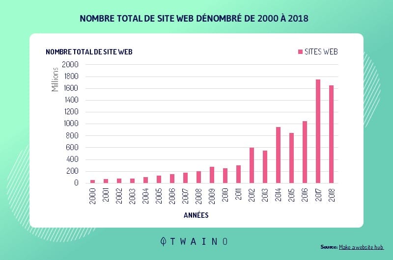
Source : Make a website hub
The best and long-term solution for this question remains natural referencing. It is an SEO strategy initiated to improve the visibility of a website on the net. It has two main components: On-page and Off-page SEO referencing.
3.1. On-page SEO criteria On-page
referencing is a branch of SEO optimization dedicated exclusively to on-page content. Initially, all the pages of the site will be globally optimized before strengthening each of them with specific keywords.
3.1.1. Semantic tags
SEO optimization is constantly changing and continually offers new strategies. However, certain basic notions such as HTML tags (or tags) persist over time and always remain effective.
For those who still don’t know what it’s all about, HTML tags are simply what everyone commonly calls “title” or “subtitle”. They have a reputation for helping to structure content and have a double advantage.
This way of structuring its content makes it possible to purify a page and make it more pleasant to read for visitors. It also helps provide accurate information to engine drivers.
3.1.1.1 The Title tag to optimize the title of a web page
This tag is used to define the title of the page and is found in the <head> part of the source code. It is of great importance in SEO optimization since it is what appears as a clickable title in the response elements returned by search engines.

It is also the content of the Title that Internet users will see on social networks and on their browsers.
It therefore requires certain best practices for optimizing your page:
- The Title tag is unique for each page and must contain the main keyword, preferably at the beginning;
- It must be quite concise and summarize all the content of the page;
- The Title tag must be no longer than 65 characters to prevent its content from being truncated in search engine results;
- It must also be seductive and contain the name of the brand if possible to give it more visibility.
When we learn that Google bases itself on the number of clicks to assess the attractiveness of pages, we realize the full influence of the Title tag on the ranking of a page in the SERPs.
3.1.1.2. Header tags for a well-structured page
These tags group together HTML H1, H2, H3, H4, H5, H6 tags and allow you to identify the headers and sub-headers of a page. They are known as “Paragraph” in the old WordPress editor and “Title” in Gutenberg.
The role of header tags is to help structure the editorial content of a page to provide more clarity. They also make it possible to enrich the lexical field of the keyword, which is strongly recommended for natural referencing.
Unlike the Title tag, Hn tags are only visible in written content on a page and do not appear in the SERP. But, they are not without interest in the optimization of a page. Their importance is rather on the side of robots.
Indeed, robots rely on Hn tags to index pages. A well-structured page therefore reinforces the information provided during a crawl and considerably improves its ranking in the search engine response proposals.
For good optimization, it is recommended to:
- Write a single H1 title, unique for each text;
- Respect the scheduling order. H6 tags should be nested immediately within H5 tags, H6 tags within H4 tags, etc.;
- Write titles that are concise and contain the keywords or other descriptive variants.
3.1.1.3. The meta-description
Like the Title, the meta-description tag is located in the <head> part of the HTML tree structure of a page and also appears in the SERPs. It completes the description of the Title to give a more in-depth idea of the content of the page.

Even if it is not yet proven that the meta-description has a direct impact on the indexing robots, it nevertheless represents this catchy pitch which will encourage the user to click on the URL of the page.
Its content must then be delicately written and include action verbs such as “Create”, “Download”, “Discover”, “Learn”, etc.; in order to win this race of the number of clicks.
3.1.1.4. The meta-robot tag to indicate to robots whether a page is indexable or not
It is this tag that will indicate to search engine robots whether such a page is to be indexed (or not) or whether its links are to be ignored during a crawl . It is generally presented under the syntax of: <meta name=”robots” content=”X,Y”>.
The “content” part takes two variable values X and Y:
X = “index” to indicate to the robots to index the page or “noindex” to ignore it;
Y = “follow” to tell robots to follow external links or “nofollow” to ignore them.
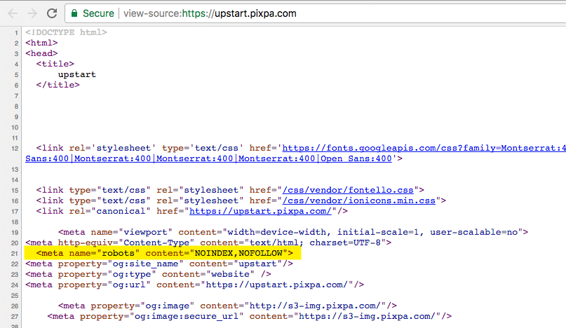
Source image : Pixpa
By default, the meta-robot tag takes the syntax: <meta name=”robots” content=”index,follow”>. Under WordPress, this tag can be modified using the Yoast SEO plugin online and locally.
3.1.1.5. Keyword targeting
One thing is to know the value of semantic tags, but another is to know which keyword to use for more efficiency. Fortunately, there are tools and techniques for listing all the keywords associated with an idea.
Obviously, not all keyword targeting tools are created equal. But here is a selection of the best tools to find the ideal keyword:
- SEMRush : is a very popular keyword targeting tool because of its very rich database which is based on results from 26 different countries. The platform provides a list of keywords related to the theme sought but also other very interesting statistics. For example, you can view the estimated search volume, CPC, or keyword difficulty score;
- Google Keyword Planner : is a keyword planning tool launched by the leader in online search. It offers a comprehensive keyword list with search volume for each keyword;
- Keyword Tool : offers keywords that Internet users search for on Google, YouTube, Amazon and Bing. It also offers a fairly comprehensive search grid to specify your searches by country, language or Google location. In its free version, you can access the list of suggested keywords but with a paid formula to find the estimated search volume;
- Ubersuggest : is a Neil Patel branded program. She recently launched her keyword suggestion space. Ubersuggest is accessible anywhere in the world and offers the ability to enter entire question phrases featuring your keyword.
3.2. The loading time of a web page
Loading time refers to the time required for a web page to display all of its content in a browser. In the past, it was almost unimportant but today, the loading time seriously impacts the optimization of a page.
3.2.1. The loading speed of a page and the Google algorithm
In recent years, the American search giant has continued to introduce new criteria in SEO referencing to improve the experience of Internet users.
In 2009, Google launched the PageSpeed Insights, an extension entirely dedicated to the loading speed of web pages. The idea is to encourage programmers to improve page execution time when creating sites.
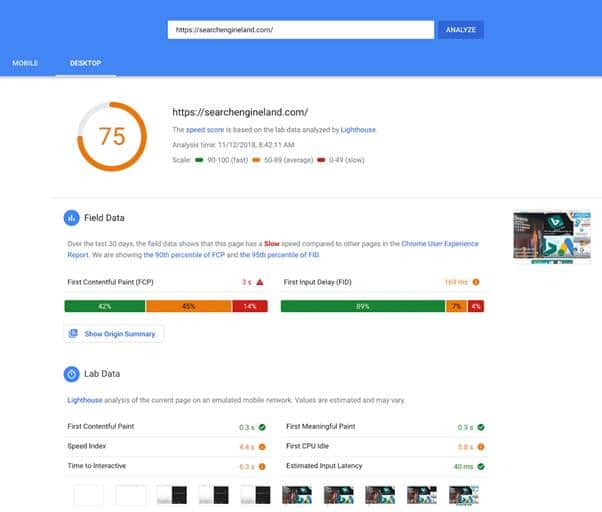
Source : Search engine land
In 2010, the brand officially announced that loading speed now counts in its algorithm as an SEO criterion. This initiative has enabled it to strengthen its performance and considerably reduce the resources allocated to the robots responsible for browsing the net.
In 2017, the Internet connection rate via mobile devices exploded and far exceeded that of computers.
Later, Google reveals that 50% of mobile users close tabs that struggle to load after 3 seconds and unsurprisingly integrates loading speed as an SEO criterion on mobile.
3.2.2. The impact of page loading time on the site
Web platforms that neglect to improve their display performance can be severely impacted. It is generally:
- A decrease in the number of indexed pages: Google having limited its resources, the crawl time of indexing robots is also revised downwards. An e-commerce store that is slow to load therefore reduces its number of pages to crawl;
- An increase in the bounce rate: The longer a page takes to load, the more its bounce rate increases. The bounce rate represents the number of Internet users who abandon a site just after a few seconds because of its slowness;
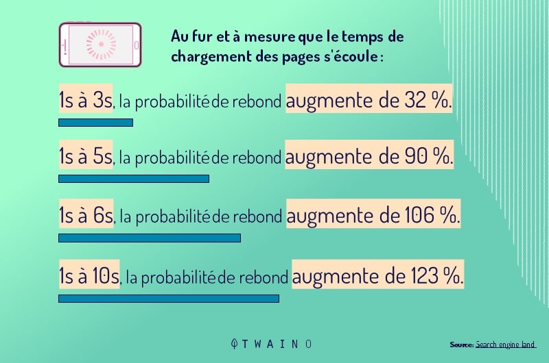
Source image : Search engine land
- To tarnish your e-reputation: A visitor who has a bad experience on your site will probably not come back. He can decide to share this bad memory with those around him.
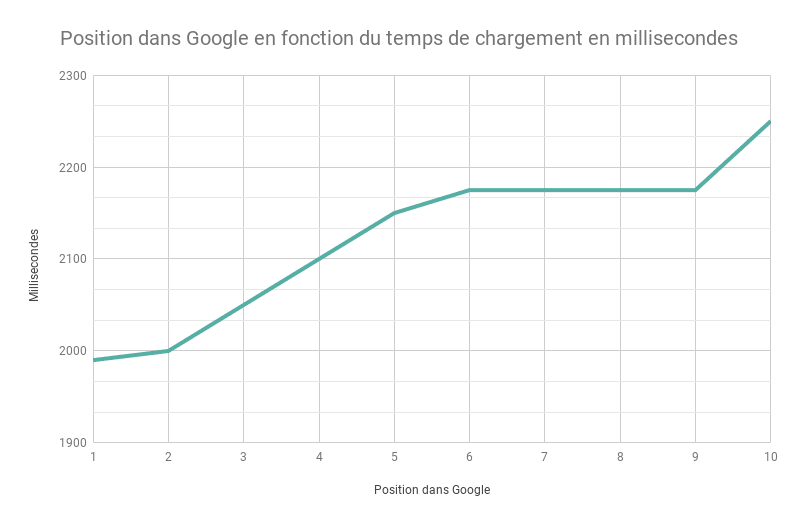
Conversely, a successful site with a good loading speed indicates to Google that it contributes to improving the user experience. This implies its repositioning and good visibility.
&
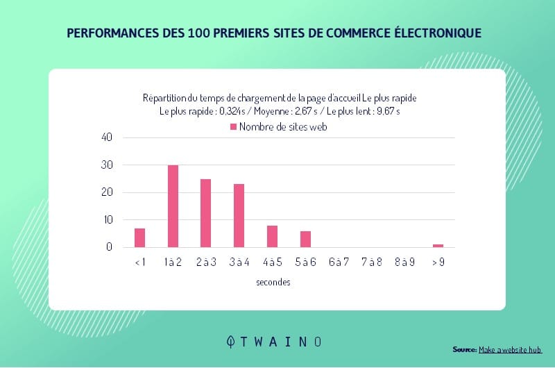
Beyond this technical advantage, a good display performance also implies an increase in the number of conversions. These successful sites receive more requests for quotes, online sales, orders, newsletter subscriptions, etc.
3.2.3. How to evaluate the loading speed of the pages of your site?
It must be said that there are many paid and free tools designed to test the display performance of websites.
Google has also looked into the issue and offers two solutions:
- PageSpeed Insights: is an extension that allows you to test the loading speed of a page on mobile and desktop. It also provides suggestions for improvement to help developers speed up the display time of sites.
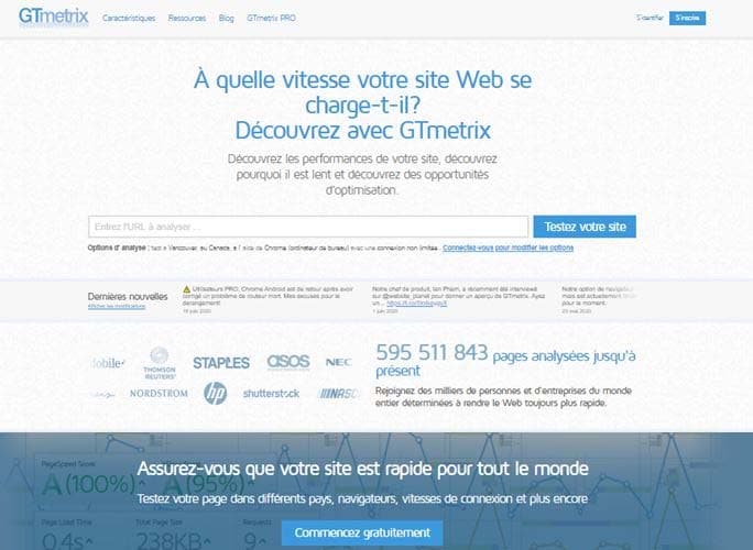
- Gtmetrix: is an SEO tool that offers a range of free features to analyze the loading time of a site.
- Google Test My Site: is a very ergonomic and user-friendly tool. It has the particularity of being strictly reserved for the mobile web and provides two pieces of information for page optimization: the number of visitors lost and the loading time. All this data can be detailed and received by email.
3.2.4. How to improve the loading speed of your page?
Page performance is the result of a series of best practices in managing your site. Here is a selection of the most important ones that effectively influence the loading time:
- Hosting: this is the starting point of SEO referencing. Accommodation offers are available in several formulas on the web and adapted to each need. For a project with a low audience, you may prefer a cheap but efficient host.
- Image compression: it reduces the weight of a page. Images are the most attractive elements of a page but they are very greedy in terms of bytes. The solution is to compress them to make navigation more fluid. There are several free online image compression tools like Squoosh, Compressor or WebP Convertor. To further optimize your loading speed you can choose to compress all other file types.
- The use of CDNs (Content Delivery Network): They form a vast global network of servers that store the content of your website in cache and make it accessible to the geographically closest visitors. Suppose your host is located in Paris and a visitor in Montreal tries to access your site. It is a POP located in Canada which will ensure the gateway to make the display of your site faster.

- Caching the resources of your pages: The principle of caching consists in saving a certain number of elements on the memory of the visitor’s computer during his first visit. These are generally the elements that make up your homepage such as the logo, photos, social network icons, CSS and Javascript files, in short everything that contributes to the design of the site. If, for example, the visitor decides to go to the ABOUT page of your site, these static elements will no longer be redownloaded. The same principle is repeated during its next connections to improve the display speed of the site.
- The use of the AMP (Accelerated Mobile Pages) format in accordance with Google’s recommendations: This is a new lighter website format, initiated by the Californian giant only for mobile devices for a smooth and fast connection on mobile . The program has been a resounding success due to its effectiveness but also due to the explosion of mobile users in recent years.
So many good practices to strengthen the optimization of your website but also to improve the browsing experience of your users in order to retain them.
3.3. How to optimize the images of a product sheet?
Many people agree to stick to editorial content to deal with on-page optimization, ignoring image SEO altogether. However, we can optimize an image so that it is well positioned in Google Images.
This image optimization earns additional clicks and can positively affect the overall SEO of the site. Here are some best practices to follow for successful image optimization.
3.3.1. Properly naming your image
The first step in referencing an image is to properly name it. Take the example of an e-commerce store specializing in the sale of watches that wants to have optimized product sheets.
What should be avoided at all costs is to maintain the default name of the image with numerical combinations that have no relation to the theme of the store.

It is recommended to opt for names like “watch-de-luxe.jpg”
or “watch-man-diamond-dior.jpg” for better referencing of the product.
Already, this explicit way of naming the image will allow the administrator to quickly find it in the database. Then, it clearly indicates to google robots the theme of the image for better referencing.
3.3.2. The ALT tag people with reduced mobility
At first glance, the content of the ALT tag (or alternative text) is used to help the user understand the concept of the image when his browser encounters a display problem.
But that’s not all, the content of the ALT tag is taken into account by search engines for better SEO referencing. It is therefore recommended to include the main keywords without overdoing it. This is a descriptive and catchy phrase that summarizes the content of the page.
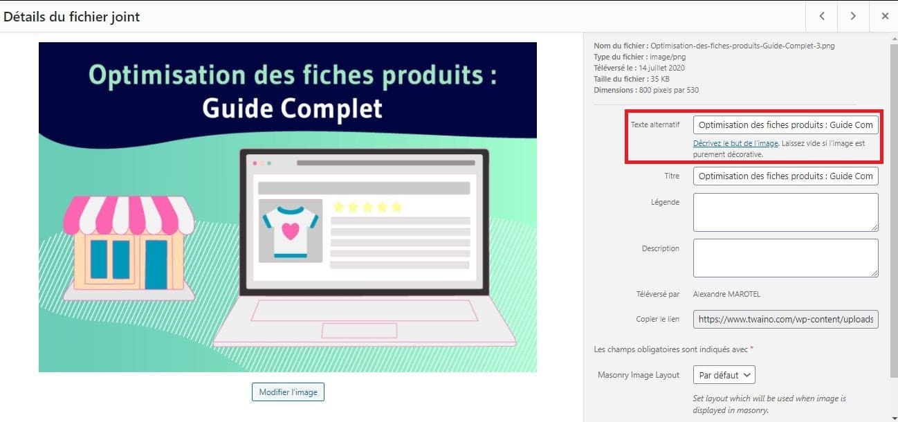
Using the ALT tag is also a way to make your site accessible to everyone. Its content will be transcribed into audio using accessibility tools for the visually impaired.
3.3.3. Preferred image formats
There are several image formats but in the current context it is advisable to favor only three: JPEG, PNG and GIF. These three formats because they are the most popular but above all the most found by search engines.
To combine all the chances on your side and allow Google to easily index your image, it would be smart to prefer these 3 formats. So avoid extensions like SVG, EPS or other fancy formats.
GIF is used for animations, PNG is ideal for logos. JPEG is reputed to be lighter than the first two without altering the quality of the image.
3.3.4. The size of the image
Generally the image banks available on the net offer photographs of very good quality, therefore very heavy in capacity. This may slow down the loading time of your page.
But when we take a closer look, we notice that these images are sometimes too large and unsuitable for a website. So why unnecessarily clutter your site at the risk of losing visitors.
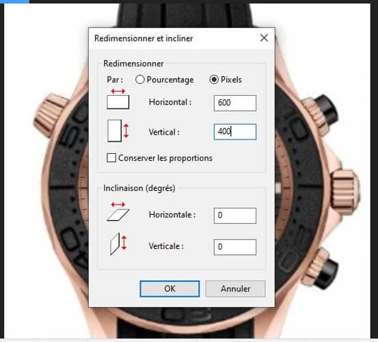
The solution is therefore to resize images that are more than 600 pixels wide. The limit of 600 pixels was chosen since it was for a long time the maximum value of the width of an image on the net.
However, today the resolutions of mobile devices have changed but this does not prevent taking 600 pixels as a good standard for resizing your images.
3.3.5. The text surrounding the image
The name of the image and the content of the ALT tag are not the only clues that search engines use to reference an image. The context in which the image is inserted also makes it possible to optimize it.
This means that an image contained in a coherent paragraph enriched with variable terms from the lexical field of the main keywords would be easier to position. Another trick is to add a caption and title to your image.
With WordPress, this trick is easily manageable by following the Media > Library path.

3.4. Internal networking to make your visitors’ session last
The insertion of external links in the articles of a page is very important and remains a capital step in SEO optimization. Bringing external links into your essays is a way to justify them and give more credit to your content.
It is not less for the internal links which are unfortunately neglected. However, they are an essential factor for successful SEO because of their stability.
Internal linking is a strategy that allows you to redirect your visitors to other pages on your site. The idea is to capture their attention, get them used to the style of your site and spend more time there.
But how to achieve internal networking? Here are the rules to follow:
3.4.1. Building thematic silos
The expression “thematic silo” refers to a set of content that deals with the same subject.
Let’s take the example of a chef who has a blog to teach his audience culinary recipes. At the same time, he decided to join an e-commerce store to the site to present a product sheet of certain utensils used during the tutorials.
Its entire site will therefore have to be split into two very distinct groups:
- The first for the kitchen pages;
- The second for utensil product sheets.
Here is an idea of how it can build its thematic silo:
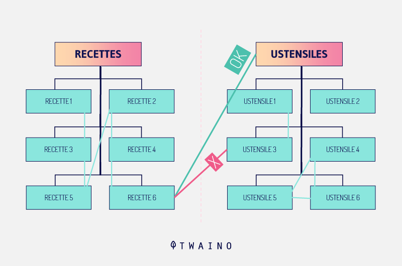
The pages maintain a reciprocal dependency relationship and all address the same subject. We can notice that each main page has links to all its child pages (blue lines).
It is also possible to make transitions between each child page of the same parent page (orange line). On the other hand, it is not recommended to pass between two daughter pages of different mothers without going through one of the mother pages (green line).
This way of organizing its thematic silo has a double advantage. First, visitors will be able to navigate logically and extend their session. Then, the search engine crawlers will clearly understand the tree structure of the site to better reference it.
It is clear that the example of the cook mentioned above cannot be achieved with everyone. On the other hand, it makes it possible to understand all the usefulness of a blog.
Indeed, depending on your field of activity, you can publish content or user guides directly linked to your product sheet on your blog space. It is true that the content of a product sheet, well written, can answer all the relevant questions that a customer may ask.
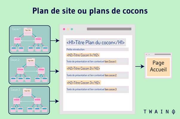
But the idea is to recall all these answers on another page of the site in order to strengthen its internal mesh.
3.4.2. How to properly manage product variations?
The management of product variations is a delicate aspect to be treated with great care at the risk of undermining all your efforts in terms of internal networking. We designate by variations of the same product, all the other similar products which differ just with some detail near like the color, the size, etc.
To properly manage the variants produced, everything will depend on the study of keywords. Let’s take the example of a color variation of any product. If you notice on search engines that certain colors are more in demand than others, there is only one solution.
You are required to create a unique product sheet for each of the colors available. It may seem too much to ask, but do you really want to optimize your product sheets?
On the other hand, if conversely the color is not a selection criterion for Internet users, you have the choice between two options:
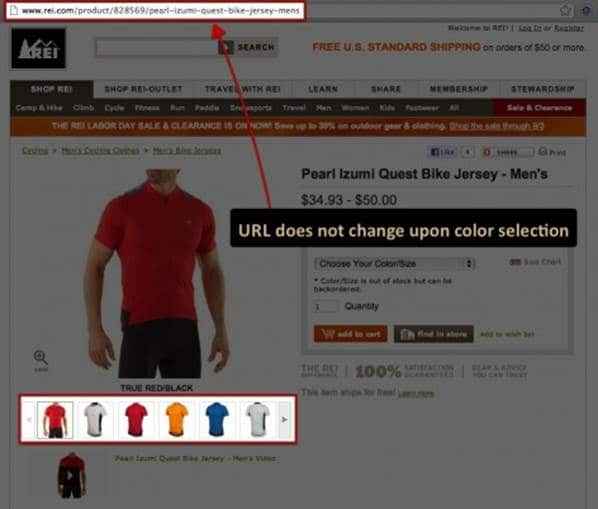
- Offer a choice system directly on the product sheet so that the customer personalizes his article without changing his ‘URL. Offer a choice system directly on the product sheet so that the customer can personalize his article without changing the URL;
Source : Merkleinc
- Create a URL specific to each color and which links to a copy of the first record. But to avoid being penalized by Google, each copy must include a “link rel=canonical” tag. This is a way of notifying Google that your site has several product sheets that all share the same content.
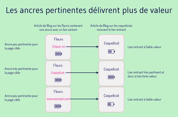
3.4.3. Write anchor text well Anchor
text is the clickable word or phrase that links to another page. It is easily recognizable thanks to its blue color and underlined style.
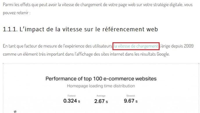
It is important that the anchor text is related to the content of the page to which it links. It is even recommended to include one or more keywords without abusing them at the risk of being penalized by Google.
Suppose you want to send your users to a page that explains how to make cheese pizza. We agree that the anchor text must contain at least the word “pizza”.
3.4.4. Revealing the depth of the site
In terms of internal networking, there are two types of links to avoid, or at least carefully: links that redirect to the site’s home and contact pages. They are prohibited quite simply because it would be superfluous to still direct visitors to the important pages of the site which are already linked by the main menu.
The secret of a successful internal linking, is to privilege the links which transit towards the deep pages of the site. This will redirect your readers to recent articles but especially to old content to prevent them from falling into oblivion.
3.4.5. Be reasonable about the amount of internal links to insert
.Excess in anything is harmful. Here too, although internal linking contributes to the optimization of your page, it would be wise not to overdo it. Exaggeratedly sewn content of internal links plunges Internet users into embarrassment.

How many links does it take to stay in the margin? There is currently no rule, even recommended by Google, which defines the number of internal links to insert in a page.
However, you can stick to only 3 or 4 internal links depending on the volume of your content. Note that your page already contains other internal links such as those in the navigation bar, the footer, the call-to-action, etc…
3.5. The breadcrumb and its importance on natural referencing
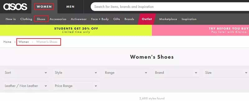
A breadcrumb, also known as breadcrumb, is the small path of text, usually positioned in the navigation bar of a site. It allows to indicate to visitors as well as to Google bots the current position on the site.
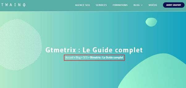
Each element of the breadcrumb trail is clickable and leads either to a previous page or to the home page. The breadcrumb trail occupies a fairly important place in the SEO referencing of a website.
This also implies its importance for the indexing robots which use it to find their way around your site.
This small piece of text makes it possible to understand the structure of the site, makes navigation more practical and considerably reduces the bounce rate. Bounce rate, since it retraces the Internet user’s itinerary on the site and guides him in navigation.
And that’s not all, the Ariadne’s thread improves the ergonomics and accessibility of the site. Since the breadcrumb also contains links to other pages of the site, it is an integral part of the internal mesh of your site.
3.5.1. The different types of breadcrumbs
Although they may appear identical at first glance, breadcrumbs exist in several forms. So to create a breadcrumb, the webmaster has the choice between 3 different forms. Each of them has its own style and specificity.
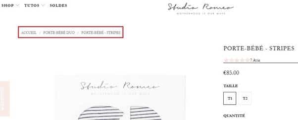
3.5.1.1. The tree-based breadcrumb
This form of breadcrumb is the most used because it is easier to understand but also easier to perform. It is integrated by default in several CMS. Consider an e-commerce site, its breadcrumb trail should look like this:
Home > category > subcategory > product
3.5.1.2. The attribute-based breadcrumb
This form of breadcrumb looks more complex than the previous one but is still just as relevant. It is set up according to the browser used by the Internet user. It appears when the user uses the filter grid to launch a more targeted search on the site.
This type of breadcrumb informs with more details the position of the user on the site contrary to that based on the tree structure. It can be presented for example in this form: Home page > category > attribute 1 > attribute 2;
Example:
Home page > shoes > basketball shoes > men’s basketball shoes
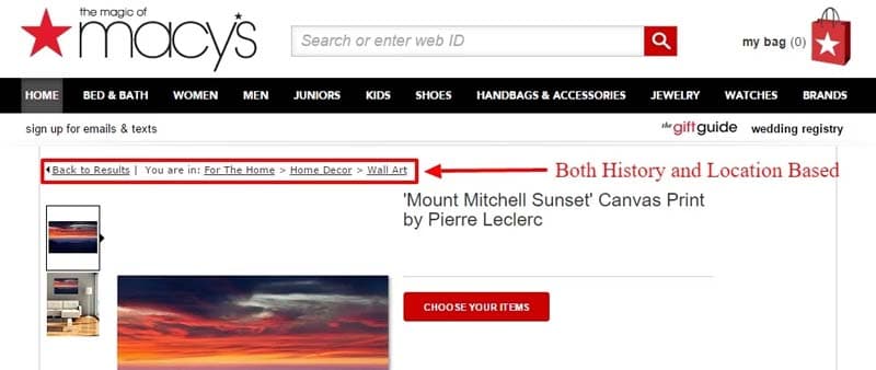
3.5.1.3. Breadcrumbs based on browsing history
This form of breadcrumb only takes into account the behavior of the Internet user. It is therefore possible that it looks a bit inconsistent and totally lacks architecture.
For example: Home page > Category page > Product page > Subcategory page.
Source : Vwo
Attribute-based breadcrumbs are a bit rare to find on e-commerce sites due to their complexity.
3.5.2. The benefits of breadcrumbs in SEO
Creating breadcrumbs on your site has significant advantages both for SEO and for improving the user experience of your visitors:
- Google encourages websites with breadcrumbs in the navigation bar
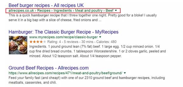
As explained previously, the breadcrumb trail serves as a benchmark for Google’s bots. But, it takes a well-constructed breadcrumb before hoping to exert any influence on the indexing robots. In addition, a breadcrumb can stand out well in the SERPs of search engines.
Thus, your breadcrumb can quickly stand out from the other response elements because of its blue color and its underlined style which encourages you to click on it. By using structured data, you can even improve the ranking of your breadcrumb in the Google SERPs.
Source : Search Engine Journal
On some levels, breadcrumbs also decrease your site’s bounce rate. Indeed, search engine robots are becoming more and more precise and it is very rare for an Internet user to be directed to the home page of a site after typing a request.
Ariadne’s thread remains in this case the best solution for the user to navigate between the pages of the site very quickly. The Internet user will then spend more time on the site, which earns you points at Google and reduces the site’s bounce rate.
3.5.3. The breadcrumb to reinforce the user experience
The breadcrumb appears as a reminder of the structure of your site and is constantly visible on each page. It is an element that many Internet users are looking for because of its practicality.
Thanks to the Ariadne’s thread, the user who is on his first visit to your site will be able to find his way easily and come back when he wishes. Although the “Back” and “Next” buttons of browsers can sometimes be grayed out and return nothing.
The breadcrumb trail remains the best solution to indicate the structure of your site to Google’s bots and also to make the navigation of your visitors fluid.
3.5.4. Properly implement the breadcrumb trail on your site
Like all the SEO elements reviewed here to improve the referencing of your product sheet, the breadcrumb trail also requires a few rules to be respected before using it.
The breadcrumb trail must be visible on all the pages of the site and a priori on the product sheets and the category pages.
If you already have a breadcrumb on your site and want to assess its importance, check the do-lists below and compare them directly on your site.
The list of rules to follow:
- The Ariadne’s thread must trace all the way to the current page, starting from the home page of course;
- The anchor texts written for each “section” of the path must naturally be related to the semantics of the page, but not necessarily to the targeted keyword for which we want the latter to be positioned;
- The last section of the breadcrumb, must correspond to the current page and must not be clickable;
- Optimize the location of your breadcrumbs by positioning them in the upper left part of the product sheet, much like the example below:
Source : Search Engine Journal
- Test and retest back and forth whether the breadcrumb trail works wonders;
- However, if your e-commerce site only contains two categories, it is no longer necessary to offer an Ariadne’s thread at the top of the page since the path is short and easy to remember.
3.5.5. Is it necessary to introduce a breadcrumb trail for mobile devices?
The answer is a big yes!
An example to better illustrate:
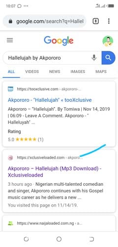
Ariadne’s thread is essential for all sites and in particular for e-commerce sites which have a slightly denser structure. In these cases, it is an essential benchmark for both Internet users and indexing robots. Ariadne’s thread is also to be considered on mobile devices even if it requires a little more to review the design to better harmonize it on a small screen.
Chapter 4: Off-page SEO optimization of your product sheet
Off-page optimization is a branch of natural referencing that complements On-page optimization. Although most people associate off-page optimization directly with link building, the concept goes far beyond that.
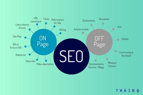
Clearly, a good part of the criteria sought by Google to improve the ranking of a site is outside the site. It is these external parameters that are taken into account in Off-page SEO.
A good Off-page optimization of your product sheet will therefore necessarily involve the following elements:
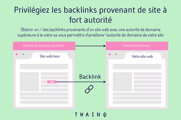
4.1. Netlinking for strategic insertion of external links Backlinks
or even external links constitute a mesh that redirects your visitors to other sites. Conversely, other websites may include your site’s address in their external links.
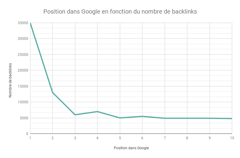
It is a strategy that gives a boost to the optimization of a page. However, it will have to be well organized before hoping for any effect on the behavior of indexing robots.
But how can an external link to another site benefit you? First, it’s a matter of trust with your audience. It’s a way to bring more credibility to your content by offering points of complementarity or corroboration in other sites that address the same theme as you.
Then, a well-structured mesh of backlinks is an SEO optimization criterion in the Google algorithm, but be careful not to force it too much.

To ensure a good external mesh of your content, there are dedicated tools for more performance.
You can opt for a netlinking platform like Get Influence, SEM Juice or Submit.fr. They will take care of listing a selection of the best sites that address your theme. A backlink to these reference sites will ensure the presence of your site there, which implies an increase in the traffic rate. There are also so-called cashlink agencies, such as Linkbucks or Clic Tune which offer monetization solutions for these link redirections.
However, it is advisable to use these tools sparingly to avoid a mass of unnecessary backlinks in your content. Which can be punishable by Google and lower the ranking of your site.
You are not also required to insert the link of a site which could degrade your e-reputation. There are online services to assess the impact of a link on your SEO if you doubt its credibility.
4.2. The little extra of social signals for your brand
Social signals refer to the positive ratings that a website receives from social networks, a blog and consumer reviews. The question you are probably asking yourself right now is how many Likes do you need to gather to build your SEO authority.
Or how many times should your followers retweet your posts for visible impact? Or simply what are the selection criteria of Google+? The real thing is that there is no documentation that says it takes 1,000 likes or 2,000 retweets to influence your site.
Many experts are also of divided opinion on the impact of social networks on the referencing of a website. The real importance of social networks in SEO therefore remains a debatable subject.
Although, social networks form a melting pot that can bring traffic to your site and contribute to its visibility on the web. Why refrain from it?

4.3. SEO tools for off-page optimization of your site
Like on-page optimization, SEO also offers a list of powerful tools to analyze and assess the off-page environment of your site. These are generally programs capable of evaluating the number of backlinks your site receives.
These tools can also provide detailed statistics on the site’s social signals. But there are powerful tools from experts in natural optimization, more complete, which allow you to work on the On-page and Off-page sides of your site at the same time.
interface Searchmetrics
Examples include Searchmetrics, Ryte, Moz or SEMrush. But if you specifically prefer an off-page application, consider providers like ahrefs. We can’t stop offering SEO tools without mentioning Google’s Search Console, renowned for its detailed analyzes based on backlinks.
The Google Search Console also offers important features such as the ability to see linked pages, which is very useful for optimizing a site.
Chapter 5: Some examples of successful product sheets
To better understand all the notions of optimizing a product sheet received so far, let’s take a look at some examples of successful product sheets:
5.1. Fabletics
Fabletics is a brand specializing in the sale of training equipment. It is renowned for the price of its products which is relatively affordable compared to its luxury competitors.
The brand therefore decided to focus on this major asset to stand out on the market and appeal to the content of its product sheets. It will therefore draw the attention of its customers to its VIP membership prices.
Another brand operating in the same sector of activity may decide to focus its policy on other assets such as showing the photograph of real customers who have already had to buy its articles and have appreciated it.
5.2. Graham & Green
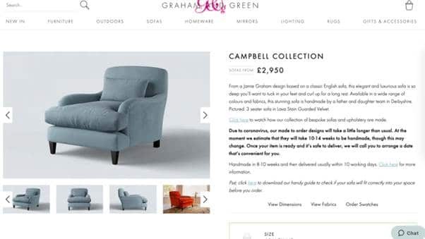
Furniture is an area that is having a bit of a hard time selling directly online. Graham & Green therefore decided to bet on quality visuals that offer a view of all angles of its products.
The idea is to be able to fill the void of the fact that the brand is not a physical store and meet the expectations of the customer. The series of photos offered is of very good quality and reinforced by video content on the upholstery in order to incite the confidence of the client.
Source : Graham & Green
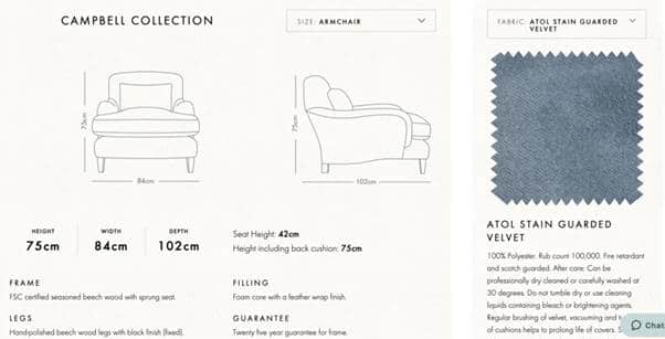
It goes a step further by adding better features like a size guide. This well-detailed guide will allow the customer to easily and clearly visualize the actual dimensions of the furniture of his choice.
Source : Graham & Green
This is an important aspect that any potential furniture customer looks for before confirming their purchase. Then, Graham & Green completes its product sheet with a section entirely dedicated to all related information on delivery and return.
5.3. Bloom & Wild
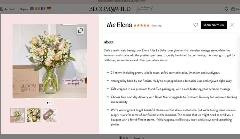
An Internet user looking for a bouquet of flowers will not dwell too much on the written content of the product. He would prefer to browse the visuals of the bouquets of flowers available before looking at the details.
Bloom & Wild understands this and cleverly adopts a product sheet style that allows you to quickly scroll through each product. Internet users can quickly go back to review a bouquet that particularly marked them before continuing to scroll if they wish.
Source : Blood & Wild
In addition to facilitating customer navigation, each product sheet has a series of imagery highlighting the bouquets with the bud and flowering of the bouquet in a context of use. The customer will already be able to appreciate what his bouquet of flowers will look like once displayed.
Source : Blood & Wild
5.1. Fabletics
Fabletics est une marque spécialisée dans la vente des équipements d’entraînement. Elle est réputée pour le prix de ses produits qui est relativement abordable comparativement à ses concurrents de luxe.
La marque décide donc de se centrer sur cet atout de poids pour se démarquer sur le marché et plaire avec le contenu de ses fiches produits. Elle va donc attirer l’attention de sa clientèle sur ses prix d’adhésion VIP.
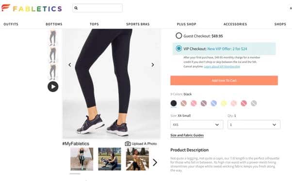
Source : Fabletics
Another brand operating in the same sector of activity may decide to focus its policy on other assets such as showing photographs of real customers who have already had to buy its articles and have appreciated it.
5.4. Converse
Item visualization technology can dramatically increase customer satisfaction and increase site revenue. By offering customers the opportunity to see what the product looks like in real life, you decrease the return rate of the product sheet.
This strategy based on quality visual content also gives customers a sense of control over the product. They will be able to customize the product to their liking before placing the order.
Converse is a reference for the best in this field. The majority of its product sheets are equipped with a feature that allows the customer to modify the product according to his tastes and desires. He can choose the color of his choice or the size that suits him best.
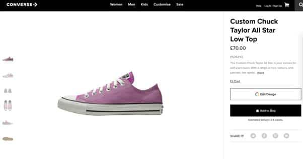
Source : Converse.com/uk
This item customization feature is impressive in its interactive feel that fully immerses the customer in the process. We could also add that it has an addictive side that hooks the customer.
The customer can banally spend a quarter of an hour personalizing his shoe without even seeing the time spent.
5.5. Bliss
Bliss is a brand specializing in the online sale of skin care products. Bliss’ strengths are consumer ratings and reviews. An element recognized for its effectiveness and popular with many brands that already have a number of prospects.
The brand adds a small grain of rather unusual creativity. Its product sheet contains a section called “Why I chose this”. The idea is to collect only positive reviews from customers to further promote the item. So she intelligently breaks down all the bad comments that could deter other customers and tarnish the reputation of the brand.
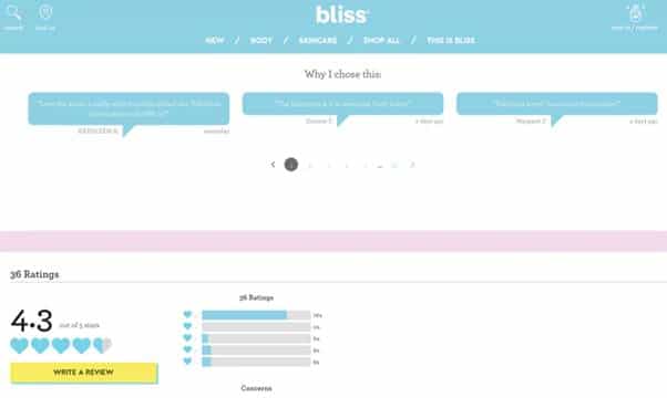
Source : Bliss
A little further down, Bliss creates another “Happiness” section that recalls the toxic products that go into making items but are not in her home. A great way to reassure the customer.
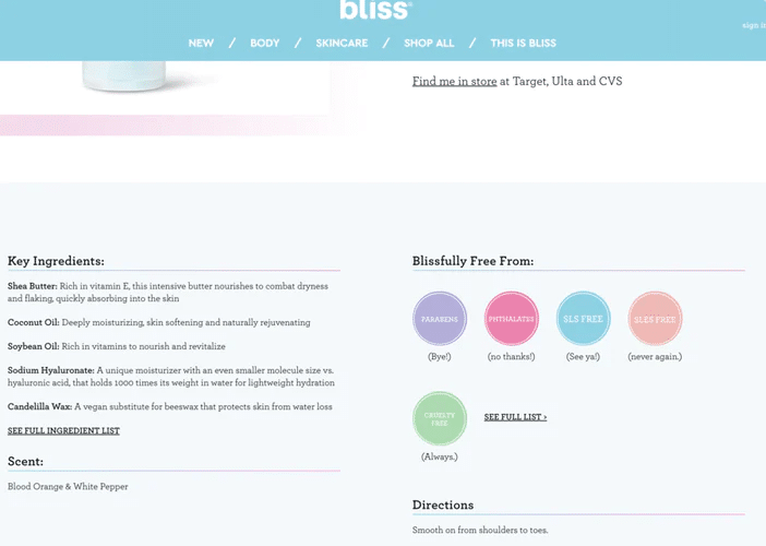
Source : Bliss
5.6. GLossier
Glossier branded product sheets are peppered with subtle but highly effective features that entice customers to purchase. For example, we can notice indicators that show if a product is “top rated”.
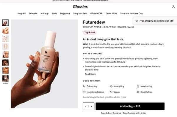
Source : Glossier
At the bottom of the page of its files there are also ratings and opinions with the functionality that allows other customers to “overvalue” to show all the relevance of the opinion. The section has a search bar with 4 different filters to better target reviews according to the needs of the user.
The section has a search bar with 4 different filters to better target the reviews according to the user’s needs.
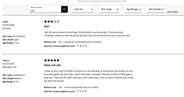
Source : Glossier
5.7. Hugo Boss Hugo Boss
product sheets have a lot of really practical elements, like high-quality visuals and effective calls-to-action (like “buy online, decide at home” to highlight free returns).
Another awesome feature is the “Complete your look” section, which offers suggestions based on the main item.
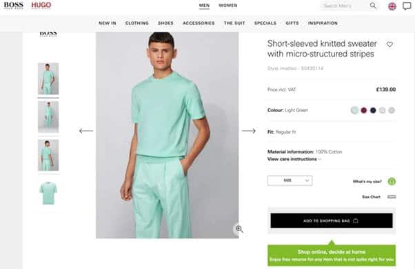
Source : Hugo Boss
In addition to showing inspiration, Hugo Boss product sheets simplify the shopping experience for the customer, allowing them to quickly and easily place an order for an entire outfit. Of course, the brand also takes advantage of this to cross-sell and increase the average order size.
5.8. Allbirds
The majority of shoe brands are often content to show off the style rather than the substance of the product, but Allbirds decides to break the routine by showing how its shoes are both elegant and ecological.
Therefore, its product sheets are much more value-based, highlighting the benefits of the product (in terms of portability and durable materials).
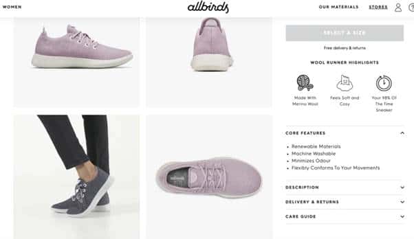
Source : Allbirds
The page’s navigation style allows users to simply scroll down to see all of the remaining imagery and videos. The user is no longer obliged to click on a gallery before seeing the visuals available, which makes it easier to read all the information provided on the form.
5.9. Brewdog
The Brewdog beverage brand is renowned for its innovative and sometimes shocking marketing strategies. However, in recent times, the brand has refocused its attention on the beer itself.
Its web platform is proof of this, with product sheets that attempt to clearly convey the ingredients and taste of beer – even to alcohol newbies.
The site also features concise, descriptive written content that cleverly complements a summary table to inform customers of the main beer flavors.
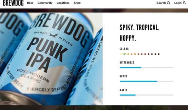
Source : Brewdog
Further down the page is the house’s ‘brewing sheet’ which offers even more detailed information on how the beer was brewed. Not to mention the top part of each product page which highlights important information such as “free delivery on every full box”.
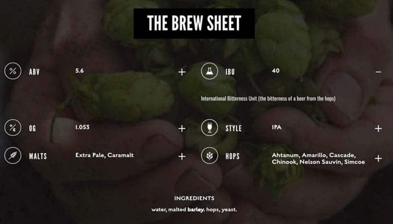
Source : Brewdog
5.10. Bellroy
Image galleries often found on e-commerce sites are generally used to help customers better understand the product in real life. Instead, Bellroy thought of integrating an auto-playing video, which serves to immediately captivate the Internet user and engage him in the elements he is browsing.
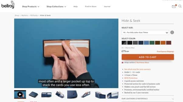
Source : Bellroy
Further down the product sheets, the brand has thought of offering a series of visual and effective representations of the product. It is a strategy designed to give users a complete idea of its size and capacity for use. An idea, it must be admitted, rather practical.
Chapter 6: SEO management of your product life cycle
Let’s put ourselves in the shoes of an Internet user looking for a given product. Our worst possible disappointment would be not being able to order a product that we found on a site and desired.
Or that the available product sheet does not give us all the information we would like to know. This highlights the importance of always guaranteeing a satisfied user experience for each of the products on sale.
From an SEO point of view, it is recommended to take certain measures to avoid losing potential prospects. What strategy is adopted for good management of out-of-stock or expired products on your site?
Here are some precautions to take to properly manage this sensitive aspect of your e-commerce store.
6.1. How to manage products temporarily out of stock?
If you’ve ever looked into this once and searched for solutions, you’ll notice that there are quite a few recommended solutions for dealing with temporarily out of stock products.
These include 301 redirects followed by a change in the content of the product sheet. Or the 302 redirect to report temporary maintenance. The 404 redirect for pages that no longer receive organic traffic.
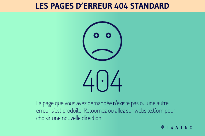
But there is a small catch for these solutions. First, the most common solution found is the 404 redirect. It is still not relevant since Google’s indexing robots will de-index the entire page. Which of course we wouldn’t want.
As for 301 and 302 redirects, they are also harmful for your site since they will appear as signals to Google robots. Indeed, they will detect a sudden change repeated at short intervals on your site without understanding the reason.
Clearly, there is only one solution to effectively manage this temporary out-of-stock problem without having a negative effect on the SEO optimization of your site: keep the page functional!
Eh yes ! We recommend keeping the out of stock product page active but disabling the “Add to cart” button.
To maintain a good ranking of the product page during this out-of-stock period and offer a satisfactory customer experience, you can:
- Insert a dedicated form to notify the customer once the product is available again on your site in a context retargeting;
- Suggest similar items on the product sheet so as not to leave the Internet user empty-handed and above all to succeed in recovering his money.
It is a technique that allows you to continue working on optimizing your product sheet even if the product is temporarily unavailable.
What good is it to lose a page that has required a lot of effort from you and which, despite the unavailability of the article, continues to attract traffic to your site.
The strategy for managing products temporarily out of stock is highly recommended for seasonal activity sectors such as assembly or aquatic equipment, food, textiles, etc.
The method is part of a context of cyclical product management which makes a point of preserving the optimization of the product sheets which will be available shortly.
6.2. Strategy for managing deleted products
How do you plan to manage a product sheet whose article concerned is deleted from your database? In such a circumstance, if nothing is done as soon as possible, your site will very quickly be overwhelmed with many duplicate orphan pages. Not to mention the linked pages which occupy an important place in the internal mesh of your site but which redirect to empty content.
Several solutions are proposed to manage this scenario. We will take care to go through them one after the other with the advantages and disadvantages specific to each. It’s up to you to weigh the pros and cons and choose the one that best suits you:
6.2.1. The use of the 404 redirect
This solution consists in personalizing the page and adding a message prepared for the circumstance which explains the situation to Internet users. It’s important that you don’t lose sight of the user experience.
Source : Skeegten
Advantage :
- Better use of resources allocated for the crawl due to the rapid de-indexation of the pages.
Disadvantages :
- You will inevitably lose the juice coming from the backlinks;
- On the user experience side, the user has no choice but to leave the page;
- You risk having an excessive number of pages with the 404 message on your site, which is very dangerous for the site.
6.2.2. The use of the 301 redirect
Here, the solution is to make a 301 redirect from the deleted product sheet to a valid page that offers a similar article from the point of view of technical characteristics, delivery time, price, etc.
It may happen that you do not find any that meet these conditions, the best solution would be to redirect the customer to an interesting category or subcategory.
The principle is to always offer an interesting solution that preserves the user experience.
Advantage :
- This solution allows you to keep the juice coming from your backlinks.
- It is still the best option in terms of user experience unless you find an article that is very close to the one that is deleted.
Disadvantages :
- This solution will potentially cause some information to be lost on the customer’s side because he will no longer be able to access what he wanted, until the redirection is taken into account.
To help you find the ideal solution for your situation, ask yourself questions about the following details:
- What is the frequency of expired items: monthly, weekly, daily?
- What is the quantity of items that have expired: only a few dozen in transit or regularly in the thousands?
- What is the organic traffic generated by the product sheet in question?
- What are your technical obligations in relation to the site: material, software and human resources?
After all these solutions, here is a last one but which is not adapted to all types of sites and which remains very relevant. This is the unavailable_after meta tag.
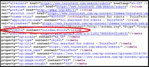
Source : Twenztech
It is possible that as soon as a new arrival of certain products you can anticipate the date on which the deleted product will be available again. Clearly, you will be forced to manage your items as seasonal products.
This may depend on your supplier, may be in the context of a particular situation or an event item. If you find yourself in these scenarios, the solution would be to use the unavailable_after tag to throw a clear indication to Google bots.
<meta name=”googlebot” content=”unavailable_after: 23-May-2020 19:00:00 est” />
Here, after May 23, 2020, from 19:00, the article concerned will no longer be available.
Contained in the header of the source code of the product page, the unavailable_after tag makes it possible to signal to Google bots the precise date of de-indexing of the page.
The good news, this solution has no negative impact on the SEO of your site and even better on the user experience.
However, be very careful! This tag is only recommended for small websites. If you try a gigantic e-commerce site for example, it can quickly become unmanageable.
Chapter 7: Some ideas to stand out from your competitors
Analytical statistics to evaluate the rate of connection of prospects to websites in general are not lacking. However, many agree that the balance leans much more on the side of e-commerce stores.

In any case, one thing most certain is that the majority of consumers take the final step from their computer.
But all the data is unanimous on the fact that all the research before the purchase is made from mobile devices. As an e-merchant, your objective would therefore be to improve the user experience of your customers by offering solutions adapted to their needs.
7.1. E-commerce, the current statistics to know
The field of e-commerce is booming and the figures say it all. Also,
the reaction of online consumers is changing. Here are some key figures to better understand the situation:
- In 2019, there were approximately 12 to 24 million e-commerce sites worldwide;
- More than 1 Internet user out of 2 abandons a site whose presentation is not attractive;
- Each second of waiting for loading dissuades the Internet user from continuing and leads to a drop in satisfaction of 7%;
- 3 out of 4 mobile users abandon web platforms that are not optimized for smartphones;
- 2 out of 5 online shoppers in Europe have already placed an order from a mobile device.
You will no doubt have understood that your goal as an e-merchant is to offer better solutions to Internet users so that they buy your products. This necessarily involves improving navigation on your site, the simplicity of the ordering process and the security of the payment methods offered.
To answer all this, you have 3 solutions to choose from: a mobile application, a responsive site or a mobile site.
7.2. Choosing a mobile site: pros and cons
Creating a mobile version of an existing site is like creating a whole new site. Everything must be reviewed and readapted to offer a better user experience than the initial site.
The first advantage of this creation of a mobile store is to let the user choose whether he prefers to browse the classic version or the mobile version.
A way to diversify the design and the user experience with a more interactive platform than the previous one without forgetting of course a good navigation available for all mobiles (android, iOS, etc.)
The disadvantage would be that you now have 2 sites, so two different URLs to be managed separately. This implies more means, and a double effort on the SEO optimization side.
From a marketing point of view, try not to change the design of the mobile site too much from the initial site. For fear of losing notoriety.
7.3. Choosing a responsive site: advantages and disadvantages
For several years now, developers have been offering the creation of responsive sites. The term responsive designates the ability of the same site to adapt easily to all resolutions. Clearly, the same site that is perfectly deployed on a desktop computer may be able to harmoniously overlap all its components to continue to function very well on a telephone.
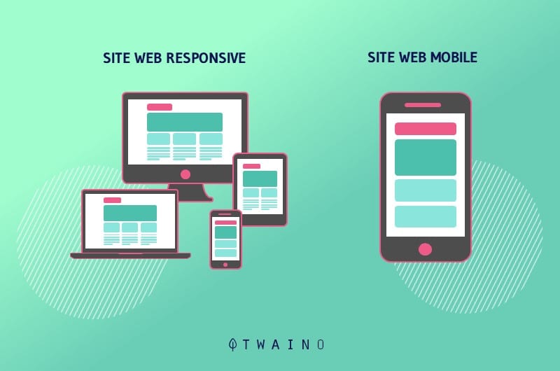
The first advantage here, you probably guessed it, is to avoid creating a second site, since it works perfectly on all screens. This also means cost savings.
Also, the user’s customer experience will be enhanced without losing any notoriety. On the SEO side, all your efforts will be saved. But despite all this almost perfect profile, opting for a responsive site also has its share of disadvantages.
Indeed, a responsive site will take a little time to load correctly. That is 3 seconds on a desktop and 5 seconds on a smartphone. In addition, on the technical side, not all themes are easily modifiable. For some, you will have to start all over again. A real painstaking job that can take a little time.
7.4. Choosing a mobile application: advantages and disadvantages
The choice for a mobile application is not without risk for an e-commerce store. Indeed, a mobile application operates in a slightly different ecosystem from a traditional website. So the creation of a mobile application requires adopting another sales scheme, but it’s a promising choice and the game is really worth the effort.
So, the benefits of creating a mobile application are enormous, but let’s start with the proximity to prospects. Indeed, the application will be available on their smartphone, and we all agree that the majority of people do not stray too far from their phone.
Then, mobile applications benefit from good and more efficient means for creation. The other significant advantage for a mobile application is the speed of use. A mobile application will take less time to load than a website. Which brings us to another advantage, the navigation quality.
The navigation is clear, fluid, and well adjusted. In addition, a mobile application does not require an internet connection to function. A real advantage that does not prevent the user from visiting the application even when offline.

Finally, a mobile application benefits from certain features such as geolocation, push messages, etc.
As for the disadvantages of a mobile application, it should be noted that there is a significant investment (time and financial). In addition, it will be necessary to develop a version of the application specific to each operating system, and not only the important ones.
Finally, the cost to be allocated to application security is not negligible.
So, which of these 3 options do you prefer?
7.5. Live Chat to listen to your customers
In the field of online sales, it is crucial to build an effective marketing strategy to encourage Internet users to place orders on your e-commerce store.
Until then, the human side of a physical store is a bit difficult to reproduce in e-commerce. We can cite, among other things, the warm welcome at the entrance to the store by a real person, the fitting and handling of products in real life, advice and tips from a physical seller, etc.
So many strategies that we try to bring closer with technology. Hence the importance of a live chat on your e-commerce store.
7.5.1. Live chat statistics in e-commerce
Here are some statistics that prove the importance of Live Chat in e-commerce and how it boosts online sales:
- Live chat has the highest level of customer satisfaction among all channels of customer service. Phone accounts for 44%, email 61% and live chat 73%.
- Around 79% of consumers prefer live chat because of its immediate assistance no matter where or when;
- More than 77% of consumers said they would not buy on a web platform without a direct chat service available.
7.5.2. The benefits of live chat in e-commerce
Live chat is a new marketing and sales channel that has literally changed online sales. What will you gain concretely by integrating a direct chat service on your e-commerce site?

Here is a list of the advantages of an integrated chat service on an e-commerce site:
7.5.2.1. Instant customer service.
One of the reasons that customers love in “mainstream” stores is the welcome of the store assistant. It doesn’t matter if you are looking for a particular pair of socks or just a different color of a t-shirt; they are always there to help you.
On the other hand, it is not easy to find such assistance on an e-commerce site.
It may happen that despite your site being quite intuitive, a customer cannot find all the information he is looking for. Maybe he was in too much of a rush for the pages and every detail.
Other customers would prefer to make a direct phone call or send a letter rather than going to the brand’s site.
Live chat simplifies things on both sides and offers a happy medium. It will allow a customer looking for information to click on the chat window to be listened to. The customer can be assisted and satisfied that his problem has been resolved so quickly.
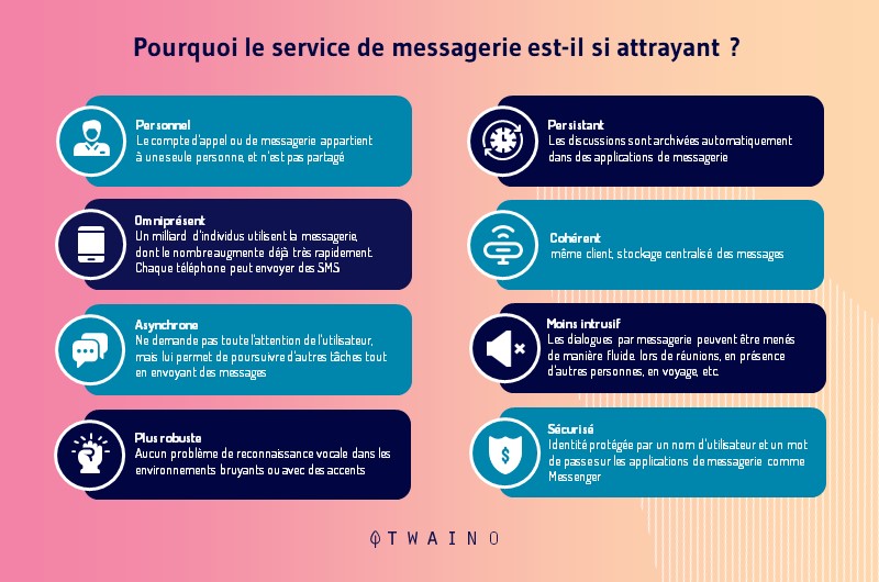
This live chat strategy is all the more interesting when you know that decisions are made in just a few seconds. A quick response on a delivery detail to win you that customer.
7.4.2.2. Chat with multiple customers at once.
The advantage of live chat service compared to other communication channels is that a single agent can chat with multiple customers. Although it doesn’t happen in real life, or on the phone, here an agent can speak with five or six customers at a time.
This is possible because the majority of live chat tools offer convenient features that allow agents to respond quickly.
Depending on the context, they can see customer messages before sending them. Or send pre-filled messages to frequently asked questions.
This practical side of live chat makes it possible not to make a customer wait in a queue and all customers are received instantly.
7.5.2.3. Easy-to-find chat window
It can be noticed that most of the online contact forms for filling in contact details are hidden, perhaps in the footer of e-commerce sites. On the other hand, the live chat can be visible on each page visited by the customer.
It can be presented in the form of a classic chat window, a pop-up or a chat bubble… In short, anything that can attract the visitor’s attention and increase the chances of engaging in discussion with him.
If the visitor has a particular concern and decides to get help, they will be just a click away from chatting with the agents. What customer wouldn’t appreciate the spontaneity of direct chat service when needed.
7.5.2.4. Automated chat greetings.
The automated greetings solution is one of the most important live chat features. The system anticipates exactly how a salesperson welcomes his customers.
Automatically, as the visitor logs into your online store the welcome message is triggered and asks if the visitor needs help.

You can analyze your website and can set up chat greetings to start a discussion at the exact moment your customer needs it.
Assuming you’ve noticed that your customer spends enough time in a shopping cart, you can guess they have a little problem. Offering them your help right now can increase their chances of completing the purchase.
7.5.3. How to add live chat to your WooCommerce site
For this section we will use WooCommerce, a WordPress tool to see how to add live chat to your online store. For those who prefer another tool, you can use one of the best live chat software.
To get started, you need to go to the LiveChat and open an account.
Source : Wpbeginner
The Live Chat service is available as a paid plan (from $16.99 per agent). It also offers a 30-day free trial so you can test out the features and see if it works for your business before subscribing to a paid plan.
If the registration is done, you will be redirected to the LiveChat dashboard. From here, you can click the Settings button to customize the look of your LiveChat window.
Now you can choose the colors and theme of the chat window to match the decor of your website. Once your chat window is customized, click on the ‘Advanced window settings’ link to add your own logo as well as your social media profiles.
Then you need to choose an eye-catcher of your taste. These are the images that appear when the LiveChat window is minimized.
LiveChat offers you several eye-catching styles to use. But if you want, you can also upload your own images and use them as an eye-catcher.
Now that you’ve finished choosing the eye-catcher and look of the chat window, it’s time to add your LiveChat agents. Switch to the “Agents” tab, then click on the “Invite Teammates” link.

You will be prompted to add an agent screen. You need to enter the name, job title, and email address of the team member you want to invite.
Don’t forget to set the “permissions” of the team member you are adding. You can add it as an agent with limited access to your account or as an administrator with full control to the app. If you are unsure, change the agent.
Once the LiveChat configuration is complete you can now add it to your WooCommerce store.
Adding LiveChat to Your Website
LiveChat makes it easy to add the chat window and buttons to your online store. To add LiveChat to your site you need to install the LiveChat in your WordPress site. The installation of LiveChat is thus complete.
If you want to make any changes afterwards, just click on the ‘LiveChat’ menu on your WordPress admin page to access the plugin settings page.
Conclusion
By studying more closely the structure of a product file, we realize that each part offers the possibility of optimizing a specific aspect of the visibility of the file.
It is all of these micro-analyses that make it possible to build a more complete optimization of the product sheet in order to obtain a quality sheet.
A quality product sheet is this sheet capable of anticipating the needs of Internet users via a strategy based on keywords. It is also this sheet that understands the language of indexing robots for better referencing of the product offered for sale on the sheet.

