Marketing hides a truth that hardly anyone ever talks about: it’s all the paperwork that has to be organized before writing a report, especially within small companies or agencies.

Between Excel spreadsheets, report tables and PowerPoint presentations, reporting has never been easy, so much so that we sometimes end up spending more time “working” on it than analyzing real information.
If you, too, find yourself in this embarrassing situation, Google Data Studio is probably the best solution on the market today to get you off the hook.
- But what exactly is Google Data Studio?
- What are its benefits for businesses?
- And how do you use Google Data Studio?
These are just some of the questions to be explored in this article, to help you discover how to use Google Data Studio to optimize your reporting.
Chapter 1: Google Data Studio – Definition and benefits
Before I show you how Google Data Studio could help you, we need to agree on a clear definition of what it is first.
1.1 What is Google Data Studio?
The best way to think of Google Data Studio is as a free tool that lets you visualize multiple pieces of data directly in a single space.
The tool connects to all your data sources to extract the information you find most useful for a unique reporting experience.
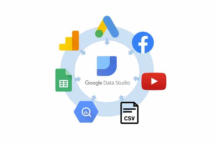
Source : Moca Interactive
This information can then be visualized directly on your Google Data Studio dashboard in the form of curves, diagrams, tables… so you can monitor changes in real time.
It’s the ideal kind of service for professionals to create interactive reports with informative, easy-to-interpret dashboards.
It’s worth noting that the Google Data Studio program was first launched in beta during 2016 before making all its features available to the general public in 2018 in the final version.
In autumn 2022, Google decided to merge two of its tools – Google Data Studio and Looker Studio, a tool for data scientists.
Today, not only can you create eye-catching, visual reports with Google Data Studio, but you can also share them with collaborators, team members or customers.
They can either access the reports as simple readers, or make modifications according to the access rights you’ve given them.
What’s more, the tool provides a list of ready-to-use reports that you can quickly copy and contextualize by adding your own data.
Whether it’s the reports themselves, the graphs or even the performance charts you’ve chosen, Google Data Studio offers you almost infinite possibilities for customizing them to your taste. And best of all, it’s easy to use.
1.2 Who is Google Data Studio for?
At first glance, you might think that Google Data Studio is an excellent reporting tool reserved exclusively for digital marketers, but the tool is accessible to a much wider community.
It’s a solution for anyone already using specialized digital platforms or even simple spreadsheets to produce reports.
These may include financiers, service providers, retailers… in short, anyone who, in the course of their business, uses tools to present data in general.

And even within a given corporation, Google Data Studio can be used at various levels.
Whether you’re a freelancer, a consultant, an analyst or part of a company’s staff, if you feel the need to centralize data to better track it and share it with others, you can use Google Data Studio.
But if you’re already comfortable working with traditional reporting tools such as spreadsheets, then you’re probably thinking that the tool isn’t really for you.
Well, Google Data Studio is full of advantages that could help you optimize your work.
1.3. The benefits of using Google Data Studio
Whatever tools you’re already using to create your reports, here are 6 benefits you’ll enjoy by adopting Google Data Studio :
1.3.1. Synchronize with different data sources
As explained above, Google Data Studio is a tool for centralizing information from multiple sources.
To make things easier for its users, Google anticipates and offers by default data sources frequently used in professional environments, which it commonly refers to as “native connectors”.
By default, there are 18 native connectors from which you can import data:
- Google Ads
- Google Sheets
- BigQuery
- Google Analytics
- Google Ad Manager 360
- File Upload
- PostgreSQL
- TV Attribution
- Cloud SQL for MySQL
- Cloud Spanner
- Extract Data
- Campaign Manager
- MySQL
- Search Ads 360
- Search Console
- YouTube Analytics
- Display & Video 360
- Google Cloud Storage
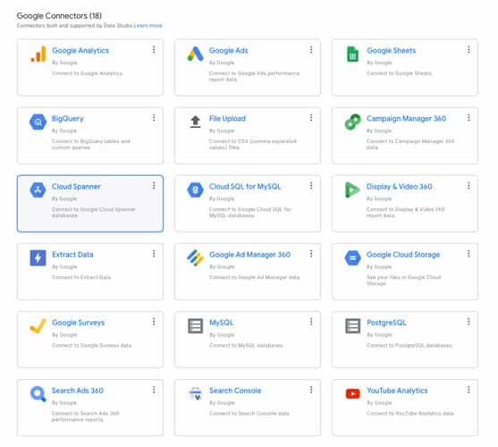
Source: PorterMetrics
But that’s not all: Google goes even further, offering the possibility of importing information from 352 other external data sources known as “partner connectors”.
These partner connectors include :
- Adobe Analytics ;
- LinkedIn Ads ;
- Facebook Ads ;
- Bing Ads ;
- Ahrefs ;
- And many more.
The idea is to really take the hassle out of consulting each of your accounts to analyze the data separately.
Now you can take a quick look at your Google Analytics traffic, check your Facebook Ads conversions and view the progress of your ActiveCampaign account all in the same window.
Simply go to your Google Data studio dashboard to instantly view all these metrics from sources you’ve chosen yourself.
And speaking of dashboards, what makes the Google Data Studio dashboard so special?
1.3.2. A highly malleable dashboard you can easily customize
Not only does Google Data Studio let you choose the data you find most useful to build your dashboard, but you can also customize its design and bring it back to your liking very easily to facilitate visualizations.
And there’s no shortage of great features at your disposal to create attractive reports and bring your business meeting presentations to life.
There’s literally no limit to the changes you can make to your Google Data Studio dashboard, like this Google Search Console display that’s become almost unrecognizable:
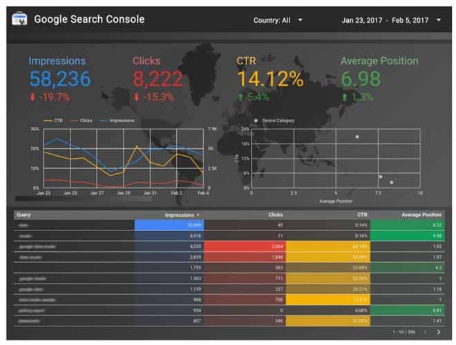
Source : Internetrix
Here are some interesting modifications you can make to your Google Data Studio dashboard:
- Match the colors of your reports to those of your brand;
- Change the style of your texts;
- Choose chart types to customize your data display;
- Customize your reports with the option to print, share by e-mail or save as a PDF ;
- And much more.
1.3.3. A team-building tool
One of the things that makes Google Data Studio so popular is its ability to bring several people together around the same document for more collaborative working.
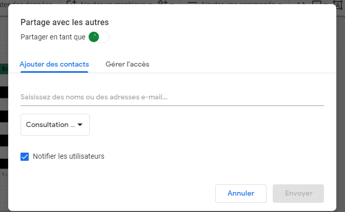
You can add people to your reports and define specific access rights for each of them. Each invited person can then participate in the elaboration of the report according to the permissions assigned to them.
Unlike Google Analytics, where you can sometimes feel inundated by a flood of data, Google Data Studio is designed to be less cumbersome.
And to that end, the tool gives you the option of selecting the information that really interests you, so you can find your way around and work more easily.
But if you don’t want other people to make changes to the appearance or content of your reports, you can simply finish your report on your own and save it to your dashboard.
Then, as explained above, you can share this saved version of the report with the people of your choice.
1.3.4. Track your data precisely and in real time
Each time you connect to your Google Data Studio space, all the data you have access to is automatically updated. This is very practical and saves you precious time.
You can even take advantage of the tool’s spontaneity to produce reports as regularly as possible, without any great difficulty.
What’s more, several filters are available to refine analysis reports and access more precise data.
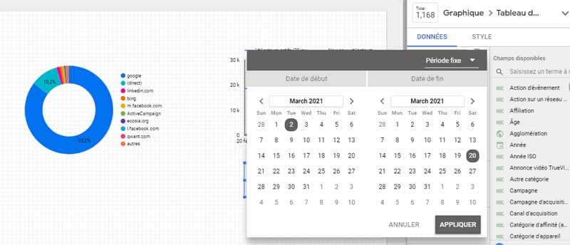
For example, the tool lets you filter analysis reports by a given time range, or by a particular user type, and many other filters besides.
1.3.5. A well-organized data display
If you’re a frequent Google Analytics user, you probably remember those times when the tool displays so many rows that they have to be compressed to fit on the same page.

It has to be said that, even though we’re talking about all-important data, in terms of display, it’s a bit difficult to read results broken down into such small lines.
The advantage of Google Data Studio is that these reading difficulties can be avoided, as you can merge cells from certain data points on your pages for easier reading.
You can also control the display of your data by injecting formulas, rather like in Excel, and eliminate certain unnecessary styles such as capital letters.
1.3.6. A free service
In its early days, Google Data Studio wasn’t exactly free. The tool just offered 5 reports to generate free of charge.
Today, however, the tool is entirely free, with the ability to generate as many reports as you like, and no limit on the number of users.
If you’d previously given up on the tool because of the 5 reports offered, you now have no excuse not to start using Google Data Studio again.
And for those of you who have never used Google Data Studio before, why deprive yourself of such a practical tool, and a free one at that?
Even if you’re already comfortable with your current reporting tool, there’s nothing to lose by giving this one a try. Give Google Data Studio a try, and you’ll hear all about it.
Chapter 2: A few basics and 7 steps to creating a report with Google Data Studio
In this chapter, we’re going to take a look at the basics of Google Data Studio and, above all, the different steps involved in creating a report.
2.1. A few basics to get you started with Google Data Studio
Let’s face it, there are a few essential basics you need to familiarize yourself with if you don’t want to miss out on your first Google Data Studio report.
These include :
- Planning the dashboard;
- Choosing a report template;
- Connecting data sources of your choice;
- Select metrics deemed important for report creation;
- Share the report with other users, if possible.
2.1.1. Planning your dashboard
Before you start planning your dashboard on Google Data Studio, it’s important to think about these two points:
- What kind of data do you want to display? Is it sales data? Performance data from a blog? Or more general site metrics? In any case, it’s important to have an idea of the story you’re trying to tell.
- Who will be able to read your dashboard? It’s also important to think about your audience and, above all, how things need to be organized to be useful to them.
Even if you’re a first-timer and don’t know how to structure a report on Google Data Studio, it would be easier for you to get away with it if you already have an idea of what data to display and what your audience profile is.
We agree that if you need to produce a report for an e-commerce site, for example, it will essentially be about presenting the store’s sales performance. These include:
- Sales figures;
- Lists of best-in-class products;
- Different points of sale;
- Etc.
The metrics and graphs useful in this context will be quite different from those used to create a report for a blog, for example. Typically, a report for a blog brings together data and graphs that reflect visitor engagement, such as:
- Most viewed pages ;
- Conversion rate;
- Calls to action;
- Traffic sources;
- Etc.
As you can see, these are two different stories, each needing different data and presentations to be told.
What’s more, keeping your audience constantly in mind will help you improve your dashboard.
Do you have a line manager to whom you report? Does he or she need so much in-depth data? Or are small, clear and important indicators already enough for him or her to measure the performance of your work?
Also, if you’ve launched a campaign, are these reports the only means your team has of assessing the success of your strategies?
The answers to all these questions will help you to make better choices when planning your Google Data Studio dashboard.
And before wrapping up this first part, I’d like to give you a quick overview of what the Google Data Studio interface looks like.
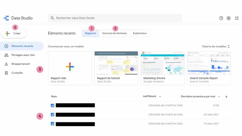
- Reports : You can start creating a report from this tab. This is also where you’ll find all your previous reports, including Google’s ready-to-use templates.
- Data Sources: This tab brings together all the data sources you can use to import your existing information from other reporting tools into Google Data Studio. The tab also allows you to add new data sources other than those proposed by default by Google. You can also connect data sources directly during report creation.
- Templates : This is the list of templates offered by Google, with a template you can use if you don’t want to start from scratch.
- Your reports: Find all your previously created reports here. To help you find your way around, be sure to name your reports appropriately.
- Create : This is a button with a ” ” symbol that lets you create a new dashboard in Google Data Studio.
Now we can continue with the second basic concept.
2.1.2. Choosing a report template
The first thing to learn is how to choose a template for your report.
As mentioned in the advantages of the tool, you have a wide variety of predefined templates to choose from and customize.
It’s important to remember that whatever template you choose, you have the same editing possibilities, so it’s up to you to choose the one you really like.
And what makes all this even more interesting is that you can add multiple pages to your reports.

It’s true that I’ve been telling you that with Google Data Studio, everything happens on a single page.
Well, the platform also gives you the option of adding other pages to your report if required. The idea is to satisfy even those who find that their entire marketing story can’t fit neatly onto a single page.
Personally, I start with a blank report, which gives me free rein to organize my data history as I see fit.
And if you’re a service provider, each of your customers probably has different needs, and it would be nice to create original reports tailored to each customer.
To make things easier for you, you can create your own templates based on elements that are common to all your customers.
This way, depending on specific needs, you can quickly customize these templates for something truly unique.
2.1.3. Connect data sources of your choice
This is an important step in successful report creation: manually select a few data sources that are already available, and the tool takes care of synchronizing them with your Google Data Studio dashboard.
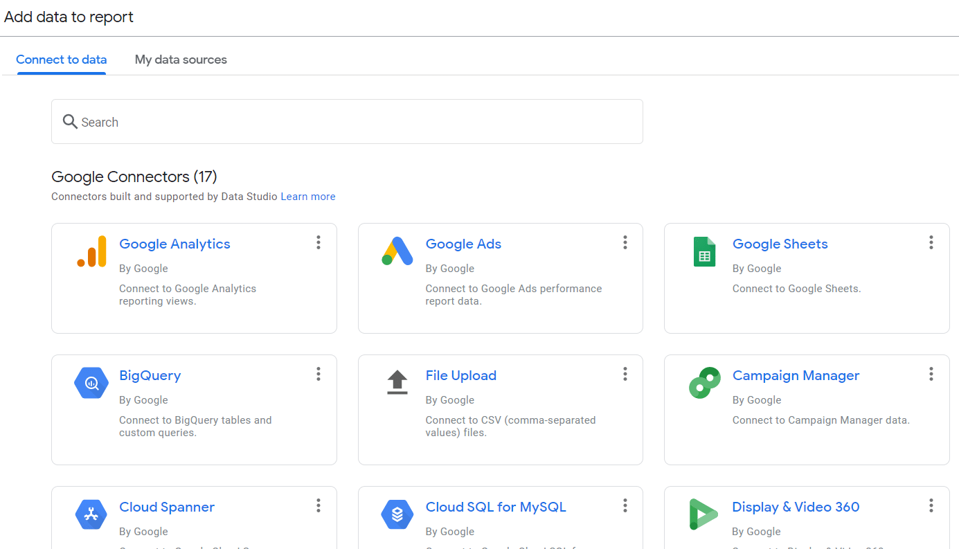
This can be done either at the very start of a new report, or a little later by clicking on the “Add data” button in the toolbar.

You already know that you have a list of native connectors that are offered by default by Google Data Studio, but also partner connectors importing your data mainly from CRMs or your social network accounts.
However, the problem with these third-party connectors is that, since they are supplements :
- They can sometimes slow down reports;
- The data may sometimes be out of date, so you may need to check certain metrics yourself and update them as you go along.
In addition, some users prefer to create a Google Sheets file with all their company data and connect it to Google Data Studio as a data source.
The idea is to avoid having to pay fees or request API services, because using partner data sources on Google Data Studio is often subject to additional charges:
- A single partner connector such as Facebook, Adobe Analytics or AdRoll, for example, can be worth between $10 and $40 a month. This payment entitles you to a direct API connection to access the source’s data on multiple dashboards.
- Partner connectors are often not sold individually, i.e. you buy them in batches. A batch of 30 to 200 connectors, for example, can be sold for between $80 and $300 a month.
- You’ll find a list of all partner connectors on the official Google Data Studio page.
If, in spite of the available partner connectors, you’d still like to have your own connector, adapted to the realities of your niche, you can always create your own, or call on the services of an expert.
And for those who don’t want to shell out the money for these extra costs, you can try the Google Sheets trick.
If your company is already accustomed to using products from the Google suite, you shouldn’t have any trouble creating a complete dashboard on Google Sheets, tailored to your reporting needs.
And since Google Sheets is a native connector and not a partner, you’ll be able to connect to Google Data Studio free of charge, without having to pay any additional fees.
2.1.3. Select the metrics you need to create your report
Who better to decide what data really matters to you than you? That’s why Google Data Studio gives you the freedom to choose the metrics that are most important to you.
And let’s face it, customers can sometimes feel inundated when you present them with a report packed with metrics here and there.
The beauty of Google Data Studio is that, although its reports are almost infinitely customizable, you don’t have to show all the statistics on offer.
Obviously, not all customers will be interested in purely technical metrics.
To help you out, I’d advise you not to forget the data most sought-after by customers, such as those relating to expenses incurred and profits recorded.
In addition, it may be worth importing data that will give you an idea of the overall awareness of your company or those of your customers, including click statistics such as :
- CTR ;
- Impressions ;
- Number of clicks;
- And many more.
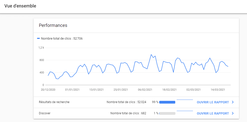
By focusing on this basic, but important, data to evaluate the success of the strategies used, you show the customer that you’ve taken a particular interest in their case, and that you’re listening to their needs to help them achieve their objectives.
2.1.4. Share the report with other users if necessary
When you’re about to share reports with colleagues, customers or stakeholders, it’s important to understand certain parameters that define sharing options:
- Invite by e-mail: This type of sharing works if the invited user has a Google account linked to the e-mail. Once this is done, the user can be added to the report as a simple “reader” or an “editor”.
- All added users, whether editors or readers, have a link to access the report, in much the same way as Google Docs works.
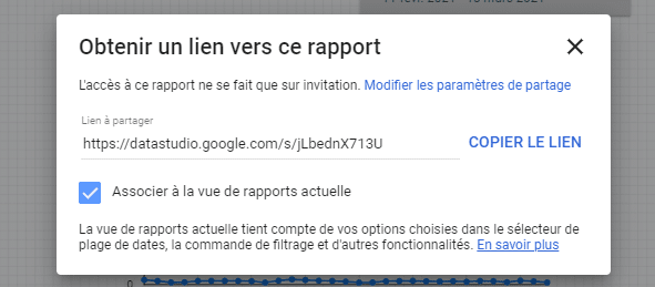
It has to be said that all these options were available from the beta version of Google Data Studio, but after the final version, new sharing functionalities were added, essentially to limit the scope of action to those added, such as :
- Not allowing editors to modify report access and invite new people;
- Or prevent the report from being downloaded or printed. Simply prevent the possibility of making a copy.
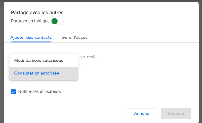
All these settings give you control over the parameters and protect your report data to some extent.
Now that the groundwork has been laid, and you’ve probably familiarized yourself with the Google Data Studio interface, we can move on to the actual creation of your first dashboard.
2.2 How do you create your first Google Data Studio dashboard?
Throughout this tutorial, we’ll be talking about creating a simple dashboard based on data from my Twaino site. To do this, we’ll be using two native Google Data Studio connectors:
- Google Analytics ;
- And Google Search Console.
Why did we choose these two data sources? Well, my Twaino site is essentially a blog, and as I had to mention a little earlier, a dashboard for a blog needs to understand visitor engagement.
In my field, Google Analytics and Google Search Console are unquestionably among the most reliable tools for assessing blog performance.
And no matter which data sources you use to create a Google Data Studio report, the procedure remains pretty much the same.
So, whether you don’t have a blog or your business is in a different niche from mine, this tutorial will be just as useful to you.
But enough of that, let’s get down to step one:
2.2.1. Step 1: Connect to Google Data Studio and generate a blank report
In this first step, we’ll go to the tool’s official website and log in with our Google Analytics and Google Search Console accounts.
To do this
- Go to Google Data Studio;
- Click on “Use it for free”:

- Enter the Gmail account corresponding to your Analytics and Search Console accounts:
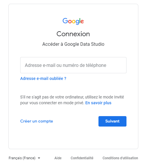
Once you’ve successfully logged in, you can start creating your report.
In this tutorial, we’re going to use a blank report template:
- Click on the ” ” symbol:
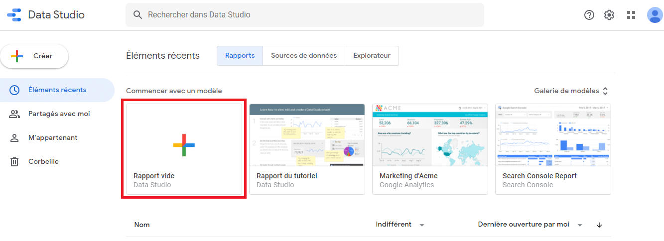
- Then enter your country and company name;
- Check the box for notices and conditions of use, then click on “Continue”;
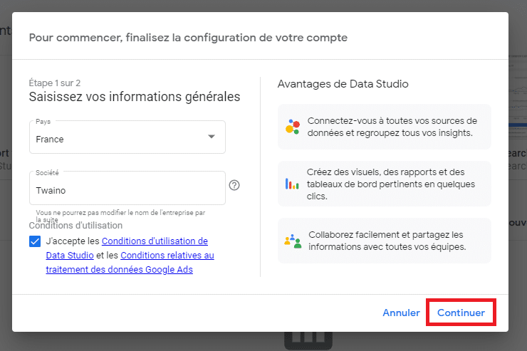
The configuration wizard will show you a second panel to finalize the configuration.
- Check the “Yes” or “No” boxes to answer the questions, then click on “Continue”:
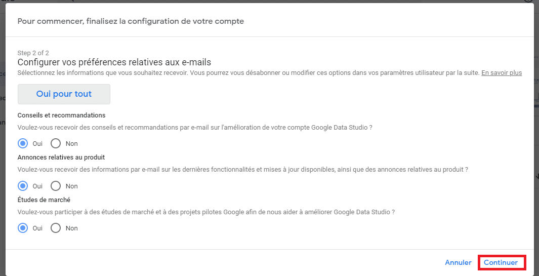
After configuration, the tool will redirect you to the home page, where you’ll have to start again, i.e. :
- Click on the ” ” symbol again to generate an empty report:

2.2.2. Step 2: Add a first data source
The tool will then offer you the option of adding data sources. As agreed for our dashboard, we’ll settle for the Google Analytics and Google Search Console source accounts.
- Look for the Google Analytics connector, then click on it:
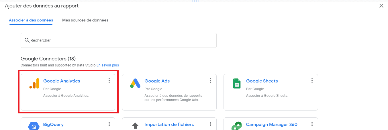
Next, you’ll need to authorize the connection to your Google Analytics account.
To do this
- Click on the “Authorize” button in the pop-up window:
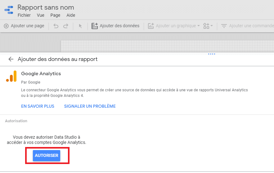
Once access has been authorized, we can now choose the Google Analytics account, property and view.
To do this
- Choose the Google Analytics account you wish to use, then the corresponding Property and View;
- Then click on the “Add” and “Add to report” buttons to finalize the addition of the data source to the report:
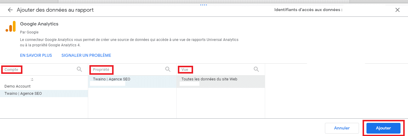
You’ve now added your first data source.
And as you can see, my Google Analytics data has now been imported:
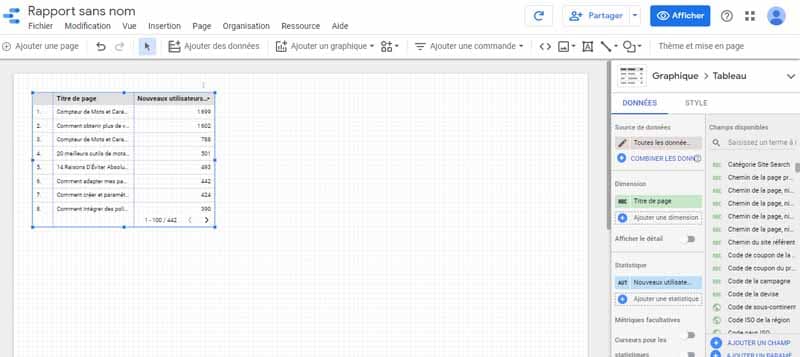
We can now move on to adding the second data source, but first there’s an important detail to remember.
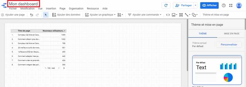
I’d advise you to rename your dashboard at the same time, at the risk of not recognizing it afterwards. The fact is, Google Data Studio works as an automatic backup.
So without even defining a name, Google suggests a default name for your dashboard. This name is not explicit enough and may be difficult to distinguish later.
To rename your report :
- Just click on the name to bring up the cursor;
- Delete the old automatically generated name and enter a new one;
- Click outside the input field to save the new name.
For our example, we won’t be bothering too much with a complicated name – “My dashboard” will do:
2.2.3. Step 3: Add the second data source
To add a second data source, the procedure won’t be the same as for the first, since at least one source has already been added, and the appearance of the screen has also changed.
To add this new data source :
- Click on the “Add data” button in the toolbar:

Or :
- Unroll the “Resources” module;
- Click on the “Manage new data sources” option:

You’ll be taken to a page where you can see our first added source.
- Click on the “Add a data source” button to add a new one:

Whichever procedure you choose, you’ll be taken to the same page for adding connectors. But this time :
- Find the Google Search Console connector, then click to select it:
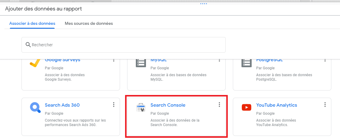
Just as when adding the Google Analytics connector,
- Also click on the “Allow” button to authorize the addition of the Google Search Console connector:
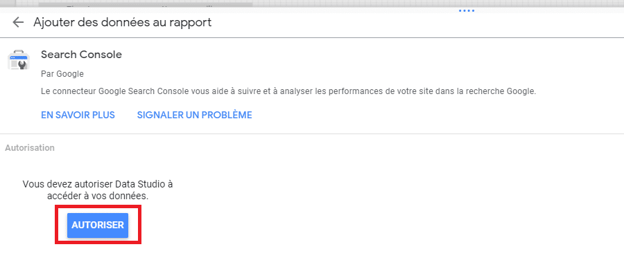
- Then select your site and a table. In this example, we’ll choose the “Site-related printout” option as the table;
- Click on the “Add” and “Add to report” buttons to finalize the addition:*
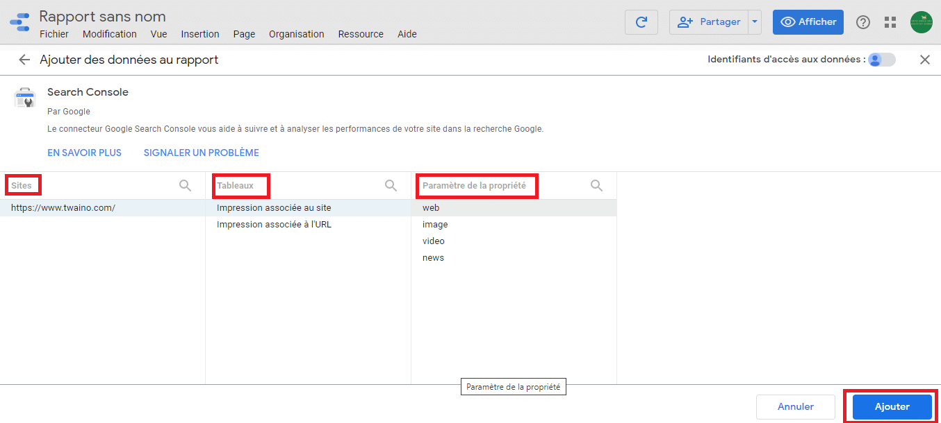
As you can see, the number of sources is now 2:

2.2.4. Step 4: Adding dashboard elements
Now that we’ve chosen and added the data sources we’re interested in, we can start creating our dashboard.
For this purpose, Google Data Studio provides a graphic palette with several elements that we can use to enhance our dashboard.
These include :
- Line charts ;
- Pie charts ;
- Tables ;
- Geographical maps ;
- Scorecards;
- And much more.
2.2.4.1. Time series line graphs
The first element we’re going to insert into your dashboard is a time series line graph. The idea is to show Twaino site traffic over time in the report.
To do this, we’ll :
- Click on the “Insert” button:

- Then select the “Time series graph” option:

Automatically, the element you’ve chosen will be associated with your cursor.
- Click on an empty space in the report to add it, or drag and drop it:
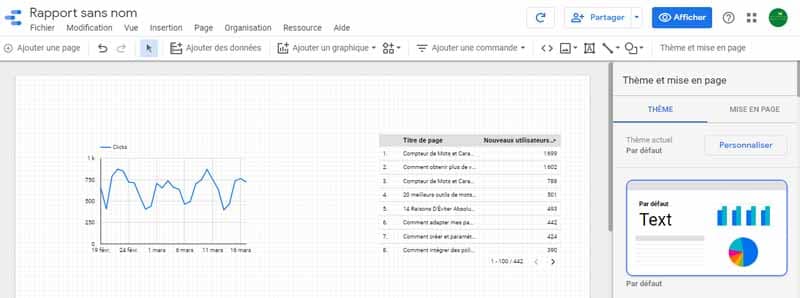
Once the graph has been added, we’ll need to select the right data source so that the representative curve matches the data on our site.
Since the last data source we added was Google Search Console, our time graph loaded Search Console data by default.
But what we want to show through this graph is the number of visitors registered on the site, and this metric is provided by Google Analytics.
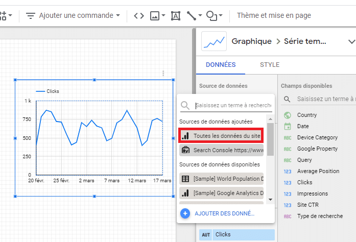
To change the Search Console data shown on the graph into Google Analytics data, we’ll :
- Click once on the graph in question to select it.
The idea is to make this panel appear on our right:
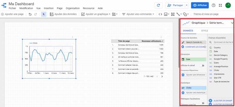
- Next, pull down the list of data sources:
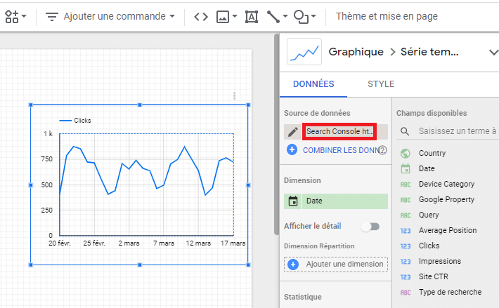
- And click on the Google Analytics source:
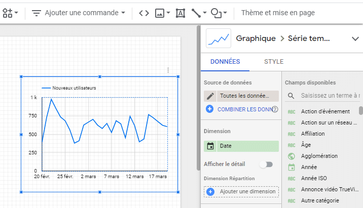
You’ll notice that the curve has changed:
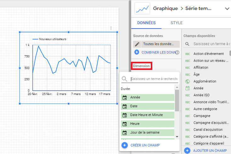
To refine this graph, you can :
- Unroll the “Dimension” field and choose the filter you require:
What’s more, what’s interesting about the linear time series graph is that you can add several metrics, differentiated by sets of colors.
Here, for example, we’ll choose the metrics “Active users” and “New users”.
To do this,
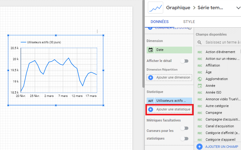
- Scroll down the “Statistics” field and select the “Active users” metric:
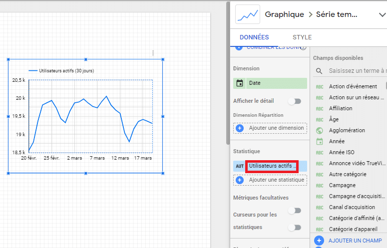
Indeed, we can see that on working days, the number of active users logging on to the Twaino.com site is close to 20,000.
- Next, click on “Add a statistic” to complete our second metric;
This time,
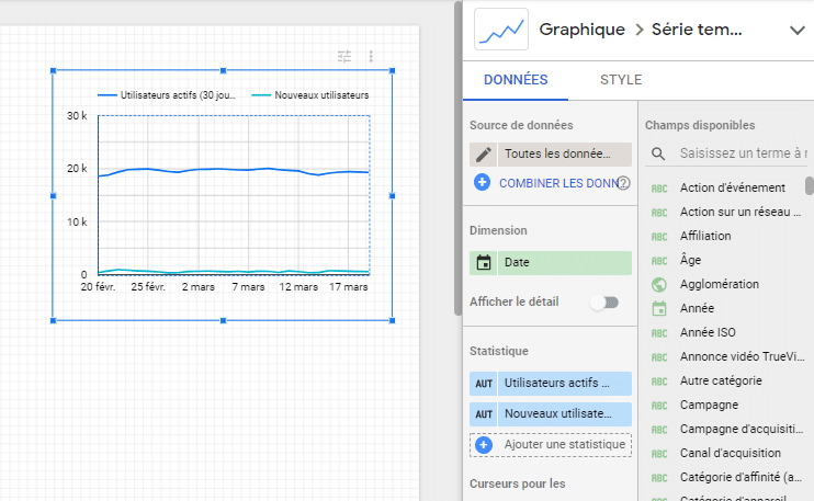
- We’ll choose the “New users” metric:
As you can see, we now have two different-colored curves on our graph.
2.2.4.2. Camemberts
We continue the creation of our dashboard, this time creating a pie chart to display Twaino’s different traffic sources.
To do this
- Click on “Insert” and then on the “Pie chart” option;
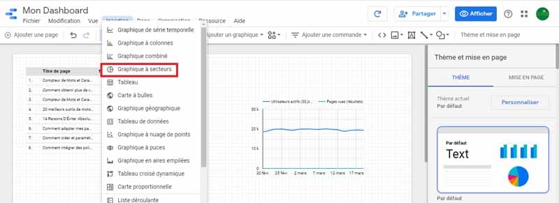
- Click on an empty space in the report to add the chart, or drag and drop:
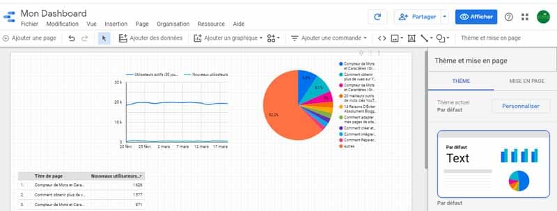
Just as we saw when we added the line chart, the pie chart also extracts data by default.
But we’re going to change them again and show the sources that generate traffic for the Twaino site.
To do this, we’ll :
- Replace the value in the “Dimension” field with “Source” and the value in the “Statistics” field with “New users”.
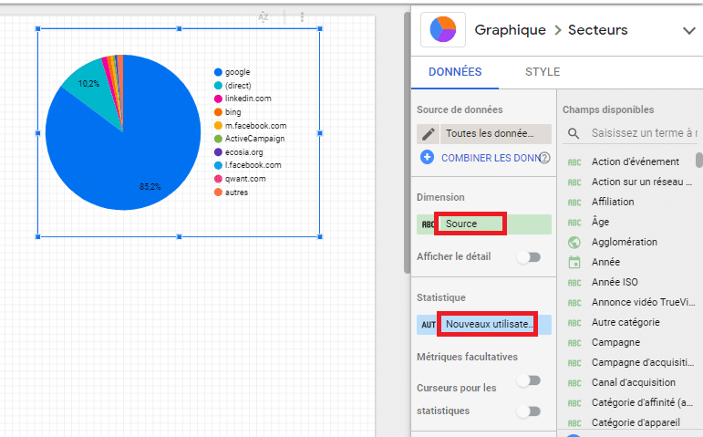
On this pie chart, we can clearly see that Google accounts for the largest share, with 85.2%.
For the sake of interpretation, this simply means that almost all traffic to the Twaino site comes from Google search results – organic traffic, in other words.
Then comes direct traffic, traffic from social networks and a little from emailing, but no advertising.
As an SEO agency, I feel it’s only right not to pay for ads to improve my SEO, to set an example that a 100% SEO approach can indeed achieve great performance on one’s site.
Returning to our Google Data Studio dashboard, you can have fun changing the style of each element you drag and drop.
To do this :
- Simply switch from the “Data” tab to “Styles”:
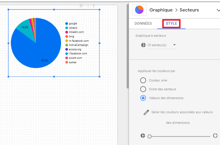
To illustrate this, we’re going to change the style of our pie chart by cutting a “hole” in the middle.
To do this, simply adjust the hole using the scale at the bottom:
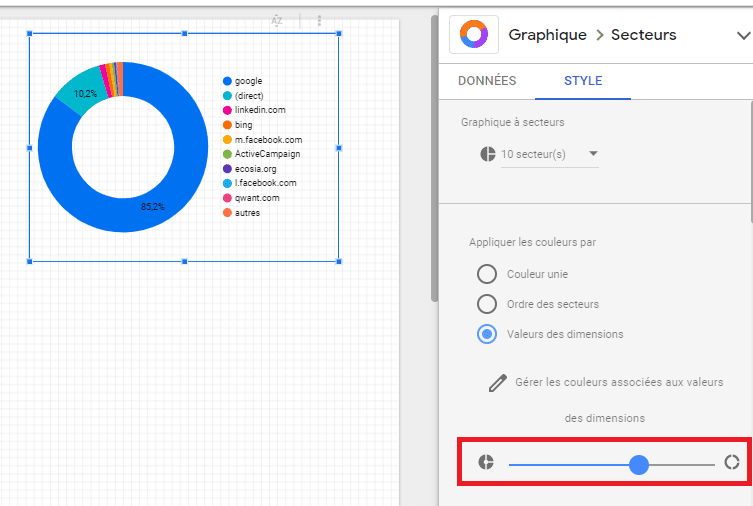
You can go even further by changing the colors, text style, labels and much more.
2.2.4.3. Data tables
Line graphs are an interesting element in report creation, but they don’t give you the exact value of the metrics.
To overcome this problem, we’re going to add a new element to our graph, a data table, right at the bottom of the line graph to help our audience get a better understanding of the report.
To do this, remember the procedure:
- Click on the “Insert” button and drag and drop the “Data table” element just below the line graph:
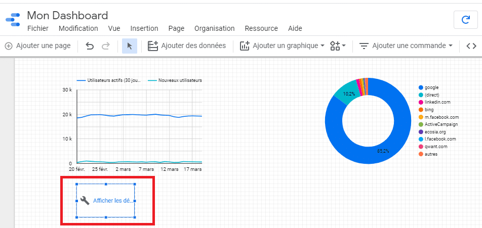
But this time, we can say that the new element we dropped loaded an absent Google Analytics metric by default, it would probably be metrics related to advertising campaigns.
And as I said earlier, Twaino doesn’t use any advertising strategy to generate traffic.
As for our data table, we’re going to update it with data from the “Users” metric.
To do this, we’ll :
- Click once on the data table to select it;
- Scroll down to the “Statistics” field and choose the “Users” option:
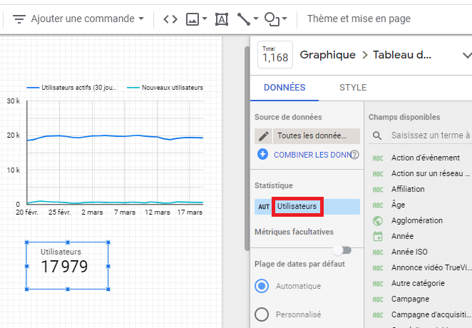
As you can see, our table has indeed been updated. What’s more, your stakeholders may want to compare the metrics recorded on today’s date with a later date to get an idea of the progress achieved.
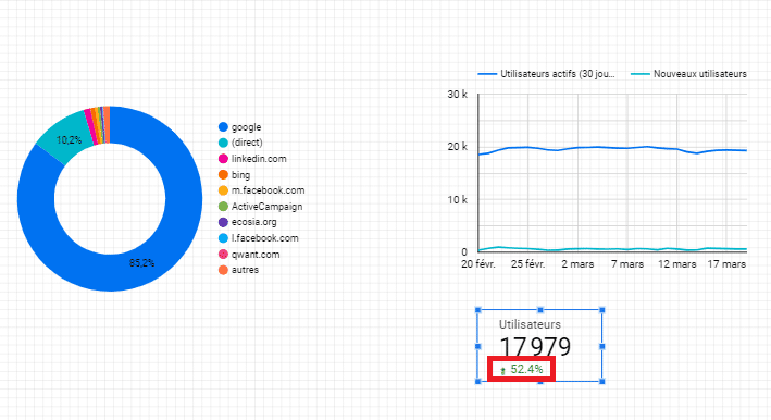
And this is where the data table can be of interest, as it displays the data for a metric over a given date interval, with a percentage of progress or regression displayed at the bottom.
In our case, we’ll try to compare the number of visitors obtained on Twaino over a 30-day range.
To do this
- Unroll the “Comparison period” field ;*
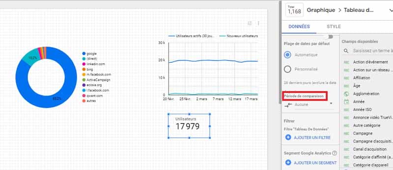
- Define a range date and click on the “Apply” button;

You’ll notice that our data table is now enhanced by a small indicator which turns green to indicate progress, and red to indicate regression during the defined period.
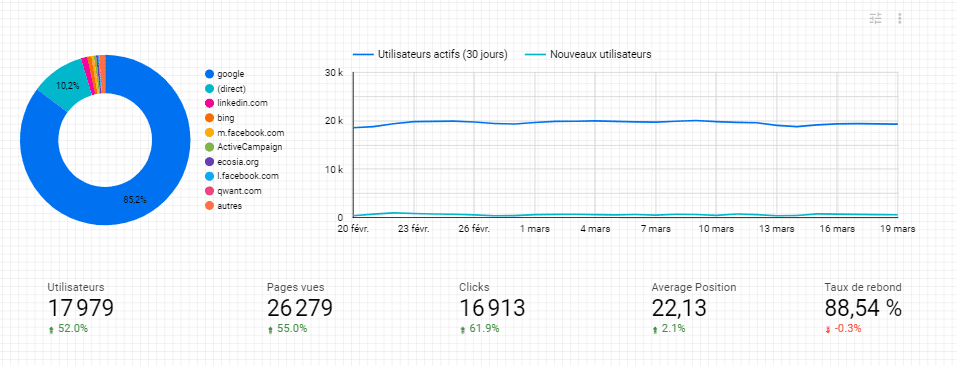
Having several of these dashboards with different metrics on your report would make it even more interesting, and that’s what we’re going to try to do with our example.
To do this, we’ll complete the following metrics:
- Page views ;
- Clicks ;
- Average position ;
- Bounce rate;
Referring to the method we used to add and update the first table of data, you can repeat it to add other tables.
To speed things up, you can copy and paste the first table several times and just modify the data.
We’re now going to add one last element to our dashboard, to make it a little more complete.
2.2.4.4. Tables
Tables are an interesting element when it comes to adding lists of data to your report. What’s more, a table can be spread over several pages, with a pagination system that makes it easier to read the data from one page to the next.
For our example, we’ll add a table to occupy about two-thirds of the large space below our first charts.
Also, as you may have noticed, right at the start of our report creation, Google Data Studio dropped in a default table to start customizing our report.

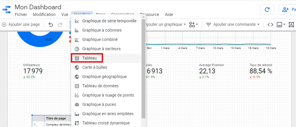
Well, now’s the time to use that table, but if you didn’t get it on your screen, that’s okay, here’s the procedure for adding it:
- Click on the “Insert” button and drag and drop to add it to the report;
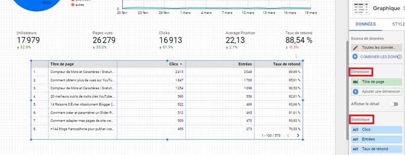
Now we’d like to organize our table so that we have :
- Pages ;
- The number of clicks obtained on each page;
- Entries;
- And the bounce rate.
To do this:
- Click on the table to select it;
- Then add the value “Page title” in the “Dimension” field;
- And in chronological order, add the values “Clicks”, “Entries” and “Bounce rate”.
Once this data has been added, your table should update automatically.
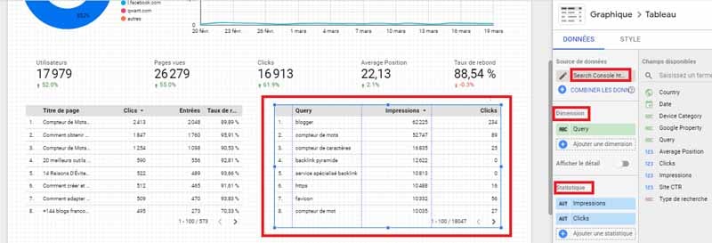
We could stop adding elements here, but why not complete a final table that draws queries from Search Console.
To do this, we’ll simply :
- Drag and drop a new table next to the previous one;
- Define Google Search Console as the data source;
- Choose the value “Query” for the “Dimension” field;
- And choose “Impressions” and “clicks” as values for the “Statistics” field:
Our report is now anything but empty. We can now move on to the next step.
2.5. Step 5: Add a date range selector
All the elements we’ve inserted so far on our dashboard are set by default to “Auto” as the date. Technically, this would mean that most of the data making up our dashboard has been extracted over the last 28 days.
But what if you want to display values from a date range other than those 28 days?
Well, Google has thought of this too, and offers the “Date Range Selector” element, which you can add in exactly the same way as all the other elements we’ve added so far:
- Click on “Insert” and then on “Date range selector”;
- Drag and drop onto your dashboard;
Once the date range filter has been added,
- Click on it to switch to display mode and define a date range:
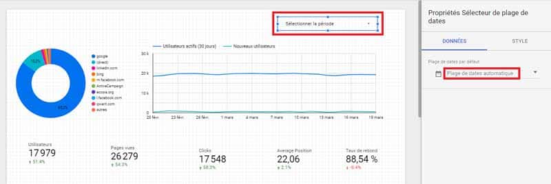
- Apply the defined date range by clicking on the “Apply” button:
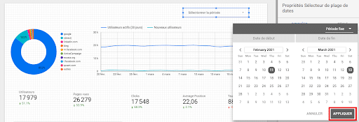
As you can see, the data stored in the various added elements has been effectively updated:
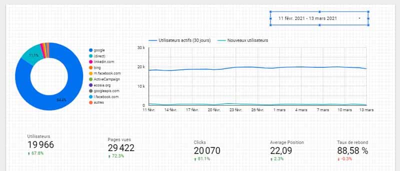
Clearly, for our current report, we’ve defined a date range that includes 30 days, so the comparison will be made for the 30 days before this range.
Google also gives you the option of changing the appearance of the date selector by switching to the “Style” tab:

Well, our table is now more or less complete with the important features for presenting my site’s performance.
However, I find it less attractive for my taste, so we’re going to take the last two steps specifically to improve its look and feel.
2.6. Step 6: Insert text headers and images
With a little hindsight, you’ll probably realize that our elements don’t have titles. This can be a little confusing for a neophyte trying to read our dashboard.
What’s more, perhaps you’d like to add your brand’s logo to make it more “original”, or a particular image to get a message across to your audience. That’s why I thought it would be useful to show you how it all works.
2.6.1. Text header
Adding a header in Google Data Studio is pretty straightforward:
- Click on the “Insert” button;
- Drag and drop the “Text” element;

- Enter a text to designate the header of an element;
There’s also a “Text properties” section on the right, which you can use to enhance the appearance of your text:

2.6.2. Adding images
As mentioned above, there are several reasons why you may want to add an image to your dashboard. The most common is to brand your company for greater professionalism and visibility.
To add an image to your report
- Click on the “Insert” button;
- Select the “Images” item;
- Drag and drop to a location of your choice on the report;
- Click on the “Select file” button in the “Data” section;
- Browse your computer disk to select the image you wish to add to the report:
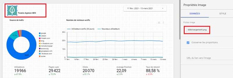
In our example, the image I’ve added is a logo for my agency Twaino. I’ve complemented it with a “Text” element bearing the words “Twaino SEO Agency” to recall the name of my brand.
I have to admit that the image didn’t fit properly on the first try, so I had to resize it several times. You can also resize your images to give them the right size.
Now let’s move on to the last step of this tutorial.
2.7. Step 7: Enhance styling
Google Data Studio gives us the opportunity to do great things with simple styling changes.
2.7.1. Global styles
When you click in the blank on your report, the sidebar to your right will be this one with the title “Theme and update”:
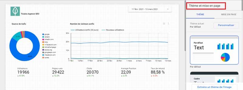
This section lets you control the overall structure and theme of the entire dashboard and all its elements.
For your convenience, Google Data Studio offers a selection of ready-to-use themes that you can quickly apply to your entire dashboard.
And even if you apply a theme, you can always add small adjustments to refine it further.
These are essentially small tweaks available in the “Layout” tab that you can make to the font and color of your texts.
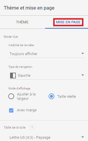
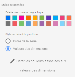
In addition, a graphics palette is available to enhance the appearance of your graphics.
The fact is, Google offers a default color order when you add curves to your charts.
By default, here’s the order in which some colors are sequenced as you complete graphs on your report:
- Blue ;
- Red ; Yellow
- Yellow ; Green
- Green;
- Etc.
Sometimes, these colors don’t fit in with your brand. In these circumstances, it’s important to change these colors to ones that work well with those of your brand.
But when making these changes, don’t forget to use different, legible colors to easily distinguish the graphs in your report.
You can also change the background color of your dashboard, as well as the borders.
Finally, you can also control the size of the canvas to adjust the entire dashboard.
I’d recommend 16:9 if you want to present your report on a wide screen. In any case, you have several tools at your disposal to adapt all the elements of your report to the size of your choice.
To access these tools, click on the “Customize” button:
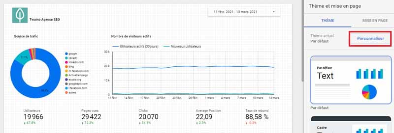
Google Data Studio will then offer you a wide range of tools that you can try out as you see fit:
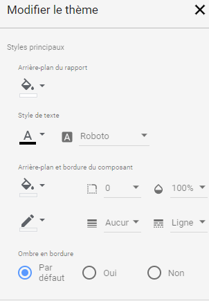
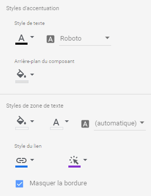
2.7.2. Element styles
While you can change the overall style of your dashboard, you can also adjust the style of each element you add.
By default, each element inherits the global style of the dashboard, and it’s up to you to modify this style on each element if you deem it necessary.
It’s also worth noting that most elements have a few elements specifically dedicated to modifying their style.
We have, for example, dashboards, which give you the option of assigning one color to lines and another to headers.
Or pie charts, which let you control the shape of the legend. In short, each element has its own style, which you can explore and create in your own way.
2.7.3. The makeover
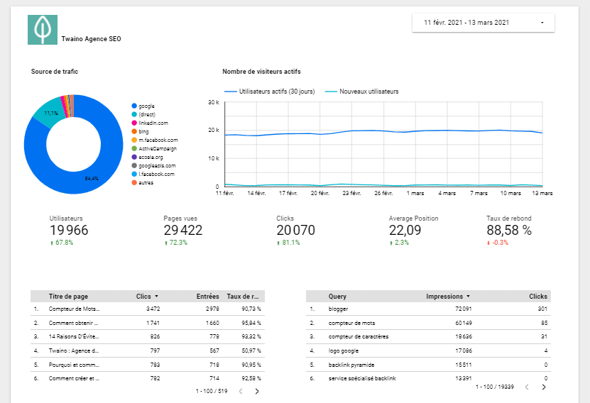
At this stage, we can say that our dashboard includes all the important data we wanted to display to reflect the engagement of our visitors and the performance acquired on the Twaino.com site.
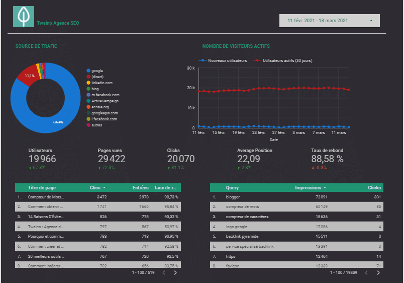
Finally, I feel that our dashboard needs a little sprucing up before it’s really ready for presentation.
Here’s the current version of our report:
But after the makeover, here’s what we’ve got:
2.3. Use a Google Data Studio template to create your reports
You also have the option of creating your reports from predefined templates to go faster.
To do this
- Return to the tool’s home page, then click on “Template Gallery” :

- Choose a template of your choice and click on it;
- The template will load; click on the “Use template” button in the top right-hand corner to use it;
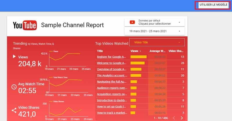
You will then be prompted to select the source(s) you wish to use:
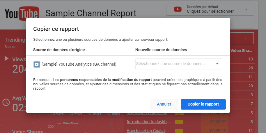
- Once you’ve selected the data source(s), click on the “Copy report” button.
The tool will then generate a copy of the template with your own data that you can modify:
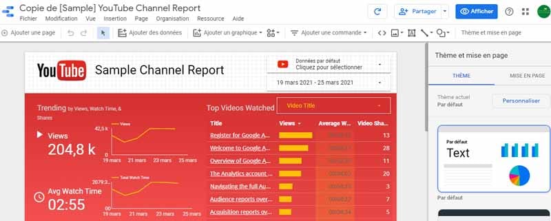
You can refer to the various sections above to customize the chosen template, and don’t forget to rename it.
Conclusion
Our tutorial is coming to an end, and if you’ve managed to complete all the steps presented so far, then you’ve just created your first Google Data Studio report, and I’d like to congratulate you.
With a little practice, it’ll get easier, and you’ll be able to create even more attractive reports than the ones we’ve just created together.
As you’ve seen for yourself, Google Data Studio is a handy tool with some interesting features that I encourage you to explore.
If this tutorial has helped you, please let me know in the comments, or if you’ve encountered difficulties at any point in the process, please let me know in the comments too.
I’ll be happy to help.

