Today, we will see together how to choose the colors of your brand, and consequently the palette of colors that we will find on your website. Let’s go…
Brand colors
Find out how to choose colors for your corporate identity:
Brand colors, anecdotal or important choice?
We all have an opinion on the importance of colors when creating a company. For me, even if it may seem something anecdotal and unimportant, it is an integral part of branding when you want to create a brand image. Indeed, think about it, can you dissociate Coca-Cola from its famous red color? Difficult, isn’t it?
Color / brand association
The objective of branding work is to reinforce the association phenomena. Thus, with a strong and distinctive color, you will be able to make coherent and consistent communication, having customers who directly make the connection with your own brand. A good use of colors associated with a good design will allow your public and your audience to find you more quickly and simply.
Talk about it around you
“Tastes and colors are not debatable. Indeed, we all have an opinion, more or less strong on the subject. Nevertheless, I advise you when choosing your brand color
to exchange as much as possible, in order to have their feelings on the subject. Of course, it is not about finding an existential answer, but simply to collect opinions and feelings. For my part, for the colors, I have like everyone else an opinion. But I am lucky with my partner Mariana, to have a partner with a good acuity in the colors than me. So, I let Mariana “carte blanche” on the choice of colors, simply indicating that a green should be my basic color in my communication.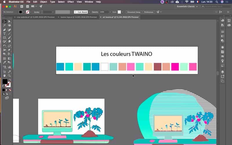
The colors fit perfectly into your branding strategy
After a lot of discussion about the communication aspects I wanted to put on my website, a positioning that I want to be very natural, very organic, with a “healthy” SEO, for a website and for a business. Our discussions had the opportunity to achieve the choice of colors for my agency SEO Twaino
.Choose a palette and stick to it…
I really advise you, when you make your communication to take time to think about your colors. You may feel like you’re “wasting time” at first, but if you do it right, “you’ll save a lot of time later”. The goal is to come up with a color palette that may evolve, but for which you have the basics. Try to be clear at the beginning in order to avoid a mixture of all the colors which can materialize by lack of coherence for your identity and your visuals.
Decide on your colors before you start creating your website
When you are going to create your website, you will go through moments of natural doubts. Therefore, I advise you to save yourself from further doubt with your brand colors that will be present throughout your website. Choosing your colors beforehand will allow you to start the creation of your website in a much more serene way.
For color inspiration: Pinterest
As, I had the opportunity to present it to you in several other Blog posts, I really like to use Pinterest during the inspiration phase. To do this, feel free to first create a “Tableau” – “Board” with all the ideas that seem relevant to your business creation. Mariana and I had already had the opportunity to find together graphic elements that we thought interesting to exploit in the optics of communication.
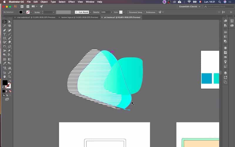
Check the colors you have chosen with your draft designs
Between a color palette, and the actual application of that color on a drawing, there can be a difference. Therefore, I suggest that you draw rough sketches, and then apply your colors to see if they work for you. I’m going to show you a little bit of how I did it, in the creation of my first visual content. Of course, I’m still at the very beginning, so you’ll have to be “indulgent”, regarding these first results.
My first Twaino visuals
For my first visual, I actually started from a computer drawing I made.
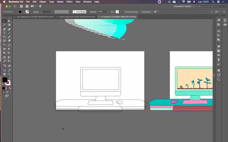
Then, I integrated in this drawing this idea of growth with at the beginning a small seed, which becomes a plant more and more big. This plant becomes so big that it goes beyond the computer and therefore it takes life in the “real” world. For this first visual, I simply applied the colors that Mariana gave me to obtain this result.
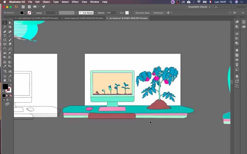
So, I think we’re going to have illustrations and visuals that look something like this. I’ve had the opportunity to do the same work for other illustrations.
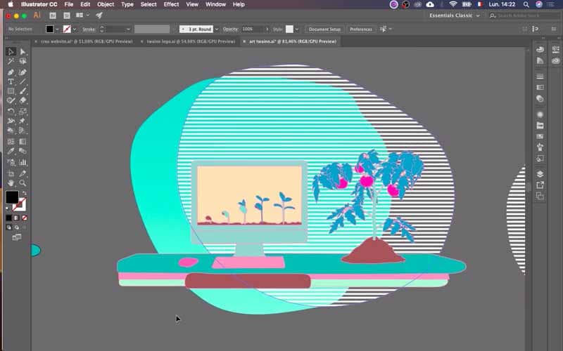
These are, I think, elements that I will probably add to the home page, along with other drawings that I will have the opportunity to do as well. I didn’t do a breakdown of the drawings for all of them, starting from the draft to the final version, but now I think you have the general idea. You see, at the beginning when I drew these first images, I didn’t necessarily have in mind this communication around the plants or around the organic, and so it would need to add some graphic elements, in relation to that.
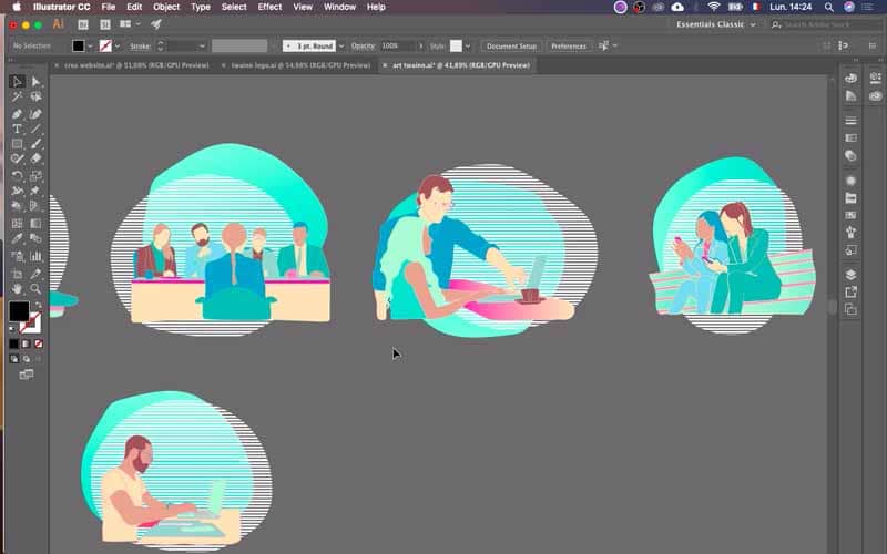
So, these are, let’s say, my first drafts that I was able to do. So with men, women, with computers, cell phones. So, these are images that are a bit generic, and go everywhere. I don’t know if I’m going to use them directly on the pages of my website, or if I’m going to integrate them into my blog posts.

Conclusion
When you decide to start your business, take a moment to decide on the colors you want to use to represent your brand. Then, I recommend that you quickly create your first drafts. For me, I created and drew my first illustrations very quickly, and thanks to Mariana’s talent for color, we were able to get consistent images, with personality, and overall, you can see that something common comes through. It’s all about choosing the right color palette at the beginning, in order to assert your branding. See you soon for the rest…


