Today, we will see together the choice of the logo! For this, I show you concretely how I ended up on my own logo for my SEO agency Twaino. Let’s go…
The choice of the logo, an important moment
In this video, I show you how to choose your logo, by showing you the different steps that allowed me to create my own logo for my company:
Find logo ideas on Pinterest
When choosing the logo, I advise you to take the time to go on Pinterest, and look at the different logos, which you like. From my point of view, choosing your logo should not be done in a hurry, as it will become your standard that will symbolize your business.
Take the time to think, and resist the rush
Thus, choosing a good logo requires time. In any case, I strongly advise you not to do it in a hurry, because even if you can eventually change it later, it is better to start on a good basis at the beginning, especially since the logo is a representation of your company everywhere. So take the time to think properly about your logo.
The typography
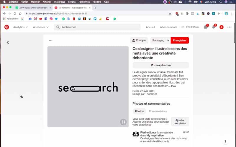
For my company Twaino, I want to create a logo that allows me to play on the typography. To, show you what, I’m talking about, I’m going to show you some ideas I found on Pinterest. You see, for example, I really like this “Search” logo, with the “A” turned into a search bar.
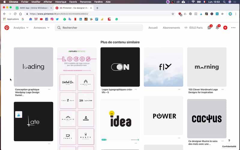
I also like this play around the typography, a bit like this one too, with “loading”, where you can see the “O” loading. Here, “fly” with the “Y” being a plane taking off. Morning with a sunrise. I like this kind of logo, where we will mix a beautiful typography with a nice design that will say much more than a simple logo in itself. It is possible to have a communication on the logo which is really effective as long as you have a generic name. For example, you see for “power”. Replacing the “O” with the little button to turn on or off electronic devices is extremely well done.
Understanding its limits and constraints
With my SEO agency Twaino, the difficulty encountered is inherent in the generic company name
that has no meaning in itself. As a result, it’s more difficult to be able to do typography work that is as effective as the examples I’ve shown you on Pinterest. More difficult, doesn’t mean impossible though, therefore the idea is really to dig for a suitable logo.A logo aligned with your corporate communication
In my last article on communication
, I had the opportunity to show you how I wanted to leverage “natural referencing” and “organic traffic” as a communication lever for my SEO agency. I ended up with a communication based on “plants”, “organic growth”, and “nature”. With Twaino, my idea is to create a logo, which exploits the graphic aspects of the “O”. In my drafts, I also worked on the “I” to see if I could exploit this letter in an interesting way.Doing tests
For the creation of my logo
for Twaino, I made a first version on my side, then afterwards I asked Mariana, so my companion, who has a sense of design, which is much more precise than mine, to review that and thus, to work and think around it. So, to be clear, I asked Mariana two things. First of all, I asked her to think about the logo, and secondly, to work on the colors. Indeed, these are two elements on which she is much better than me. So I might as well ask her to help me with that.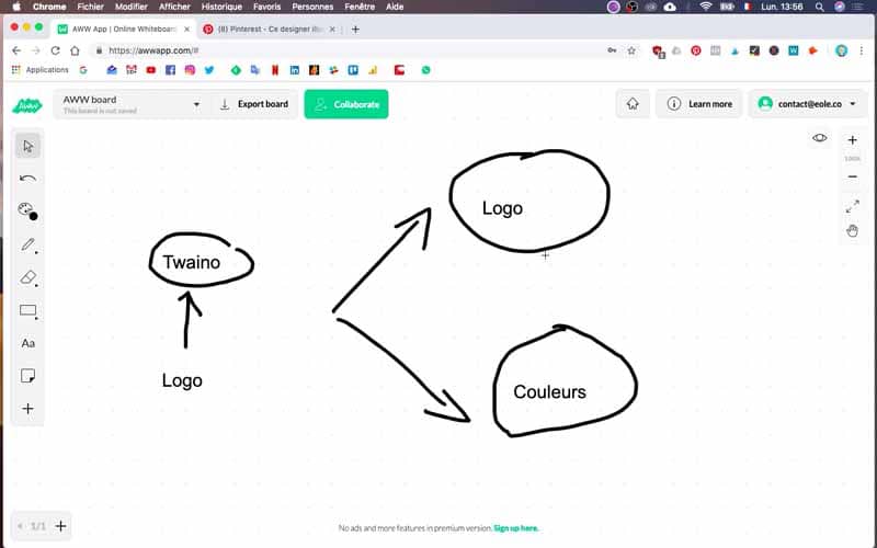
My logo attempts
I’m going to share with you my first drafts that I created for Twaino, before I asked Mariana to take a look. With the name Twaino, I thought it would be interesting to work on the “I”. So I tried to turn that “I” into a little plant. I also thought of a way to use the “O”, with a little plant growing inside.
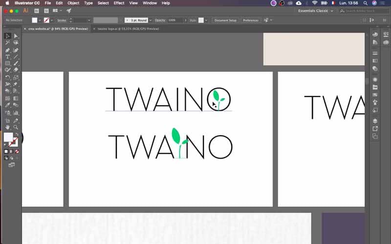
I had noticed some visuals on the internet, which inspired me and could be used in this frame.
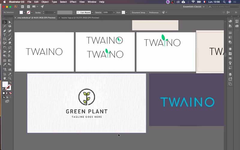
In terms of colors, I started with green / turquoise by the way. As you can see, there were several attempts, with several types of fonts. Some attempts were not successful, especially with a font that looks like the one used for the Twingo. So that I discarded, but that was really at the beginning anyway the different things I worked on.
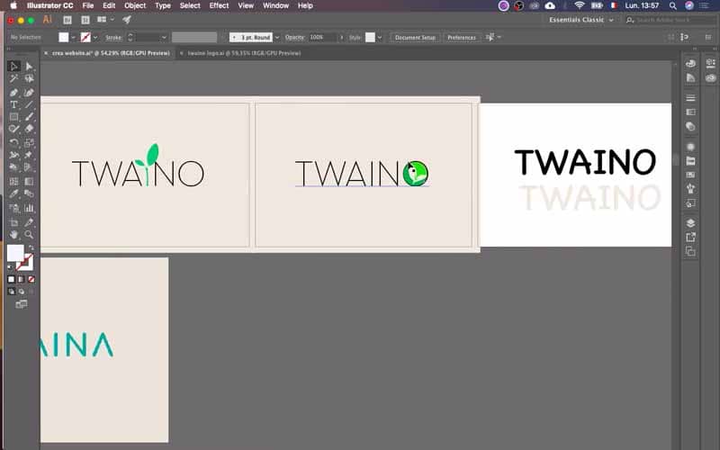
Mariana’s help
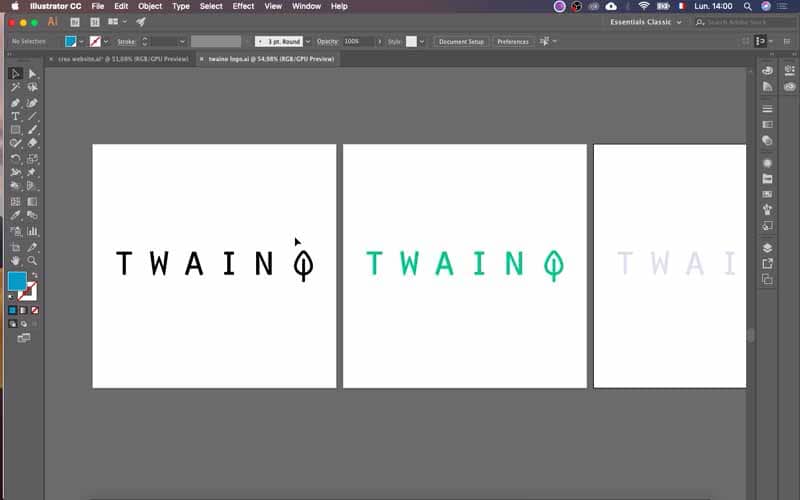
There are many things to see on a logo. Since Mariana is not very comfortable making videos, I will show you the result. However, Mariana could talk about fonts and fonts in English for hours. Overall, she is able to tell what is a professional font and what is not, much better than I can. In short, depending on the image that one projects for the company, she is able to choose with better acuity than I, which are the best decisions to take and the best ideas to exploit. So, she had the opportunity to look at what I had done, and then she reworked it on her side to end up with the logo that I am going to present you now.
The final version of the logo
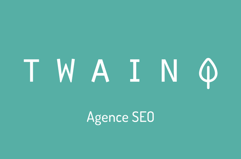
Following my first drafts, Mariana had the opportunity to work on it. Here is the final logo. We are on something extremely “clean” and very pure. At the end, the “O” is used to form a small plant, or a small tree. It is therefore a logo perfectly aligned with the communication I had indicated, with these ideas of “organic growth” and “plants”. For the typography, I can assure you that when Mariana starts to choose the fonts, hundreds are reviewed and corrected.

Conclusion
To conclude, the choice of the logo is an important moment in the creation of your company. For this, you have to decide on the design, the typography and especially get a logo that is aligned with the communication of the rest of your company. If you still have doubts, I recommend this very good article by Florent on the 4 great qualities of a good logo
that will help you make a decision. In the next article, I will have the opportunity to present you how to choose your colors for the graphic charter of your company, see you soon…
