Did you know that 57% of visitors who visit a website with a poorly designed site do not recommend it? In addition to this figure, 40% of visitors leave if it takes more than 3 seconds to load. Therefore, you need to present a fast website with a good design in order to offer an excellent user experience. And the first page that must have this characteristic is obviously the homepage. Indeed, this is the page that is likely to get the most traffic and that will allow you, to this extent, to get the most customers for your products or services. You should not neglect its design and I will guide you, step by step, in the creation of its body with the plugin “Fusion Builder” of the theme “Avada”. Note that this article is part of a series, in which I show you how to start in the website creation. Also, feel free to watch the accompanying video to get a visual on the whole process.
Creating the homepage with Fusion Builder
In this video
, I show you how to create your homepage with the Fusion Builder offered by Avada:The importance of the home page
This is the main page of a website and is directly accessible from the domain name of the website. Therefore, your homepage must represent your website as a whole and in addition to giving access to the other pages of the website, it must present the most relevant information of your website. This information is spread over different areas and the one that contains the most is its body.
Indeed, the body of the homepage is the part that begins just below the waterline. This represents a virtual boundary above which is the part that usually includes the navigation menu and a slider, which are visible to visitors without them scrolling down.
Therefore, the body of the homepage is usually seen once visitors start scrolling down and often presents the most information.
What to put in the body of the homepage?
The home page can be both a gateway and a rallying point for lost users to access the main features of your website. You must therefore offer visitors elements and navigation methods to facilitate their search for information.
This problem varies from one site to another as well as from one theme to another. However, you must present the most relevant information in order to make the user experience particularly pleasant.
In addition, keep in mind that you must find a compromise between “not enough” and “too much information”. Indeed, the more links and information you provide, as I did on my homepage, the more likely the visitor is to find the information they are looking for quickly
On the other hand, if you overdo it, the user will have trouble finding his way around and will probably decide to leave your website. So you have to find the right balance and good practices will help you.
Good practices to make your website’s body successful
According to a study conducted by Chartbeat based on 25 million web sessions, the majority of visitors do not wait for a full load before scrolling down a page. This implies that the body of your homepage is the most viewed area by your website visitors. For this reason, you need to adopt good practices for its design and implementation.
Ensure a fast loading time
With a loading time ranging from 1 to 10 seconds, the bounce rate can reach 123% according to ThinkWithGoogle. This implies that you must first think about the download speed of your homepage and your website in general.
Besides, if visitors leave your website before even seeing its content, you will have a lot to lose. The idea being to keep their attention at all costs, work on making your pages load quickly. You can use
Google Analytics which is a very powerful tool to monitor the speed of your pages.
To do this, make sure that your visuals are not large even if it is often tempting to decorate your homepage with images, videos, etc..
Make the text easy to read
Very few Internet users read word for word word for word the texts that appear on a website. Indeed, they tend to skim over them and I recommend :
- To make your texts concise and easy to read;
- To structure them well by highlighting the most important information which will be put in the form of titles, bold words, etc..
Highlight a call to action
The home page is not designed for your visitors to linger too long. Indeed, its role is to lead them to buy a product, to ask for a quote, to use your services, etc..
To get them to do so, you must clearly show it from your home page via a call to action. This is usually in the form of a button that is highly visible to visitors.
Clearly explain your added value
What do I gain by pressing this button or performing this action? This is the question your visitors will ask themselves. To do this, you must explain as clearly and concisely as possible what you can offer your potential customers.
Make a projection of your home page
To have a well structured website that offers an optimal user experience, I recommend you to make the mock-up of your website
Indeed, this step which can sometimes be considered as a waste of time, allows you to have a precise result when you actually create your website.
How to create your homepage with Fusion Builder Avada?
In a previous video, I had the opportunity to show you how to create a navigation menu with “WordPress” and the “Avada” theme.
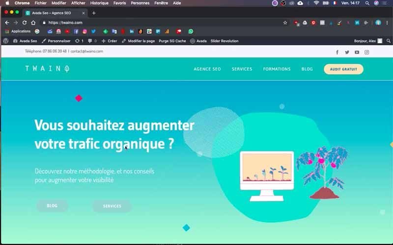
In the same logic, I described the process to have a ” Slider Revolution “.
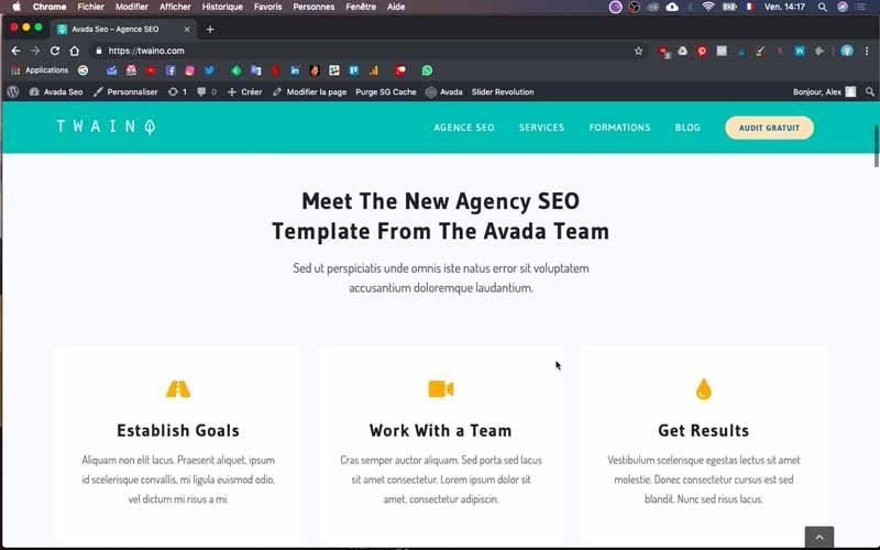
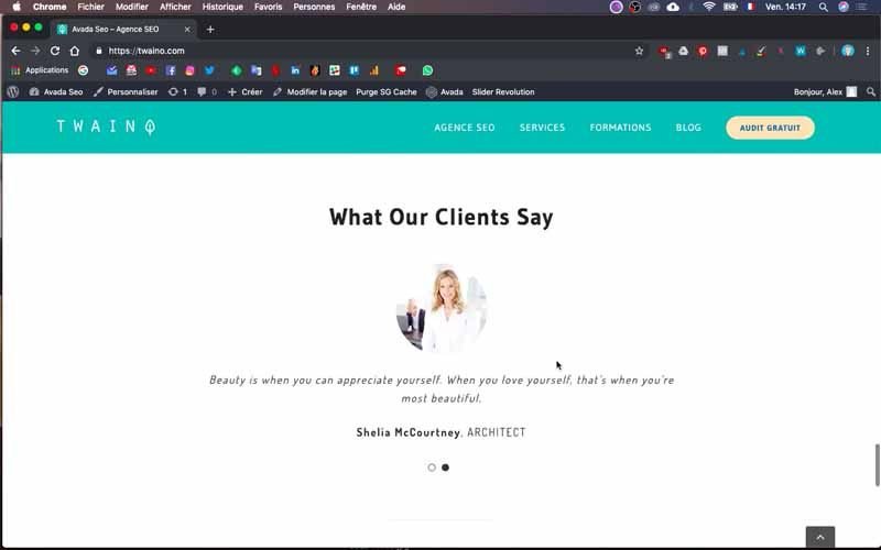
However, the “Body” or the “body” of the homepage has not yet been modified.
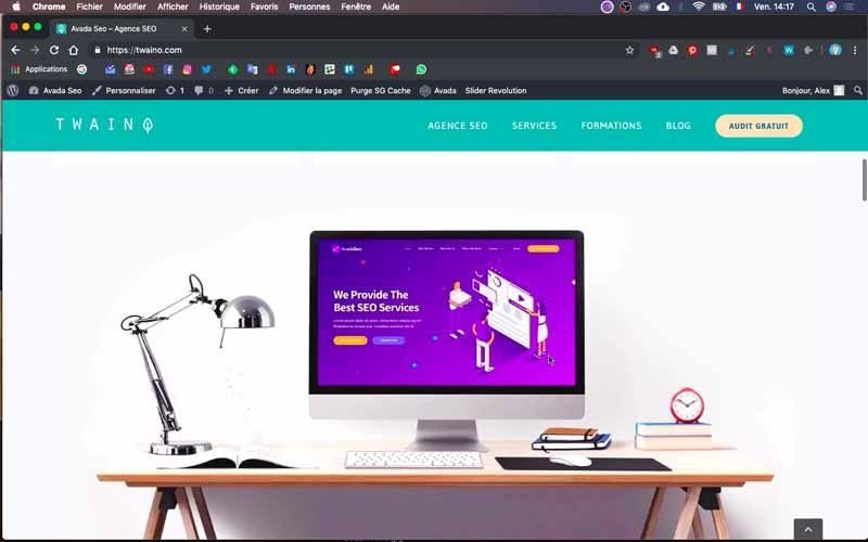
So, I’m going to adapt it according to my needs for my SEO Agency, Twaino.com.
To do so, I will make use of the plugin Fusion Builder which is directly integrated in Avada.
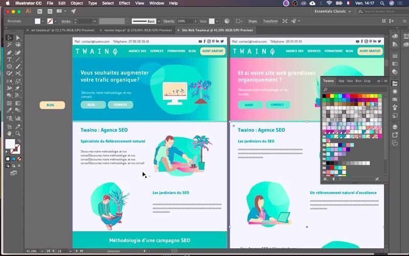
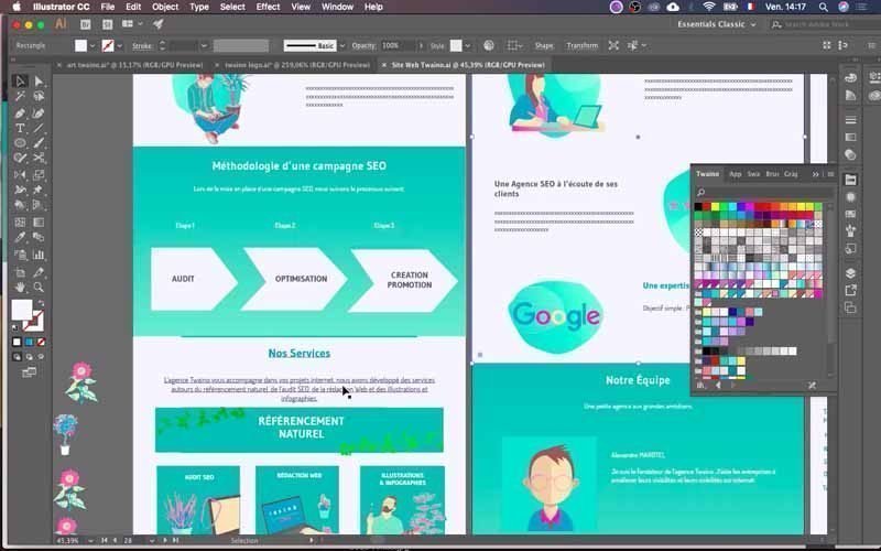
By the way, note that before creating my website, I had the opportunity to make the model of my website. So I have a clear idea of the final result.
1) Log in to your website’s dashboard
To make the changes you need, you need to access the WordPress console.
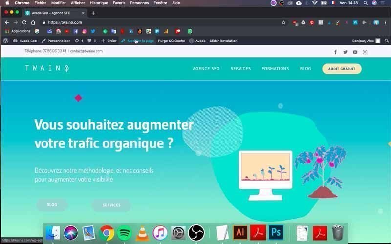
To do this, you just need to fill in the “…./wp-admin” entry in your browser at the URL of your website. Mine is ” https://twaino.com/wp-admin “.
On the connection page, fill in the boxes with your identifiers and then validate to access the dashboard.
2) Go to the home page
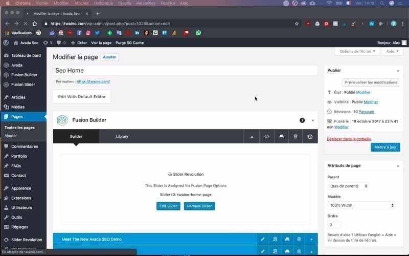
Once you are in your dashboard, go to the home page and click on the “Edit page” window.
It is preceded by a pencil icon located at the top of the page, just to the right of “Create”.
3) Go to the different blocks of your page
Once on the new interface, you will see the “Fusion Builder” which is located just below the “Edit With Default Editor” button.
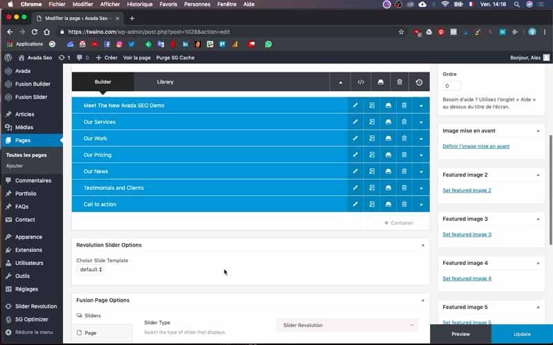
By default, you will have the “Builder” window selected and you will have the options. If you scroll down a bit, you will see blue elements that are actually the different blocks that make up your web page.
You can unfold them by clicking on the small arrow located on the right and on the same line as their name. Inside, you have the structure of the different elements of the selected block.
4) Check the correspondence of each block on your homepage
To see how these elements look on the homepage, look at their content and go check on your homepage. I advise you to open another window in your browser on which you will open your home page in order to check the rendering of the changes as you go along.
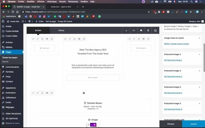
At my level, I have in the block “Meet The New Avada SEO Demon”, the section “Meet the New SEO Agency” followed by “Template Form The Avada Team”.
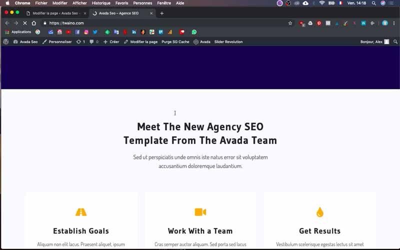
On my home page, I find exactly the same structure and the same texts. There is also the “content box” of the block which is represented by the image of the desktop that is just below.
5) Insert a colored line to make a separation

Between the “Slider Revolution” and the block that follows it directly, I want to insert a different color line that will serve as a transition between the two blocks.
5-1) Create a new container
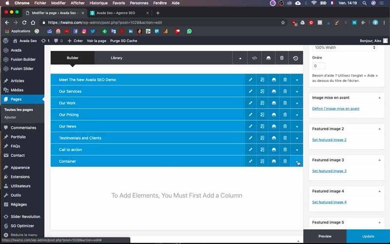
To do this, press the “+ Container” button that is located just below the blocks and in the right corner.
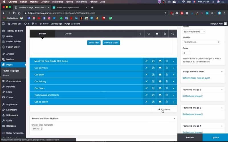
Select the first rectangle, which has a much lighter color than the others.
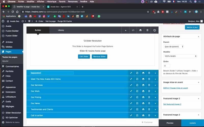

In fact, this is an empty container and you will simply move it to the top, just below the “Slider Revolution”.
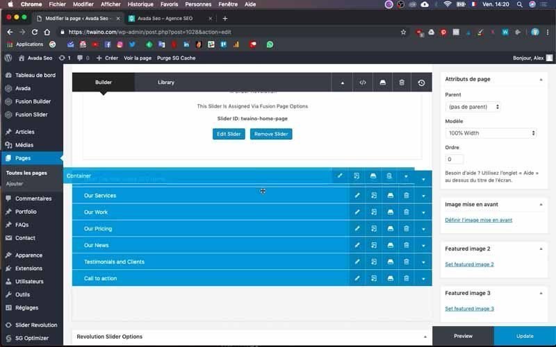
Then click and hold on this new container to drag it to the top.
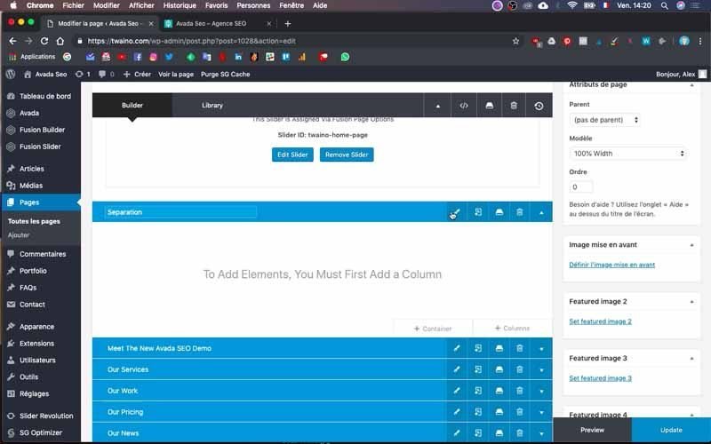
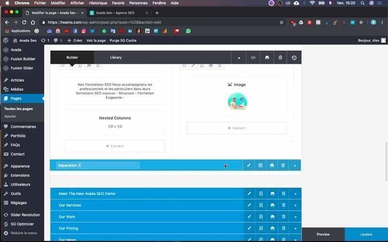
You can name it whatever you want by clicking on its title. I call mine “Separation”.
5-2) Insert a background color
I click on the pencil edit icon that is on the same line as my new block name.
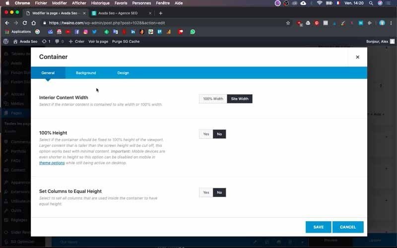
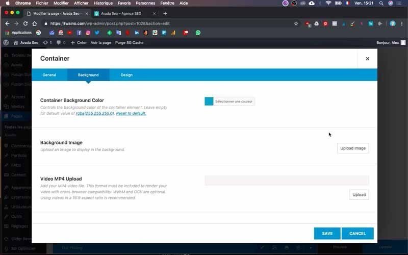
Then you have the options for the block which has three windows:
- General;
- Background ;
- Design.
Go to background and click on “Select a color” in the “Container Background Color” option. Choose the color you want or take the code of the color you want and paste it in the box reserved for that purpose.
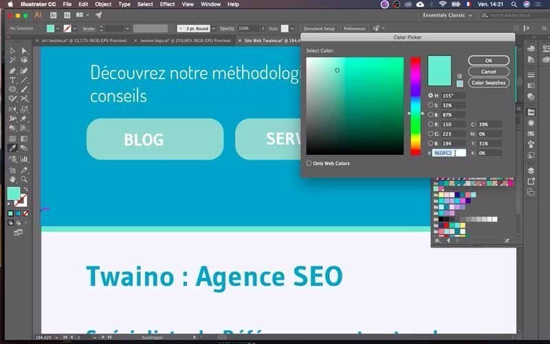
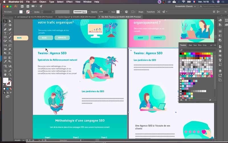
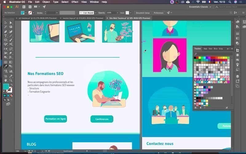
At my level, I copy the color code from my website’s mockup into my Adobe Illustrator software.
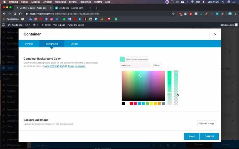
5-3) Adjust its size
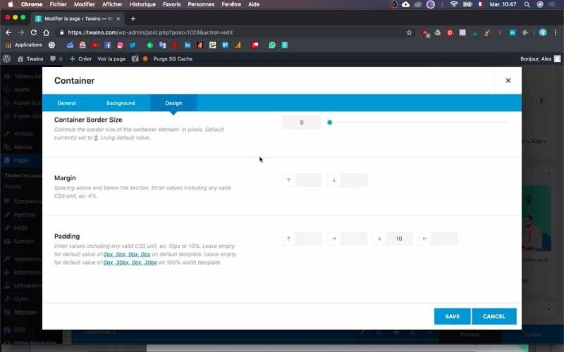
You have to give a certain size or height to the separator. To do this, go to the “Design” window and the “Padding” option. At my level, I write “10” in the second last box from the left. This gives me a straight line separating the color I want to have.
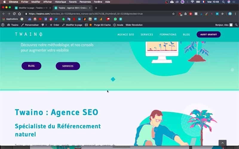
To check how the result looks, press the “Preview” button and a new window will open in your browser to show you your home page with the changes.
6) Add a new container or block
After the divider block, you can now add the other blocks containing your text and illustrations or videos.
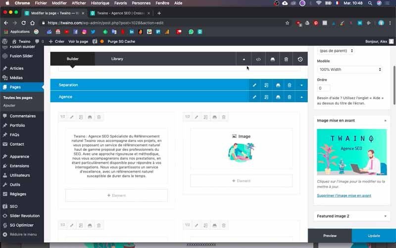
I’m going to do the same by creating the block for the “Twaino : SEO Agency” part of the template.
To do this, also create a new container and name it as you wish. I’ll name mine “Agency” and add content.
6-1) Select a column type
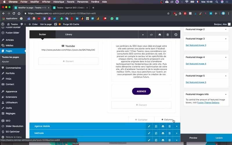
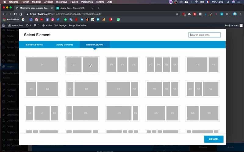
To do this, click on the “+ Columns” button at the bottom right of the “+ Container” of the block you are on.
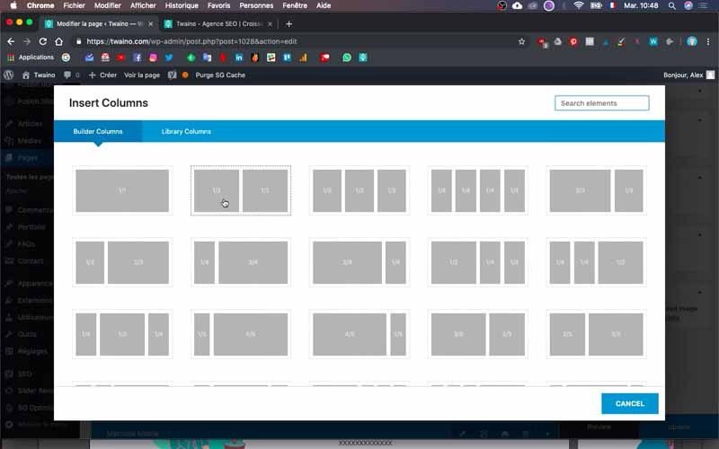
On the interface that appears, select the type of presentation you want according to the result you want. As for me, I chose the ½ and ½ rectangle which allows me to have two columns of equal dimensions.
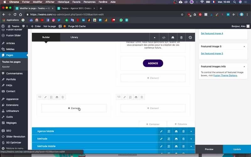
Automatically, you will then have empty columns that show up depending on the type of presentation you selected.
6-2) Add text to the block
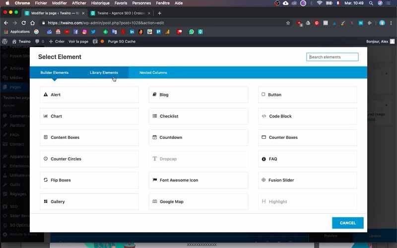
Press the “+ Element” button which allows you to choose the type of content you want.
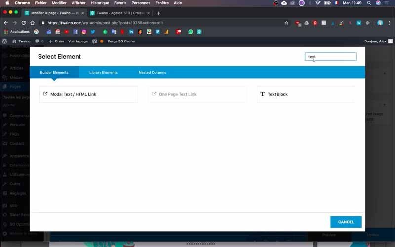
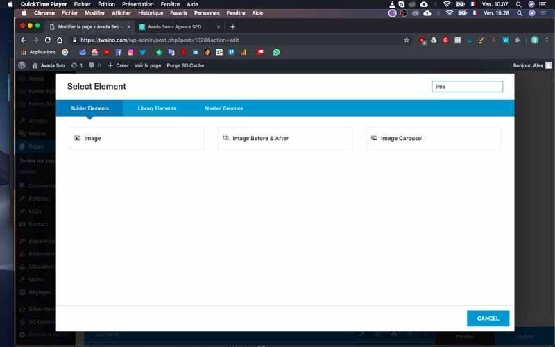
You can browse to choose the ideal option or type directly into the search bar, the element you want.
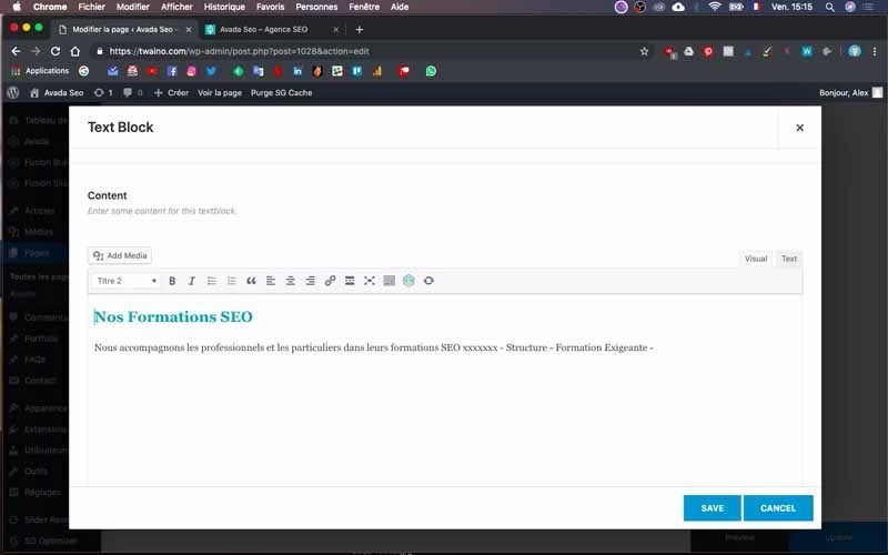
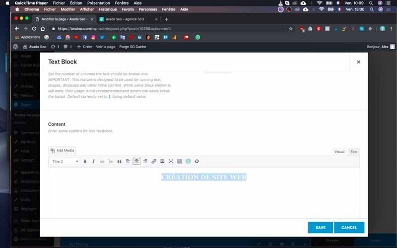
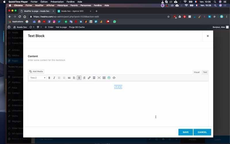
When I search for “Text”, I automatically see the “Text Block” button that allows me to edit and add text.
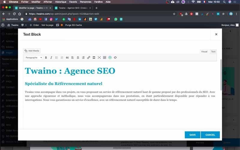
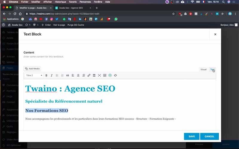
I add the title “Twaino: SEO Agency” followed by a subtitle and a text.
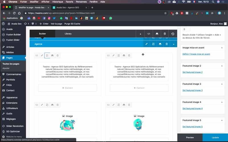
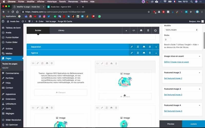
Click “Save” to save it and you’ll see a thumbnail of your text in the column, which means the text was successfully inserted.
6-3) Add an image to the block
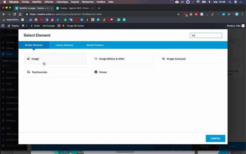
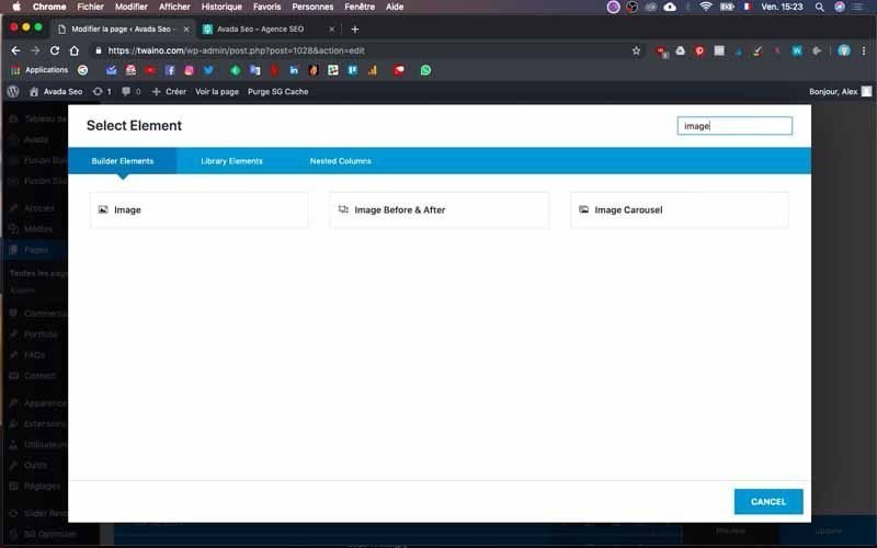
If you want to add an image, search for “image” in the elements and press the “Image” button to insert it.
Then click on the “Upload image” button that appears on the new interface and browse your “Media Library” to select or upload it.
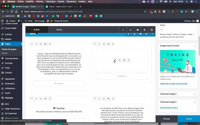
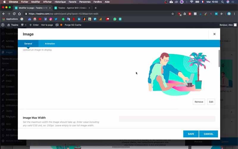
After that, click on “Save” to save the changes
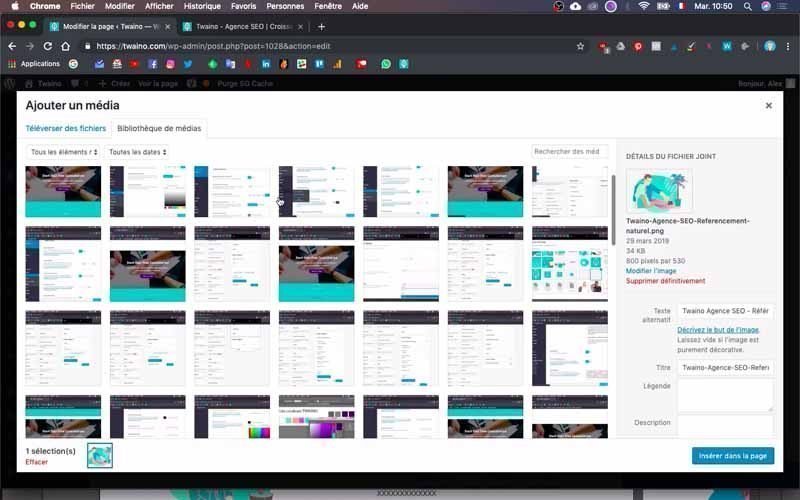
6-4) Add a video
Just below the previous two columns, I’m going to insert a video that is accompanied by text
So these are also two columns that you can still choose too by following step 6-1.
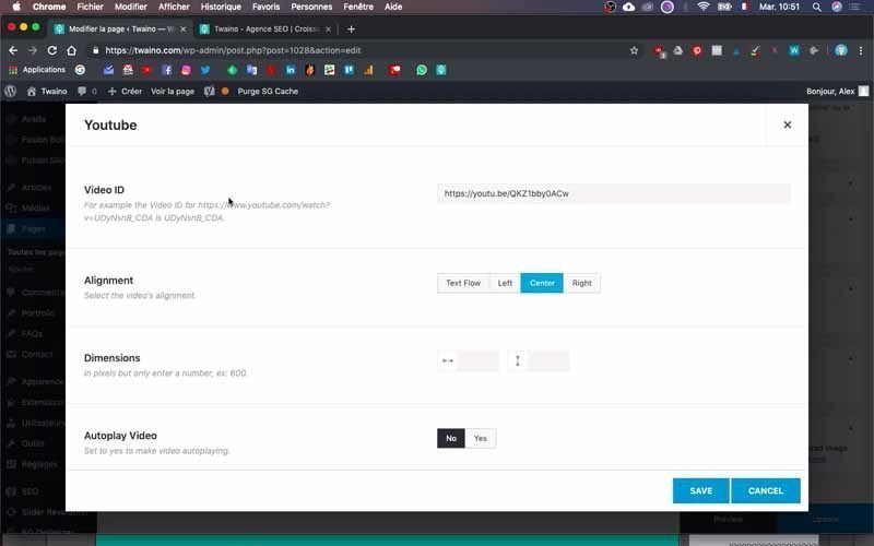
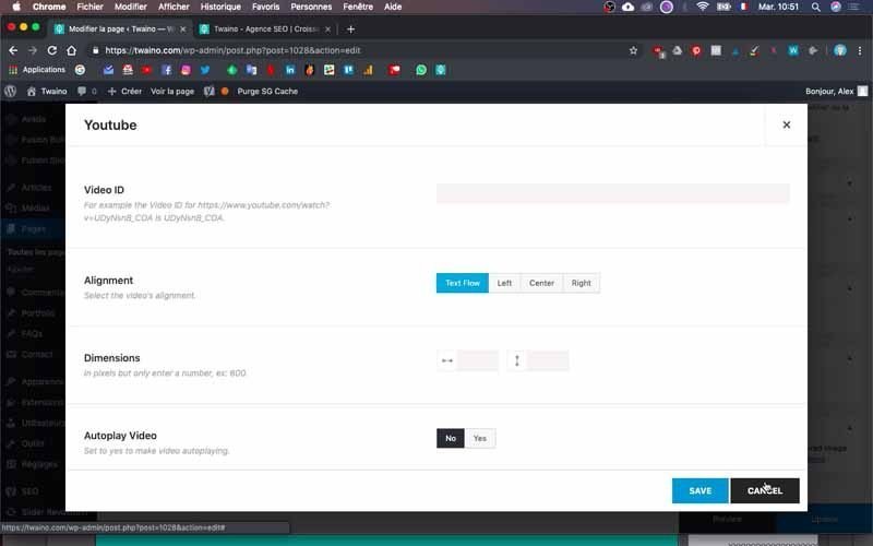
To insert the YouTube video, simply search in the “YouTube” items and press the “YouTube” button that appears.
Then, paste the URL of your video in the “Video ID” part and make some adjustments. For me, I centered the video by clicking on “Center” in the “Alignment” option.
6-5) Add a button to the block
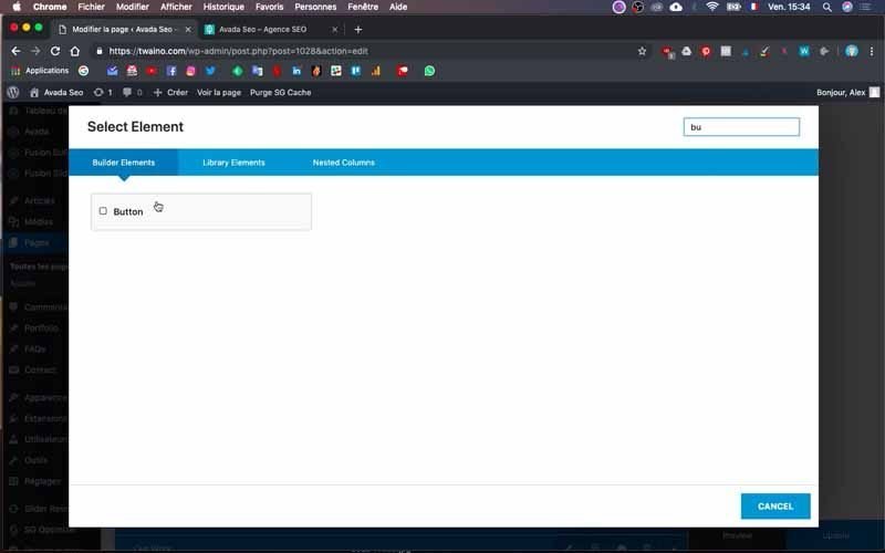
To add a button like my dark blue button labeled “AGENCY”, press “+ Element” in the cell and look for the “Button” element.
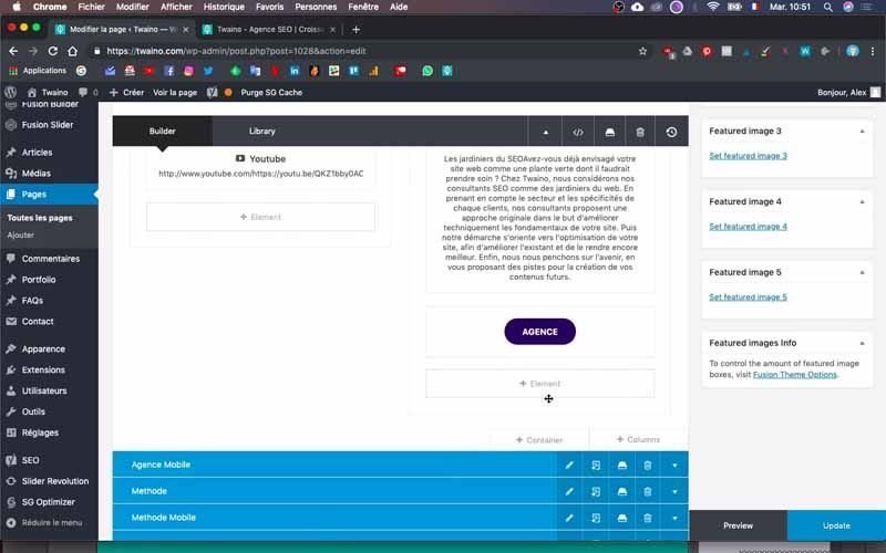

You will be able to set up the button on the following interface by :
- Adding a link with ” Button URL “: You can directly paste the link in the part reserved for this purpose or click on ” Select Link ” which groups all the links of the pages of your website;
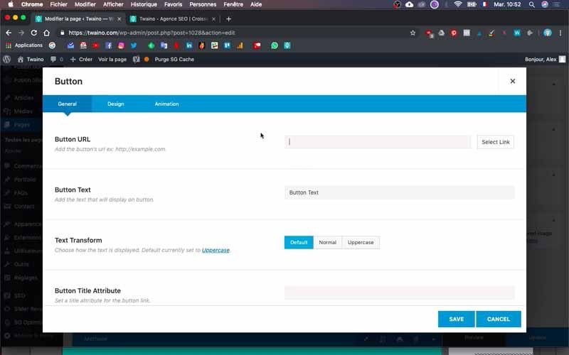
- Adding the text of the button with “Button Text”: Write the text that will appear on the button. In my case, it is “Agency”.
- Choosing if the new page will open in the same browser tab or in another tab with the “Button Target” option. Know that the “_sell” opens the new page on the same tab unlike “_blank” which opens it in another tab;
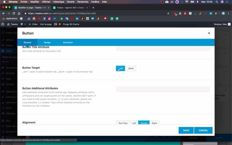
- Center the button text with “Alignment”: Select “Center” or another option if you want.
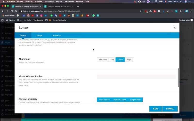
At the end, save your changes by clicking on “Save”.
Note: I recommend that you always reduce the blocks you are not working on. This action allows you to follow your work correctly and not to make mistakes.
7) Create a block with embedded and clickable arrows
I am now going to create a new “Method” block that will have horizontally embedded arrows that are clickable. Please note that these arrows are actually images on which it is possible to insert links.
To do this, create another empty “Container” in which you will add columns using the same principle as in step 6.
7-1) Change the background of the block
In order to add a background color for this block, click on the pencil-shaped edit icon that is located just after the block title.
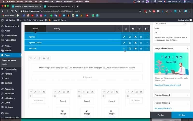
Then go to the “Background” window to :
- Select a color with the “Container Background Color” option;
- Choose an image as a background with the “Background image” option.
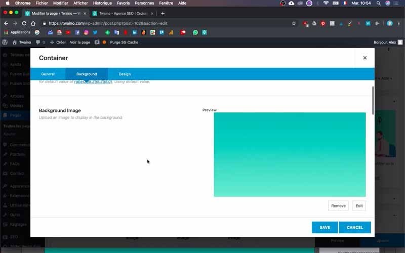
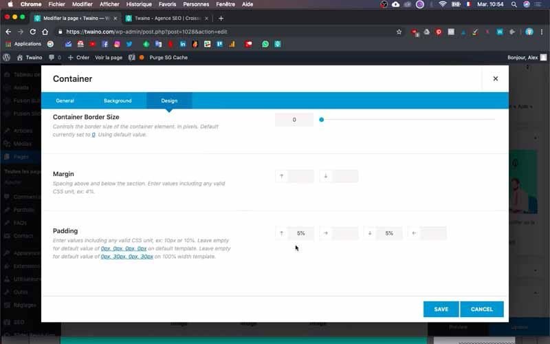
I choose the second option by inserting an image in the form of a color gradient. Also, I put a “Padding” of “5%” for the distance.
Then, I create a full column for the text of this block, which you can do by following the instructions in step 6-2.
7-2) Add an empty block
For the “Method” block, I didn’t want the text and arrows to take up the entire width of the page. Therefore, I created empty columns with a proportion of “1/5” each. By placing the text column between these two empty columns, I have some space on the left and right. This makes a total of three columns on the same line.
7-3) Creation of texts and arrows
After the title and the main text of the “Method” block.
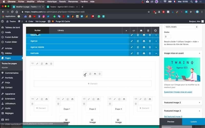
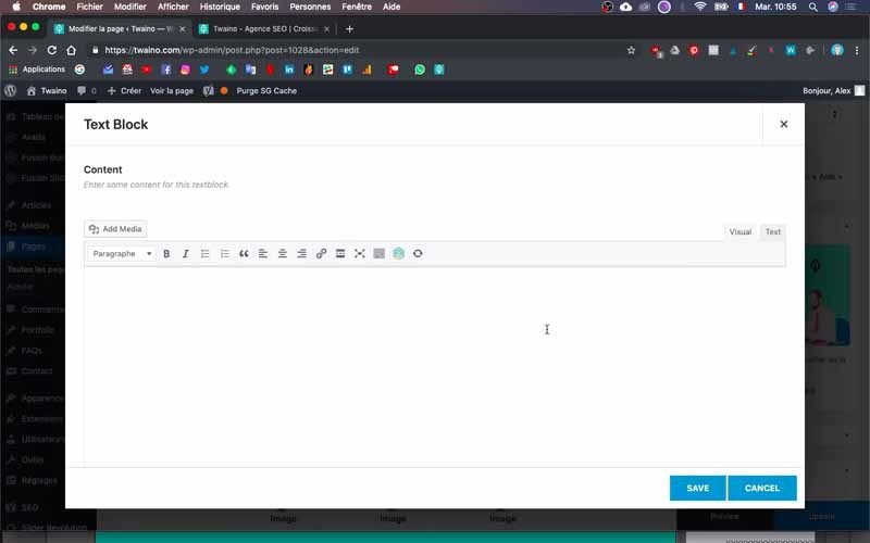
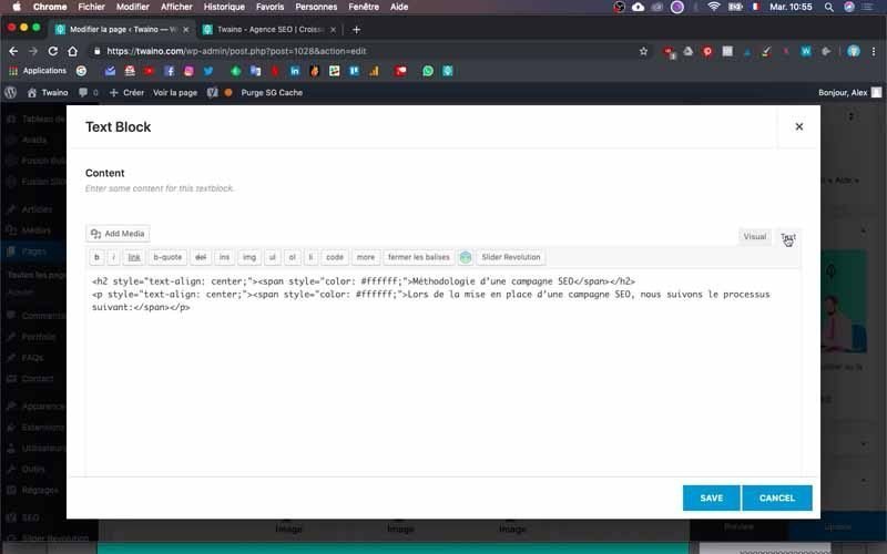
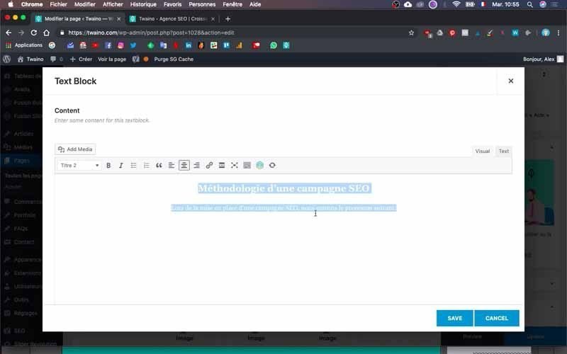
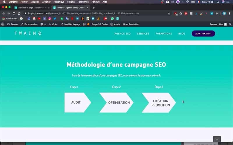
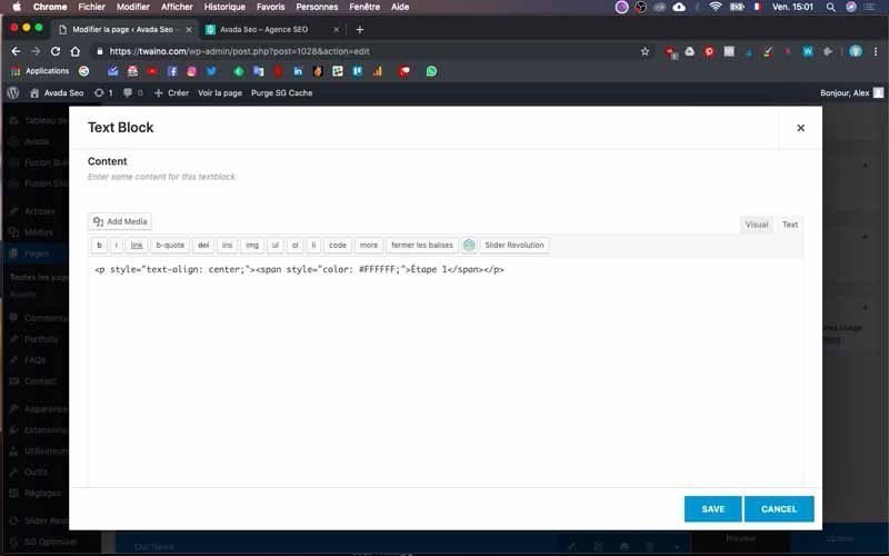
There are just at the bottom the mentions “Step 1”, “Step 2” and “Step 3”. These are obviously texts and you can now create following the same principle.
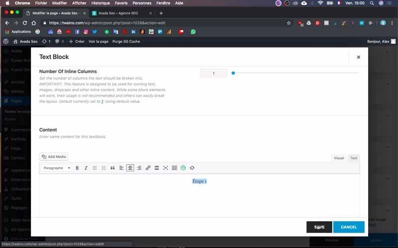
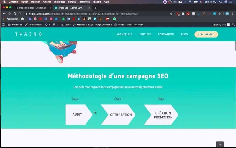
Except that here, the column should not be “3”, but “5” since there are the two blank cells on the same line. To do this, you will select a column with “5” parts and having a proportion of “1/5” each.
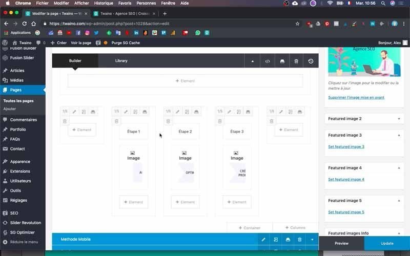
Then you just add the column with three parts for the three arrows.
They must have the same proportion “1/5” in order to stay directly under each step and have spaces on the left and right.
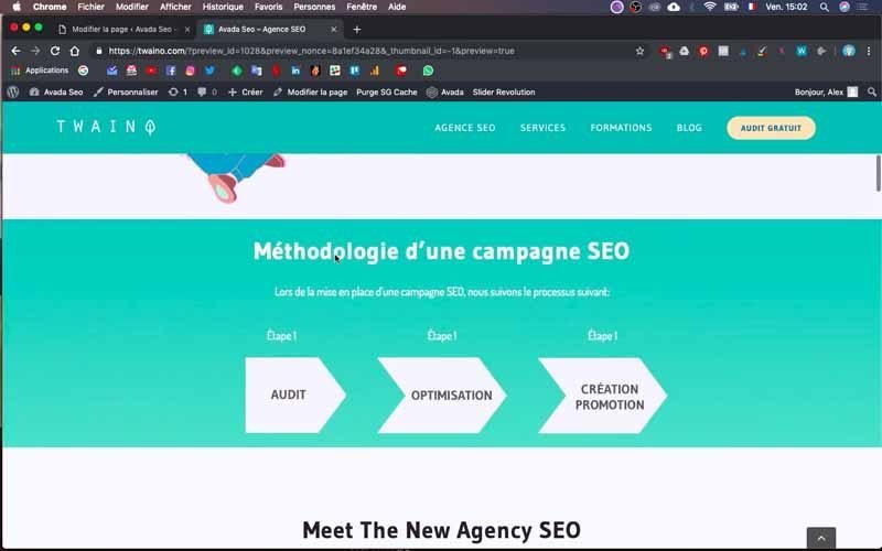
Then add the images in each cell as in step 6-3. Don’t forget to save your changes so you can see how it looks.
8) Add another block with several images
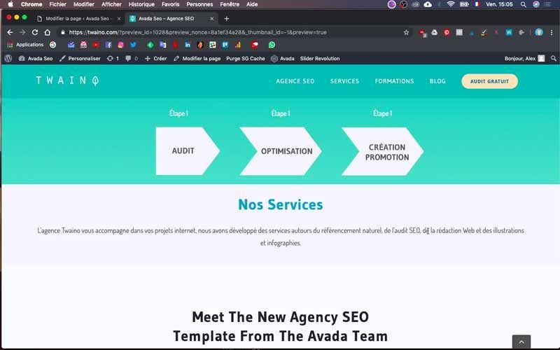
After the “Method” block, I have the “Services” block on my layout that I want to add and that includes text and several images.
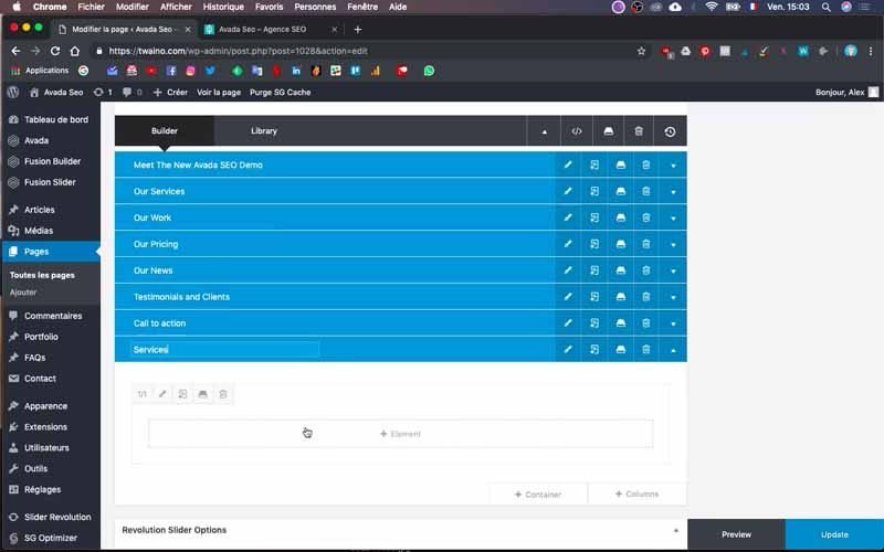
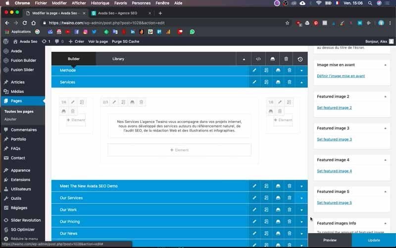
To do this, I create yet another “Container” which I rename to “Services”. I move it to the right place just below “Method”.
I first add text following the same principle as in step 6-2 and I take care of the formatting.
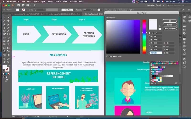
When I click on “Preview”, I notice that the text takes up the entire width of the site. This is not necessarily attractive and I will make it compact.
8-1) Make the text compact
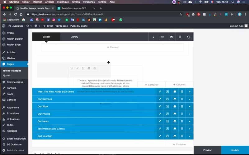
To do this, create empty columns and place them to the left and right of the text column. To save time, duplicate the text column twice in a row, taking care to delete the contents of the two new columns.
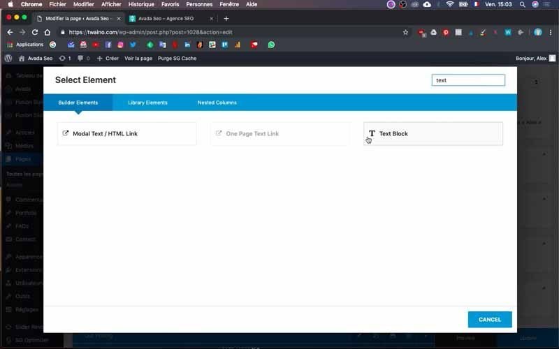
To duplicate the text column, click on the icon in the middle of the column at the top left
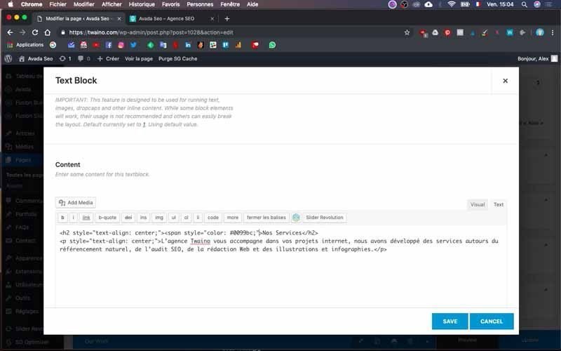
On the other hand, to delete the content, click on the trash icon located on the right when you drag your cursor over the content of the column.
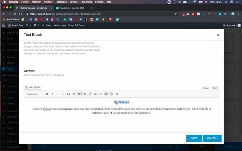
For the old column with the text, set its proportion to “2/3” by clicking on the first icon on the same line as the duplication. Select “2/3” from the proportions that appear.
Use the same process to set the proportions of the two new columns to “1/6” and place them to the left and right of the text column.
When you press “Preview”, the new rendering looks much better.
8-2) Change the background color of the block
I change the background color, which you can do by following the process described in step 7-1.
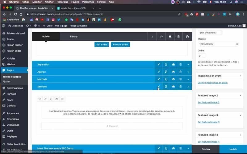
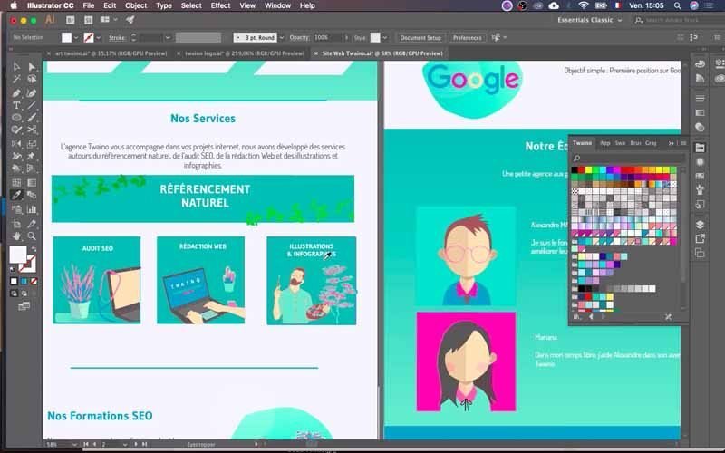
At my level, I copy the color code from Adobe Illustrator and paste it in the space reserved for this purpose in the “Container Background” option.
8-3) Insert the images
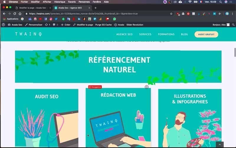
Next, I’m going to insert a first image with the wording “NATURAL REFERENCING” and which covers the entire width of the block.
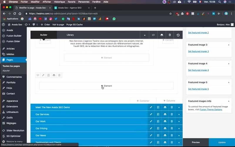
I duplicate a column, taking care to give the right proportion “2/3” so that it can have the same width as the text.
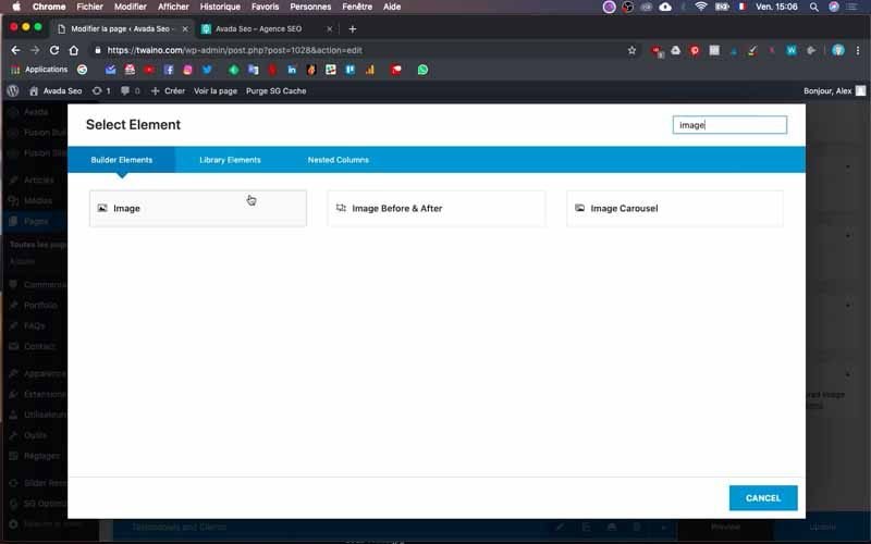
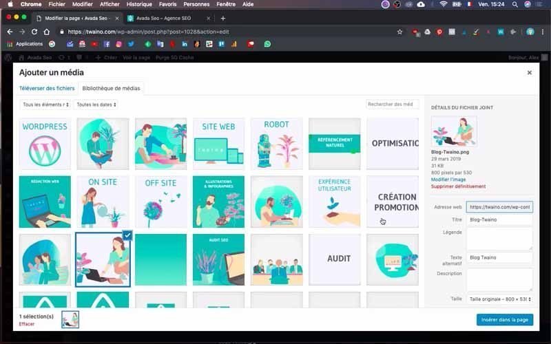
I use the same principle as in step 6-3 to add the image element. Except that in the “Media Library”, select the original size of your image instead of the default size of “Avada”.
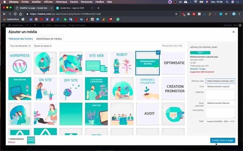
To do this, click on the “Size” option located at the very bottom right, above the blue “Insert into Page” button and select the original size.
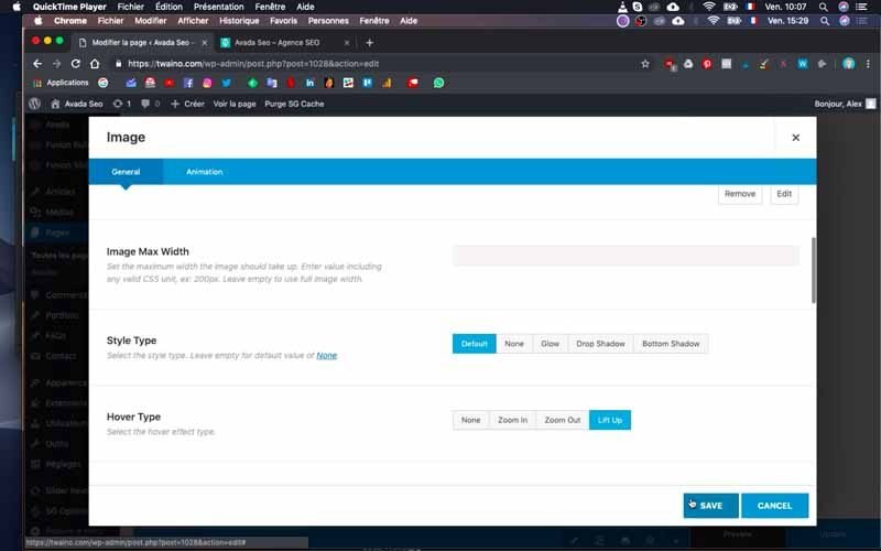
I make sure to check “Lift Up” in the “Hover Type” option in the configuration interface that appears just after selecting the image.
This setting allows the image to expand slightly when you move the cursor over it, which is quite an interesting effect. Also, scroll down and over the “Align” option and select “Center” to center the image.
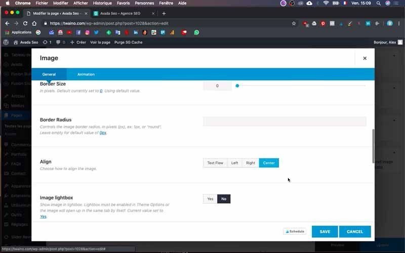
8-4) Insert three images on the same line
Next, I’m going to insert three images just below the last one. To do this, I repeat the same process with the duplication, but this time I’ll use a size of “1/3” since the images must be on the same line.
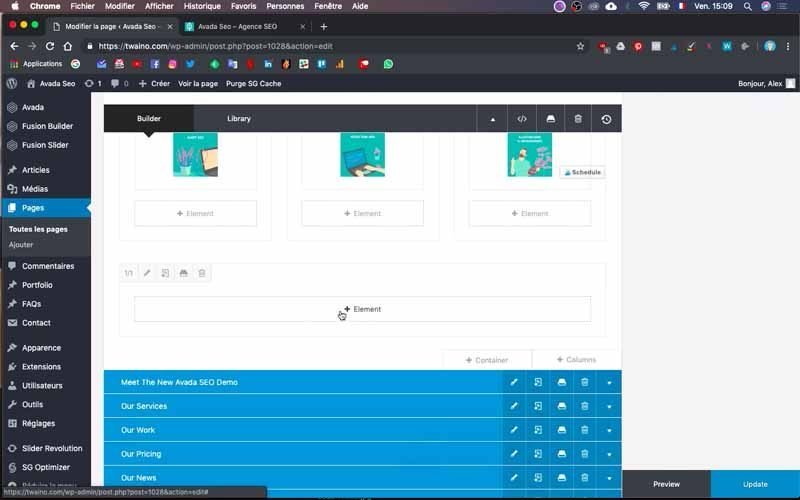
My three clickable images have the words:
- SEO AUDIT;
- WEB COPYWRITING;
- ILLUSTRATIONS AND INFOGRAPHICS.
Everything is now well centered with good rendering.
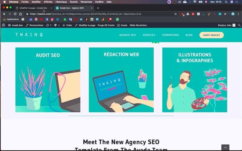
8-5) Add a separator
A line comes just below the three images and to do this, duplicate a column and be sure to delete the image it contains.
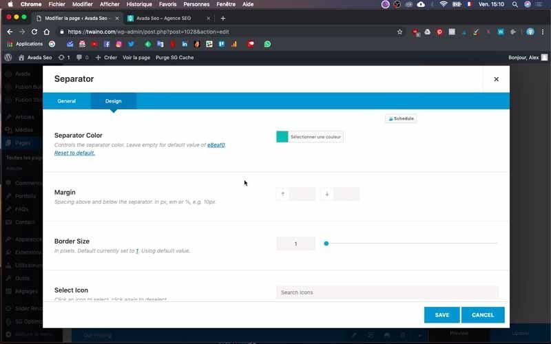
Then click on “+ Element” and look for the “Separator” element and press the button with its inscription.
On the configuration interface, select “Single Border Solid” in the “Style” option of the “General” window.
In the “Design” window, select the color you want with the “Separator color” option.
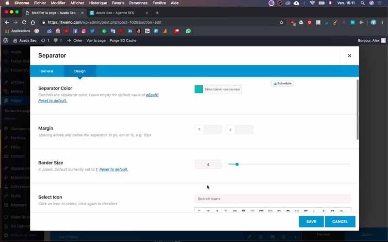
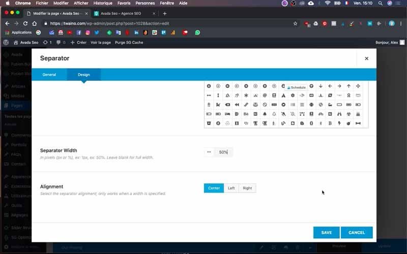
For its size, check a percentage in “Separator Width”, 50% for me. Increase the “Border Size”, I put “4” in my level.
To center it, make sure you also have “Center” checked in “Alignment”.
8-6) Set the distance between the columns
I want the distance between the separator and the three images to be increased. To do this, click on the edit icon of the separator’s connector at the top left of its column.
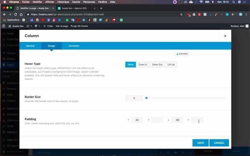
Select the “Design” window and in the “Padding” option enter the distance you want. Note that at this point you may have to fumble to find the right distance for the best look.
In my case, I enter “40” in the first and third boxes of this option. The rendering is acceptable, but I will have to make some adjustments afterwards.
8-7) Add another line of image and text
To add another row of image and text, you just need to duplicate the text and image columns you created before.
To do this, I duplicate the text and image column of the “Agency” block that I had already created. Then I move them below the separator.
I modify the text by replacing it with my new text and I proceed to its formatting. I also proceed to change the image following the same principle for changing images.
Then add two buttons to the text column by pressing “+ Element”. Then check the two-column rectangle in the “Nested Columns” window. Note that it allows you to have two buttons side by side.
Then follow the steps described in step 6-5 to configure the first button. Then duplicate and modify only the text of the second button and the link.
At my level, I have two different buttons including:
- Online training ;
- Conference.
9) Make a second separation block
To do this, duplicate the first one that has already been done in step 5. After this duplication, rename it and move it just after the “Services” block.
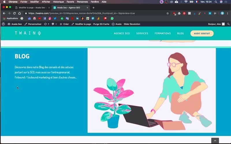
10) Creation of the “BLOG” block
For the creation of this block, I will use the same process as for the previous blocks.
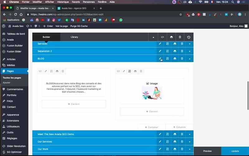
I create a new container and name it “BLOG” and move it just below the second separator block.
Change its background color by following the same steps as in step 8-3.
10-1) Add a text and an image
For the addition of text, duplicate the same types of columns that you had the opportunity to make and that have the options you want to have for this text.
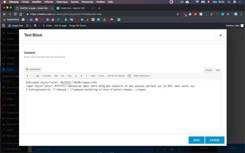
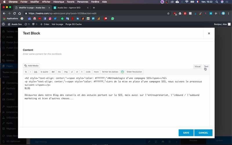
In my case, the text must be white, so I duplicate the text column of the “Method” block and move it to the present block.
I modify the old text by inserting the new text of the “BLOG” block in its place.
Next, create the image column and take care to insert the image reserved for this part. Follow the process presented in step 6-3. Also, make sure you choose the right proportions for each column.
In my case, I choose “1/2” for the text column and “1/2” for the image column.
Save the changes and preview to see how it looks.
10-2) Add a space between the image and the edge of the block
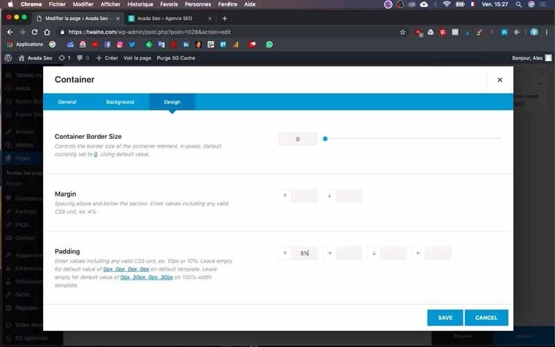
To make this change, click on the “BLOG” block edit icon and go to the “Design” window. Enter the distances in the “Padding”, I fill in “5%” in the first and third box.
10-3) Add four images on the same line
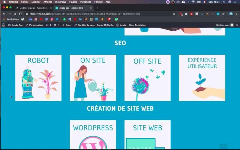
According to the mockup, I have the text “SEO” which is followed by four images after the previous line.
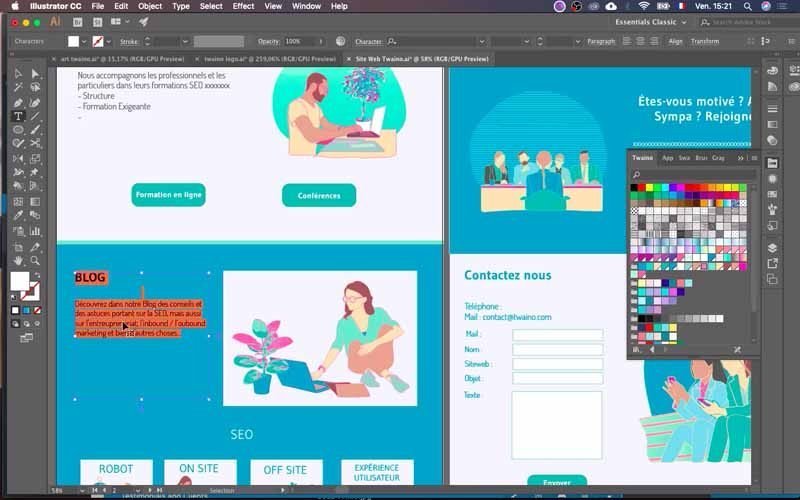
So I create the “SEO” text column first with the proportion “1/1”.
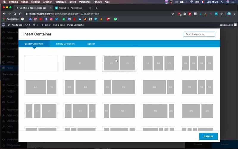
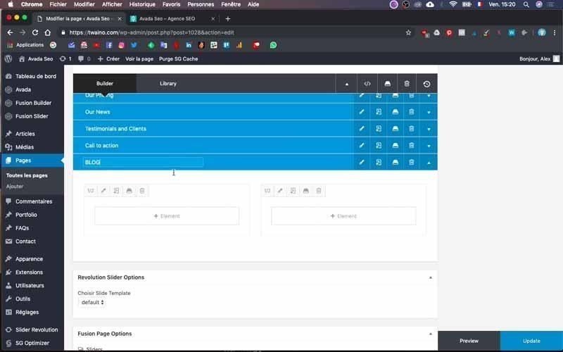
Then create a column of proportion “¼” to insert a first image following the same procedure as in step 8-4.
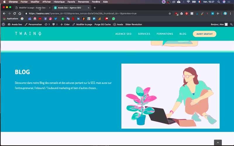
Duplicate this column three times in a row, taking care to insert the correct image and to select the “Lift Up” option.
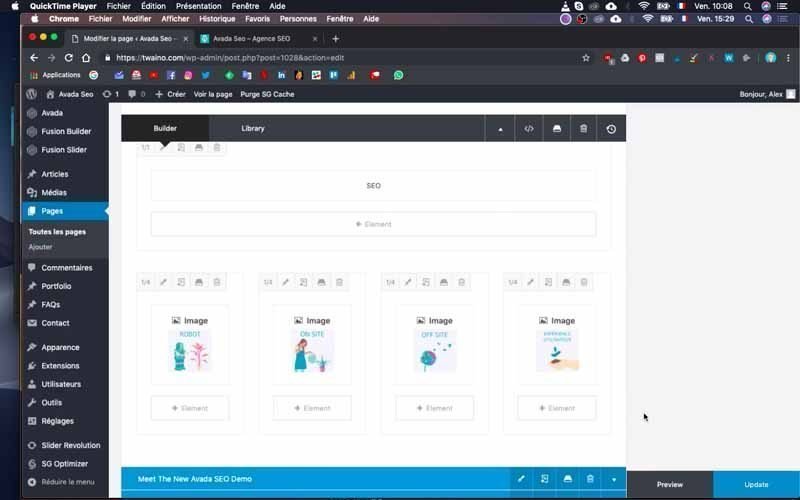
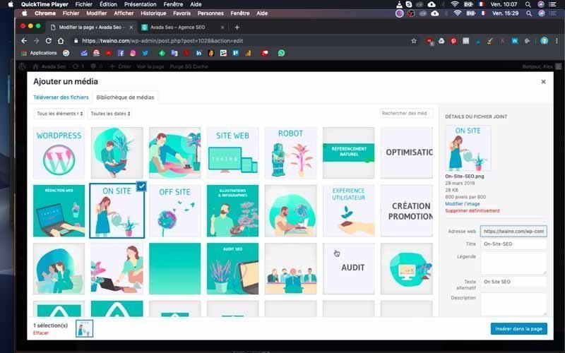
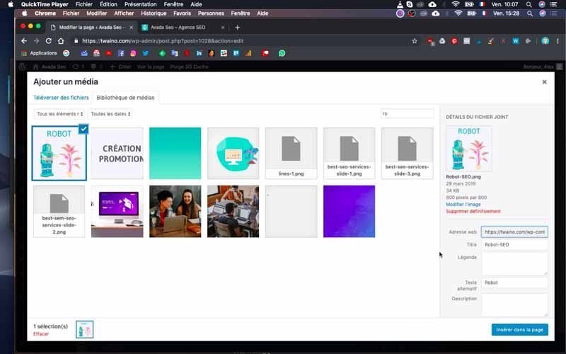
I have the 4 images:
- ROBOT;
- ON SITE ;
- OFF SITE;
- USER EXPERIENCE.
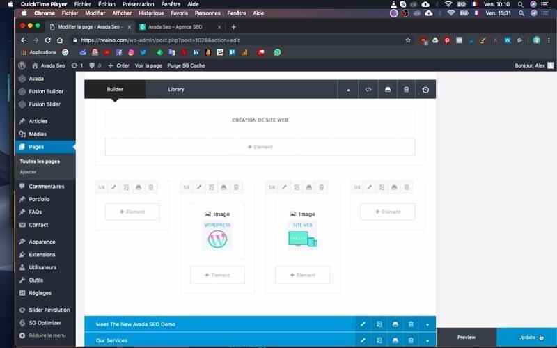
I do the same thing for the text “Website creation” and the two images “WORDPRESS” and “WEBSITE”.
At this level, I put two empty columns on the left and on the right so that the images are centered.
Save your modifications to verify the changes.
11) Creating another one-line block
I will now create the “AUDIT” block by creating a new “Container”. I will place it under the previous one and make sure to name it.
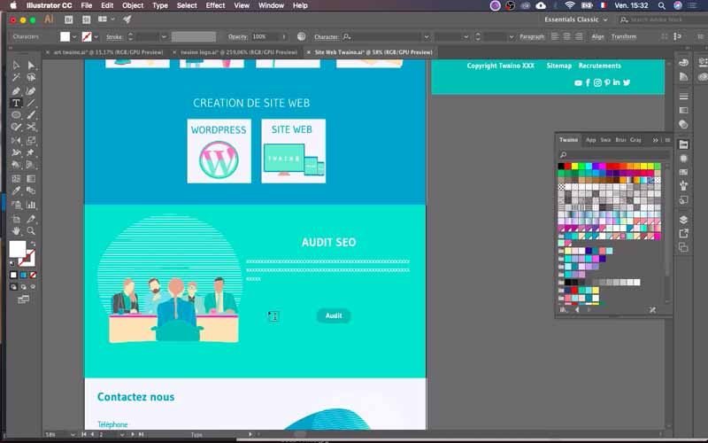
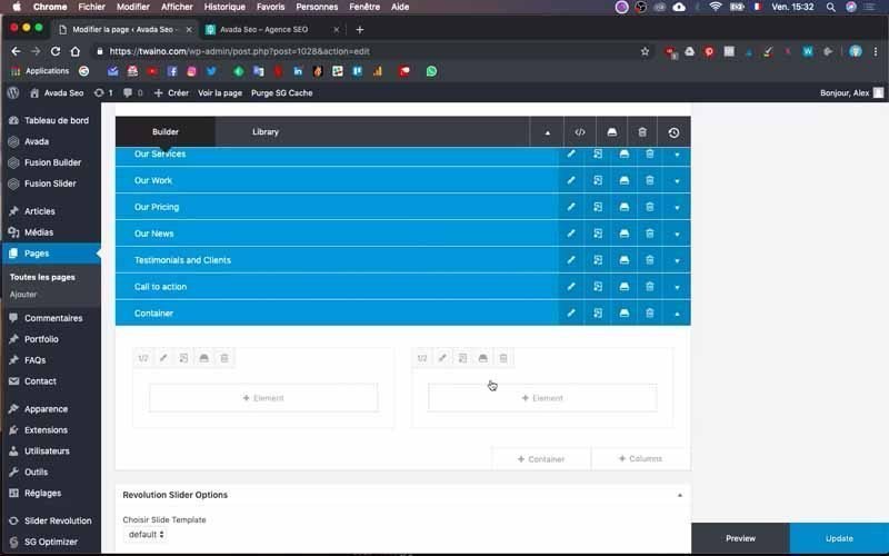
Change its background color using the same principle as in step 8-2.
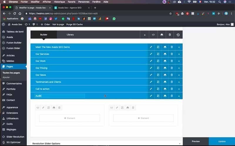
I make almost the same changes as in the previous step. In other words, I duplicate the “Website creation” column that I have just changed to “SEO AUDIT”.
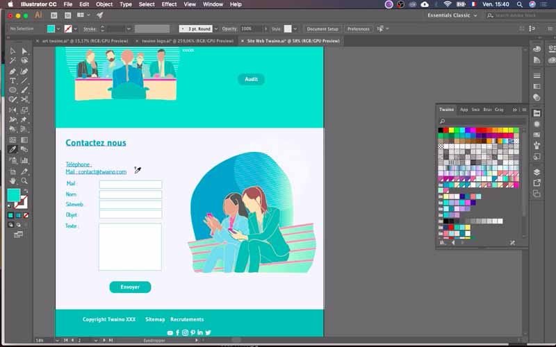
To insert the text and image in this block, also do the same by duplicating and modifying them.
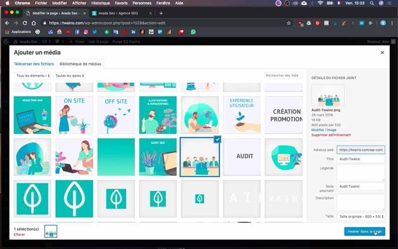
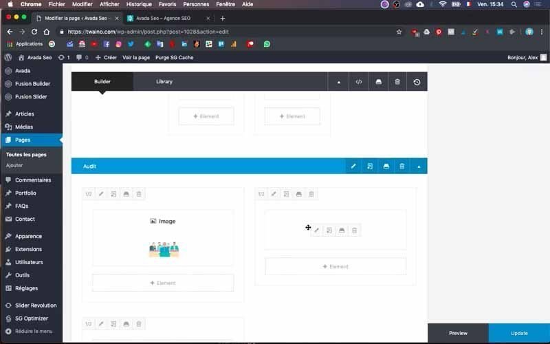
Also insert the button following the principle of step 6-5.
Increase the padding of the block by going to the Design window and fill in the first and third boxes with the vertical dimensions
I enter “5%” and “5%” at my level.


12) Save your changes and make a final check
After all these changes, click on the “Update” button in the bottom right corner. Then go to the home page and do a final check to see if everything is working properly.
In case there are still problems, make corrections according to the block.
And that’s it! You have just created your homepage body with Fusion Builder.
Conclusion
The homepage is one of the first pages created when creating a website. And as it is the main page, it is likely to have the most visits. For this reason, you must take care to design each of its parts and ensure that it offers the best user experience. This is especially true for its body, which should present the most relevant information in a clear and easy-to-read way. In addition to its design which must be attractive, I recommend that you pay close attention to the loading speed of the page. This last point is crucial and can either increase or decrease your bounce rate, which will inevitably impact the number of customers you will have.
See you soon for more articles!

