Did you know that an intuitive, ergonomic website is likely to increase conversion rates? That’s why UX, or user experience, plays such an important role these days. To this end, sliders are useful tools both for navigation and, above all, for making a good first impression on visitors.
Consequently, this article will deal with an essential element of the home page: a Silder, which in most cases is found just after the navigation menu. In fact, it’s the second part after the navigation menu that visitors will come into contact with, and its impact on their decision to continue the visit is great.
So don’t neglect its creation, and I’ll guide you “step by step” through the entire process. In addition, don’t hesitate to consult the video accompanying this article, which supports the steps described here.
The Revolution slider
Today’s video shows you how to create and set up a Revolution slider. I’m going to do it as part of my website creation for my SEO agency Twaino :
What is a slider revolution?
A slider is a feature that allows you to display a variety of information in a loop or not. This information can include text, images, videos, links, etc., and is grouped together in “slides”.
In this way, a slider can comprise a single slide or several slides, whose multimedia elements can be animated or interactive to react to user actions.
There are several tools available for creating a slider, but in this guide we’ll be using “Slider Revolution”. This is actually a very powerful and popular premium WordPress plugin with over 4 million users. This plugin is integrated free of charge into the Avada theme when you purchase it.
WordPress slider options
With WordPress Slider, you can choose between several slider styles, of which there are mainly three. Note that the choice of one or the other strongly depends on the products or services you wish to showcase on your site.
Image with superimposed text
Generally speaking, this style of slider revolution features visuals combining an imposing image, a clear, concise message and a call to action. It’s the most popular slider style, as it retains the essence of the information you wish to highlight.
As a result, it’s well suited to a website that wants to present a flagship product or service, or that’s running a limited-time offer or promotion.
Personally, I prefer this type of slider, as it’s very economical in terms of resources, making for a fast, efficient website.
Slideshow or carousel
Many WordPress sites opt for this style of revolution slider, which has a certain dynamism to it. So it’s easy to see why it’s the best choice for providing users with a beautiful interface. What’s more, this option offers the possibility of showcasing a wide range of information.
On the other hand, the figures show that it’s not the ideal solution, since barely 1% of users click on slideshows or carousels. This observation was made after a study on the ND University site, based on 3,755,297 visits to the home page.
In fact, 89.1% of those who clicked did so on the first page only. These statistics show that the carousel is not the best option to display on your web pages if you hope to increase conversions.
I therefore recommend that you only choose a carousel if you feel it’s relevant to your site and to what you want to promote. To get it right, choose a maximum of three slides and rank them according to priority.
In addition, opt for manual scrolling of the carousel to give users the choice of whether or not to scroll through your slides. But don’t expect users to be really interested in the latest slides.
Video
This slider revolution option is becoming more and more popular, since unlike slideshows, videos create a very strong impact immediately, and have a much higher conversion rate. This is why more and more companies are choosing this option to highlight an innovative, sophisticated product or special offer. It’s also likely to attract visitors’ interest quickly.
To do this, you need to ensure that your video footage is perfectly aligned with your brand and is of professional quality. Don’t hesitate to call on a photographer who has mastered the art of video, or learn to do it yourself.
Best practices for creating a good Slider Revolution
Keep in mind that you need to emphasize the most relevant points when designing your homepage, since web users’ attention spans are very limited. Whatever your objective, you need to use your silder to direct their attention after they’ve landed on your site.
Choosing the right visuals
Almost all websites use images, illustrations or videos to communicate what they offer in a visual way. So you need to make sure that the visuals you use to design your slider revolution do exactly that, and that they’re of high quality.
To do this, I suggest you don’t limit yourself to the beauty of your visuals, but choose them because they represent what you want visitors to understand at a glance when they arrive on your website.
Limit information and animations with your revolution slider
Don’t confuse visitors by overloading your slider with lots of information. If they’re confused, they may quickly leave your website. So go for a clear, precise message with a button that calls for action.
I suggest you take the time to think things through and identify the messages that are most relevant to your business. You should also be aware that, just as a lot of information can drive people away, too little information can sometimes have the same effect.
In fact, too much free space without visuals and a strong message won’t attract visitors’ interest, and they may leave your website.
On the other hand, I recommend that you make reasonable use of your silder’s animations on your web pages, and not overuse them, so that visitors can quickly find what they’re looking for on your site.
Creating a step-by-step resolution Slider
Given the mock-up of my WordPress site, I had the opportunity to show you in my last article how to create a navigation menu on WordPress. Following on from that, I’m now going to set up a revolution slider on the home page, which doesn’t have one.
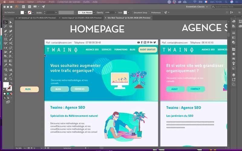
To do this, we’re going to use the Slider Revolution plugin. This slider is one of many plugins that offer a wide range of options for creating sliders.
To install it, simply go to the plugins area and download the slider plugin like any other plugin. Of course, you’ll get several plugins after your search.
However, I’d like to warn you that it’s not easy to use, and you’ll need some practice to quickly find your way around.
.

There are four main steps in creating a slider:
- Choosing the slider location and making the configurations;
- Setting up the visuals: background color, text, buttons, images;
- Resizing the slider;
- Optimizing the slider for different media.


Log in to your WordPress “Admin” account
Before you can start creating your slider, you first need to log in to your WordPress site’s admin account. To do this, simply add “…./wp-admin” to the URL of your site. On the interface that appears, fill in the boxes with your credentials and validate to access the WordPress Dashboard.

Choose the slider location and make the configurations
1) Modify the home page
Once I’ve logged into the Dashboard, I’ll go to the home page of my Twaino.com site, as this is where I want to integrate my slider.
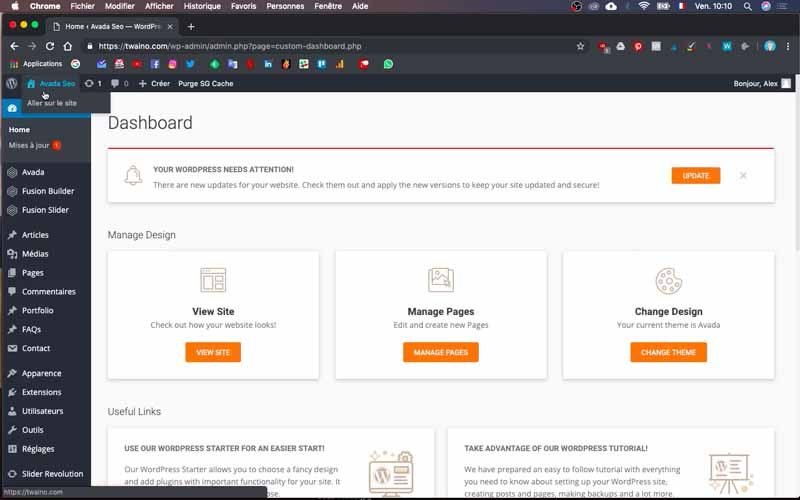
Then click on the “Modify Page” window with the pencil icon at the top, just after “Create”.

On the interface that appears, in the “Builder” section of “Fusion Builder”, you’ll see “Slider Revolution”, which will allow you to insert your Slider. Note that you can add Sliders to some or all of your pages, depending on your needs.
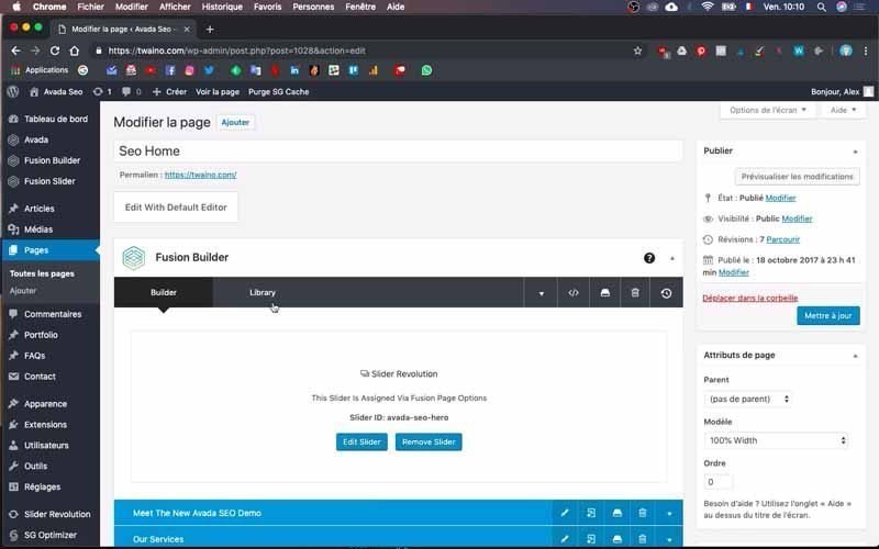
If you have several sliders on different pages, you can access all of them directly by going to “Slider Revolution” on the left-hand sidebar of the dashboad and clicking on the option with the same name.
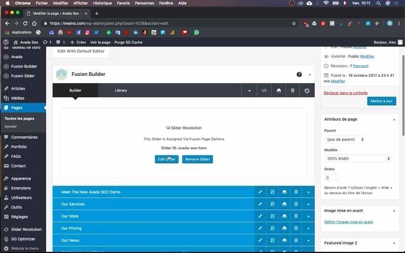
2) Go to the Slider configuration interface
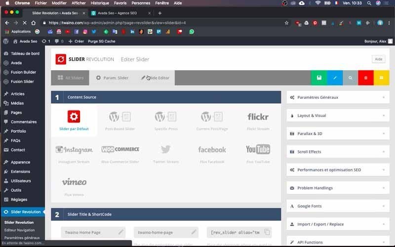
In the “Builder” section labelled “Slider Revolution”, click on the blue “Edit Slider” button to enter the slider configuration area.
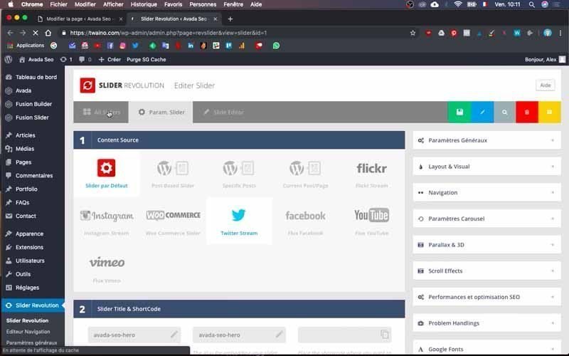
The page that appears offers the options of the window labelled “Param. Slider”, click on the first window on the left, “All Sliders”.
3) Duplicate the default silder
To speed things up, I recommend duplicating the default slider and making any necessary changes. Not only will you save time, but you’ll also avoid getting lost in the tool’s various settings.
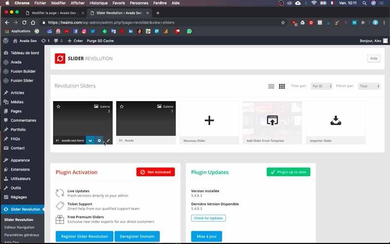
To do this, press the down arrow next to the name of your slider (mine is “1# avada-seo-hero”).
Then select the “Duplicate” option to have a copy of the slider.
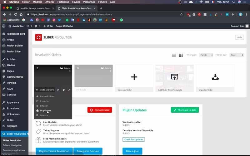
Enter the title of the duplicated slider in the dialog box that appears, and I’ll enter “Twaino Home Page”.
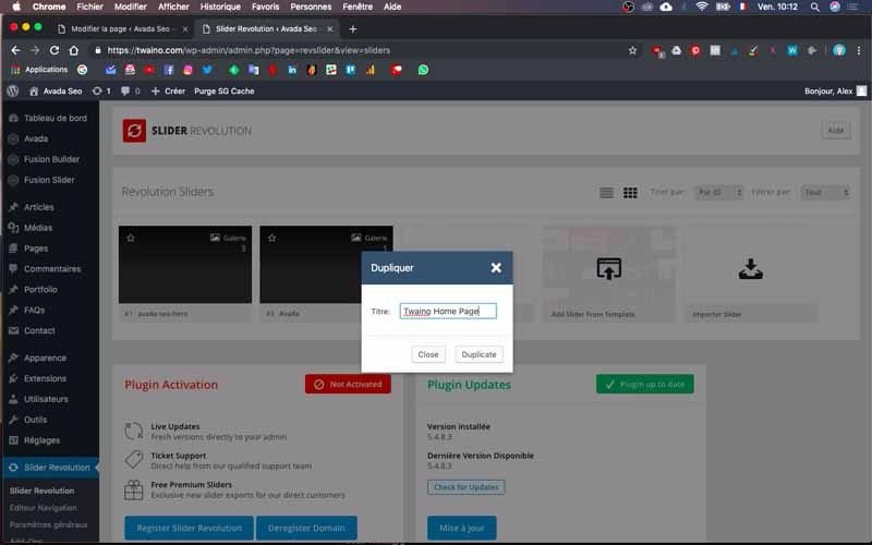
Then press the “Duplicate” button to confirm the duplication.
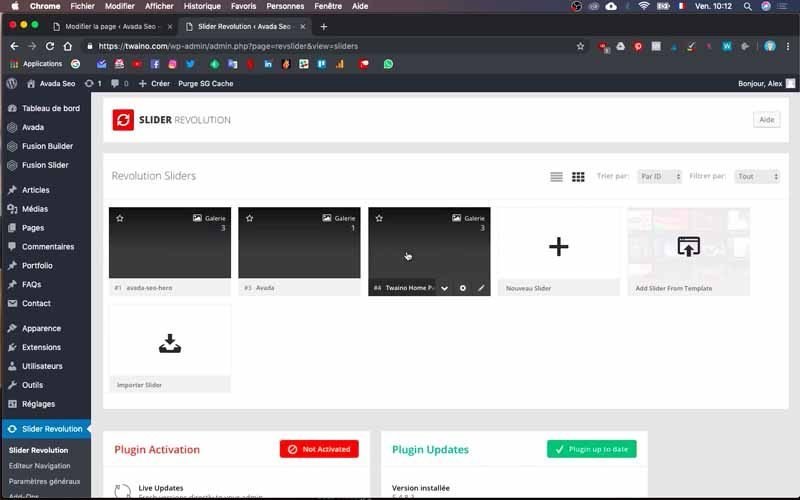
4) The slider configuration interface
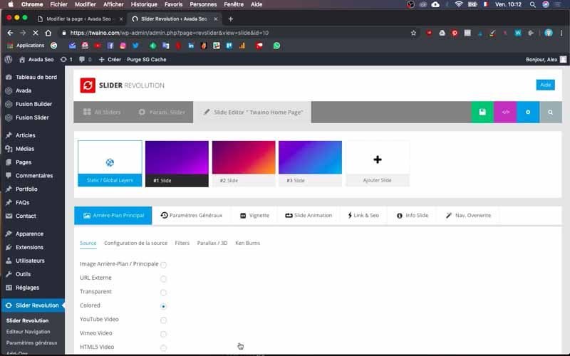
Once the duplication is complete, click on the copy you’ve just made to proceed with the modifications. On the configuration interface, you’ll see in first position the number of slides – I have three at my level.
In the second position, there are various options:
- Background images / Main ;
- External URL ;
- Transparent ;
- Colored ;
- YouTube Video ;
- Vimeo Video ;
- HTML5 Video.
These different options allow you to choose the type of visual you wish to place in the slide. At my level, “Colored” is selected, and as I modify it, I notice that the background of my first slide changes color.

In third position, we find a projection of the slider which shows directly what it looks like with each modification. Right at the bottom are the settings for the various elements, which will be arranged according to your needs and timing.
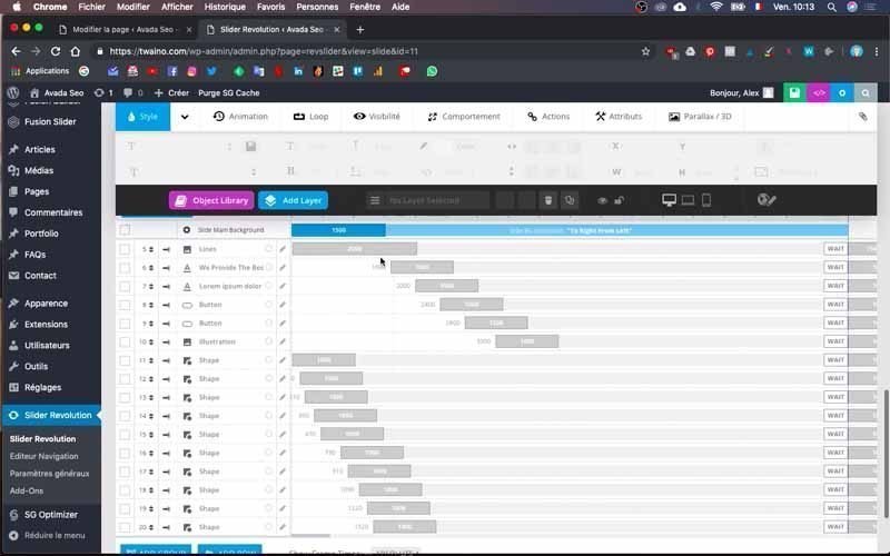
By pressing the “Play” button, you’ll get a preview of the animations you’ve set up. Please note that you can change the timing settings at will, down to the second, but I personally choose not to do this right now, as it’s a time-consuming process to set up correctly.
5) Delete unnecessary slides
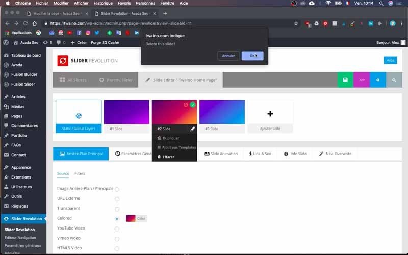
At my level, I have three slides when I only want one, so I’m going to delete the last two.

To do this, go to the slides in question and drag down to choose “Delete” from the drop-down menu.
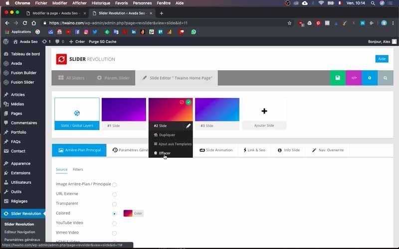
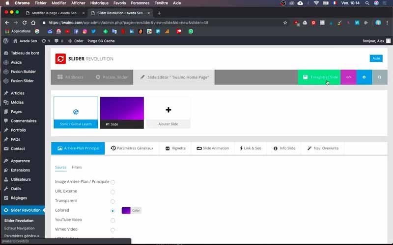
Then you can save by clicking on the green button with the save icon. I suggest that you save often to validate your changes.
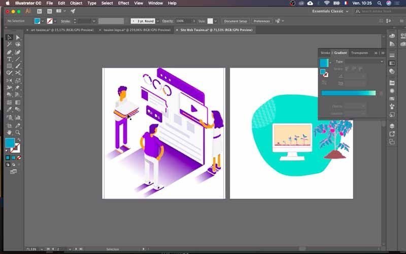
As for the next step, I already have a site mock-up that shows me what I’m aiming for. All I have to do is use it to get the final rendering, and I urge you to do the same. You can also entrust the creation to the designers for a professional marquelle.
Setting up the visuals: background color, text, buttons, image
1) Change background color
To do this, I’ll copy the color code I want to use directly into Adobe Illustrator.
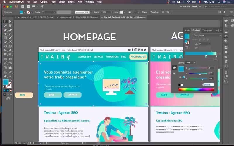
If you also have a mock-up of your site and don’t necessarily know the color code you want to use, just ask your graphic designer. This code is generally made up of 6 characters, including numbers and letters.
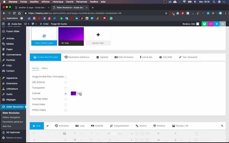
Then click on the colored area of the “Colored” option I mentioned in point 4. At this point, you can choose a solid color or a gradient color, according to your wishes and needs.
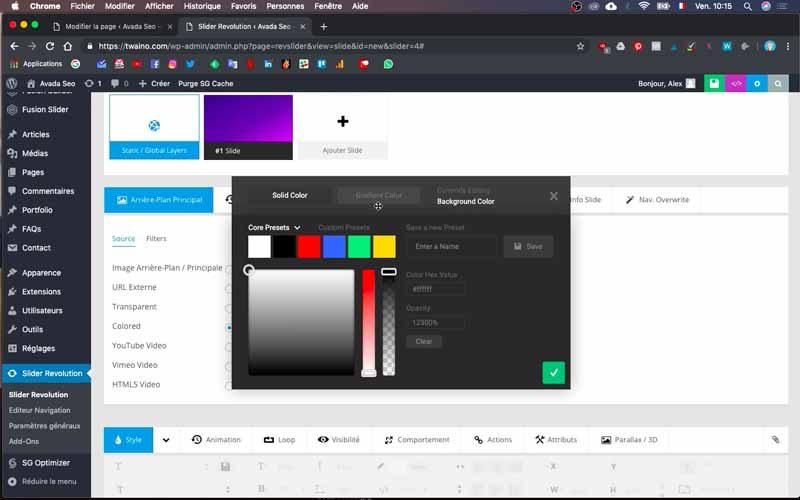
It’s a two-color gradient at my level, so I select “Gradient Color” and double-click each arrow at the bottom of the gradient to insert my color codes.
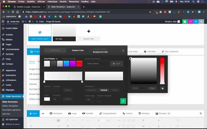
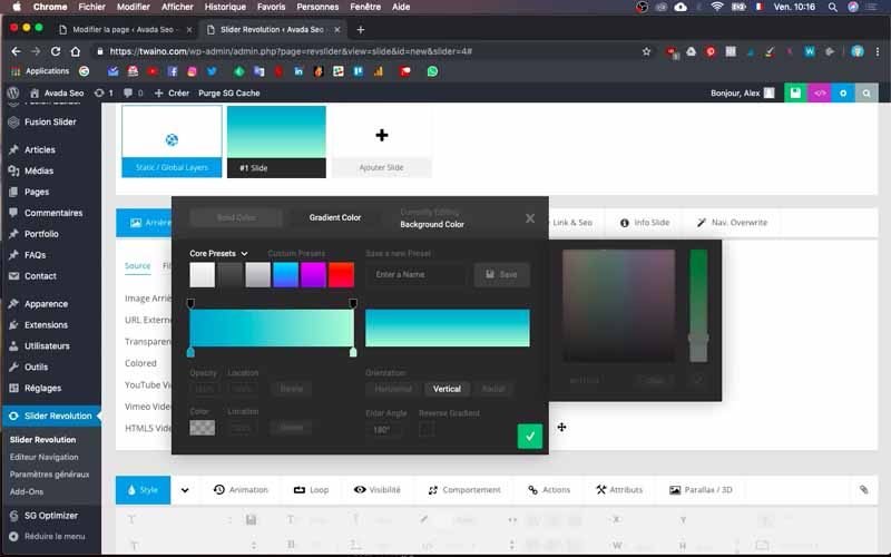
2) Insert text on the slide
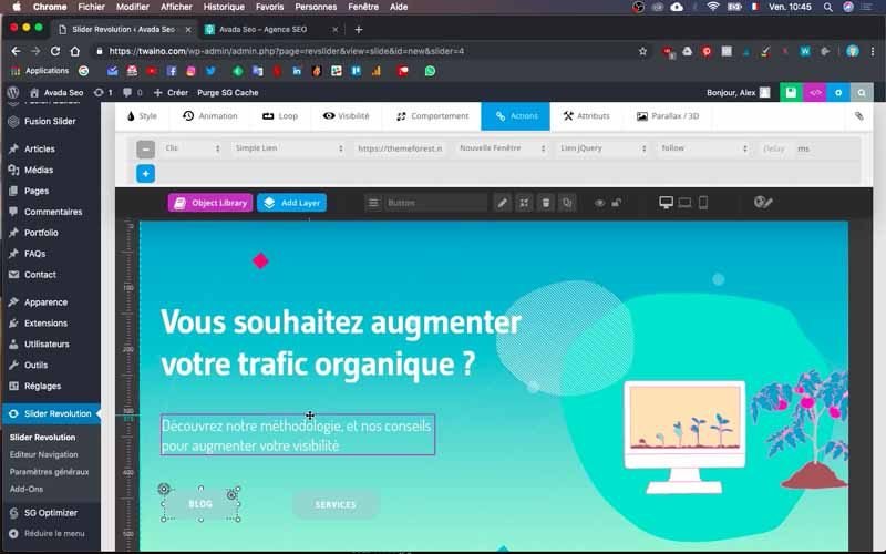
Next, I want to insert the text “Would you like to increase your organic traffic?” on the slide. To do this, click on my default text “We Provide The Best Seo Services”.
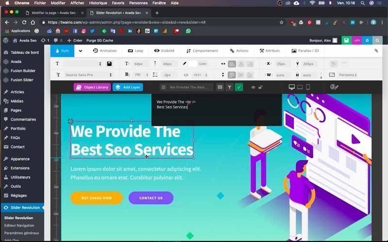
You’ll notice that the same test appears on a black rectangle at the top and that the text on the slide is framed, showing that I can modify it.
Copy your text and paste it in the black rectangle in place of the other text. You’ll notice that your text now appears on the slide.
If you see “
if you see the word ” “, this is a line break tag. So, in the black rectangle, my text looks like this:
“Do you want to increase your organic traffic?
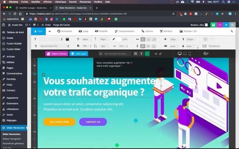
But it’s presented as I want it to be on the slide:
“Do you want to increase
your organic traffic?
When you click on the text, you’ll see that there are text options at the top of the configuration field. To change the font of this text, enter the name of the font you want in the appropriate box. In my case, I’ll enter “Gudea” instead of “Source sans pro”.

You can also change the font size to suit your needs. I set it to “55” for this text. I do the same to add the second text “Discover our methodology, and our tips for increasing your visibility”. Except this time, the font is “Dosis” and the size “25”.

3) Modify the slide buttons
3-1) Modify the text and give the button its first color
To modify the slide buttons, proceed in two steps:
- Replace the text;
- Change the button color.
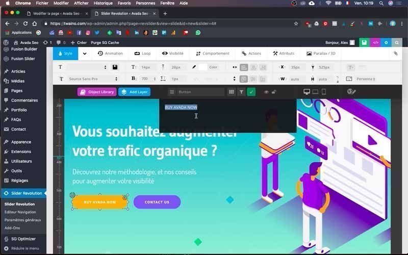
For the first step, click on the button text. You’ll find the black rectangle with the default text. I’ll change it by writing “BLOG” instead, and “SERVICES” for the second button.

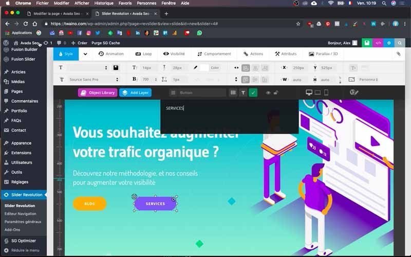
To get the exact color that’s on the template, copy the code from it. Next, click on the button itself and you’ll have several options right at the top of the field, including “Background”, located to the right of “Font”. Select it and choose the desired color or paste the code to have precisely a certain color.
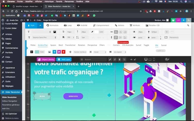
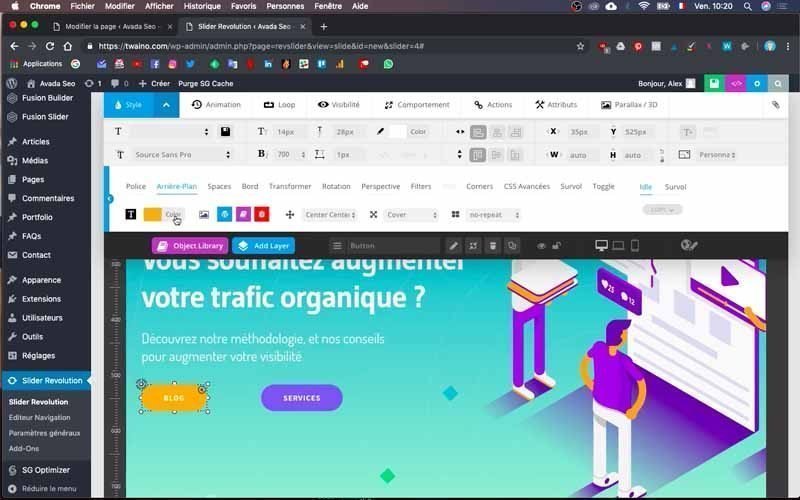
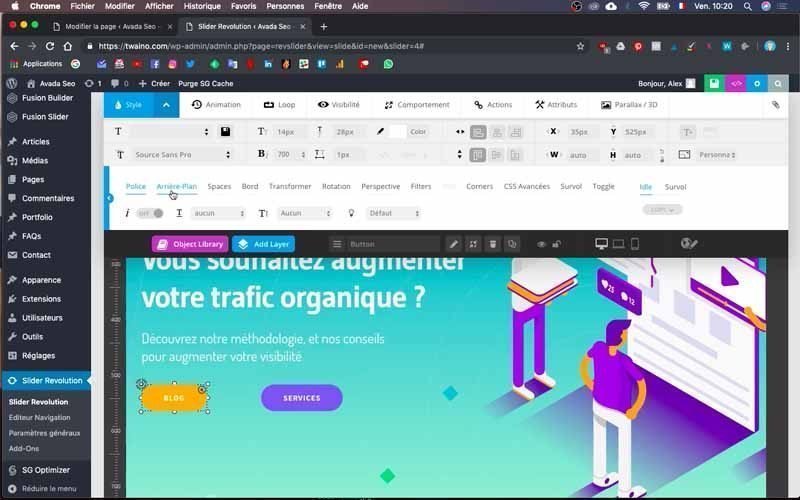
I also take the opportunity to change the font and text size in the menu at the top of “Background”, with “Gudea” as the character and “15” as the size.
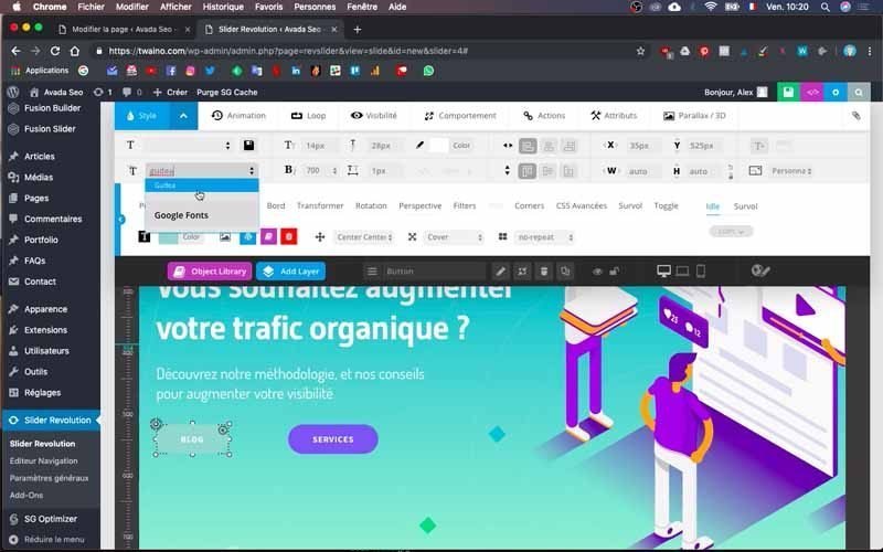
3-2) Give the slide buttons a second interactive color
Once I’ve given the buttons a color, I’ll add a second color that will be displayed when a visitor hovers over the button. To do this, go to “Overview”, which is on the same line as “Background” and completely to the right.
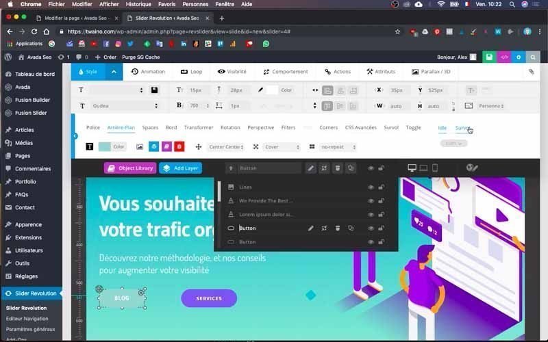
You’ll then have the “Overview” menu, which also includes “Font”, “Background” and other options. Then click on “Background” and “Color” to choose the type of color you want. You can also change the text font, as I did with mine.
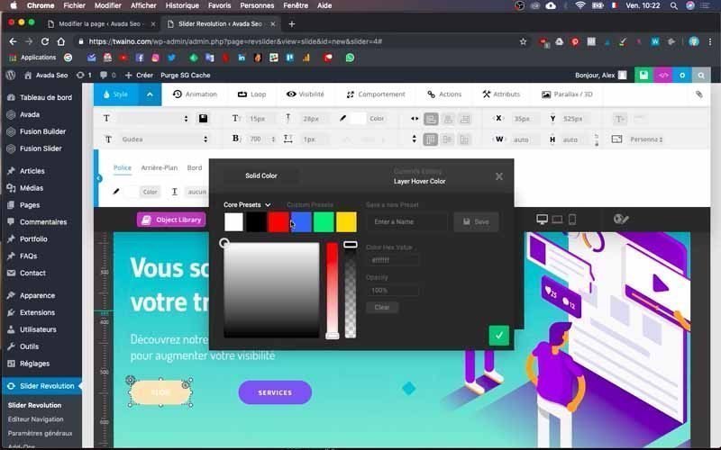
Then return to the “Idle” menu next to “Overview” to return to the previous configuration settings.
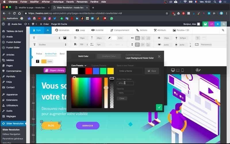
Save your changes, and when you pass over the button, you’ll see that it does change color.
Next, I do exactly the same for the second “SERVICES” button.
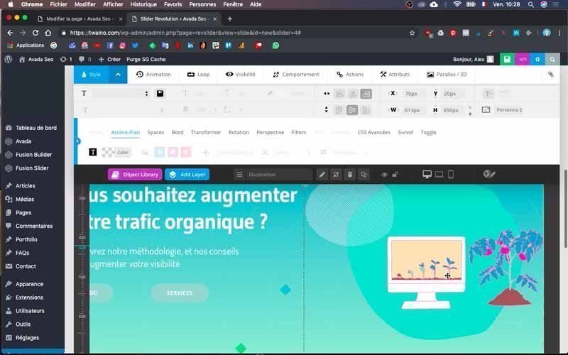
4) Change your slide image
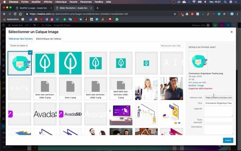
To change the image, simply double-click on the default image to access the “Media Library”.
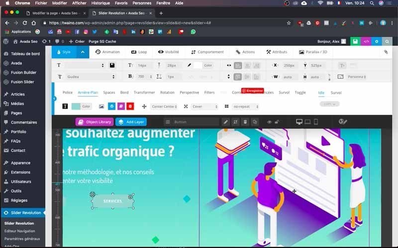
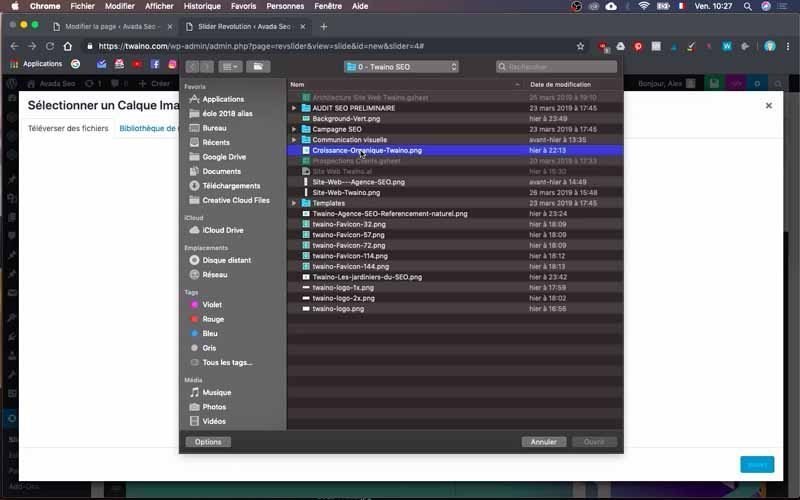
Then press “Upload files”, which allows you to upload your image with the “Select files” option.
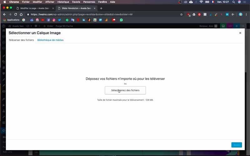
So I import my image and take care to name it.
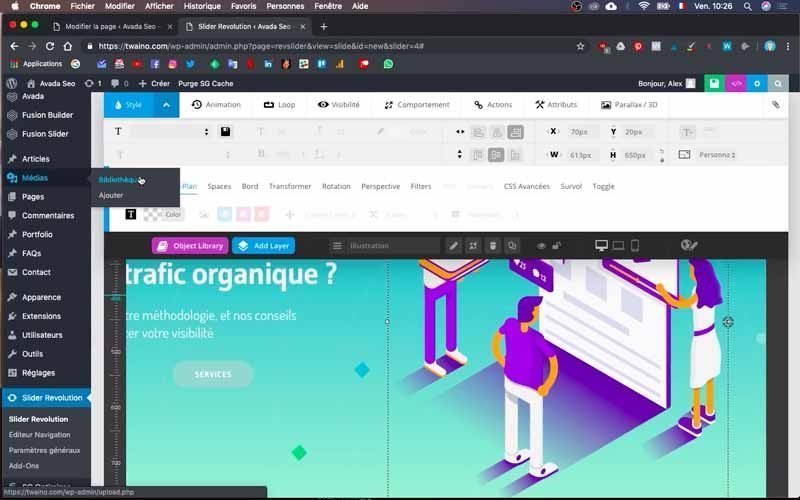
Note that beforehand, I looked at the size of the default image to adapt the size of mine. To do this, go to “Media” on the left-hand sidebar of the dashboard and then to “Library”.
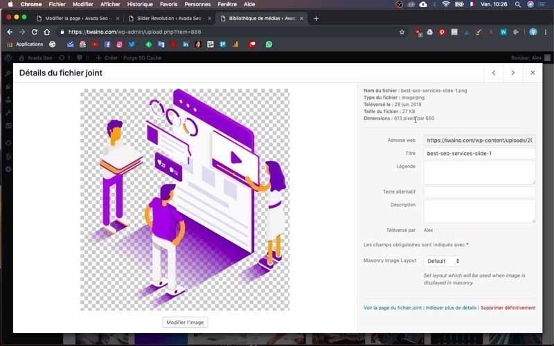
All you have to do is search for the image in question and click on it to see its details.
Mine is 613 x 650 pixels.
5) Link the new slider to the right page
The previous modifications will not appear directly on your home page when you go there. To see what it looks like, you’ll need to associate the slider you’ve just created with the home page in question.

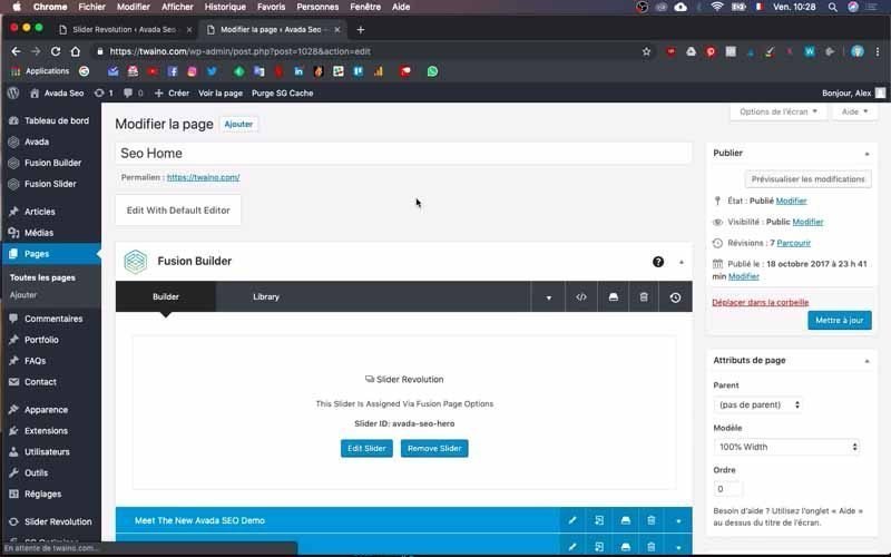
First, go to the home page, then click on the “Edit Page” window with the pencil icon at the top.
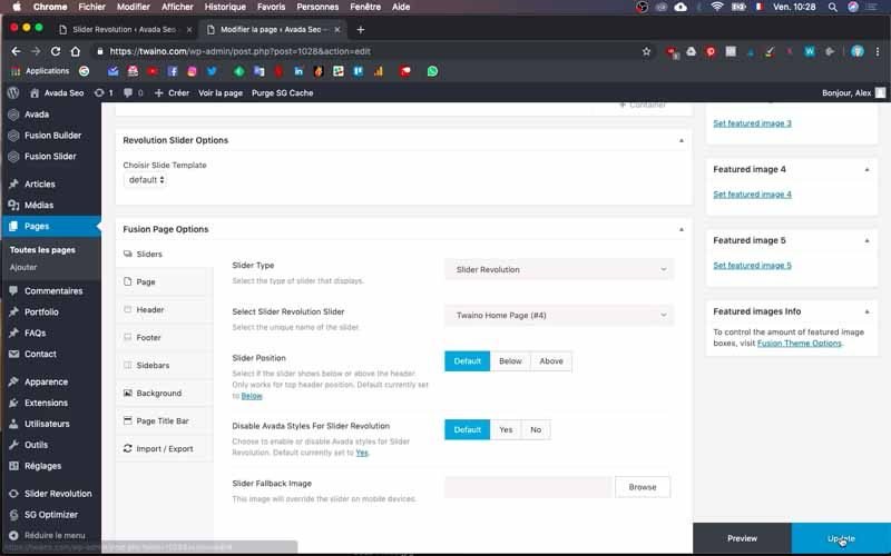
Next, go to the “Fusion Builder” settings and scroll down to the “Sliders” menu under “Fusion Slider Options”
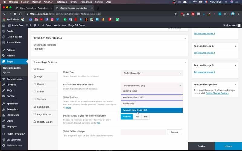
Click on the “Select Slider Revolution Slider” drop-down bar and select the name of your theme. I choose “Twaino Home Page (#4)” and click on the blue “Update” button in the bottom right-hand corner to save the change.
Click directly on “Preview” next to “Update” to see how the home page looks.
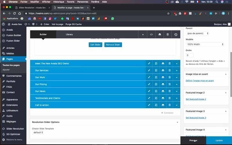
At my level, the changes have been taken into account, but my slider contains a lot of unnecessary space, which I’m going to reduce.

Resizing the slider
1) Reduce slide size
Go to “Slider Revolution” on the dashboard sidebar and then to the “Param. Slider” window.
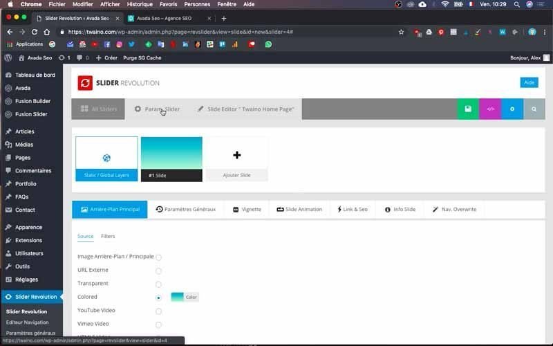
You’ll then see a number of settings, including :
- Centent Source ;
- Slider Title & ShortCode;
- Select a Slider type;
- Slider Layout ;
- Customize, Buil & Implement;
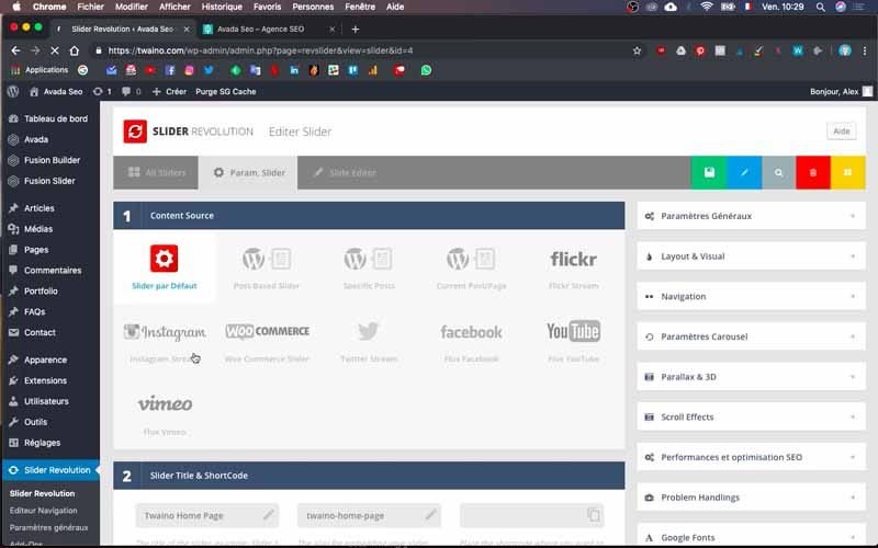
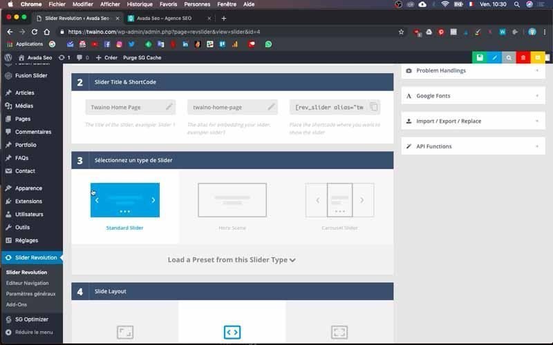
The “Select Slider Type” parameter lets you select the type of slider you want. I chose the slider without the “Hero Scene” arrow for my single slide.
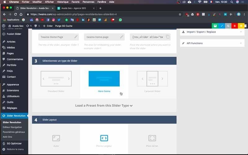
The “Slider Layout” parameter lets you modify the size of the slide.
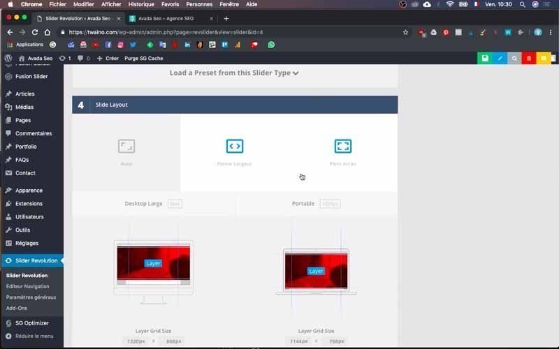
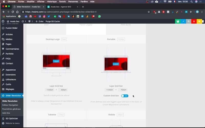
First, there’s the “Full Width” layout, which already suits me fine. Right at the bottom are the dimensions I’m going to modify, but I need to know at least the width of my website to do so.
To find out, go to your theme options.
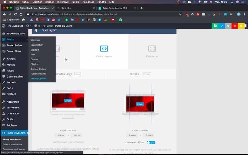
I click on “Avada”, then on “theme options” and in “Layout”, you’ll find “Site Width”, which represents the width of your website.
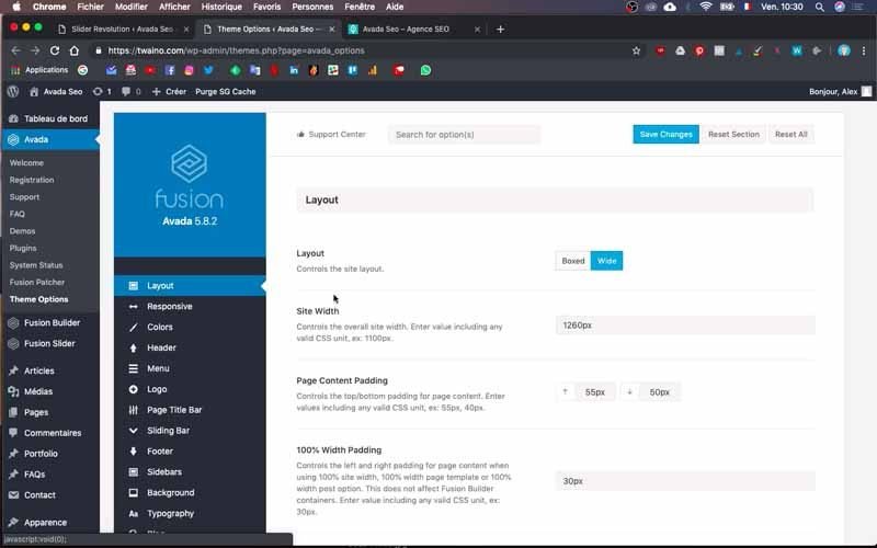
Copy the dimension you find just in front of the “Site Width” option, mine is “1260 px”.
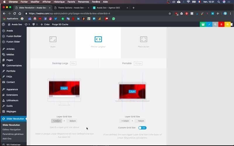
Then simply paste it into the “Slider Layout” parameter, precisely in the first rectangle just below the computer screen design marked “Desktop Large”.
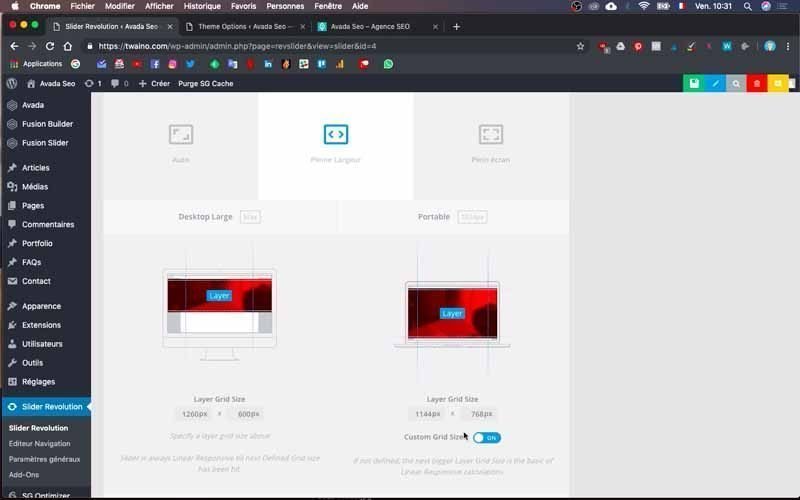
Decrease the slide height too, so I change the default “820 px” to “600 px”. I do the same with the screen on the right marked “Portable”, taking care to paste the width in the appropriate box and enter “600 px” in the second box.

Note that you can change these dimensions at any time. Save your changes to validate them, and once you’re back on the home page, I can see that the new dimensions have been taken into account.

However, you now need to refocus the text and the slide image.
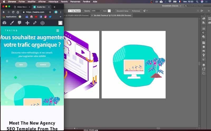
2) Recenter your silder’s content
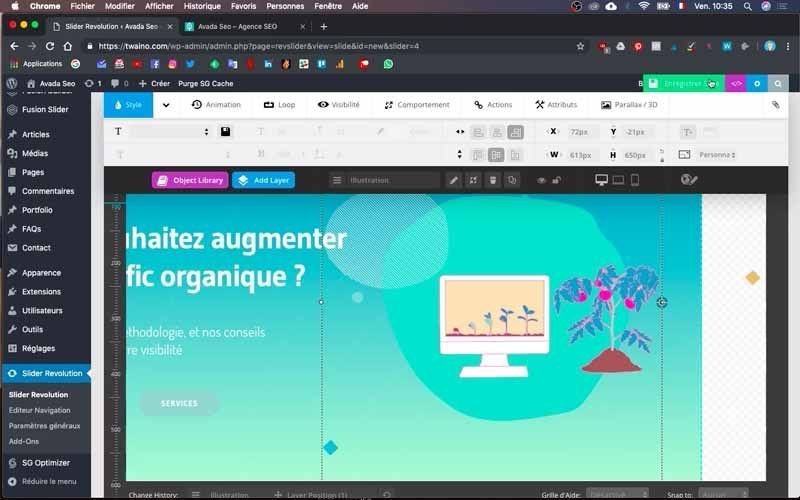
Go to “Slider Revolution” on the sidebar of the dashboard and then to the “Slide Editor” window. Here, simply click on each element and move it up.
Save your changes and go back to the home page to see the results.
I advise you to go back and forth several times if necessary to get the right fit.
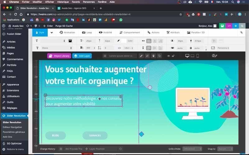
Please note that we’re talking here about large-screen display, and that the presentation may differ from one medium to another.

Optimizing sliders for different media
Sliders are not displayed in the same way on computers as on laptops or tablets. To do this, go to the “Slide Editor” window in “Slider Revolution” and once in the configuration field, you’ll find three icons in the top right-hand corner, symbolizing desktop, laptop and cell phone.
Click on each of these icons to see how your website looks on these different media. In my case, the first one presents my website well, unlike the last two icons where the content is not yet centered and some parts of the text are cut off.
1- Optimize display on laptops
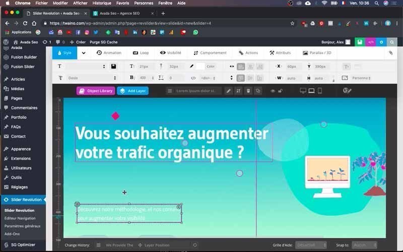
To recenter the content of your slide on the laptop, click on the icon in question and move up each element as in the previous step.
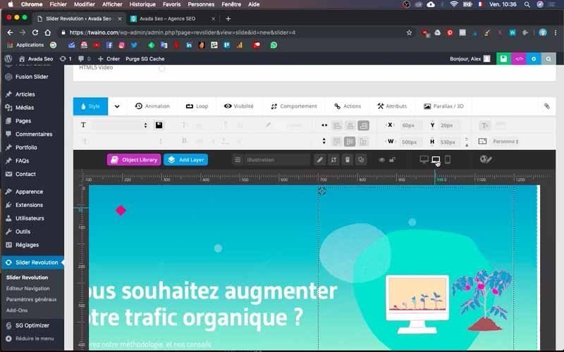
You can also change the text size if you wish.
Note, however, that these modifications do not affect other display types at all.
2- Optimize cell phone display
For cell phones, click on the corresponding icon to proceed with optimization.
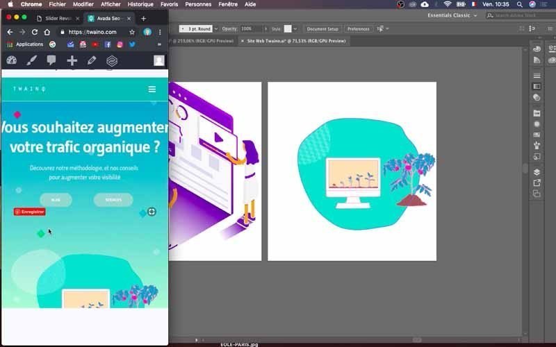
At my level, I notice two lines framing my slider.
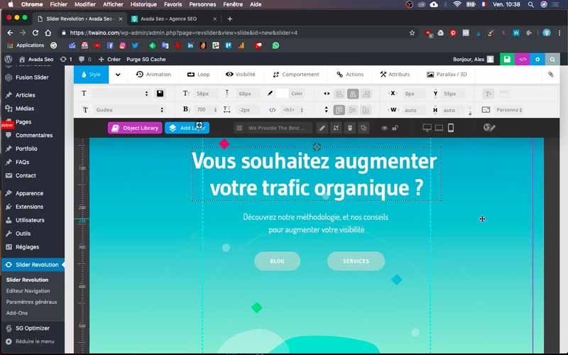
In effect, they delimit the display area, and any element outside them does not ultimately appear on the support.
To do this, I reduce the size of my overflowing text and increase the size of my second text. I recommend that you enlarge the buttons a little more, and to do so, click on each of them to access the various options just above the configuration field.
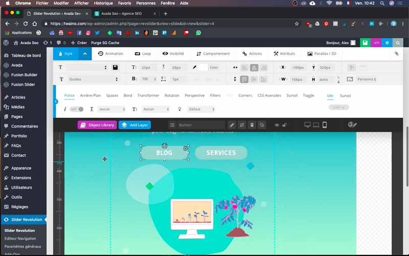
Change the text size after stretching the button. Remember also to center the text by clicking on the arrow on the blue “Style” button in the top left-hand corner and then on the “Space” window.
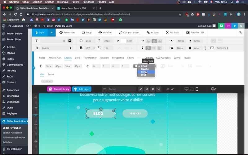
Then press the “Inherit” drop-down menu and choose “Center”.
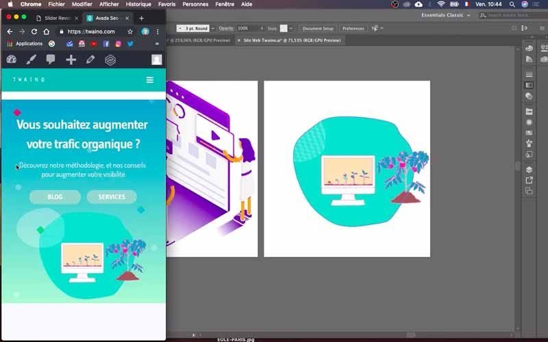
On the other hand, there’s also the image that I’m going to recenter, taking care to reduce its size a little for a good fit.
I save the changes and, by minimizing my browser to simulate the display of my site on a cell phone, I can see that everything is fine.
Final check of modifications
This final step involves checking the final display of your website on all media to see how it looks. For this, don’t hesitate to use your smartphone as well as your tablet and any other type of support to carry out the check.
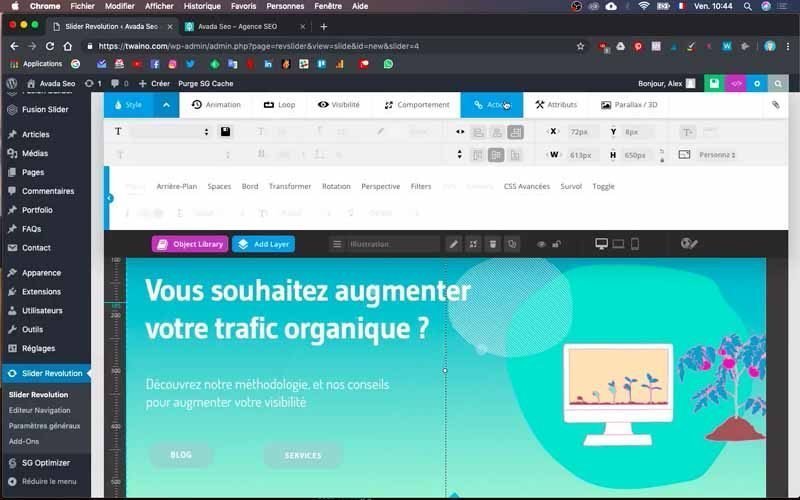
And that’s it! We’ve just finished creating the home page slider.
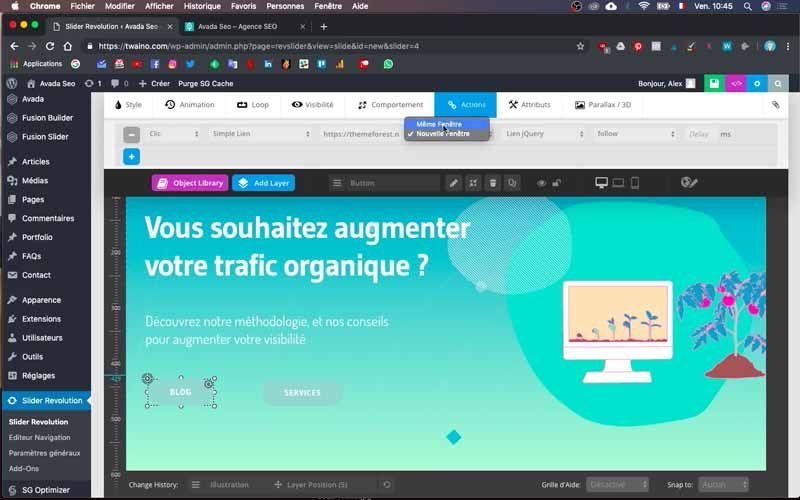
In another article, I’ll show you how to associate the slider buttons with specific URLs or pages to facilitate navigation.
Conclusion
After creating a website’s navigation menu, the next step is usually to create a slider for your home page. And as I mentioned, you have several options in terms of visuals, including still images, slideshows and videos. However, you owe it to yourself to choose a slider that combines good design with extremely fast loading speed. For the simple reason that the slider is one of the first elements to be presented to visitors, and it has a huge impact on their decision whether or not to continue browsing your website. That’s why I’m suggesting you use Slider Revolution, a powerful and effective tool, but one that can be rather complex and time-consuming to set up. I hope that the steps outlined above will help you enormously to get up to speed with the tool.
See you soon!
