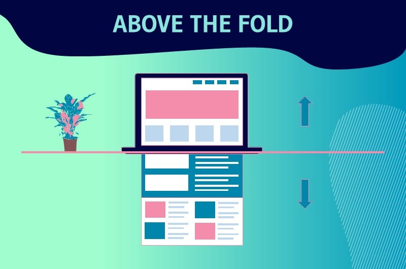
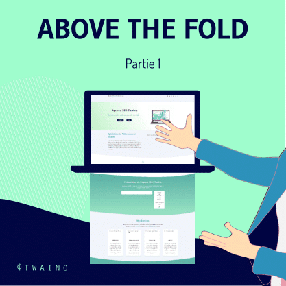
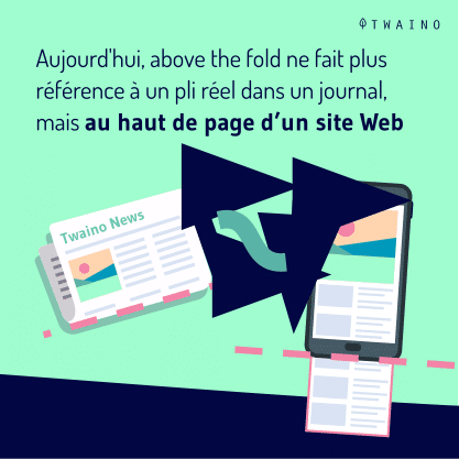
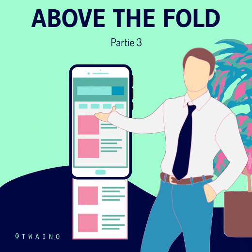
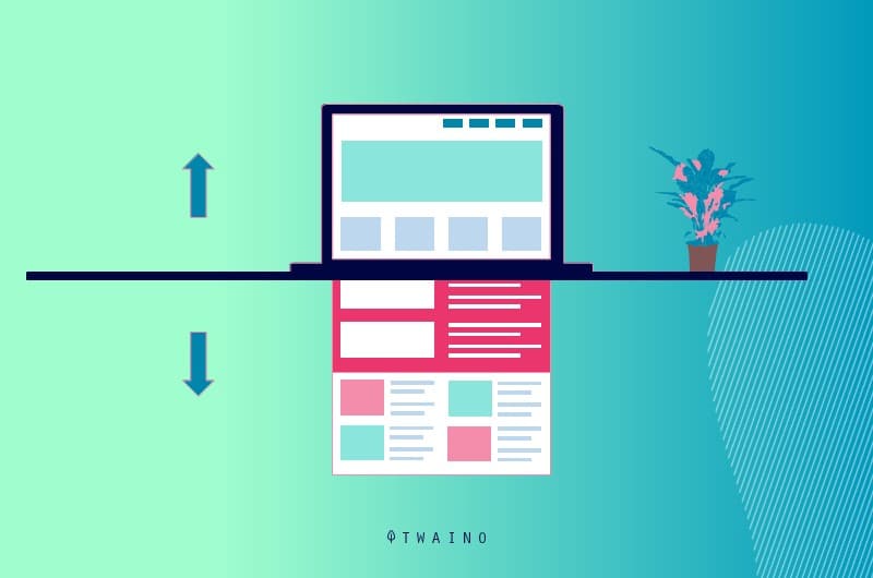
Above the fold refers to the part of a web page that is displayed directly to Internet users without them having to scroll down the page
While it was possible to display several elements in the upper part of a web page, this is no longer the case
- What does this notion really mean?
- Is it useful?
- What are the best practices to take full advantage of it?
Chapter 1: What does Above the fold really mean?
In this chapter, I explain what the expression “Above the fold as well as its importance and implications.
1.1. above the fold: origin and meaning
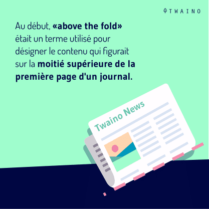
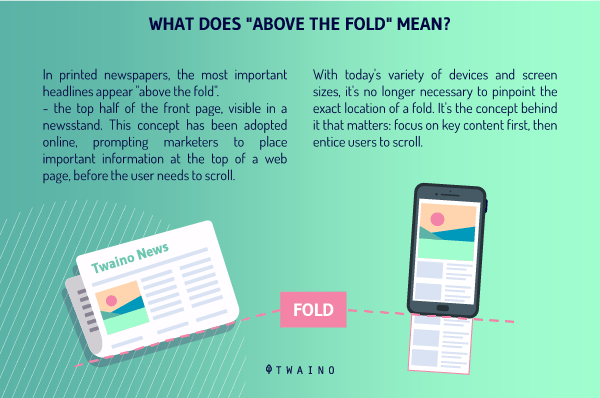
To understand the origin and meaning of the expression “Above the foldto understand the origin and meaning of the expression “Above the fold”, we have to go back to the time when the printed press was still one of the main sources of information
In those days, in fact, when newspapers were displayed, they were folded so that people could see only the most exciting headlines.
This is actually a marketing action whose objective is to attract people’s attention by showing them the most important headlines
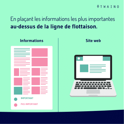
This idea will be taken up later in the design of websites and we will talk about “Above the fold” or waterline to designate the area that is displayed when one arrives immediately on a page without having scrolled down.
1.what are the different elements that are usually found in an “Above the fold” area?
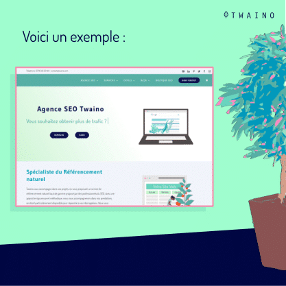
Generally in the upper part of a website, you will find the following elements:
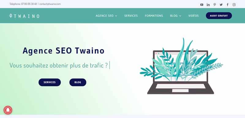
1.2.1. The logo and the name of your brand
This is a graphic element that you use to establish your brand image and allow your visitors to get an idea of what you stand for.

1.2.2. The site’s navigation menu
This is the set of arrangements you make to allow your visitors to have a framework that will allow them to explore your site and learn more about what you offer.

This framework must be intuitive and simple
1.2.3. Contact information
Another element you can include in the “Above the fold of your site is the way by which the Internet users can contact you.

This is an important element for the internet user, as it tends to prove to them that you are a legitimate business.
However, it should be noted that this part is not above the waterline on all websites. The same is true for :
1.2.4. Social media buttons
Today, it is more than difficult to imagine an online presence without social networks.

Indeed, they allow users to subscribe to your social accounts and follow your news.
1.2.5. The key selling point
The key selling point is what allows you to instantly show visitors to your site what you offer.

It must be
- Simple ;
- Concise;
- And brief
It is usually one line long and displayed in large type.
After this presentation, if you are wondering about the interest of talking about the part that is “above the fold of your site, let me tell you why it is important.
1.3. How important is the “Above the fold” part for a website?
In web design, the “Above the fold” part is an important element in web design. This is justified by the fact that it is the first element that appears on the screen of visitors when they arrive on a website. It must therefore make a good impression and hold their attention.
In addition, being the first element that is seen on a website, it has a certain visibility that makes it conducive to hosting the information that we would like to put first on the site.
This is precisely what the study on the importance of being seen carried out by Google.
In this study, you will learn that the ads placed in the “Above the fold had a 68% visibility as opposed to the ads that were towards the bottom of the page whose visibility was around 40%.
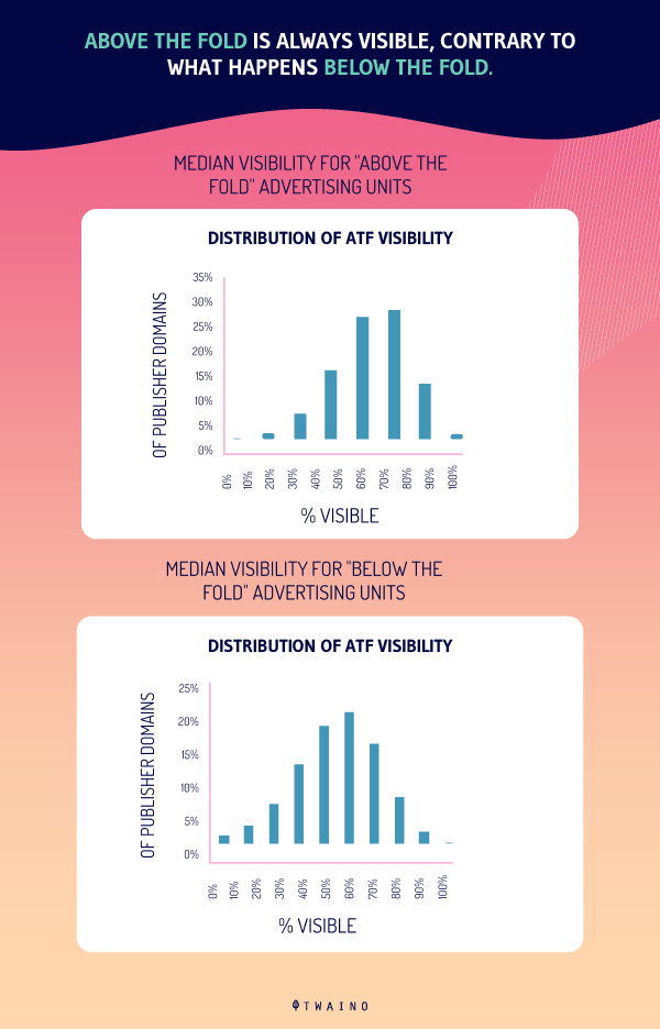
The most important elements of the site can therefore be placed at this level to have more success
But remember that there is no question of positioning several important pieces of information at this level
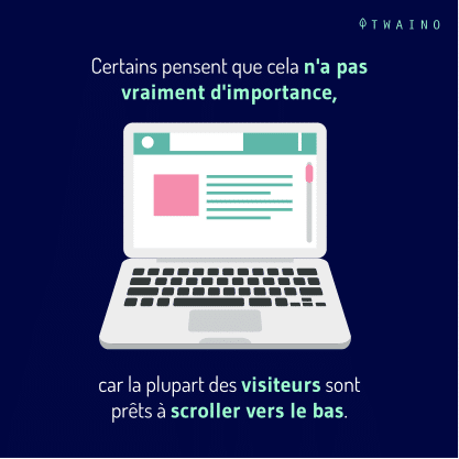
The strategy to adopt should rather consist in using this part to push the Internet users to go further in the scrolling of the site pages
In any case, when it comes to the “Above the foldit is important to take into account both the mobile-friendly design requirement and SEO requirements.
1.4. Some mobile and SEO considerations for the “Above the fold” area
1.4.1. Mobile considerations
It is almost impossible to identify the location or give the measurement that the “Above the fold” area should have
Because today, the location depends more on the settings and characteristics of the devices (sizes, screen resolutions, browsers, etc.) used to access the website.
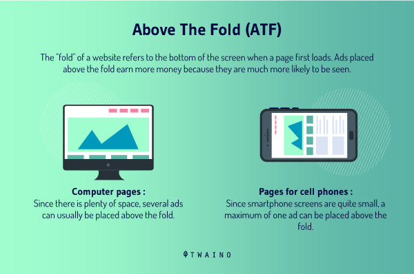
Moreover, Internet users adopt new habits depending on whether they are browsing with their smartphones or on their computers.
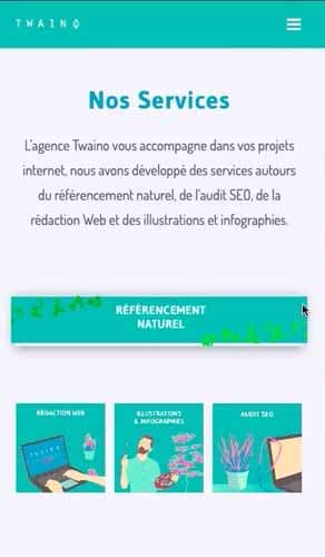
For example, the fact that browsing on most mobile devices is done in portrait, Internet users are more willing to scroll down to discover their content
1.4.2. SEO considerations
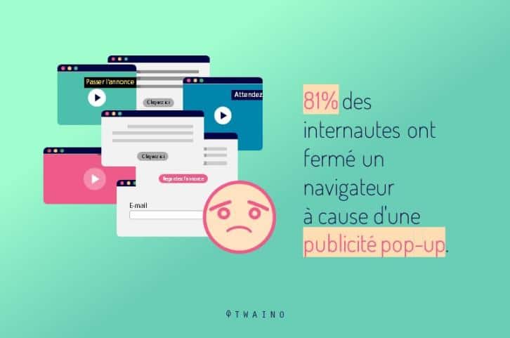
It is true that ads displayed above the waterline have more visibility than those displayed towards the bottom of the page
However, abusing them is not beneficial for referencing of your site
Sites that do this can see their SEO traffic decrease. I would therefore recommend that you ensure a certain balance between ads and the user experience of your site.
Indeed, the ambition of a high quality user experience led Google to launch in 2012 its “To heavy” layout algorithm
Its task is to search and punish web pages that have a high number of ads above their waterlinesns.
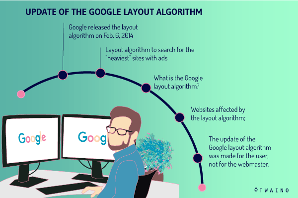
This algorithm was subsequently modified three times
- First in October 2012: About 10 months after the launch of the layout algorithm, it was changed. And according to a tweet from Matt Cutts this change affected 0.7% of English queries
- Then in February 2014: Specifically on February 6, 2014, Google to perform the update of its algorithm, but no explanation on the impact had been notified to web designers ;
- Finally in November 2016: When you are hit with a penalty due to a large number of ads above the fold of your site, this penalty could only be lifted if Google bots crawl your content The 2016 update solved this situation by dedicating the automation of the algorithm. This allows it to take into account changes in real time
Beyond these various changes, it should be noted that google’s layout algorithm does not systematically penalize everyone who has put ads above the fold on their site. It is rather intended for those who make an excess.
This is precisely what Matt Cutts defends when he says:
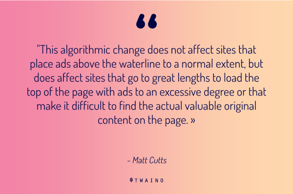
So as you can see, Google’s layout algorithm helps get webmasters to consider user experience in their site design
Now that you know what the term “Above the fold” and how it is useful for your site, I suggest you discover in the rest of this article the best practices for their design
Chapter 2: Best practices to consider when designing the “Above the fold” part of your site
Here are some tips you can use to efficiently design the “Above the fold” part of your website:
2.1. keep the design simple
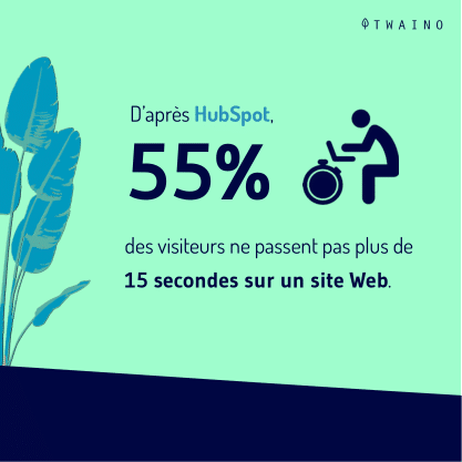
Don’t load a lot of elements in the above the fold area. This could prevent your site visitors from easily finding what they are looking for or cause slow loading time.
As you know, both of these elements are likely to cause bounce of your visitors. Instead, keep it simple and create a user-friendly, well-organized top of page.
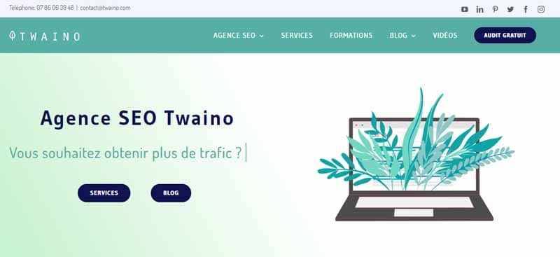
Consider, for example
- Adding a featured GIF content to give some animation to your page
- Identify your key selling point by trying to be as simple and concise as possible
- Add a short sentence if necessary to explain the selling point.
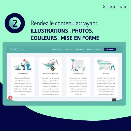
2.2. Make the content attractive
Each time a user arrives on the “Above the fold” area area of your site, he gives you an opportunity to convince him
Take this opportunity to really convince and delight them.
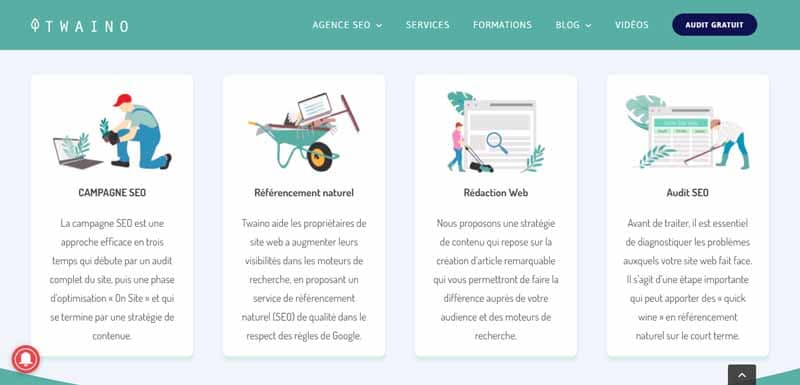
To do this
- Build your web pages in simple ways;
- Adopt a writing and design style that reflects your brand;
- Adopt and show your brand colors in the content you write
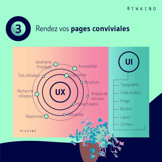
2.3. design your pages to be user-friendly
To have a greater effect on Internet users, the content you create must offer an optimal user experience and be user-friendly.

In fact, before you make your content public:
- Test it and make sure it works properly;
- Check that it is easy to interact with;
- Check that it loads quickly.
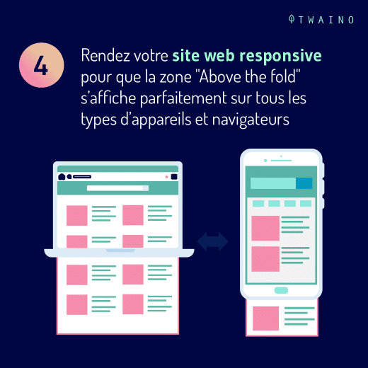
2.4. Fix the challenges of your “Above the fold” area for visitors
When designing this part of your site, there are a number of things you should check
- Make sure the content is mobile-friendly;
- Check how it displays in the major browsers (Chrome, Firefox, Internet Explorer, etc.);
- Also consider responsiveness to make sure the site displays properly on different screen sizes
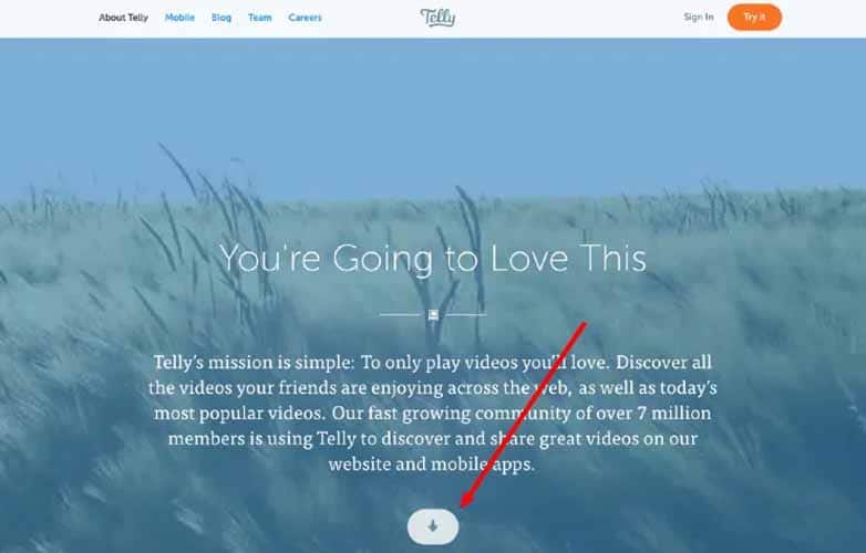
2.5. Avoid creating a “false background” on your site
A “false background” is when a section of your site gives the impression to the user that there is nothing left at the bottom of your site.

You must avoid this by including visual clues in your design that will allow them to understand that there is content towards the bottom of the page:
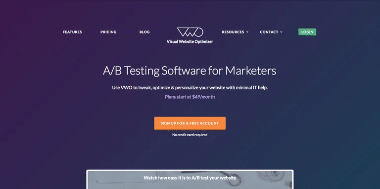
You can integrate directional cues to ask them to scroll down or up.
2.6. integrate identifying information into your content
Placing identifying information on a website helps to build trust with users.
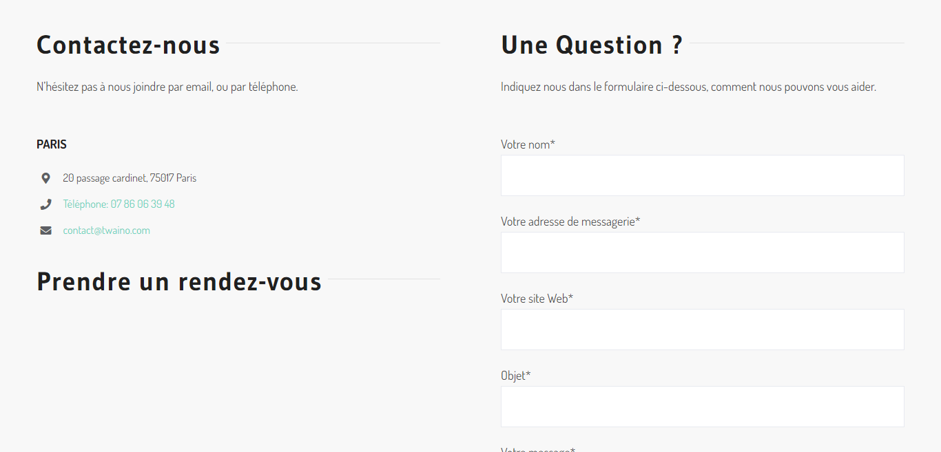
They will be able to easily connect with you, but also search to see if you are a legitimate business or not
A publication of the wpforms has proven that putting contact and security information on a website leads to a higher conversion rate.
2.7. Don’t forget to focus on the quality of your site’s content
Even if you follow all the best practices and have done a good design in the “Above the fold of your site, you should always keep in mind that content is important
In fact, meeting the requirements of attractiveness and so on does not always guarantee you a high conversion rate
This is partly due to the quality of the content you offer. It is indeed thanks to this quality content that visitors will be interested in what you offer and will be more inclined to scroll down the page
Keep this in mind and always associate quality content to your “Above the fold”
In summary
The creation of a website always includes the design of an “Above the fold” part
If you have always overlooked its importance, this article will help you understand what it is and what it means.
It also provides you with various tips on how to set up “Above the fold parts on your site.

