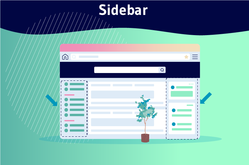
A sidebar is a vertical column placed to the right or left of the main content area of a web page. It is responsible for collecting secondary information from the page such as advertising
Competition has become atrocious on the Internet nowadays. It no longer gives a company the opportunity to stand out with just great content, it now has to focus on how the elements are organized on the site.
A better way for designers to keep a site’s layouts fairly airy and intuitive is through the use of the sidebar.
This allows to organize in a consistent order, information that is supposed to be on the page, but should not impact the user’s attention from the main content.
Sidebars are intended not only to ensure a good user experience thanks to their nature to organize information, but also to enhance the ability of the main content to attract attention.
So, if you are interested in learning more about sidebars, I invite you to read this article.
Chapter 1: What does Sidebar mean?
Let’s find out in this chapter what is meant by Sidebar.
1.1. what is a sidebar?
When we talk about a sidebar, it is completely detached from the main content of the page and is also not a primary means of navigation
In most cases, a sidebar is designed to organize the secondary content of the page.
Secondary content is indeed essential for a website, even if it doesn’t necessarily grab people’s attention
It helps highlight a few sections of the site to help the main content get more attention in order to achieve the site’s goals.
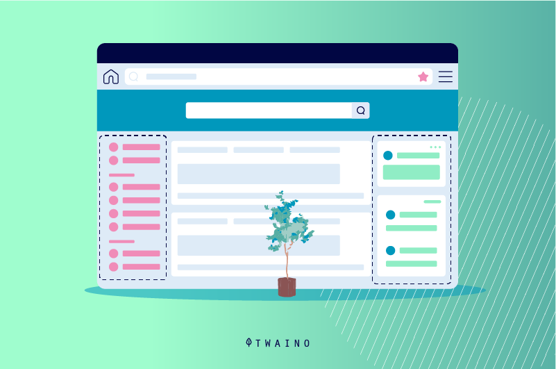
The sidebar is in this case an excellent place to place these kinds of contents that need to be included without distracting from the main content.
There are two different types of sidebars:
- Left sidebar: Typically, the left sidebar is used as an additional navigation element next to the header navigation.
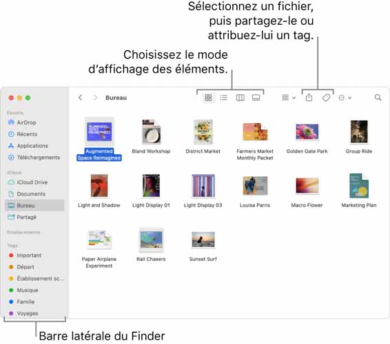
Source: help.apple
Since we read from left to right in Western culture, the left sidebar positioning particularly helps with orientation on the website and gives the user the ability to navigate more easily. The left sidebar is particularly used for e-commerce sites, as categories need to be displayed in a tab, which usually cannot be displayed via the header navigation;
Right sidebar: Like the one placed on the left side of the main content, the right sidebar is also intended to contain secondary information of the site or page.
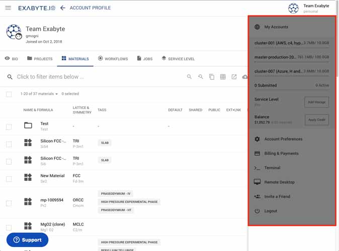
Source: docs.exabyte
Because of the reading direction, it is only noticed by the user later. It is no longer used to navigate to a specific destination, but rather offers to “see more” or “explore”
Sidebars on the right side result in fewer conversions, but this is a secondary goal for your blog
Users visit your blog to benefit from your content. Therefore, the primary goal of your layout is to make it as easy as possible for those visitors to read your content, engage with you, and share it on their social networks.
1.2. Why are sidebars important?
First, the sidebar can be used as a space to:
- Promote a product or service
- And prompt page visitors to perform a particular action you want them to take
For example, integrating your bio into the sidebar of all blog pages, allows you to strengthen your relationship with your readers
This in turn strengthens your fan community and is reason enough to include a sidebar.
Author bios can be added after the blog content in each post, but it should also be noted that many visitors will not read your entire post, especially longer posts
You also can’t place a bio at the beginning of an article, it will only distract your readers from the content.
Sidebars are also necessary if you are trying to attract recurring traffic
In your sidebar, you can include links to your social profile, as well as an invitation to sign up for emails
Another reason to include a sidebar is that it can contribute to a higher ranking on organic search engine results pages (SERPs)
For example, when you include links to your most recent or popular content, it passes on traffic and internal link juice to the pages listed. This allows them to rank higher on Google.
1.2) Which sites need a sidebar the most?
The usefulness of sidebars for some websites is indisputable, as they need them to better organize the information they display to readers.
We can mention
1.2.1. Large websites
Online magazines and some famous blogs are sites that usually gather a wide range of content categories, products or services.

Source: ephesossoftware
The other most important thing about these sites is that they publish content almost every day.
And as you know, too much content on a website can make it a bit more difficult for visitors to navigate.
So the sidebar allows visitors to these sites to have enough ways to interact and engage.
1.2.2. E-commerce sites
E-commerce sites are the most complex in terms of navigation, as they list enough products for their audience.
Every day, the number of pages on the site increases due to recurring product releases.
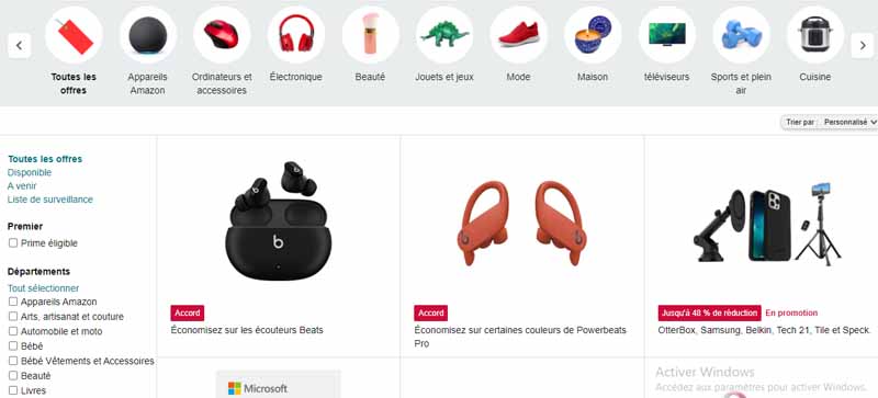
E-commerce sites usually require too many options, and without a sidebar the user experience would be quite poor.
This is actually what makes sidebars even more useful for these kinds of websites.
Chapter 2: What do experts think about sidebar placement?
Several web marketing experts have given their opinions on the usefulness of sidebars on a website. And let’s see what they say:
2.1. Opinion of Usability Geek
In an analysis by Usability Geek, Yona Gidalevitz talks about why sidebars are not very useful.
But rather than sticking straight to this opinion, Yona Gidalevitz demonstrated in his analysis how a sidebar can be used in the best way.
He uses the Google Drive platform to prove when a sidebar is necessary.
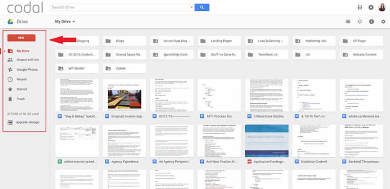
As you can see in this image, the Google Drive platform has a left sidebar.
For the author of the analysis, this is quite reasonable, because:
- It is compatible with all Google layouts;
- It serves a real purpose and is not just loaded with useless widgets;
- It replaces the traditional top navigation of most sites.
But on the other hand, the author denounces how some news sites abuse sidebars.
For him, sidebars on these kinds of sites are really useless and only harm the users’ experience.

Source: usabilitygeek
The author, in his analysis, simply emphasizes the effective use of sidebars to enhance the user experience.
2.2. opinion of VideoFruit
On the topic of the usefulness of sidebars, Bryan Harris of VideoFruit asked himself the question of what would happen if he dispensed with sidebars and focused solely on the main content.
The author arrived at this question after getting a click-through rate of only 0.3% on his blog’s sidebar, which got him thinking about this alternative.

For him, if sidebars are removed, visitors will focus better on the main content and click on the call to action if it is placed at the end of the content.
So they did an A/B test and come to a conclusion:
”The version without sidebar resulted in 26% more email subscribers than the version with sidebar.”
2.3. opinion of Impact BND
Like VideoFruit, John Bonini ofImpact started with a similar philosophy.
For him, companies can’t generate leads if their sites are filled with sidebars. He also proposes to remove the sidebars from the site
With this in mind, he also conducts a test that gives the following results:
- Original with sidebar: 33 clicks to form, 14 form submissions;
- Variant without sidebar and redesigned CTA at the end: No clicks because the form was directly on the page and 24 form submissions.
Chapter 3: What are the essential elements of a Sidebar?
Here are some components of a good sidebar:
3.1. Recent content
If you regularly update content, a recent content widget can encourage users to read your most recent content.
On the other hand, if you have a blog that covers a range of unrelated topics, it would be best to opt for a list of recent content by including an image thumbnail to grab people’s attention.
Likewise, it’s worth thinking about how recent posts can semantically detract from the focus of your pages
Another alternative to organizing recent content is to link it together in the sidebar
3.2. Social proof
As a business, you may want to have links on your site to prestigious publications citing your brand and its works, so the Sidebar is probably a good place to place these links.
If you’re a new business, you might benefit from customer testimonials or a logo from an industry-recognized trade organization.
You can also add reputation links to the footer, but the Sidebar is specifically designed to collect anything that doesn’t distract the reader from the main content, but also tries to attract attention.
3.3. The search bar
A search bar is also an element that strengthens the user experience, especially when it is new.
The search bar makes it easier for users to navigate the site in case they get lost. And the right place to place your search bar is above your left sidebar.
But, if you have a direct signup form in your sidebar, consider placing the search bar somewhere else, because a search entry and an email entry can look really similar
In no case should you leave users guessing where they should go with an option on the site.
3.4. Categories
A list of categories is a visual shortcut to tell visitors what your website is about.
Displaying your site’s categories is like listing your interests in a personal ad. It’s a quick way to show site visitors what you like
Search engines are smart enough to consider sidebar content less relevant overall, but it’s still a good indicator of your key topics.
It works best if you can have an open list of links rather than a drop-down menu. An open list works best if you have five or fewer categories
If you have a long list with a dozen different categories, it can look really cluttered to your visitors.
3.5. Biography and image
Another item that can appear in your site’s sidebar is your image followed by a one to two sentence bio
This should not be your entire story, or the explanation of how you started your blog. Your bio should be short, sweet and to the point
It should really help visitors feel at home and know that this is the right place for them.
After this image of you and your short bio, you’ll have a link to your about page so someone can click through to that page and learn more about your blog, your story and how they fit in.
3.6. Social networks
To avoid cluttering the main content of the site, the sidebar is a great place to put links so people can follow you on different social channels.
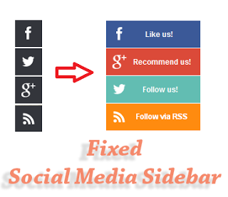
Source: i.pinimg
Having those social media follow icons right there in your sidebar will help people who want to follow you on social media find them easily.
When choosing which ones to include, make sure you only include ones that you are active on and really trying to grow
3.7. Call to Action
A possible call to action could be:
- A ”Subscribe” option that tells visitors to submit their email address to sign up for your mailing list;
- Or it can be a link, some sort of graphic, an ad for a product or an ebook you have.
Either way, it’s something you’d like to provide value to your audience or serve them in some way.
Whether it’s a merchant product or a free product, your CTAs need to be placed in the right place on the site so they don’t give visitors the impression that they are being forced to do something.
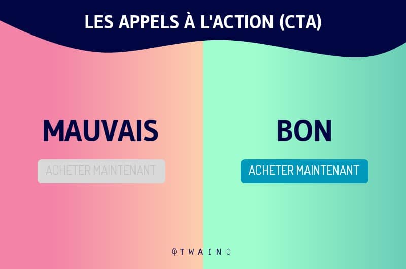
So your sidebar is a perfect place to put your CTAs to keep consistency on your site.
3.8. Community interaction
Another common trend is that many sites are offering:
- Twitter feeds;
- RSS feeds
- Flickr feeds;
- Etc
In fact, the websites with a strong community are the ones that succeed so quickly
One way to increase interactivity on a site is to allow users to see how other users are already using the site.
Some websites contain many features that create a community, while others can be quite static
3.9. Advertisements
Most obviously, many ads are placed in sidebars.
Sidebars are the right places to place ads in an intrusive way that wouldn’t bother visitors.

Source: sothink
Ads are usually placed towards the top of a sidebar to give them more monetary value
Using quality ads that are relevant to users can also be valuable content if those visitors are interested
3.10. Site Sections
Having a link to a section of the site at the top is essential, but it can also be quite beneficial to include it in the sidebar, along with some introductory text, images or other elements that can help the page attract attention.
It’s almost impossible to put all the sections of the site at the top, as it would look very cluttered to readers.
Sometimes we also see links to sections like ”Services” in the main navigation and at the same time defined as a sidebar block, with a little presentation to really draw attention to that section of the site
The idea is to engage more attention on its services, that’s why they are again highlighted in the sidebar.
Chapter 4: Some Tips for Better Sidebars
It is not enough to place sidebars to provide a good user experience, but it should be done in the best way possible.
4.1. organize your sidebar
Just like writing an effective blog post, editing is essential for your sidebar
Make a list of the widgets you think you’ll necessarily need, then put them in a useful order
But you also need to base it on the value that the widget can bring to you or how it can help you achieve your goals.
It’s also worth noting that each item in your sidebar should be linked to another or to a page to keep consistency across the site.

4.2. create targeted sidebars
There is no rule that says your sidebar must be static across your entire site
The key is to create custom sidebars for pages, blog posts and archives
For example, instead of asking your visitors to submit their email address to sign up for your mailing list, simply ask them to subscribe so they don’t miss future posts if they’re interested.
4.3. avoid redundant content
If you have a feature that allows your audience to communicate with people on your blog, it’s pretty clear that you no longer need another alternative feature like including a networked blog box.
To ensure a good user experience, you should not use widgets that play almost the same roles on your site.
Therefore, you should examine your widget list and exclude the ones that are really not needed to avoid clutter.
4.4. Make sure widgets fit in the sidebar
When widgets overflow the designated sidebar space, it makes your blog look less professional and gives the impression that you don’t care about them
If you can’t take the time to resize your widgets, readers may assume that you don’t have time to also spell check your content or write content that is even worth reading in the first place.
So you should try to make adjustments when you feel imbalance between your sidebar widgets.
4.5. Only include content that is relevant to your blog
Avoid including every widget that comes your way, even if you think it will be useful.
The widget you are considering must necessarily be extremely relevant to your blog or content.
You should not clutter your sidebar with widgets that have no direct connection to what you are offering as content.
A blog’s sidebar should enhance the reader’s experience, allowing them to connect with other related pages. If browsing your sidebar becomes tedious, you will lose potential readers.
Conclusion
While you want your main content to attract attention, there is also a lot of other information that your site users need
With a sidebar, you can display critical elements such as links to key areas, email signup forms on your pages.
So it’s important to know how to use sidebars on your site so that you don’t negatively impact the user experience.
That’s why we have listed in this article my best ways to manage your sidebars on your website.

