According to figures, 90% of people have left a website because it was poorly designed. And this same percentage of users is likely to continue their purchase on a website offering a good user experience.
We can understand through these statistics that a bad user experience caused by a relatively bad design or operation of the website negatively affects the activity of your company. And to remedy this, the complete redesign of the website is the best option.
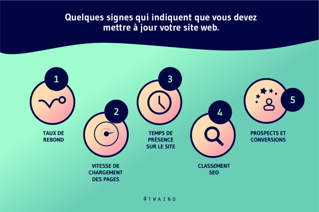
According to GoodFirms, factors that contributed to why companies redesigned their websites included :
- A low conversion rate ;
- A high bounce rate ;
- Poor user experience ;
- Non-responsiveness ;
- Being outdated and not SEO optimized.
If you are facing these kinds of issues on your business website, it is a good idea to consider a redesign.
In this guide, we will cover the different ways to successfully redesign your website.
Chapter 1: What is website redesign?
Let’s talk here in this chapter about the definition of redesign and its nuance with the update of the website.
1.1. What does website redesign mean?
A website redesign is the process of making significant changes to your website to :
- To improve the user experience;
- To increase website traffic ;
- Or improve conversion rates.
There are different types of website redesign projects, but they generally share these common goals.
Website redesigns often include a new interface for your website, making it better for both website visitors and the team running your site.
This usually includes updating your functions so that the user experience is as interesting as possible. Although the process can be time-consuming, it’s essential to ensure that your website provides your customers with the information and access they need.
Many believe that once the original website design is complete, any redesign will kick into high gear.
Even if it is possible, it is better not to underestimate the process. After all, sometimes a website redesign can involve completely rebuilding the website.
1.2. Website Refresh vs Website Redesign
To put organization back into the operation or layout of a website, there are generally two approaches :
- A refresh ;
- Or a redesign.
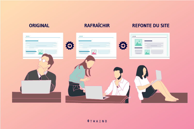
1.2.1. Website update
A new website doesn’t mean you have to start from scratch, sometimes you just need to make a few updates to your existing site to make it look and work like you want it to

A refresh can be used to make major changes to a site, but instead of building it from scratch, you can update and change some things that need tweaking.
Updating allows for example to give a new face to your website as if it has just been created.
This approach is simpler, faster, and requires fewer resources at any given time. But it may have limits depending on the technology you use and the current operation of the site.
A website redesign has a completely new look and feel compared to the original.
1-2-2-refonte-du-site-web
A redesign is what most people think of when they start planning a new site.
A proper redesign involves designing, developing, and structuring a new site from scratch.
We can refer a website redesign to a room that we can demolish to rebuild it from scratch, then add a new paint color, etc.
This process is more complex, slower and more expensive than a refresh, but can sometimes give you better value for money.
If your website is so badly in need of work that it will take longer to update things than starting from scratch, then a redesign is probably the best option for you.
The best way to determine which approach is best for your organization is to have an honest conversation with a digital agency about what you need :
- Your goals ;
- Your existing problems ;
- Your budget ;
- Your calendar.
It’s also important to set aside personal preferences and focus on what’s good for the organization.
Chapter 2: What are the benefits of a website redesign?
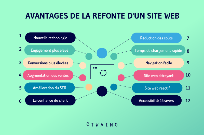
There are plenty of benefits you can get from a website redesign..
2.1. The redesign improves the image of the brand
Redesigning a website further establishes brand consistency for the business in question.
When a business owner decides to redesign their website, they likely find the design and some features older.
The new look after the redesign of your site allows your brand to inspire trust and be quickly recognized by consumers.
Most consumers usually rely on the design to examine a company’s trustworthiness the first time they find it online.
To illustrate this, we are going to use this statistic which says that first impressions count and they are influenced 94 by the design of your site.
From this, it can be understood that if your site has the old era with an old-fashioned design, it will be far from giving confidence to the potential customers of the company.
The good impression your site acquires from the redesign makes your brand quite relevant and further enhances its image.
2.2. The redesign of the website allows you to be up to date with the evolution of the Internet
Every day the internet is constantly changing and it is spreading new web design sensibilities. This more or less changes the standards we expect when browsing websites.
As an example, we will refer to the very increased growth of responsive website development due to the number of mobile device uses on the Internet which is becoming more and more important.
Another interesting fact, today we prefer HTML5 instead of Flash from before.
At the same time, the resolution of the high-end monitor has changed from sub HD to 2K or even 4K, and the modes have also changed.
To this effect, the perception that you would have of a high quality website in past years will no longer be the same for the same website today.
In other words, a website that was considered authoritative in the past will no longer be so today if the owners don’t do an overhaul to bring things up to date.
This would mean that if your site was last redesigned more than two years ago, you probably look rather old with very low resolution images and old school sensitivities.
It makes all the difference to the first impressions you create when someone visits your website. And as a drag chain, it could lose you a lot of potential customers.
2.3. Redesign Communicates Change
A redesign can also be a good way to communicate a change in direction for your business.
When you plan to define your brand image differently, or you want to focus the activities of the company on other aspects, or you want to join other partners and remove others, the redesign is often a new start.
In these cases, opting for the redesign services for your website is the best option, because it will be a question of adopting important modifications.
It might just be adding a few pages to your site and it won’t really work with your existing layout and setup.
Or, it may be a question of adding interesting features that you have discovered on other websites and which work well.
2.4. Design Drives Conversions
No matter what action you want visitors to take, like sharing their email address or phone number, scheduling a demo, making a purchase, the primary goal of any business site is to transform prospects into customers.
When planning a website redesign, you need to design every aspect to optimize that effort.
Your website is your biggest lead magnet. How visitors view your brand when they arrive at your website has a significant impact on the likelihood that they will take an action and become a lead.
According to an old statistic known to all, users will spend approximately 2.6 seconds to browse your website to find the information they are looking for.
The longer the user stays on your page, the better the perceived impression of your brand, and design plays an important role in keeping visitors on the site.
Redesigning is a great way to embrace a new look. People are more forgiving of well-designed pages, and that first impression can be made within 2.6 seconds of visiting a site.
Since the new design after a proper redesign excites people to spend more time on the website, this results in a huge increase in conversion rate as a result.
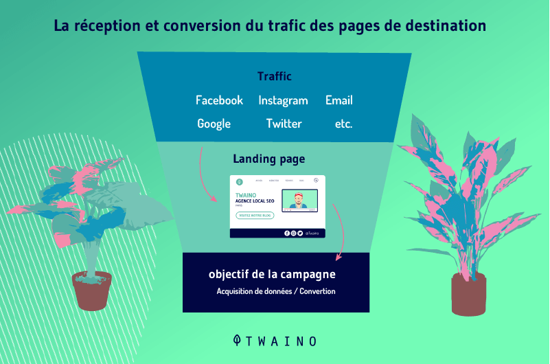
A website redesign gives you the ability to create a website that delivers a truly positive customer experience, helping to turn visitors into leads and therefore conversions.
Design is one of the factors that visitors use to judge the credibility and safety of your website before making decisions about your brand.
Even minor design changes can result in increased visitor engagement, retention, and trust.
2.5. Redesign Leads to Higher Search Engine Rankings
An optimized site experience means it’s also optimized for search, which will help your business move up Google’s search results and increase organic traffic.
A website with the best design won’t bother if users can’t seem to find it online.
SEO is not a one-time project, it is a set of continuous and ever-changing processes that require your constant attention and effort.
While it offers impressive ROI, SEO won’t work magic or instant wonders.
As it can take time for the effects to become visible, SEO practices are likely not very obvious for more pressing business goals.
Just like bringing your brand identity back to life, a website redesign is a good opportunity to address any SEO shortcomings to bring your website up to standard. This also results in an optimized user experience.
A great website can help attract more backlinks, which can give your business a strong authority score for even higher Google rankings and additional referral traffic.
2.6. Redesign Increases Revenue and Reduces Costs
A strategically planned website redesign will help your business increase brand awareness, improve search engine rankings, turn visitors into customers and maximize results. of your company.
Like all these benefits, website redesign can also help reduce your expenses.
Often it is more cost effective to implement a complete website redesign than to fix functionality issues and add more features over time.

To reduce the costs of missed opportunities and lost revenue, it’s usually better to do a complete overhaul and start fresh than adding functionality to an old website.
Plus, a new website based on modern technology can work much more efficiently, take up less space on your server, and run more smoothly for all of your visitors.
2.7. Redesign Improves Your Content Strategy
The primary purpose of your website content and information is to help potential customers learn more about your company, products, and services before they do business with you.
One of the beneficial reasons for website redesign is that you can shape the display information in such a way that all relevant information is easily accessible as visitors move naturally from page to page.
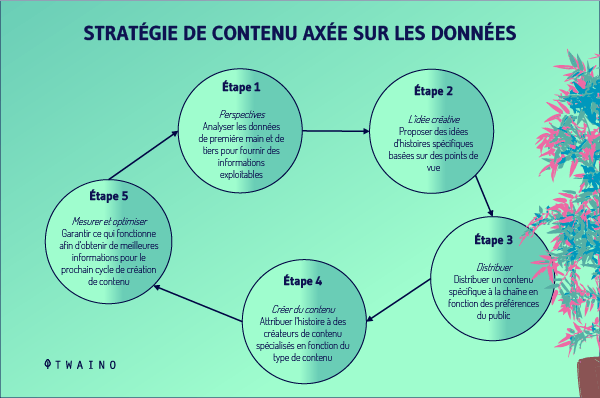
Whether providing information about your brand, telling your brand story, or educating them about your products and services, the primary purpose of a website is to provide information that empowers visitors to perform the desired action.
And an optimal flow of information is necessary to persuade your readers to engage with your offerings and become valuable customers.
For example, a simple design makes it easier for the reader to read the information on the page, instead of feeling overwhelmed by a cluttered design.
However, great website design cannot make up for poor content.
A good SEO service should be able to work with you to create a look and feel that work together to attract visitors, keep them on your site, and convert them into customers.
2.8. A Website Redesign Ensures Security and Responsive Design
When your website’s plugins, theme or CMS software becomes outdated, it can make your website vulnerable to different types of security threats.
But when you design your website, your developer can help you update any required plugins, themes or CMS software, thereby securing your website.
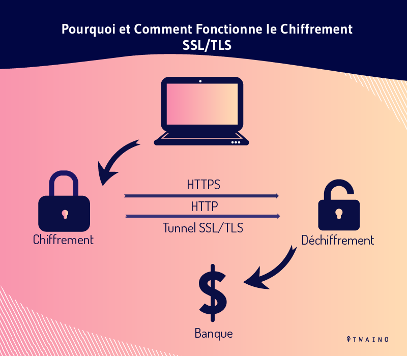
There are plenty of practices your website builder can adopt when redesigning your website to make it more secure.
Here are some of them:
- Changing the conventional access URL of the backend of your website;
- Changing the conventional username of the administration area of your website;
- Ensuring that your website backend password is strong and hard to guess;
- Restrict access to crucial files on your website;
- Ensuring that all plug-ins used on your website come from trusted sources.
On the other hand, if your website design is outdated, chances are you don’t have a responsive design.
But the good news is that most of the themes available today for your website redesign come with a responsive design.
In other words, when you hire a web developer to redesign your existing website, you don’t have to worry about responsiveness.
With a responsive design, you get many benefits such as:
- Notable search engine rankings;
- More sales and conversions from mobile users;
- Reduced bounce rate;
- The optimized loading speed of your website on smart devices;
- Wide audience coverage as most internet users browse websites using their smartphones.
2.9. Website Redesign Boosts Brand Awareness Brand
awareness somehow refers to consumers’ ability to remember and recognize a brand.
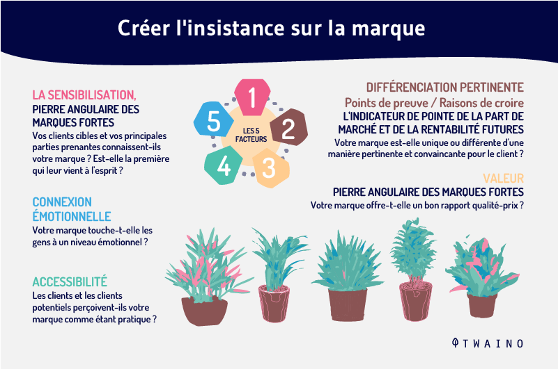
Becoming synonymous with the services and products offered by a company, brand awareness is a determining and encouraging factor in repeat purchase decisions.
While investing in brand visibility won’t drive conversions overnight, making your business memorable to your target audience helps build trust in your services and products over time.
If your brand has an outdated design or offers a confusing user experience, it can easily and quickly distract visitors without them taking the time to learn more about your business.
A website redesign gives you the opportunity to step back and ensure that your brand provides a positive online experience that helps shape brand identity and increase awareness for maximized business results.
Chapter 3: When should you do a website redesign?
There are signals that should let you know that your website needs to be redesigned for it to work properly.
3.1. When your website is outdated
It can happen that your website design no longer dynamically resonates with the behaviors of the target market.
This is no problem, but once things get more and more modern, an old design no longer attracts attention.
As we said before, you have little time to impress your audience before they hit the back button.
When consumers see a website’s home page, they interpret it as the owner’s way of running their business.
Outdated designs give the impression that if owners neglect the state of their website, they most likely have neglected other important aspects of their business, which undermines the effort put into getting a product.

As privacy concerns increase with data, outdated websites are more prone to hacks and security breaches, especially those without an SSL certificate.
If your website doesn’t have a lock icon in the address bar, few people will stick around.
Users are looking for websites that offer solutions and are professional, state-of-the-art and up-to-date in their industry.
A company’s website can meet all of these user expectations. But without a modern design, there will be a disconnect and your business credibility will be in doubt.
3.2. When Your Site Isn’t Responding
These days, people do the majority of their business through their phones. This sometimes involves important operations such as inserting bank details.
Responsive web design helps to energize the look of a website, depending on the screen size and orientation in which you are viewing it.
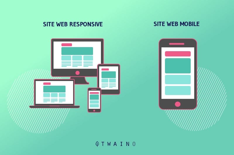
Without responsiveness, users would be stuck with unnecessary resizing, scrolling, and panning. This gives the user more work, which can create frustration and they can leave.
Indeed, figures show that 57% of users say they wouldn’t recommend a website that doesn’t display well on mobile.
Another study on mobile versus desktop usage tells us that 68.1% of retail website visits came from mobile.
Responsive design promotes a better mobile experience for users, enticing them to stay on your website longer, increasing website traffic, and increasing search engine rankings.
3.3. When Rebranding Your Business
As your business grows, it’s natural to want to rebrand to match your current target market.
Rebranding revitalizes a company’s visual aesthetic, including logos, colors, layouts, and content. It is a necessity to keep up with modern trends. We have in our eyes the example of Google which renamed its logo from serif to sans-serif.
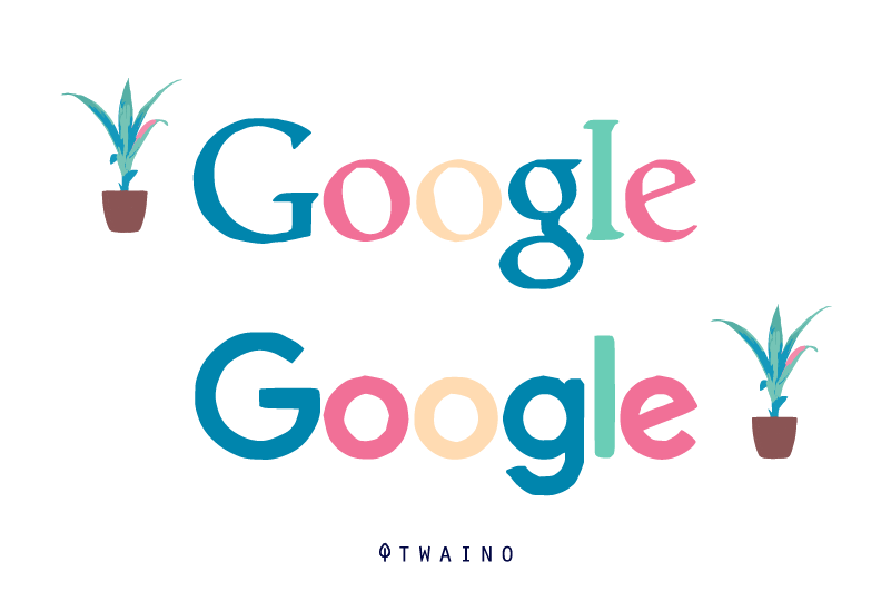
Rebranding is for the entire website, if any of the design elements are out of line, users will notice.
For example, creating a consistent layout for all pages on the website means you’re moving away from the old brand as much as possible.
This often requires the creation of a brand book serving as a guideline to reinforce consistency
. This document actually serves as a guide on the
- colorsto be respected;
- Use of the logo;
- Photography rules;
- Fonts ;
- Iconography;
- And much more.
3.4. When you need a custom solution for your website
As businesses grow, they’ll want to incorporate more features into their website to streamline the customer experience.
These can include:
- Portals and advanced customer account dashboards;
- e-commerce CMS systems;
- Reservation portals or advanced design techniques such as parallax scrolling features.
As your business grows and you need to add revolutionary or advanced features, plugins will do less of the job.
It might be a good idea to find a custom website development company.
3.5. When you need new content
It’s not uncommon to notice that some site content becomes so outdated that it’s no longer worth reusing.
In these types of cases, you immediately feel the need to completely overhaul the content of the website.
In some cases, you will notice that your website generally no longer reflects your offers or you need to add sections that were not developed during construction to adjust your website to the evolution of your activity.

Source : markentive
Since the website already existed, adding content can be an easy thing to do, especially if you’re using a quality content management system.
3.6. Slow Speed Index
In April 2012, Google initiated Speed Index to measure site performance.
Speed Index is the average time in milliseconds that visible parts of the web page are populated and displayed.
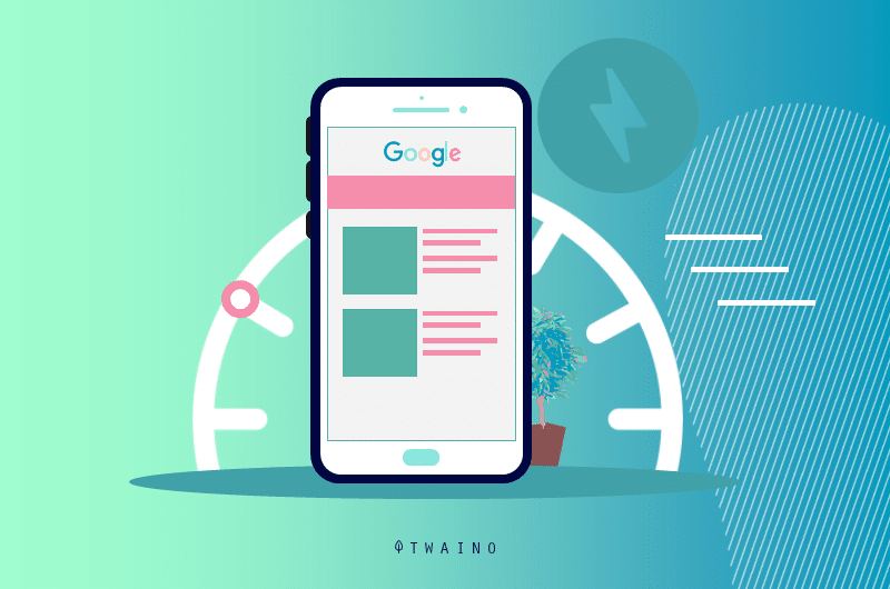
In other words, it measures the speed at which the user receives the visible content.
WebPageTest saves a page as it loads. 10 frames per second are analyzed to see the percentage of content loaded.
Since Speed Index is based on viewport percentage, you can use this metric to compare sites across desktop, mobile, and tablet viewing.
3.7. When your website lacks engagement
Engagement is a metric that can measure the length and depth of a user’s experience.
If a user interacts with a site, it is a signal that the content is both engaging and easily accessible to visitors.
While there is no universal standard for good engagement, using your top performing pages as a benchmark can give you an idea of engagement goals.
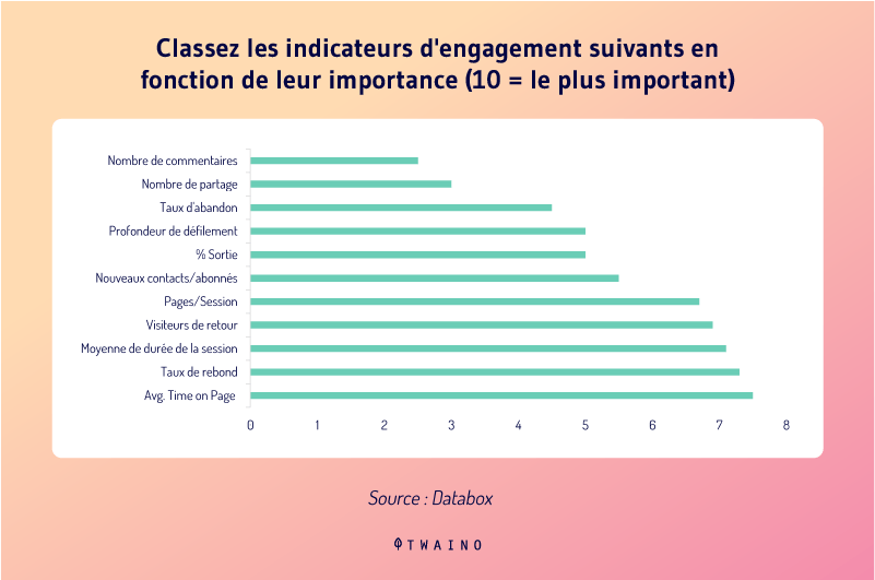
One of the most accessible engagement metrics is session duration.
Google Analytics shows how long visitors spend on the site and its individual pages.
While session duration isn’t always 100% accurate, it can still be used as a great metric for measuring engagement.
If engagement is very low, now is a good time to consider a redesign.
The simple reason is that 38% of people will stop engaging with a website if the content and layout aren’t appealing.
3.8. Your website does not provide value to the end user
What keeps a user on your website for a long time is the value you offer them through the website.
This would mean that if they find no value there, they will immediately bounce back and head to competing sites.
In today’s digital landscape, prospects conduct the majority of their research online.
This is another reason why you need to come up with a compelling digital destination.
At every turn, your business website should provide added value to visitors.
In order to continually deliver value to your audience, you need to create content type like:
- Blog posts;
- e-books;
- Videos.
Your website should be a hub of useful information about your organization. It should also be an educational resource center to help prospects make their decisions.
3.9. When your website doesn’t reflect your brand
Your brand should be communicated through your branding.
This communication finds its meaning via:
- The brand image which is experiential;
- The appearance and beauty of your brand;
- The way your team dresses, talks and functions;
- Your main marketing messages, your slogans and all that is visual.
Your website should be a central and powerful brand ambassador working on your behalf 24/7 without interruption.

Too often, however, brands treat their websites poorly and the most common inconsistencies include:
- Wrong fonts, colors and logos used;
- Outdated and difficult to navigate layouts;
- Lack of features and functionality;
- Etc.
To align your website with your brand in this case, you need to do a complete overhaul of your website.
3.10. When your team struggles to manage
Another common problem that some organizations notice is that they can’t manage to use their own website.
In most cases, they just modify the copy and images without thinking about changing the code itself.
Typically, they face one of two issues:
- The website does not use a content management system (CMS);
- The site was not well constructed.
The CMS is the mediator between code and content. This is what is used to upload photos and add pages.
The most popular content management systems are WordPress, Drupal, Magento and HubSpot.
All of these CMS interfaces offer different sets of benefits. One of the most important roles they play, aside from their benefits, is helping organizations manage their content.
Without a CMS in place, you can only rely on whoever built the website for major changes to the site.
This is usually a great sign that the website is built purely in HTML and CSS. From the design side, this may seem fine, but from the management side, it can make things more complicated.
But sometimes the website just isn’t built well.
If it’s difficult to perform simple tasks, like adding image locations or editing text, it’s a development issue.
A website without an easy to manage CMS is not ideal for you or your team, especially if you want the independence to implement content on your own.
You can choose to leave the implementation to your website design partner, but you should also have the option to do so if you wish.
Chapter 4: A few points to consider for website redesign
Now that you know what a website redesign is and its different phases, we will discuss the tips for making it a success.
4.1. Analyze Your Metrics
When you realize your website is malfunctioning, we know how eager you are likely to be to dive into all the exciting aesthetic changes and modernized reformatting your website needs.
But you can’t start creating your new look without taking a few steps first.
Before fully committing to a website redesign project, the importance of carefully reviewing your current site statistics and available data cannot be overstated.
After all, you will have no idea what to improve and what to maintain.
For that, it’s pretty obvious to turn to your marketing metrics and let the numbers speak for themselves.
- Check if your website has significant traffic patterns: Focus on your sources, organic traffic, direct traffic, email marketing, social media and referral sites… Then identify any correlation with strong or weak page performance and identify the flaws therein;
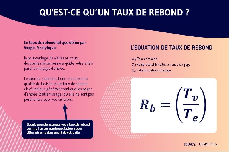
- Check your bounce rate: Bounce rate measures the percentage of website visitors who enter and leave your site rather than continuing to browse your other pages. Your site’s page bounce rates can point to the source of a significant problem.
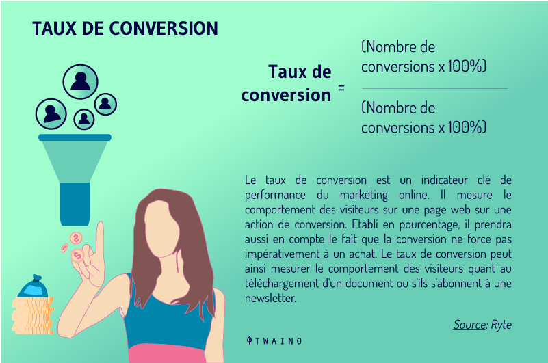
- Measure relevant conversion rates: Determine how many visitors convert into leads and how many leads convert into customers. Conversions are the end goal of marketing. So, view those pages that convert and tweak those that don’t.
- Find out your top performing landing pages: Similarly, your landing pages receiving the highest traffic and facilitating the most downloads should be highlighted and promoted;
- How are you ranking in search engines with your current keyword strategy? It’s time to figure out if your keyword strategy makes sense. Find out how many of your priority keywords bring you to the first page of search engine results;
- Find out the monthly search volume for your priority keywords: Make sure your keywords are actually terms that people use. Think about how people search for businesses, products or services. This allows you to identify the words and phrases they type into search engines.
4.1.1. What works best on your website?
Here, it will be a question of identifying the points on which your website has already been successful.
So,
- What are your most popular pages?
The top performing pages on your site can serve as great benchmarks. Use high-converting, high-traffic pages as a template for any areas that need a redesign.
- What are these pages really for?
In truth, each of your pages is created for a specific reason. Understanding its purpose or functionality provides insight into how visitors primarily use your website.
- Why are these pages so popular?
Analyzing page popularity involves both quantitative and qualitative assessment. Figure out what makes the content on these pages viral and how you can apply these differentiating features throughout your website.
- What can make these pages even more visible and accessible to visitors?
Include links to these pages in your navigation, in the sidebars of other pages on the site, and in the copy of relevant blog posts. Get the most out of your best content.
4.1.2. What went wrong on your website?
Not everything can work on your website at once. Before considering a redesign, ask yourself what needs to be touched up.
- What pages can you get rid of?
Chances are that some pages are contributing to your website’s malfunction or poor experience. Outdated or irrelevant pages can be deleted, unpublished, archived and redirected.
- What is one critical improvement you can make to your web pages?
Start by tackling one component for each type of page, i.e., landing page, blog post, contact, etc, that needs a change. For example, you can add a relevant call-to-action to each of your blog posts.
- Can you use Google Analytics to better evaluate your website?
It’s not just your homepage that serves as the gateway to your website. Identify first impressions of inbound traffic by looking at the numbers.
If visitors spend very little time on specific pages, continuously hitting the “back” button after a few seconds, you have already found areas to focus on.
Analyzing your current measurements and available data is an essential step.

4.2. Plan your redesign
Now that your intent is set and your goals are clear, it’s time to figure out how you’re actually going to go about redesigning your website.
4.2.1. Write your vision doc and work backwards
When managing a project, the best place to start is at the end.
Ask yourself the question of whether everything went exactly as desired, what this new site would look like. Think of this as working backwards.
This will allow you to find inspiration for the type of site you want yours to become.
You can also go one step further and create a vision document which is just a brief description of what the site will be like when complete. Explain what it will do, what it will contain, and why your users will love it.
A good vision document clarifies what you will need to do to make the site a reality.
This makes it easy for a designer to know whether to grab a standard WordPress theme or spend hours on user research and user testing to create a breakthrough experience.
Another method is to do what Amazon does and start a project by writing the corresponding press release.
The press release describes in a simple and very precise way what the product does and why it exists, what are the features and benefits. Writing a press release ahead of time clarifies how the world will view the product, not just how you think about it internally.
4.2.2. Build a detailed to-do
list Building a to-do list is like assigning a specific task or solution to each of your objectives listed in your strategy document.
What’s great about this method is that even though you don’t know exactly what the final site will look like, you do have an idea of the results you want to achieve.
From there, you can decide which features, pages, design elements, CTAs, you will need to touch to achieve those goals.
Ultimately, each goal should have milestones mapped out to complete your redesign project.
4.2.3. Estimate your time and money costs
To create an action plan for your website redesign, you need to assign a time and a cost to each task.

Even the most experienced project managers have problems with estimating.
But diving into a website redesign project means having at least a good idea of how long it will take and how much it will cost.
If you’re having trouble estimating, or if this is your first redesign, here are some tips for estimating correctly:
Go through your list of tasks and estimate how long each one will take based on your past experience. Then multiply the estimate you made by:
- 1 time for tasks in which you have experience and confidence;
- 1.5 time for tasks you’ve never done, but have a clear idea of how to do;
- 2 or more time for tasks you’ve never done that require research and testing.
Sometimes you really won’t know how long a task will take until you’re in the practice phase.
4.3. Focus on your brand personality
Speaking of your brand, you need to be able to establish a quick description of its personality by adhering to consistent brand guidelines.
When someone visits your website, they should be able to instantly tell that it’s related to your brand.
As you know, your website should have a business card that inspires searchers to explore your entire site.
We’re talking consistent colors and fonts, as well as brand-specific images and an easily recognizable logo.
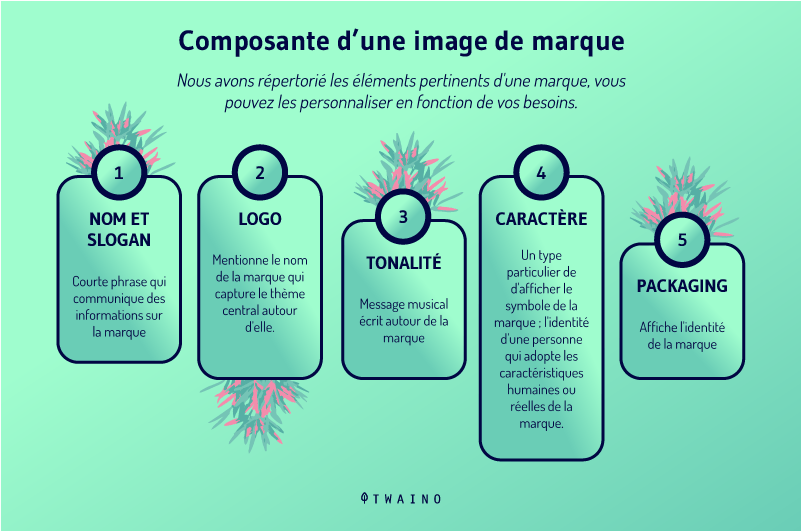
A mixture of colors and images without any control is the perfect opportunity for your redesign not to be focused on your brand.
When redesigning yourself, don’t get carried away with the endless design possibilities. Instead, think about the true message, mission, goals, and personality of your brand.
Rather than just thinking about your brand personality, lay down the details in a brand guide.
Research has indicated that businesses can increase revenue by up to 23% by consistently presenting a brand consistently.
Your website is the face of your business, which is why you need to make sure it meshes well with your brand elements if you want to earn a high profit.
4.4. Reorganize your website text and content
If you already have good fonts for your website, it’s a good start to start looking at other aspects of content.
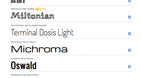
Source : e-monsite
While you can just copy and paste your old content into your new site, that’s not always the best idea. Redesigning your website provides a great opportunity to optimize every word of your website.
In all honesty, choosing a solid website design is quite easy, but only great websites have content as powerful as the images and graphics they select.
All of your content, from product descriptions to titles and button text, should be chosen with great care.
This is especially true given that most websites are starting to use less copy than they did in previous years.
4.5. Prioritize your audience’s goals over your own
Normally, your audience should always be the most important factor in your brand’s website redesign.
It doesn’t matter if it’s only you and your team who appreciate the website unlike your target audience.
The point of redesigning your website is to better attract your former and future customers.
This brings us to a concept known as ‘UX design’ or ‘user flow’.
UX flow is a visitor’s journey from landing on your site to achieving a specific goal or action.
The more complicated it is for them to achieve their goal on your website, the more inefficient your UX flow.
During a site redesign, it’s up to you to map out your product’s typical UX flow and figure out what your users really want from your website.
And for that, make sure they:
- Have easier access to your products;
- Have an ease in reaching you or asking for help;
- Are kept on your pages for a long time thanks to the eye-catching visuals.
When it comes to user flow, you definitely need to think about how your users operate.
4.6. Knowing who is visiting your website and why
Identifying your most valuable pages is a strong point for successfully completing your website redesign project.
Unfortunately, this alone is not enough, you must also find out who visits these pages and the reasons for their visits.
A few years ago, a Google study revealed four main types of intentions that drive people to a website:
- “I want to know”;
- ”I want to go” ;
- ”I want to do ” ;
- And ”I want to buy”.
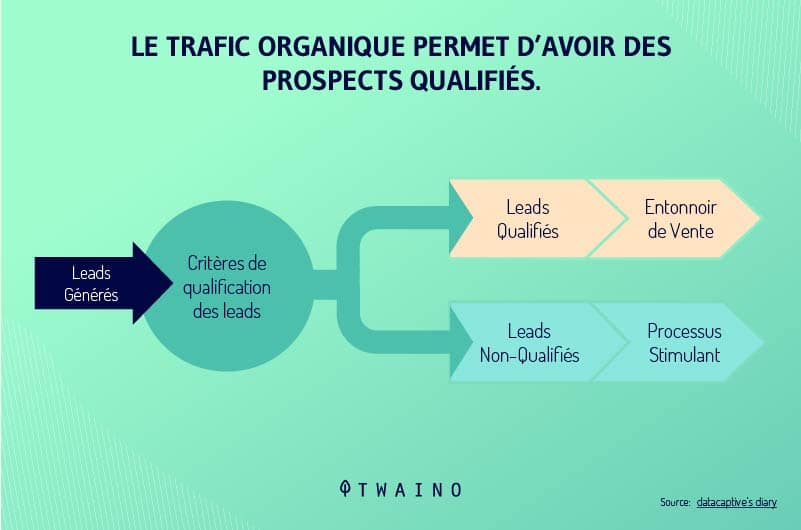
In this context, website visitors may come to your site because they:
- Are curious about something about your brand or products;
- wish to come into physical contact with you;
- Need to learn how to use one of your products;
- Are ready to buy something.
Every visitor has their reasons for visiting your website and when you use redesign to better present your pages to the right target, it means that you now know better the intentions of your audience.
The best way to do this is to create customer personas that are just semi-fictional representations of your existing and ideal customers, based on real demographics and psychographics.
Personas help you determine with a good degree of clarity:
- Who your ideal customers are, ie the precise profile of your customers;
- What is their primary intent when they visit specific pages on your website.
Persona insights help you get a clear idea of who you’re planning a redesign for and their needs and motivations.
If customers are coming to your main landing page and the only thing they’re interested in is a store locator, the best thing you can do is give them that.
4.7. Prioritize your blog redesign
These days, most businesses with an online presence try to have a blog in order to expand their reach.
It is thanks to the blog that a company’s website begins to acquire more visitors with content marketing.
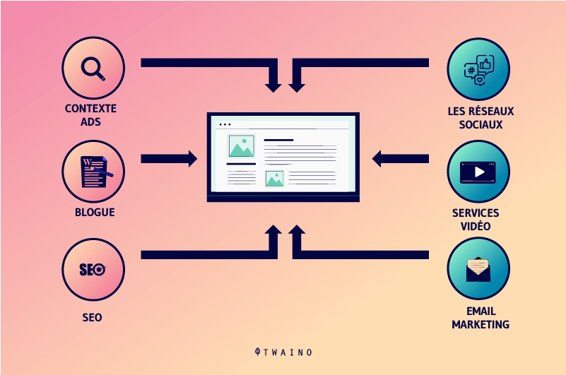
In many cases, a blog is a company’s greatest marketing asset.
A blog gives businesses the opportunity to boost their brand, inform users about updates and new products, and engage their target audience with relevant content.
But nowadays, it is really hard to grab the reader’s attention for a while.
Although this relates to the content directly, a poor blogging experience in general can be the wrong signal. Users will abandon a webpage if the UX is not optimal.
A good designer should know how to improve readability, eliminate visual distractions, and insert CTAs into high-converting spots.
Designers should also use website analytics to improve user experience of content to know where users stop reading and why. This allows him to make design decisions based on data.
4.8. Do the e-commerce redesign E
-commerce design is one of the trickiest aspects of UX and also requires extensive experience in data-driven design.
According to a study, e-commerce stores suffer from an average cart abandonment rate of 69.23%.
Where $738 billion was spent on e-commerce in the US and Europe, an estimated $260 billion was recouped through a better checkout flow and better design.
For an eCommerce store, the checkout flow is the most critical aspect. And a designer who can identify where users are dropping off is the expert who can improve that.
Here, the designer must ensure that:
- The website inspires trust and security;
- The website has a valid SSL certificate;
- Payment forms are well labeled and easy to use;
- Input fields display the correct type of keyboard;
- The user can search and should find what they are looking for;
- You trick users into signing up when they prefer to pay as a guest.
4.9. Re-examining links and reviews
It may sound very trivial, but obviously a suspicious website with many outdated sources is less likely to be visited.
The reason is quite simple. Nobody wants to be distracted by misspellings, broken links, or outdated visuals.
Look for ways to fix all the errors on your blog and main website pages so that they don’t have a backlash effect for the audience.
When you overlook these little things, it would make customers wonder if:
- This website is even active;
- Is the information mentioned reliable enough;
- This brand always offers good services.
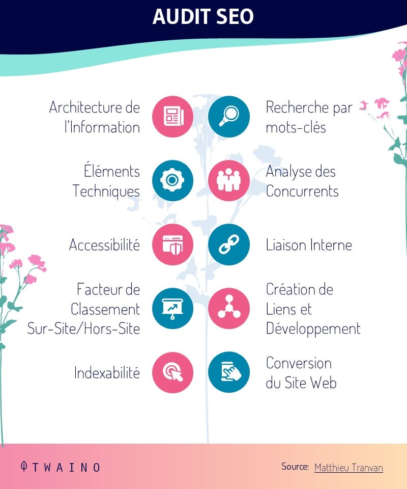
Start with the current sitemap and work with your team on the requirements for the new sitemap, as this will be your guide for the rest of the steps in the SEO redesign process.
If you have a large website, this could very well be the most complex and important part of the redesign process.
4.10. Investigate Your Customer’s Behavior
It’s also essential for you as a designer or marketer to do a little research that demonstrates key customer incentives and opinions.
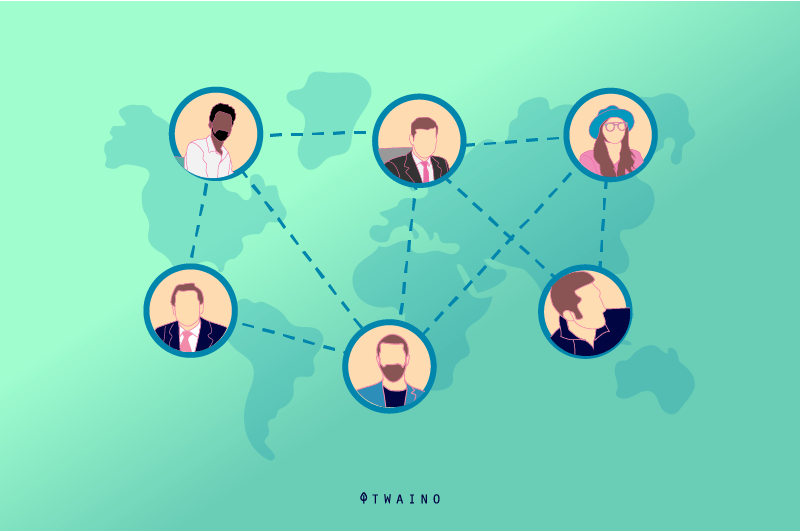
Design is an indirect communication that, when used effectively, can help you get into the mind of the customer.
And website redesign is basically the same thing.
Using visual reports such as heat maps or scroll maps to analyze your website visitor behavior can also help you identify potential issues.
Logs can provide even more detailed information about the activities of website visitors on specific pages.
However, it focuses more on current communication models that bring better clarity and accessibility at a later stage.
It seems that the design represents only visual needs and constraints, but there is much more than that.
Take a small first step by diving into a redesign with creative support tools that facilitate your overall brand value and image.
For example, you can ask customers for honest feedback or a wishlist.
The metrics and reviews will describe the results of the website redesign and this is how you will continue to improve the shortcomings.
4.11. Speed up site loading speed
When a website is poorly designed, web servers tend to take longer to process all the web elements and display them in the user’s browser.
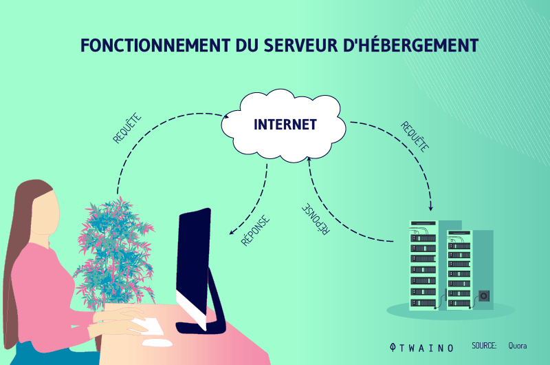
As a result, the website lags and this can be a huge inconvenience for most internet users.
Research shows that out of 10 users visiting a slow site, 5 are likely to leave before seeing its content if it takes more than three seconds to load.
The first aspect you need to look at is the quality of hosting you are using for your site.
It is important that you are sure that the problems related to the speed of the site do not come from your host.
Second, use lightweight web elements to minimize the load on your web server. Finally, uninstall infrequently used plugins and add-ons on your website or set them to load on demand.
4.12. Consider Progressive Web Apps
Since their inception a few years ago, Progressive Web Apps have quickly revolutionized the web design industry.
If you’ve never heard of them before, they’re simple websites that deliver content in an app-like format on typical browsers using the web app’s manifest file.
Most businesses use them to provide full-screen interfaces, send web notifications, and instantly engage visitors with animated page transitions.
According to AppInstitute, Progressive Web Apps (PWAs) can increase lead conversions by around 50% and user engagement by up to 136%.
These apps offer app-like interfaces and experience within a website, eliminating the need to visit app stores to download dedicated apps.
It is important to note that search engines can index content posted on PWAs while access can be enforced via URLs without an actual application installation.
4.13. Engage visitors
When designing your website, the communication channels that help you interact with your visitors are also important.
These can take the form of live chat portals, comment sections, rating features, and more.
The idea is to make it easy for your readers and customers to share their thoughts and opinions on your brand.
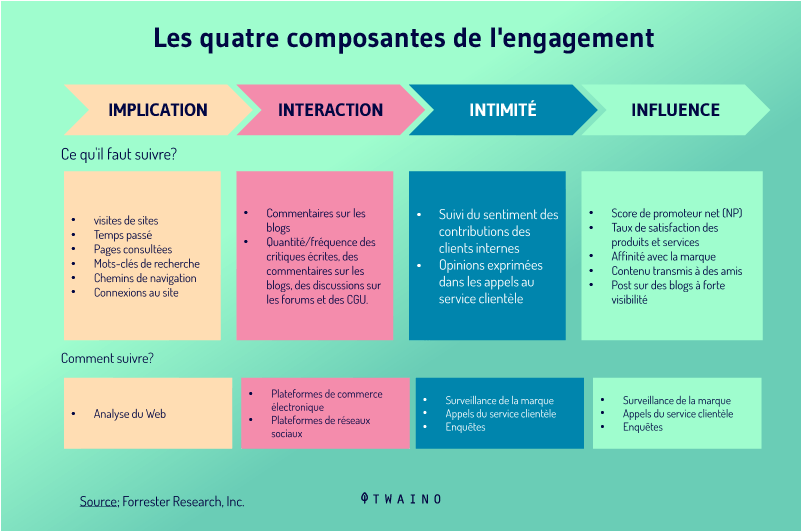
With this, you can measure acceptance levels of your products or services and understand areas that need improvement.
Like most modern businesses, you can choose to install bots that can provide useful resources triggered by the keywords the visitor searches.
Another approach is to add FAQ pages to act as a reference point for common queries.
Finally, you can sync all of your website’s communication channels into a single platform that notifies you immediately when a visitor starts a conversation about your business.
Chapter 5: What are the different phases of a site redesign?
When we talk about website redesign, we ignore that it can be focused only on a single part of the website as it can affect the entire site.
Here are some phases of a redesign:
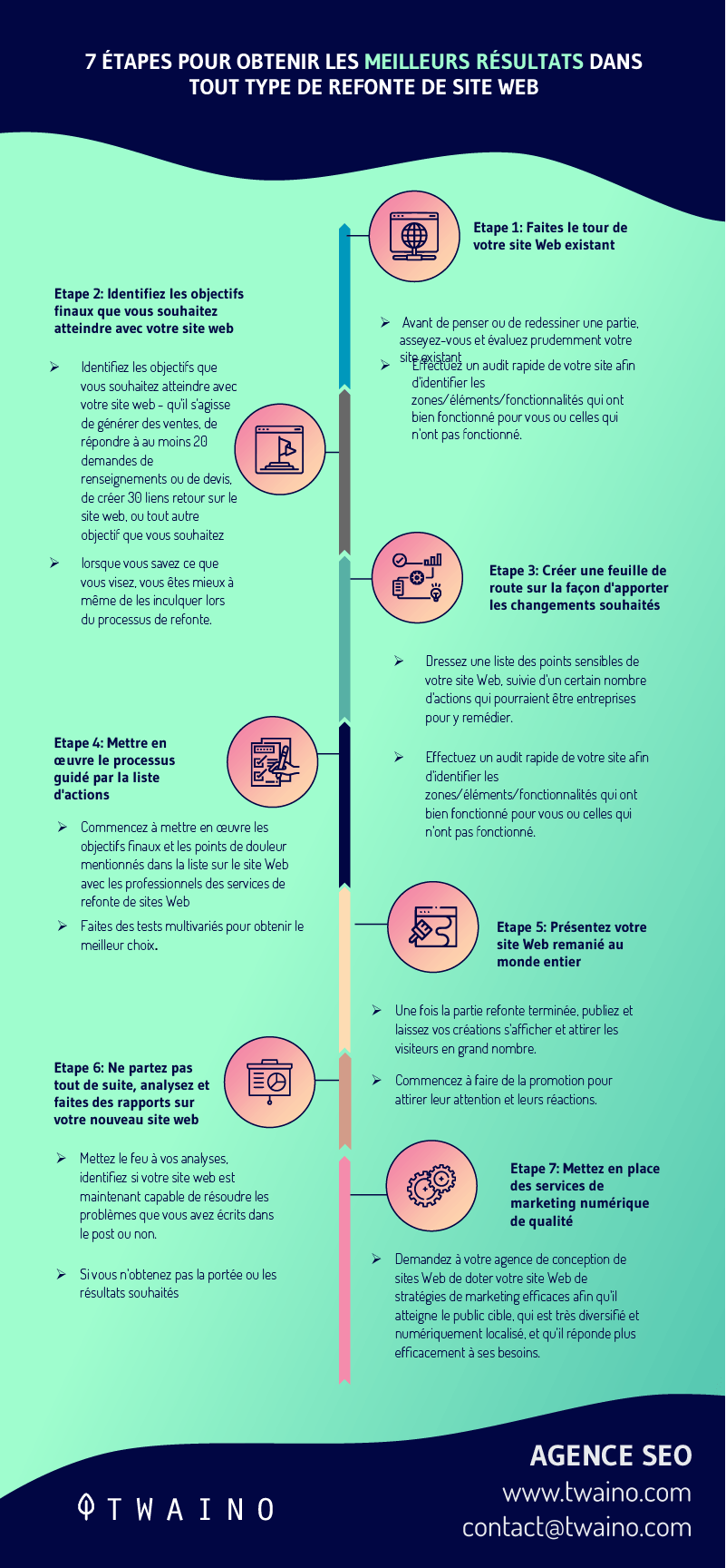
5.1. The Content Structuring Phase
Most website owners completely ignore site content when it comes to doing a redesign.
What concerns them the most is the beauty of the website, which leads them to dress up the website on poor content.
That’s why you need to be proactive in order to make a difference in your industry.
However, maintaining old content after a website redesign still gives the impression of a website that is never updated.
For this, you need to take advantage of all your existing safeguards if you want your audience to take a positive new look at your website.
Here are some things to consider:
5.1.1 The website plan
The sitemap, also known as the website structure, contains all the pages of the website and how they all relate to each other.
Sitemaps can be thought of as the skeletons on which the body of websites lives.
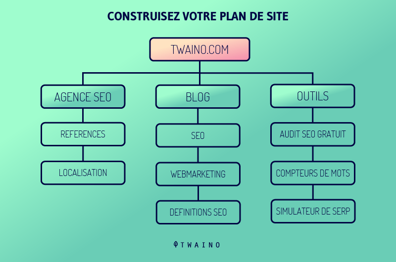
To do a thorough overhaul of website content, you need to display your website’s current data on a Google file.
This will allow you to inventory all the pages with their corresponding URLs. This list can help you set up redirects with our new website.
Based on the results obtained through the audit, the establishment of a new site plan becomes easier.
At this point, you can initiate a content redesign update process by adding new web pages or deleting some existing pages that are detrimental to your user experience.
Rebuilding and/or renaming web pages may also be important or necessary depending on your brand needs and goals.
5.1.2. Content Extraction
Sometimes,some owners invest enough time, money, and energy in the design of a website in order to obtain a website that gives a flawless result.
For redesigning sites like these, business owners prefer to maintain the content of the site because of its quality.
In this case, you can go about it by pulling all the content from the current site and consolidating it into a series of Google Docs.
5.1.3. Imagery
In addition to pulling content from Google Docs, image sharing is also done using Google Drive.
To use this resource effectively, you need to set up a series of Google Drive folders. The goal is to have a new sitemap website for better and easier navigation.
Just like your design, your photos can become outdated over time.

Source :.muzli.space
Consider new photos to use when redesigning your website. If your company doesn’t have a variety of team or company photos to use, choose a few from the archives to balance out the site content.
While stock photos can be personalized, it’s important to use less of them because your consumers will be less likely to trust your brand if stock photos dominate your web pages.
It can also be a great idea to strategically use infographics on your website.
Infographics attract visitors and are great inbound link bait that increase your web page’s authority score.
5.2. The Design
Phase The website design phase is where some difficulties arise during website redesign projects.
Here, you will not know if you should prioritize the content of the website or its design. Normally both are needed for a good experience.
However, it’s best to start with the sitemap, which describes all the pages on your site. Next, you need to work on the structure of the homepage.
Here are some general design elements:
5.2.1. Home Page First
The design phase of the website requires that the home page be finalized first.completedraft might do the trick.
Once the homepage web design is established, your colors, fonts and general website language can be set as well.
Designing your homepage effectively requires a lot of attention because it’s usually the first online interaction a potential customer has with your brand.
The most common landing page mistake is trying to cram too much information onto the page. The key to a successful homepage design is simplicity.
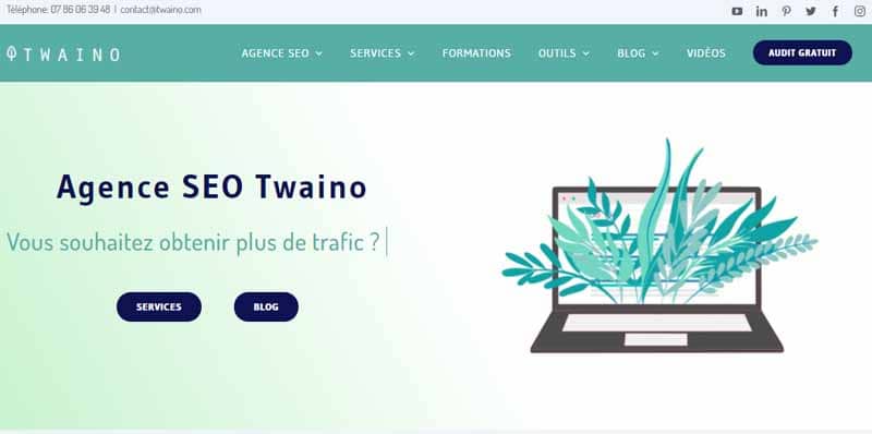
You should avoid anything that can make information readily available to visitors.
You can also make your site easier for search engines to find by optimizing your content with targeted keywords.
Other homepage design best practices include:
- Create personas for your site visitors, then develop an appearance on your site that resonates emotionally with that target group;
- Provide intuitive navigational aids to help your visitors quickly access more detailed information;
- Integrate social media links, blog posts and other social content into your homepage layout;
- The same customer focus that your brand has offline should also be felt on your website.
5.2.2. Design mockups
Design mockups are an exact image of what your website should look like. This is usually done with graphic design software.
When working with a website designer, you need to make sure you receive mockups.
These are fleshed out working models of your new site:
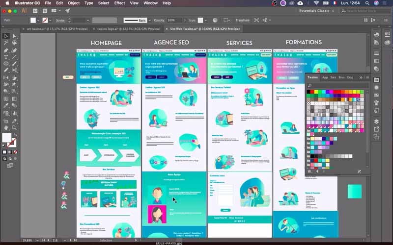
Not only does it give you something that looks like a finished product, but as explained Filipppo Di Trapani, designer of Shopify Plus, this lets you see the design through the eyes of your audience.
When the website designer presents you with a working website from the start, it means that he is working with a template. And pre-made templates mean you’re not starting afresh.
5.2.3. Wireframes for working on UX and navigation issues
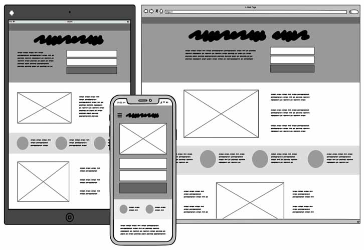
Wireframes are the view of what your new site will look like. They are static, low-fidelity representations of how your pages will be laid out, where content is needed, and how everything will ultimately work.
Source : balsamiq
Wireframes are like a blueprint for a house. With a house plan, you have a lot of information, but you don’t really know what the finished house will look like. And, like house plans, wireframes let you experiment with different styles and structures before you start.
There are many ways designers can create wireframes.
Some use general design software like Photoshop to draw the wireframes on paper, while some prefer to use specialized UX software like Balsamiq.
5.2.4. Content fonts and colors
Content fonts and colors are the most underestimated and overlooked elements when designing a website.
The content of most websites is largely text, so font can have a huge impact on the success of a website.
The general rule with fonts is that you need a maximum of two font styles for your project.
As for colors, the general rule with colors is to have:
- Two to three primary colors;
- And two to three accent colors.
To make sure you’ve chosen extremely contrasting colors, it’s recommended that you use a contrast checker and read a color guide.
5.3. The SEO Phase of Website Redesign
A website with a super-pretty eye-catching design wouldn’t be worth it if consumers can’t find it in search results.
Simply put, if you ignore the SEO details of your website when redesigning it, it just won’t work properly.
Achieving a successful website redesign involves taking a close look at how your site works technically.
For this, it is up to you to find out if:
- Is your website well optimized;
- You are using the right platform;
- Your new website can be reached if an old customer searches for the old address.
These are all topics that need to be considered in your redesign strategy if you want to succeed seamlessly.
5.3.1. Link redirects
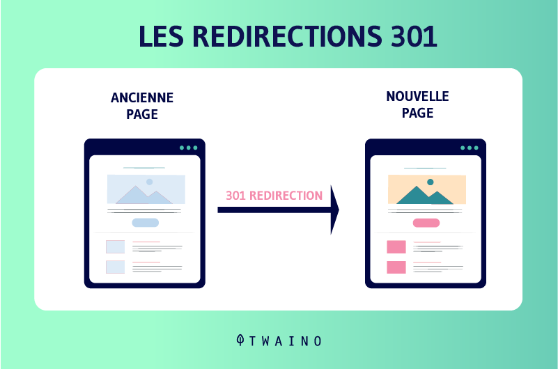
You should also ensure that you have a 301 redirect in place for new pages on your site and that there are no broken links.
We’ve all had the experience of clicking on a link and ending up on an inaccessible page.
Typically, this is indicated by a ‘404 message’ or ‘page not found’ text.
These errors often occur when a site page is moved to a new URL and the old link was not directed correctly to the new address.
This seriously hurts the user experience and you need to stay very awake on this.
Think about your missed opportunity when your potential customers or buyers want information they can’t find due to a broken link.
These feelings of frustration on the part of customers cause missed sales opportunities for your business.
Another solution to remedy this is to customize your 404 error page to drive customers back to your website or provide a light message to communicate moving content to another address.
5.3.2. Platforms
In addition, another technical problem that faces business owners is the choice of platform used to set up a website.
In fact, there are a multitude of tools and platforms that allow you to create and structure websites and applications. The most widely used platforms can be classified into one of three categories:
- Content Management System (CMS);
- Content Management Framework (CMF);
- Web application framework.
5.3.3. Keywords
Another aspect to consider when discussing a website SEO redesign is the extent to which your website is optimized and how keywords are exploited.
Keywords play an essential role in the optimization of a website for search engines (SEO).
However, you must know how to use it, for example by avoiding keyword stuffing on pages of your site.
Search engines may see this as the lack of readability and usability, which can lead to serious penalties.
To do this, position your keywords meaningfully and include long-tail versions where appropriate.
5.3.4. Optimized meta descriptions on pages and ALT text on images
As you know, the meta description is the 150 character text below the title in a search result.
Meta descriptions don’t actually have a direct impact on SEO, but they do improve click-through rate.
Inserting important keywords into a page allows it to target more the queries for which it responds.
Unlike meta descriptions, image ALT text directly correlates to SEO.
For good optimization, make sure that the corresponding ALT text of your images includes a key search term and that the filename of your image does not consist of a series of random characters.
5.3.5. Page titles optimized for search
Like meta descriptions and alt texts, it is also important to include relevant keywords in order to optimize it for search engines.
A tip for success with headline optimization is to do a comparison of your top 10 headlines to see which one has been more successful in driving your site to significant traffic.
This gives you a clear idea of what kind of title your audience likes and how you can do better to increase organic traffic.
5.3.6. Domain
Authority The authority of your page is based on a scale of 0 to 100, indicating the relevance of the information and links in the pages of your site.
A higher page authority provides a higher chance of your page appearing in search engine results and your page ranking well.
Domain authority is the indicator that promotes the creation of links to your page and in return search engines reward you for being a source of information.
Inbound links refer to any link to your website from another website.
Simply put, the higher the authority of the other website, the more optimization points you get. Link building for SEO remains an integral part of any inbound marketing strategy.
If your site isn’t optimized for search or your links aren’t working properly, no one will see your improved design anyway.
Additionally, consistently producing new and valuable content is essential to any SEO or link building strategy. It keeps you relevant in the eyes of search engines and keeps others coming back to your site.
5.4. The development
phase The development phase consists of transforming your website from an image in Photoshop into a real website.
Here is the web development process checklist:
5.4.1. Initial Development
When the developer has finished coding on their local machine, the codes are uploaded to a test URL.
Most developers code the HTML and CSS part of the website first. Once the review is complete, you can say that the initial aspect of development is complete.
5.4.2. Development of the CMS
When the initial development of the front-end is finished, the integration of the site into a CMS can then take place.
Developers commonly use WordPress. CMS development might be the most underrated aspect of the process.
Your developer will tell you how easy it is to have changes and updates in the backend of your website.
5.2.3. Mobile Development
Many clients are amazed to learn that web design happens during the development phase.
The truth is that there are hundreds of tools to build a website. -focused web design mobileThis step helps the site display well on all devices, current and future.
5.2.4. Control
As the owner of the website, you might be surprised to see poor displays across devices and browsers. This is why a series of rigorous quality assurances is necessary.
Quality control allows new websites to be tested on all device widths and all major browsers.
This step takes time, maybe you can dedicate a week or two to it.
How long it takes depends on the scale and extreme of your website redesign project, not to mention your goals for your organization .
5.2.5. Training
Once all the previous steps have been completed, your website can now be put online and visible to your audience.
However, there may be certain other tasks that you will have to do which are often classified in the development phase.
These can be tasks such as:
- Editing;
- And the update.
It is at this stage that you should feel the need to train yourself on how to update things on your website.
First, you need to make sure you understand how your website’s backend works. Knowing enough would let you know how to make common types of changes to your website.
Some developers shoot up to 10-15 small screencast videos on the main aspects of the website backend. They work better because some users come and go. Referring to the video helps train anyone responsible for the site.
5.5. Testing and optimization phase
Ideally, you should test the design and functionality of your new site often, as you go through the process.
It’s generally good to test in different browsers and devices whenever you make a significant change to a page or feature.
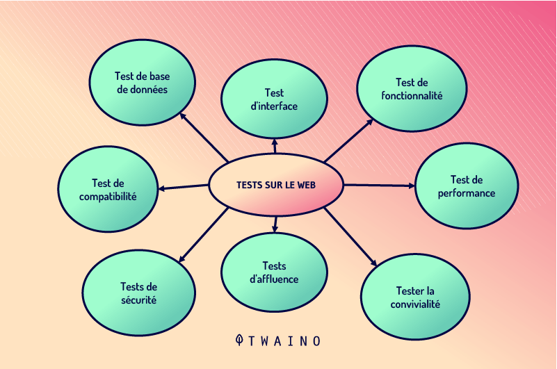
On top of that, when you feel like you’re nearing the end of the project and maybe a few weeks away from your go-live date, you should start with the more formal testing.
This is the time for thorough testing to ensure that the site, hosting, backup configuration, and plugins are all bug-free, fully compatible, and responsive.
You will have to test the new website using several different devices i.e. PC, Mac, tablets, mobile phones.
Preferably, test on at least several major browsers such as:
- Chrome;
- Firefox;
- Internet Explorer;
- Safari;
- Opera.
At this point in testing your new design:
- Refine and finalize the details of the application design and functionality;
- Then set a deadline for making changes and content adjustments;
- As the creator of the site, you must provide thorough verification of every link, form and functionality of the new site.
In real life, it may take a few weeks or months for you to feel the impact of the touch-ups on your new website.
Performance improvements are usually evident within weeks or months of launch.
Close monitoring of website analytics and user feedback will help keep your website performing consistently. You can then make minor adjustments to maximize the experience.
Custom analytics tracking and reporting can help you gauge return on investment and identify opportunities to develop additional functionality, if any.
You should keep in mind that comparative data from before and after your website redesign can also help you take the best steps.
Once a redesigned site is live, it can feel like both the end and the beginning.
While the redesign project itself is over, an online website necessarily needs follow-up and improvement.
To do this, develop a plan to keep content fresh and look for opportunities to continue advancing your digital presence.
Consider sophisticated add-ons that may not have been part of your initial project, such as:
- Websitecustomization;
- A blog with educational content;
- A product finder and custom layouts or widgets, like dynamic comparison tables.
Incorporating new, relevant content and features will help build loyalty, increase retention, and give visitors a reason to come back.
It also fuels your digital marketing efforts by providing direction for future campaigns.
Although redesigning a website involves many moving parts, a thoughtful and deliberate process will pay great dividends in the long run.
Strategizing ahead of time promotes collaboration and develops an overview of your goals and objectives.
Chapter 6: Tools for Successful Website Redesign
Review a list of tools you can use when redesigning your website.
6.1. Figma
Designers working freelance or in a digital agency should consider adding Figma to their inventory of web design tools to facilitate collaboration and real-time feedback from their clients.
Figma is the most intuitive design tool today. Changing names, layer numbers, and objects literally takes a moment, as does adding descriptions and rearranging design elements.
The interface, including the pages section, is very user-friendly and clearly designed. In addition, importing objects and creating new objects is very convenient.
Working with objects in Figma is just fun. The same goes for scaling objects, which only requires one key press.
When creating a design, the tools work similarly to CSS rules, which speeds up cooperation between designer and developers.
Figma is incredibly efficient, the number of views in your design is almost unlimited. However, the performance of the tool does not decrease as their number increases. Plus, it’s enhanced by the fact that you’re working online, so you don’t have to open large office files on your computer.
Often, page design tools don’t allow you to create a chart or shape yourself from scratch. This is for example the case with Photoshop.
Figma lets you create vectors, it supports various graphic formats and gives you the ability to independently create page or app elements with real-time preview.
6.2. Wireframe.cc
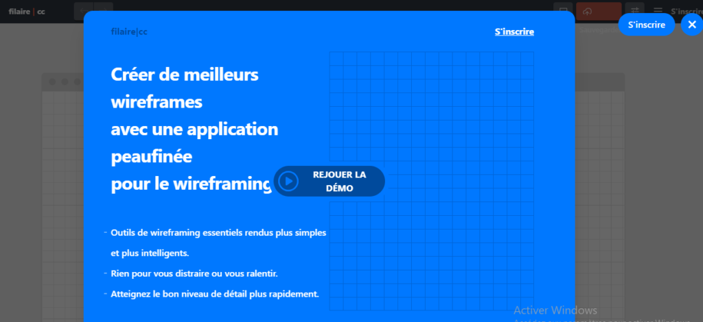
Wireframe.cc is a completely free browser-based wireframing tool.
It is a minimalist tool with a basic and clean user interface, ideal for quick mockups.
Its simple user interface allows designers to stay focused and not get lost in site navigation.
This amazing tool has features like:
- Drag to Draw: Creating your wireframe elements couldn’t be easier. All you need to do is draw a rectangle on the canvas and select the type of stencil that will be inserted into it. You can do this by dragging your mouse over the canvas and selecting an option from a context menu. If you need to edit anything, just double-click on it;
- Super minimal interface: Wireframe.cc offers a clutter-free environment. Now you can focus on your ideas and draw them easily;
- Easy Annotation: If you want to make sure your message gets across, you can always comment on your wireframe. Annotations are created the same way as any other object on the canvas and can be toggled on or off at any time;
- Limited palette: If you want your wireframes to be crisp and clear, you need to keep them simple. Wireframe.cc can help you achieve this by offering a very limited set of options. This applies to the color palette and the number of stencils you can choose from. In this way, the essence of your idea will be even more realistic.
6.3. Balsamiq
Balsamiq is a fast wireframing tool that has been smartly packed with collaborative features to better serve the iterative nature of user experience processes.
It has a simple learning curve allowing easy onboarding for novice users.
First and foremost, Balsamiq is one of the fastest tools used for piecemeal wireframing.
It has a built-in library of multiple UI elements, which you can simply drag and drop.
There is also a quick add function, which allows you to quickly enter the desired item and displays a list of matching items from its library.
Clicking on one of these items in the list immediately adds the item to your canvas.
Another feature that helps speed things up is the availability of a built-in icon library.
Common icons such as search, home, help. are all readily available.
6.4. Cloudways
Cloudways is a PaaS (Platform-as-a-Service), a classification of cloud computing service that provides a platform for customers.
Through this platform a user can develop, run and manage web applications while remaining free from the complications of building and maintaining website infrastructure.
It is a web hosting platform that allows a user to create a particular server.
It is a platform-as-a-service solution ideal for bloggers, designers, and developers who want to host their own websites.
Essentially, Cloudways helps you deploy, configure, and manage multiple applications across multiple cloud servers, from a central dashboard.
It secures your cloud server by protecting it from malicious attempts. It takes regular backups of your cloud server and configures it with advanced caching tools to boost your website speed.
Basically, a large number of real-world servers work together as a single system to provide stable and secure hosting for virtual servers. This means higher performance at lower cost with even greater web hosting flexibility.
Cloudways offers customers a large number of features compared to other WordPress hosting platforms.
With an interactive and user-friendly interface for managing servers and applications, it offers individuals a one-click solution to all hosting problems.
There are many other renowned names in the cloud hosting market, but the features of Cloudways are indeed one of a kind. In fact, they tailor their services to what they charge users.
With a simple ”Pay as you Go” model, you can scale your server size and monitor your WordPress website traffic based on your budget.
Features are divided into two tabs, Server Management and Application Management.
In server management, Cloudways offers the possibility to control your server, start it, stop it or restart it. You can also use monitoring items, interact with services, configure settings, back up the server, and more.
With the app management option, you can choose from apps and add-ons to make your site more functional. You can also:
- CheckURLs and credentials.
- Manage domains;
- Install an SSL certificate for free:
- Etc.
Cloudways provides customers with exceptional performance for servers and applications.formula ThunderStack isn’t the only thing that adds to its performance.
The platform further offers revolutionary SSD storage that supports super-fast read-write queries that cut your website loading time in half and help you achieve SERP .
Security plays a vital role when hosting WordPress websites through a good cloud hosting platform.
Cloudways offers customers platform-level firewalls for their WordPress sites to keep their data secure.
‘ technical support team Cloudways is focused on applying innovative security hardening techniques to create a higher platform.
Cloudways gives you a unique feature of adding a list of whitelist IP addresses applying limitations to allow entry to the server.
Their dedicated cloud servers and one-click SSL management along with automatic patches will ensure that your site remains secure on Cloudways servers.
6.5. Google search console
When redesigning your website, you should consider the keywords and topics you will use on your new website to help you with your search engine optimization efforts.
With Google Search Console’s detailed reports on search appearance and traffic, you can optimize your content for search engine rankings when planning your new design.
With this tool, you can see what keywords and topics your website is currently ranking for and what people are clicking and not clicking on.
This information will help you optimize your content around your SEO strategy for your website redesign.
And when used in conjunction with the other previous tools, you’ll be able to determine if your new website is successfully achieving its goals.
These tools are essential for showing the success of your current website to ensure that your redesign plan takes into account your past mistakes.
Using these tools on your new site will give you powerful insight into how your new website is performing against your goals.
This means that when planning your redesign, be sure to select a content management system that will allow you to add these beneficial tools.
To narrow down your options, check out our blog post on choosing a content management system.
6.6. Hotjar
Hotjar is an all-in-one tool, as it includes both analytics and user feedback collection.
This tool aims to help you understand what visitors are doing on your website. Hotjar’s strength is that it combines, in a single platform, a range of essential analytical features with user feedback tools.
Before Hotjar existed, we needed different platforms to access this combination of features, each increasing the cost and complexity of your optimization toolkit.
Hotjar brings together different analytics, cro and user feedback features in one platform.
Once you know what Hotjar is, let’s do a brief summary of the main features of this tool:
- Heat maps: You will be able to see where your users go, where they click;
- Visitor recordings: Video recordings of user sessions so you can see exactly what they are doing;
- Conversion funnels: This shows where users leave your sales funnel;
- Forms analysis: This shows you how users are interacting with your forms to help you reduce errors;
- Opinion Polls: This feature allows you to ask users why they did or did not perform a certain action;
- Feedback: This option allows users to leave feedback on your website or app, telling you what they like, dislike or what makes them indifferent;
- Surveys: This feature allows users to be reached with forms asking for their opinion.
6.7. InVision

InVision is a unified platform for designing digital products. It facilitates collaboration between different stakeholders throughout the UI design workflow.
Although used by many of the biggest companies, the software is also designed to suit smaller teams as well.
Like other UI design tools, InVision allows designers to create UI navigation patterns, design prototypes and wireframes, and plan user journeys.
With InVision, different users can give feedback to improve plans, designs, layouts, and even onboarding flows created using Freehand, their online whiteboard.
Here are some of the benefits of this amazing tool:
- Simple and Accessible: InVision is intuitively designed and easy to use for people of all technical levels, with drag-and-drop functionality to facilitate feedback on certain aspects of designs;
- ‘s product tours InVision show users how to use the application simply and efficiently. Like all major onboarding workflows, InVision segments users based on their level of knowledge to offer them step-by-step procedures;
- Scalable: The software is designed to meet the needs of everyone, from freelancers to global enterprises with thousands of employees. This is reflected in the flexible cost of InVision’s services.
6.7. Designmodo
Designmodo rivals most other design resource sites with its quality mockups.
Their unique articles and tutorials help website users improve in various skill sets.
Information about the latest design trends and developments is what keeps customers coming back.
Once on the homepage of Designmodo, all of its features are displayed.
The client can instantly assess all the possibilities this website has to offer whether it is a small startup, a freelancer or a global company.
There’s no need for coding experience since Designmodo uses a drag-and-drop editor, which is extremely convenient for people who are just getting started with website builders.
Above all, trust is essential for a stable relationship with customers. Designmodo has proven its value and effectiveness by successfully offering its services to some of the biggest players in the market.
It is stated on their website that companies like Nike, Google, Ikea, Microsoft, NASA and others are among Designmodo’s clientele.
This is a beneficial factor in attracting new customers, as it gives a sense of security.
Designmodo also offers the opportunity for web designers and developers to find suitable employment, whether full-time or remote.
So, in addition to creating website and email builders, providing tutorials on various trends and techniques, they also help design professionals build their careers and make useful connections with worthy companies.
Conversely, companies can also benefit from this feature since they can post a job offer.
In this way, Designmodo connects companies that need designers or developers with workers.
Anyone with a blog, social media account or website has the opportunity to join the Designmodo Affiliate Program.
This program gives you the chance to be rewarded for referring others to Designmodo products and earn a 25% commission.
6.8. Behance
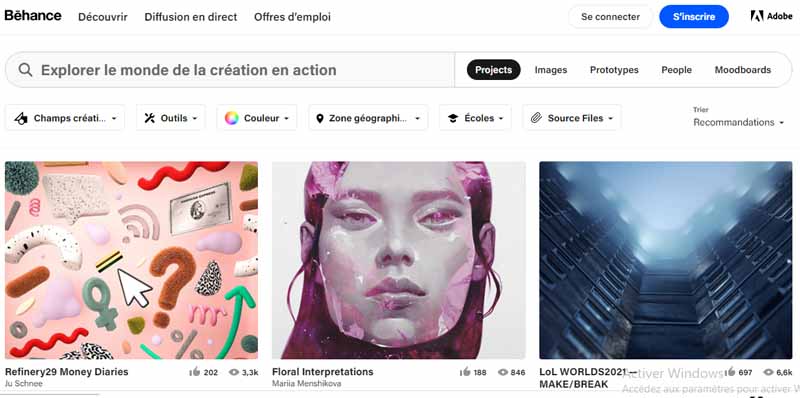
Behance is one of the many tools Adobe has to help creators stand out. It’s a bit like LinkedIn, in that you can use it to showcase your professional work and connect with others.
Creators in many fields can use Behance, but it’s especially useful for visual artists like designers and photographers.
The main reason most creators use Behance is to create a portfolio. You can post projects you’ve done for clients or for your own enjoyment.
When you create a new project to share, you can include multiple items.
These include, but are not limited to:
- Photos;
- Videos;
- audios.
If you have an Adobe Lightroom account, you can save time and import visuals directly from there.
When you create new projects on Behance, you can increase your visibility by adding tags and sharing the tools you’ve used.
You are not limited to sharing projects on your profile. If you are currently working on something exciting, you can create a work in progress, which will be visible for as long as it takes.
6.9. Adobe Kuler
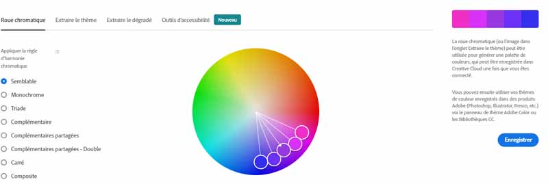
Kuler is a web-based application that allows users to browse, create, and share color themes through the Kuler website, Kuler desktop application, or a Kuler widget for the Mac OS X
Kuler is also available in favorite Adobe CS4 desktop applications including:
- Photoshop;
- InDesign;
- Illustrator;
- Flash;
- Fireworks.
Kuler is available online for free and you don’t need to be a CS4 user to enjoy it.
The use of color is usually one of the most important aspects of any design.
But not all designers are lucky enough to create color combinations that work well together.
Most of us know a great color combination when we see one, but we couldn’t create one if. This is where Kuler can help you.
Designers can browse thousands of color themes created by the Kuler community, including the ability to search color themes by tags, themes, hex color, and more.
Users can also create new themes based on the colors of an existing image you upload from your desktop.
Once you find a color scheme you like, you can rate it, add it to your favorites, export it as an Adobe Swatch Exchange file for use in any Adobe Creative Suite application or add it directly to the Swatches panel of your CS4 application.
You do this with a simple drop-down menu in the Kuler panel next to the sample name.
6.10. Gliffy
In 2005, two engineers living in San Francisco started Gliffy, an tool for developers who wanted to share visualizations of the software they were working on.
Gliffy offers its users a variety of features, including an easy-to-use editor, sharing and collaboration features, and version control.
Today, Gliffy is used by companies big and small like Netflix, Nike, Pixar and Twilio.
The drag-and-drop editor lets you start with a blank slate. To create your diagrams, you drag and drop various elements onto the page, joining the icons with the connectors of your choice.
Alternatively, you can start working on your diagram with a theme or template and build from there.
Users of Atlassian products can purchase add-ons that allow Gliffy to integrate seamlessly into Jira or Confluence.
The Jira add-on lets you add diagrams to your issues so you can do things like visually document bugs and other code issues.
The Confluence add-on lets you link directly to diagrams, use previously created diagrams as templates, and work on content without leaving the Atlassian ecosystem.
To share your diagram, you can create a custom URL that links to your creation, or you can embed your image elsewhere.
You can also import and export diagrams on demand. Gliffy also includes collaboration that allow viewers to comment on or edit your diagram.
Chapter 7: Some notable redesign examples
In this chapter, we explore some websites before and after their most notable redesigns.
7.1. Yellow Page
Yellow is the website of an organization whose goal is to help people in a locality find services very close to them.
Without making great efforts, you can find local businesses or people who can help you meet your need. This may be:
- A lawyer;
- Of a restoration;
- A car repair;
- From a dentist;
- From a veterinarian;
- Etc.
According to their ”About” page, Yellow Page is the only website that can help everyone live a better life with just a few clicks.
It would really make sense if they reduced user effort on the website by making it easier to access research information.
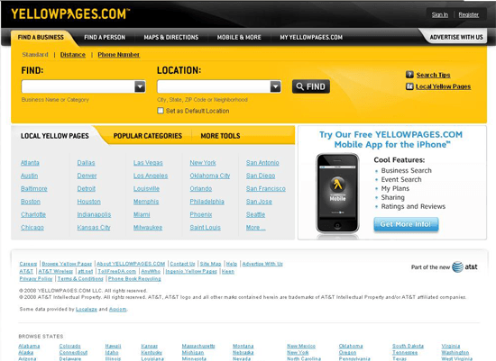
Here you have a view of an old face of their website:
Next, a view of the face of the website after a redesign
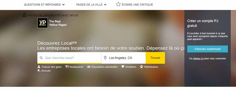
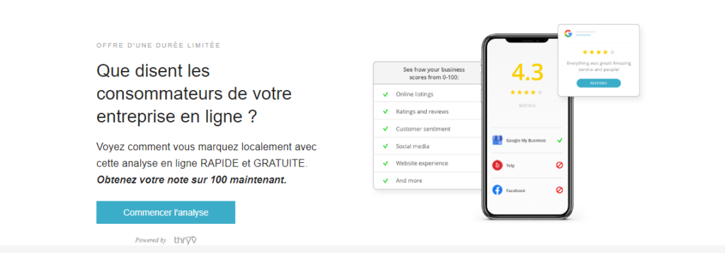

The website hasn’t completely lost its old look after the redesign.
They have been able to retain a large part of the original colors, in particular the company colors, yellow and black.
The new design comes with a location feature in the search bar which is used to better direct the search results of site users.
This reduces the effort that users have to make to select the locality that interests them the most.
Besides that, the design of the site after the redesign is quite nice and the less useful features have been removed or moved.
For example, the ”search tip” link, which could help new and existing users improve their search queries, has been removed.
Even though the many images on the old site are really attractive, they seriously clutter the user interface.
This can significantly reduce website performance, loading speed and user experience.
7.2. Mozilla
In our view, Mozilla websites almost have a professionalism that shines through them. Plus, they come with a host of curated features that need regular tweaking.
That being said, let’s take a look at the old Mozilla design:
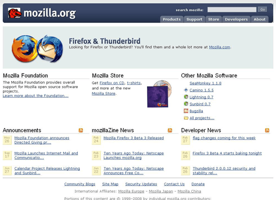
And then here’s the look of the Mozilla website after redesigns:
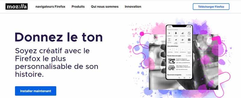
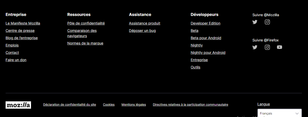
We’ll notice that there’s more airflow on the interface of the new look, despite the fact that the features that cluttered the interface are not removed.
These are essentially:
- The registration form for the newsletter by email;
- A slideshow highlighting the content presented;
- Etc.
In fact, there were some reductions in hyperlinks and the use of spaces between design elements.
7.3. Mailchimp
MailChimp is a digital platform that helps companies in one way or another to increase their income through the internet.
, this is what the MailChimp website UI looks like:
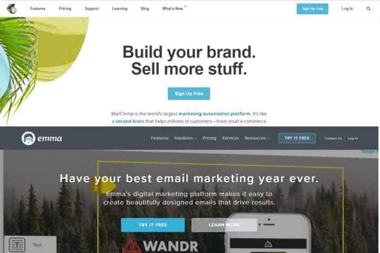
But today, after some redesigns, here is the new look:
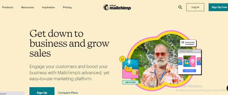
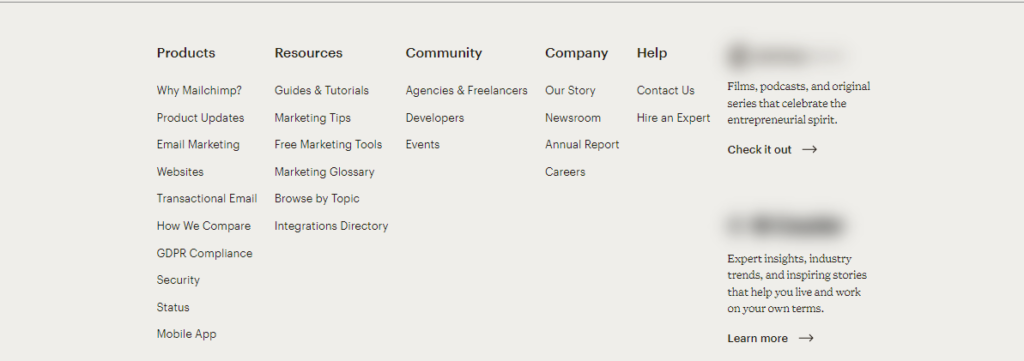
In real life, even before the redesign, the website presents a very nice image and everything was working pretty well.
The goal of MailChimp’s redesign was to better communicate the company’s values to its valued and growing community.
The old version of the homepage was clean and easy to navigate, with a top menu and an organized landing page decorated with a hero image.
The work of the redesign has resulted in a more correct organization, a more vibrant color palette that moves away from the typical typeface and wordmark.
7.4. Tweeter
As we all know, Tweeter is a social network that helps companies increase their visibility thanks to its great popularity.
This image gives us an idea of what the Tweeter hierarchy looked like in the past:
Source : byothe
Next, here is the picture of the user interface after a redesign:
Next, here is the picture of the user interface after a redesign:
When composing a tweet, the popup has a distinctive appearance which is an open space instead of a rectangular box.
The “tweet” icon is now moved to the top of the page.
7.5. Instagram
Like a tweeter, Instagram is also known to be a social network that serves the purpose of promoting the goods and services of many companies.
This is how the user interface looks like in years gone by:

Source : img.staticigen
And we can see some changes from the redesign:

Source : f.hellowork
The website underwent an overhaul in 2018, but one can notice that most of the popular features remain unchanged.
As before, you still have the option to scroll through your feed and double-tap to like photos, comment on images, and browse other people’s profiles.
But square-shaped profile pictures are now rounded, while the image grid above the username has been removed.
The Instagram blue is replaced with a combination of attractive and modern grey, white and black themes.
Overall, the interface is simplified with a flatter design compared to the old preference.
The Instagram app suite was not very consistent in terms of look and feel. The redesign process brought all aspects of the app together for a cohesive look.
7.6. The major overhaul of Reddit
Reddit is also a social community that allows people to share knowledge, ideas and be informed of news in the world.
Here is its user interface before the redesign:
Source : external
So we see the site after a few tweaks:
The new Reddit highlights easy navigation with a hamburger menu on the left side of the screen, which showcases your feed, profiles, and any subscriptions you have.
There is also a selection of buttons that Redditors can use to change the format of the website to suit their individual preferences.
The Card View is a flatter look like Facebook, while the Compact View lets you view a wealth of content with effortless scrolling.
Chapter 8: Website Redesign Questions and Answers
Let’s discuss some frequently answered questions here that can serve as a guide in your redesign process.
8.1. Should I use a growth-oriented design or a complete rebuild?
Not long ago Hubspot initiated Growth Driven Design (GDD), a term to describe an iterative design process that ensures a website is built step-by-step from the ground up to completion.
It is in a way the methodology of the ” minimum viable product” deployed in the process of building a website.
This engenders the reassignment of content as possible and the transition of the site design step by step. So the most important pages are the first to be converted to the new look.
The advantage of a GDD approach is that once a part of the site has been deployed, you can immediately start learning from its analytics, allowing for more frequent iteration and improved conversion rate.
GDD is particularly useful when the old site has no possibility of conversion.
Being able to quickly set up a website with the right CTAs in the right place means you can quickly gain leads and learn about your target audience’s browsing habits faster.
As an alternative to GDD, the traditional rebuild method is to complete all content, functionality, and pages before putting the site live.
This method may take enough time, but it allows you to focus more on the design and content of the site, making sure everything meets the needs of all stakeholders before you go live.
It is true that both methodologies can require a time commitment to create content, but the traditional method requires even more before you start seeing results.
Whichever process works best for you, once the site or one of its components is live, it’s important to monitor your conversion and traffic acquisition data so you can make improvements.
8.2. Which Content Management System is Right for You?
There are probably more content management systems in the world than there are word processing apps, but that doesn’t mean you should obsess too much about one choice.
If your website was built in the past few years, chances are you’re using WordPress.
It’s the most common content management system in the world, and it powers almost a third of the sites on the web.
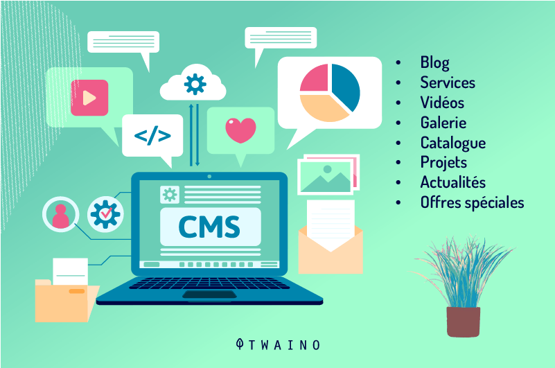
It’s relatively easy to use, seamlessly integrates with HubSpot and many other marketing automation platforms.
Let’s say almost any web development agency can help you with backend or template updates.
But this popularity has also made WordPress a target for hackers and other criminals.
If you are going to use WordPress, it is absolutely essential that the site and all of your plugins are kept up to date to maintain your site’s security and search rankings.
To do this, choose a quality hosting provider that requires frequent updates and test the site to make sure it still works as expected.
Despite its recent appearance and the fact that it is the main target of hackers, the WordPress content management system is far from being compared to others like:
- Drupal;
- Joomla;
- Wix.
The ease of use and flexibility of WordPress played a big role in its preferential adoption figures.
Of course, there are also closed-source content management systems worth considering.
Most CMS platforms are difficult to customize and make it very difficult to quickly iterate marketing content.
They also tend to have very old user interfaces, which makes updating content more complex.
If the primary goal of your site is lead conversion, WordPress may be a better option. But when it comes to taking lead nurturing to the next level, your CMS can be assisted by a CMS like HubSpot’s COS.
Dubbed the Content Optimization System, it makes it easy to tailor intelligent content to each site visitor based on their position in the buyer’s journey.
COS renders content very quickly and really doesn’t need to be updated like WordPress, which means your site is always secure and on the latest version.
8.3. How will you use existing content?
Repurposing existing content can be one of the most effective strategies you can use to save time on a website redesign project.
In many cases, as long as the content is not factually incorrect, it can be reused in an updated, intuitive layout.
The goal of a GDD approach is to reuse old content for better live conversion site design, and then identify the most important content to reuse first.
Prioritize the pages with the highest conversion potential, these may or may not be your most visited pages, but be sure to consider the current search rankings of these pages before making any major revisions.
You don’t want to inadvertently delete content that was helping you rank for important terms.
Additionally, many forms of non-written content are required when building a site, including:
- Photography;
- The illustration;
- Audio;
- And the video.
Repurposing content can also save time when launching a new site.
But having original source files on hand can save time if images need to be resized to fit a new site layout, for example.
In many cases, if your new website uses the same content management system as your old one, you may be able to retain access to all of the images, icons, infographics, or photos of your site’s content.
8.4. How do I align my buyer persona with the redesign?
If you’ve been doing inbound marketing for a while, you know what a Buyer Persona and why you need it for effective conversion.
Basically, buyer personas are used to denote a fictional representation of your ideal customer.
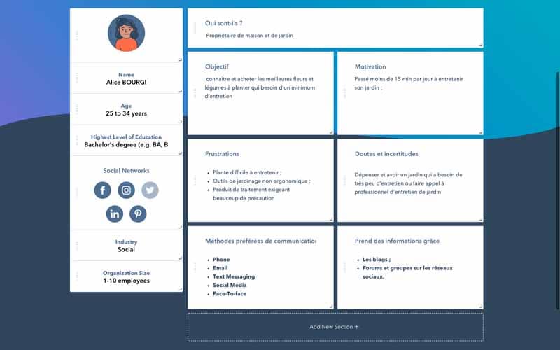
You can have one buyer persona, although from experience this is quite unlikely, or you can have more than one.
Some organizations even think they have dozens of personas different.
Although this is possible, it is extremely difficult to manage, especially with a small or medium-sized business.
When creating or refining your personas, be sure to probe deeply into the triggers that lead your personas to search for your product or solution so you can provide appropriate responses in your marketing workflows.
Your personas will also help you develop an information architecture or a search-optimized sitemap.
Look for opportunities to use the actual terms your personas are searching for in your site’s primary and secondary navigation.
This will make the site more easily scannable when someone lands on it via search or other means, and signals to search engines that these are important topics for your organization.
8.5. How long does a website redesign project take?
The actual time to invest in a website redesign project largely depends on the scope of the work and the expected results.
In case you choose to accomplish your redesign project in a phased approach, you should note that the duration may be relatively longer.
On the other hand, when it comes to a simple user interface refresh, it will probably take you a month or two to finish the work of collecting data and setting up goals.
This suggests that if you want something bigger or more complex than a simple refresh, you’re going to have to invest months.
Even if you’re not so thrilled to hear that, you need to remind yourself why your site needs a redesign.
Then you also need to think about the value of taking a methodical approach to redesign over a long period of time.
By prioritizing the parts of the site causing the biggest problems, they’ll start to see progress before the job is done.
This means you won’t have to spend a huge amount of money on a redesign project before you can expect to see a return on your investment.
You will pay for each stage of the project and you will slowly but surely see your website start generating more and more revenue along the way.
8.6. Will a website redesign impact SEO?
If you are successful in redesigning your website in a way that improves user experience, traffic rate, engagement, and conversions, it will give your website a boost in search.
On the other hand, if you make mistakes during the redesign and it falls flat with visitors, the website’s rankings could plummet and put you in a worse position than before.
When you make excessive changes to page content and metadata, it can negatively impact your rankings. But that’s not always a bad thing.
For example, if you retarget some of your pages around better keywords, you can expect it to take a while to increase your search visibility again.
It only becomes a problem when you change something like the page URL.
If you simply save the redesigned page to the new URL, anyone who accesses that old URL, from search, social media, or other sites, will end up on a 404 error page.
So if you are making significant changes to the site structure, you should remember touse 301 redirects to keep visitors on live pages and preserve the original page’s link juice in search. .
8.7. How much does a website redesign cost?
Freelance web designers charge anywhere from $500 to $5,000+ for a brand new website.
Pricing is quite simple since you know how much time and resources it takes to build a certain type of website as well as the return you can get from it.
Realistically, it could cost anywhere from $500, for a simple branding refresh, to over $10,000 for a complete overhaul.
The cost of your project may also depend on things like:
- The time to run usability tests and gather the data needed to create the appropriate strategy;
- The part of the site to be redesigned;
- The complexity of the changes;
- Etc.
If you can estimate the total time you will spend on the project as well as the cost of additional resources, your project proposal and costs will be much more accurate.
8.8. How often should you redesign your website?
In general, a good rule of thumb is to invest in a website redesign every 2-3 years. The number also depends on your industry.
If you work in a highly competitive industry that is constantly changing and progressing, you might want to redesign your site every 1-2 years.
Some industries, like the finance and construction industry, tend to change their website design every 3-5 years.
To a large extent, the frequency of your site redesign will depend on your preferences and the state of your business.
If you have recently redesigned a website and you believe that some changes may be beneficial, it is advisable that it has been 6 months or less since the last redesign of your site before making a new retouch.
8.9. Should I completely redesign my site?
It mostly depends on the state of your site, your goals, and the reasons for a website redesign.
If you have a website that is so outdated that it is no longer worth it, we will offer you to start a new design.
To get a clearer idea of the state of your website, simply request a website audit on the Twaino homepage.
8.10. Why should you choose Twaino for your website redesign?
While a website redesign can benefit you, it can also hurt your business website in several ways.
For example, if your existing website has a lot of inbound links and top performing keywords, you can casually lose them during a website redesign.
And this can significantly damage your rankings and lead to the loss of important traffic.
Since traditional web designers aren’t very familiar with search engine optimization, they won’t know how to properly protect your online assets.
In addition, Twaino is an experienced agency in its field that can help you not only with the content and development phase of the redesign, but also to become an authority in your sector thanks to the work on the SEO phase of the process.
Conclusion
Website redesign is generally a process of rebuilding your website with a new design.
To this end, it gives a new look to your website to make it more attractive and resolves other irregularities in the functioning of the site.
It becomes even more indispensable when you notice certain signals like very slow loading speed, very old images and poor user experience in general.
We have detailed in this content, the best practices for an effective website redesign.
If you possibly know of any other tricks that we have not shared in this content, feel free to share them with us in the comment section.

