Video Transcript
Hi, this is Alex. Today, we’re going to talk about the colors of your website,
the colors of your brand. Now, this may seem like something a little
anecdotal, or not very important in itself.
However, when we do branding or when we really want a
brand image. Well, finally, the fact of having
colors that are associated with your brand is something that is extremely
extremely important, so don’t take it lightly, simply because a good color
because in fact a good color, or at least a good design will really allow your audience
really allow your audience to identify who you are extremely quickly, simply with a
extremely quickly, just with a particular color
it really makes all the difference. So for that, since I don’t necessarily have
i don’t necessarily have a very good acuity in terms of colors,
i asked my partner, Mariana, to do this work on colors so that she could choose
the colors so that she chooses a palette which are appropriate. In any case
after discussion… So obviously, we talked about the aspects of
communication, what I wanted to put on my site,
the fact of having something that is once again very natural, very organic, so there is some reference to
organic, so there is referencing between
quotes “healthy”, for a website and for a business. And so, we discussed it, she had the opportunity to look at
had the opportunity to look at and work on the choice of colors.
So, you see, there are several, so I advise you
when you make your communication to really sit down and say to yourself
and say to yourself “ok, now these are my colors” and between quotation marks
“it’s done once and for all” maybe not because it could be always
always be subject to change, but in any case try to be clear at the beginning with this kind of
with this kind of thing, simply because otherwise it’s going to be such a
be so much of a mixed bag that, your website might lack identity
perhaps lack of identity. In any case your communication may lack
of coherence. So do it, from the start and once it’s done, well it will
allow you to create your website in a much more serene way
to make something that is really beautiful, really nice.
So typically in terms of communications, we found something
a little bit similar like that on Pinterest. And I thought to myself
and I thought, and Mariana thought that it was something that
interesting to exploit from a communications perspective, and so
so it’s really good for me. What I did was I
i drew. I’m going to show you a little bit of how I did it
how I went about creating my content, at least in the creation of the first
content and visuals. Of course, I’m still at the very beginning, so you have to
so you have to be a little indulgent with the results.
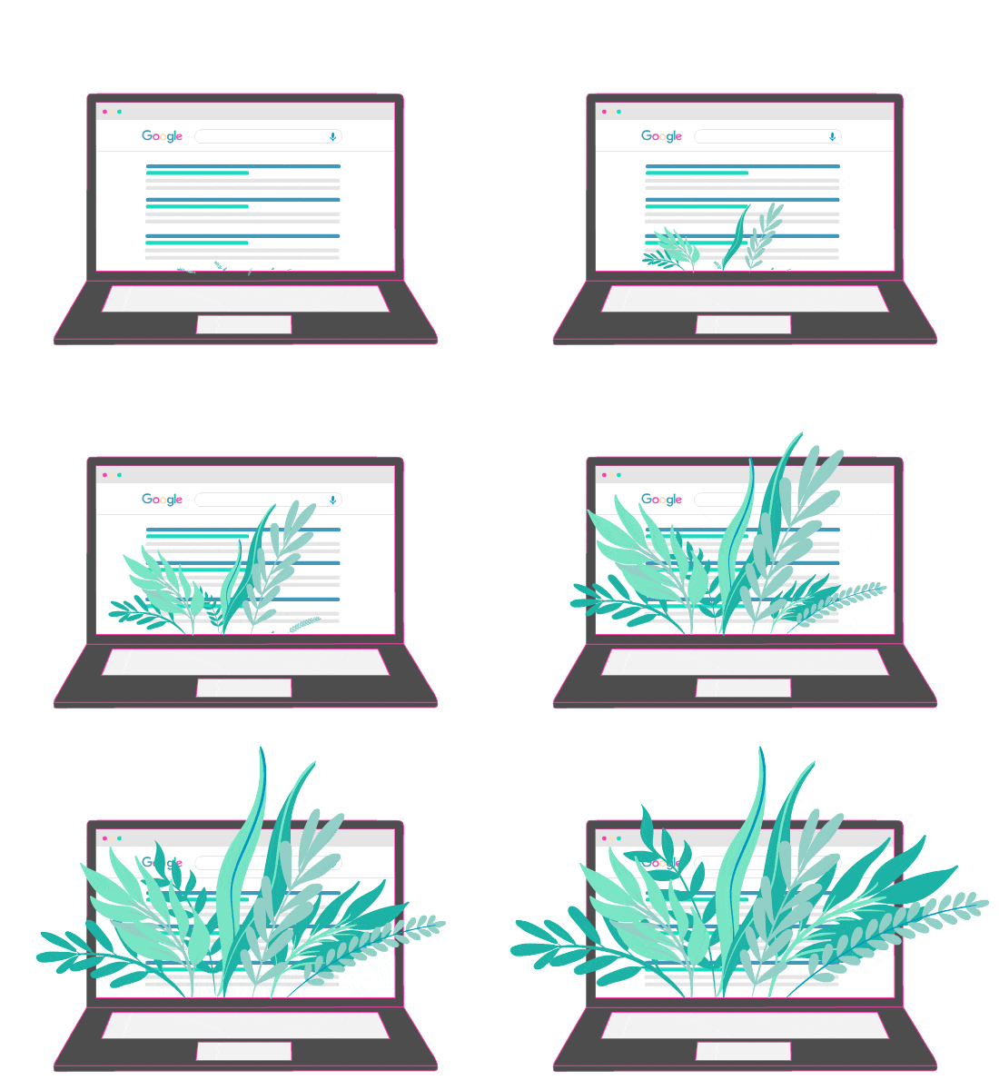
But here it is. In fact, I started with a computer drawing
that I made and then I integrated into this preliminary drawing
preliminary drawing, precisely this idea of growth with at the beginning a small
seed, which becomes a bigger and bigger plant, and then this plant
finally, it even exceeds the computer and thus it takes life in the
the real world in quotation marks. And so, you see typically the colors that
are here and it follows exactly the graphic elements that Mariana gave me
that Mariana gave me. And so the final version, I don’t know
anyway, for the moment, we’ll have something that will look like
something like this, in fact. So taking the design that’s here, a little bit reworked, with
reworked a little bit, with the drawings that I was able to do, the colors of
Mariana’s colors, and it looks like this. So there you go, I think these will be
elements that I would probably add to the home page
in the home page, and there are other drawings that I could make too, and for which I didn’t
for which I didn’t make a breakdown for all of them, but this is a typical drawing that I
is typically a drawing that I was able to do with Mariana’s
colors of Mariana, and therefore it is typically elements that I will integrate in the
i’m going to integrate into the website, and you can see at the beginning when I drew these
when I drew these first images, I didn’t necessarily have in mind this
communication around the plants or around the organic, and so it would
and so it might be necessary to add some graphical elements in relation to that
in relation to that. So, these were the first drafts that I was able to make
to do. So with men, women, with
computers, cell phones.
So, these are images that are a little bit generic, so I don’t know
generic, so they’re all over the place, so I don’t know if I’ll use them
directly on the pages of my website, or will I integrate them in a
a blog. In any case, these are images
interesting to exploit, because they are relatively generic, so interesting at this level
generic, so interesting at that level. So there you go,
each image, indeed it is things that I created, that I drew and
and thanks to Mariana’s talent for colors, we have something
in a few images, we have something extremely coherent and we have
something extremely coherent and we can see that something common emerges from it, in
in fact. And it’s all about choosing the right color palette at the beginning,
in order to have something that you actually like and that is
consistent with the image you want to give off with your company.
So here it is, a short video
and see you soon for the rest…


